Vila 953 is a traditional restaurant with a contemporary approach, located in Vila do Conde, Portugal. As we delved into this branding project, researching for the narrative and designing the brand’s visual identity became a time trip and a thrilling challenge. As we dug through one of the oldest historic episodes at the genesis of our own country, we discovered the most charismatic characters and an unexpected commercial deal that led to the foundation of Portugal itself! How about that?! The final result tastes like tradition and is definitely one we are very proud of!
The Vila 953 brand breathes an elegant combination of tradition and contemporaneity, reflecting a modern and dynamic vision of the richness of our national gastronomic heritage. With a mission to pay homage to national gastronomy and the art of hospitality, the Vila 953 brand proudly incorporates strong traces of the past in an elegant visual aesthetic, reflecting the values of originality, quality and charisma.
To achieve our client’s goals, we used some of the most emblematic historical figures that are at the origin of Vila do Conde and Portugal itself. They became the visual pillar of the brand, revealing an updated and sophisticated identity.
As a result of our collaboration in this branding endeavour, we find in Vila 953 a sophisticated yet welcoming space, which appeals to local memories of historical heritage while offering a wide range of high-quality traditional delicacies.
HOW WE HELPED
- Strategy: brand analysis; creative concept; service design analysis; brand-business alignment analysis;
- Branding and Storytelling: brand narrative and core brand values; tagline and signature; visual identity: logotype and variations; illustrations; stationery; photography style; brand book;
- Brand Collaterals: general F&B items; menus, account holder; signage

A Brand’s Story inspired by History
The main stakeholders of Vila 953 wanted to implement a gastronomic concept where traditional Portuguese cuisine and its Mediterranean influences meet with a contemporary approach and contacted us given our experience in building brands. In their own words, “Early in the process of opening the restaurant, and after a positive referral from a supplier of ours, we got in touch with KOBU. We only had a naming in mind and we needed help to transform that into a brand with a strong identity“.
The superior quality customer service and the above-average gastronomic offer were to be appreciated in an elegant space. During the Research & Discovery stage of our process, we understood that we would have to explore the business concept and the desired target audience to create a coherent visual universe that would match the level of sophistication of both space, service and product. These would be the distinguishing factors that would elevate Vila 953 and set it apart from the competition inside the food court of the shopping centre where the restaurant was set to open.
Given the business characteristics and the chosen name for the brand, the solution would be to develop a charismatic identity closely linked to the city’s historical heritage while bringing it to present days through an appealing language. We decided to build a bridge between the most interesting historical characters we found to be crucial for the birth of Vila do Conde and the restaurant’s clients. By telling the old story at the start of it all, and the personalities involved in it, we opened a precious window and allowed Vila 953’s clients to get to know more about the city itself.
THe CHALLENGE:
We wanted Vila 953 to become an easily recognisable brand in the Restaurant, Food & Beverages segment and, given the location of the restaurant, as part of a food court in a Fashion Outlet, to feel exquisite. But most importantly, we felt the need to impregnate the brand with meaning that would go beyond the gastronomic experience, upholding and honouring the tradition inherent to the stakeholders vision for the project.
UNCOVERING THE ROLE OF a Strong Woman: MUMADONA DIAS
Vila 953’s message is closely associated with the history of Portugal, and the city of Vila do Conde in particular. The company intends to present itself as a traditional Portuguese food restaurant that will drink the charisma of its image and the diversity of its product from the roots of Portugal’s history. The restaurant’s name refers to the foundation year of the village of Vila do Conde, which is surprisingly older than the country itself – we placed this fact at the root of the historical concept that ended up guiding the construction of the brand identity and visual universe defined for Vila 953. We used one of our most beloved creative tools – storytelling – to embody the richness of this brand. Join us now in the exploration of the process.
The city of Vila do Conde has in its genesis the historical figure of Mumadona Dias, countess of the Condado Portucalense. Even though she’s not the founder of the city, she was, however, the first person to write down records about the village. Mumadona Dias was a nun and an important strong woman who signed, in writing, a property deal between Flâmula Pelagius, her niece, and Gonta, the Abbot.
This deal is at the origin of Vila do Conde village, which was to be officially founded in 953. Mumadona is central; she was a rather unusual educated woman, given that she lived in the Middle Ages; as a clergy member, she could read and write and was responsible for the drafting and certification of important documents. She is not only at the heart of Vila do Conde’s genesis but was also a prominent figure to Portugal’s foundation as she is linked to the management of Condado Portucalense, the original piece of land from which Portugal was built.
Flâmula was her niece, a young woman descending from a noble lineage. She represents the strength of softness in a metaphor to the fact that she was a woman involved in an official contract, in times where these matters were almost exclusively in the realm of men. Gonta was the Abbot in Mosteiro de Guimarães, and he represented the Church in the contract deal, acquiring two small villages for commercial purposes.
These three characters ended up depicted in the brand’s imagery as the story revolves around them.
HISTORY-INSPIRED DESIGN: CREATING THE LOGO FOR VILA 953
When researching about the contract binding Mumadona, Flâmula and Gonta, we also went looking for visual references from the same period and among those we discovered several graphic elements related to the official family stamps of the people involved in this transaction.
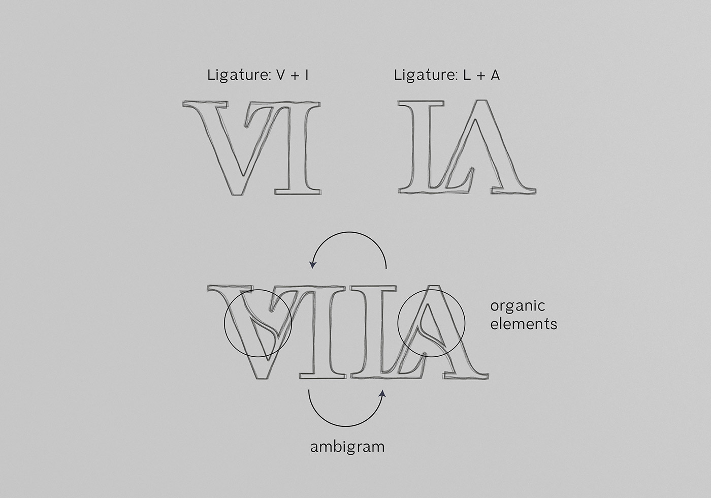
One particular characteristic of a graphic element in the manuscript called our attention: it displayed several axes of symmetry. It was an ambigram. As Douglas Hofstadter puts it, “An ambigram is a visual pun of a special kind” [1], a visual composition that can have palindromic features, to display symmetrical relationships. Ambigrams have been found in art and visual expression over the centuries, some of them dating back to Ancient Greece [2]. Isn’t this an inspiring discovery? It immediately sparked our interest and led us to explore the role of symmetry in brand design.
As we started designing the logotype, we went through several iterations varying between serif and sans serif styles. As the brand required a distinguished feel, it would be best to use a serif typeface with a humanist side – to perfectly breathe a medieval inspiration while aiming for a royalty-like mood.
Coupling that typeface with the ambigram symbol we had previously identified as a geometric shape in the logo could be an obvious solution. Still, it did not convey any particular value nor would it be easily perceivable or associated with the story we were putting together. Instead, we pursued an alternative path to create something that would be visually appealing yet, embued with the concept of ambigram.
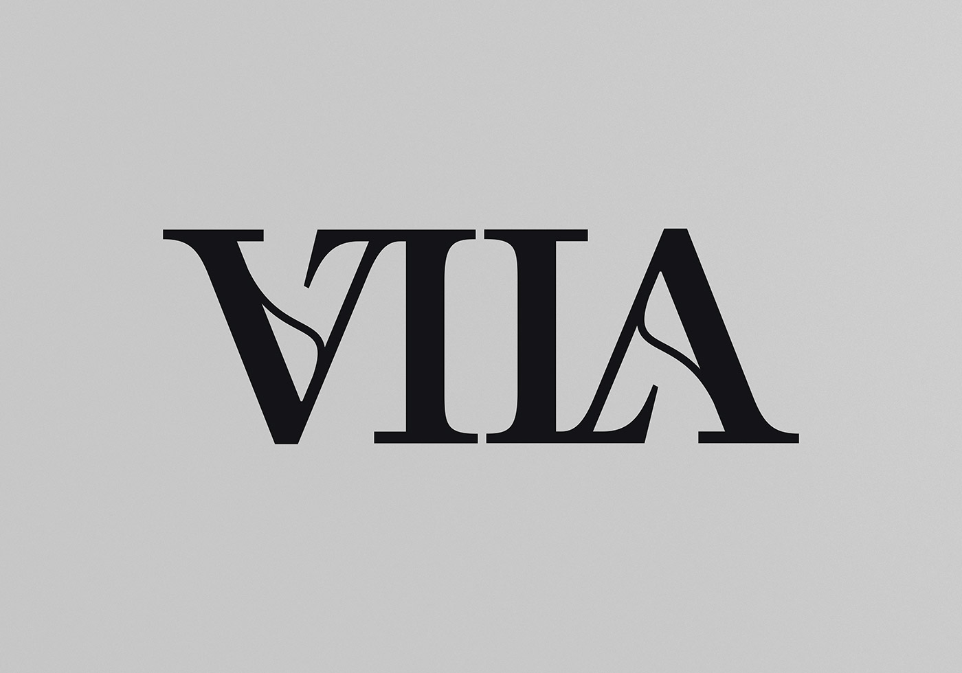
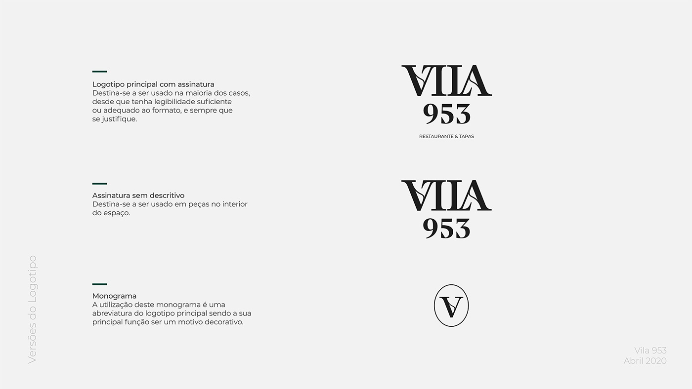
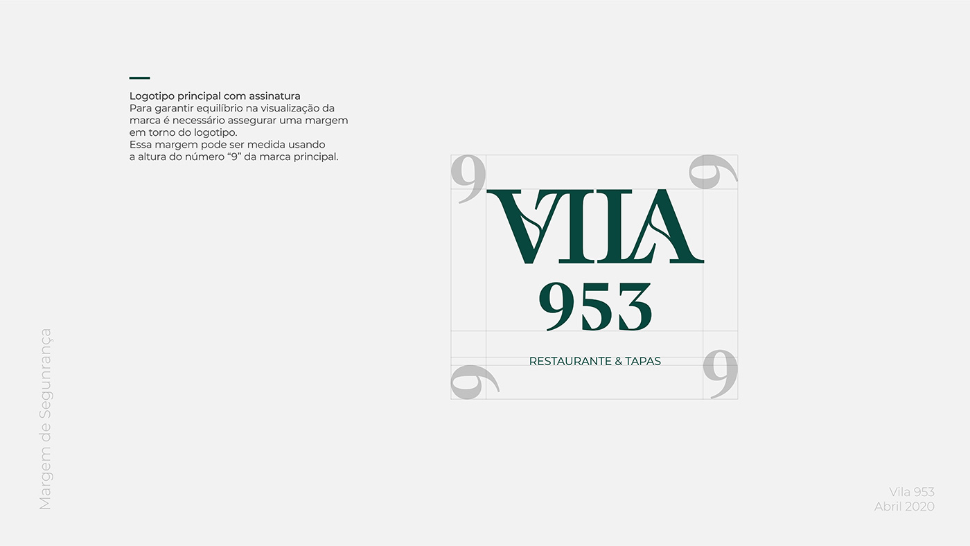
As you can see in the above image, the word “Vila” ended up representing itself as an ambigram. We designed two custom ligatures between “V”/”I” and “L”/”A” that together form the word “VILA” and display a symmetrical relationship: when inverted through a 180º rotation the word maintains exactly the same reading. Additionally, as we carefully looked into details, the crossbar in the “A” letter got its inspiration from the organic forms found in the 953 AD manuscript.
To finish the logo design, Vila do Conde’s foundation date – 953 – was placed below the word “VILA” using a similar visual language expressed through a serif typeface.
KEY VISUALS ANd OTHER BRAND ELEMENTS
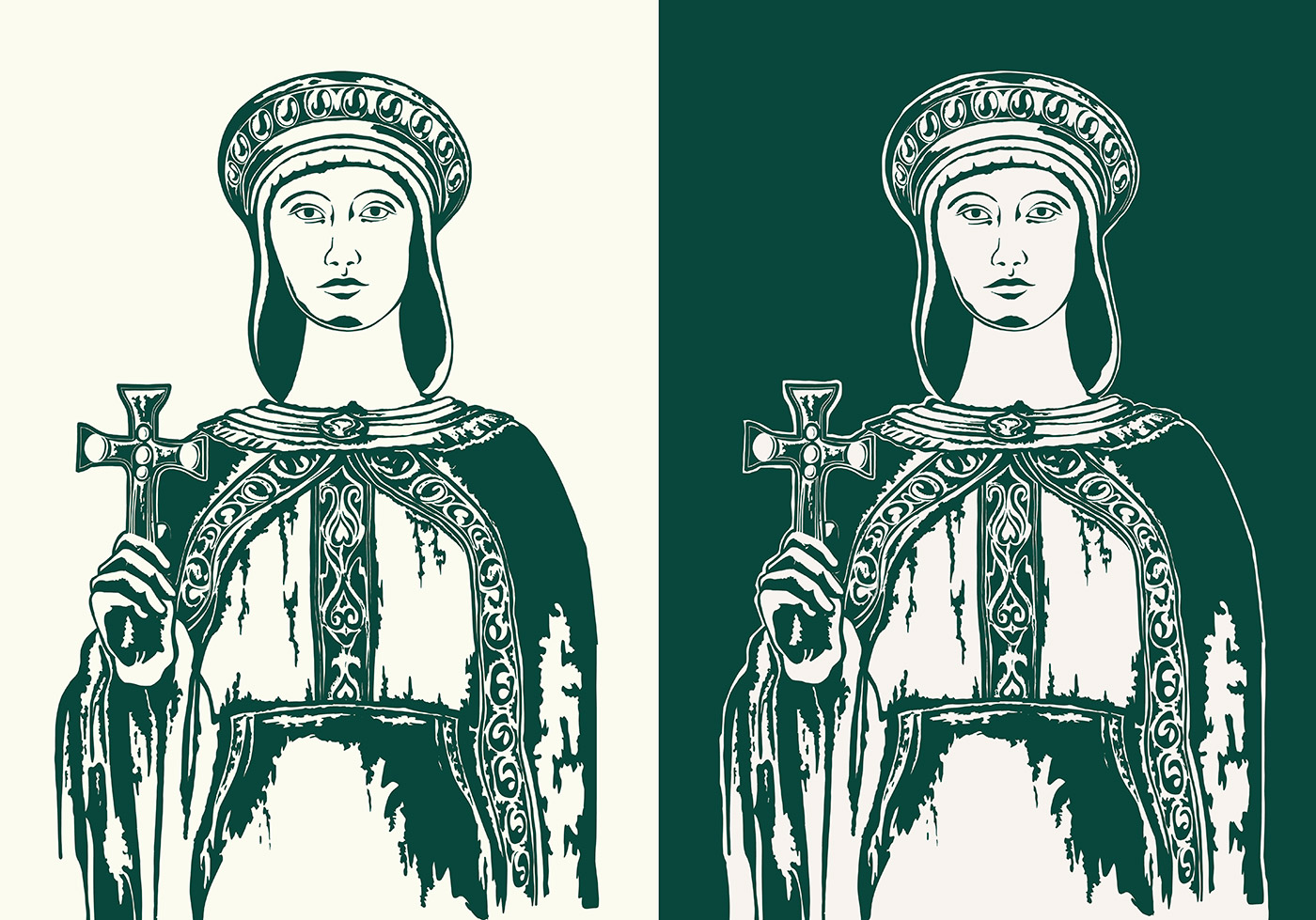
Because of the story that we unveiled during the process, we wanted the Vila 953 brand and its visual identity to become much more than just a logo. We wanted to show the faces of those at the genesis of Vila do Conde, so we decided to transform them into key visuals of the brand, by creating illustrations of the three characters – Mumadona Dias, Flâmula Pelágio and Abade Gonta.
As you may as well imagine, such a task ended up being more daunting than initially expected – because we really wanted to draw inspiration from History, we went looking for visual references for the characters. Fortunately, there is a statue of Mumadona Dias in Guimarães, which we used to guide the illustration style and the details of her face. To represent Flâmula and Gonta was a bit harder, as we couldn’t find any real references. Instead, we carried out research that included altarpieces and old illustrations of abbots and court ladies of the 10th century.
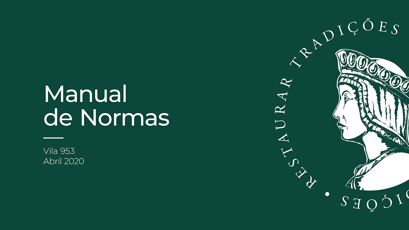
These illustrations were used to recreate ancient wax seals with the characters’ profiles and tagline. The intention was to allude to the commercial deal while maintaining the medieval mood of the story. The illustrations are also part of different touchpoints of the brand in the restaurant: from menus to table covers, and used to tell the visitors a bit of the character’s history.
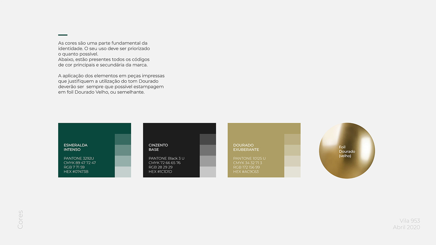
The brand colour palette is composed of emerald green as the main colour and a vibrant gold to accentuate the regal spirit of the story. It also includes a range of greys to support communication in its different contexts. These colours, in addition to the graphic identity, are also present in the restaurant’s decoration, thus making a harmonious connection across the different touchpoints of the brand, both physical and digital.
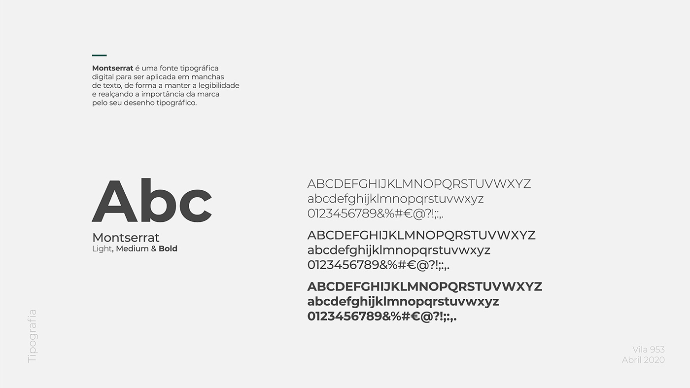
To complement the identity, we opted for a serif typeface for titles – Cormorant Garamond, designed by Christian Thalmann – and a sans serif for text – Montserrat, designed by Julieta Ulanovsky, Sol Matas, Juan Pablo del Peral, Jacques Le Bailly. The typeface choice for Vila 953 is a reflection of the brand positioning and showing it as a whole, allowing legibility in all the pieces developed.
A COMPREHENSIVE BRAND BOOK TO BRING IT ALL TOGETHER
The Vila 953 story and visual universe were then systematised into a Brand Book that lays the graphic foundations and guidelines for visual communication namely: logotype applications and examples, colour palette, typography, key visuals and illustration style, claim, among others.
All the brand assets in Vila 953’s visual universe were adapted according to the pieces and materials required for the operation of a restaurant: from stationery to signage and restaurant décor – they were all carefully crafted to enjoy their own space and individual identity.
LONG LIVE VILA 953!
The research for this branding project brought us a special joy – it was an honour and a source of pride to be able to find our history’s legacy and explore so many interesting and rich moments. When thinking about the storytelling underlying Vila953, the final result seems as if it was expecting to be discovered: a real plot involving real people who were themselves relevant historical figures. It was as if the job was mostly done!
Bringing Mumadona Dias to life, telling this episode of her story and triggering the curiosity to know more about her and her doings was something we really found meaningful to share. We wanted to show her might as we drew her facial features, the seriousness of her social position.
But we also wanted XXIst century people to relate to her, to empathize with her as a person. Creating a visual universe around the commercial deal at the foundations of Vila do Conde was definitely a very rewarding creative endeavour.
When the biggest challenge of the project turned out to be designing the logo, we took our time to figure out how we could give centre stage to one of the most striking women at the heart of the Portuguese identity and who was forgotten by history. Her role was fundamental, and we could not overlook it.
We believe that the Vila 953 brand achieved a balanced solution that conveys an elegant, contemporary and strong visual identity, but also a meaningful message that tells an episode of our own country’s history, presenting authentic, noble characters. Vila 953 is a restaurant that delivers a combination of tradition and contemporaneity, both through its identity as through its gastronomic offer.
That is also reflected in the tagline we created for the restaurant: “Restaurar Tradições” (Portuguese for “Restoring Traditions”) as a statement of that commitment and will to recover ancient traditional flavours and bring them to the present day.
The success of this branding project grew from the relationship of trust we established with our assertive client. Trusting in our commitment to come up with a well-suited branding proposal was vital to achieving the best outcome for their business.
In their own words “Throughout the creation process, we were surprised by the quality of the visuals proposed by KOBU, whether because of the elegant aesthetics of the logo or the beautiful proposals for other items such as Menus, Clothing, Décor, etc.“
A restaurant brand that promises to take us on a journey through traditional flavours while offering a window to a very special chapter of Vila do Conde’s history: Mumadona Dias, Flâmula Pelágio and Abade Gonta will be at the table with us, and we will be eager to know more about their story… and their meals!
In addition to the quality and beauty of the visuals developed, we want to highlight the commitment, cordiality and team spirit of the Kobu team, always patient and attentive. On the occasion of the restaurant’s opening, we were able to prove the quality of the work through customers’ opinions. A special thank you to Sandra and Brígida, always so thoughtful.
Paulo Borges, Manager of Vila 953
Vila 953’s presentation card to their clients leaves no one indifferent and fire’s people’s curiosity to know more about the Portuguese heritage, both in history books as at the table!
The Vila 953 branding project was featured on Behance in both the InDesign (07/01/2022) and Branding (09/25/2022) categories.
PROJECT TEAM
Creative Director: Sandra Lopes
Business Strategist: Isabel Evaristo
Brand Designer: Brígida Guerreiro
Illustrator: Gonçalo Cevadinha
Motion Designer: Pedro Santos


