When a typeface starts to feel like a feeling, not a tool, you know something beautiful is happening.
I went to see Bugonia last weekend expecting the usual fever dream of myth and cinema from Yorgos Lanthimos – a gorgeous, unsettling film about conspiracy and ideology. I got all of that. What I didn’t expect was to walk out thinking about typography.
The title card hit like a design mic drop: BUGONIA, spelled out in thick geometric shapes that felt both ancient and futuristic. Carved from blocks, circles and triangles, it looks alien and brutalist at once — like Bauhaus on a ritual.
The Afterlife of a Typeface
The typeface is called Churchward Roundsquare, created by the late Samoan New Zealand designer Joseph Churchward. He made hundreds of fonts, most drawn by hand long before modern design software. His work seldom reached wide visibility, despite its inventiveness.
Most times, fonts are supposed to disappear behind language, but Roundsquare refuses to. It performs. Each letter feels like it’s balancing on the edge between system and spirit, which is, come to think of it, the same edge Bugonia walks.
For Bugonia, Greek graphic designer Vasilis Marmatakis, a longtime Lanthimos collaborator, found a specimen of Roundsquare in the archives of the Museum of New Zealand Te Papa Tongarewa. He reached out to Churchward’s family, secured permission, and digitised it for the film. “I love this font,” Marmatakis told It’s Nice That, “because it feels monumental yet sharp, even a little threatening. It struck me as futuristic, but in a very analogue way.”
Typography as an Artifact
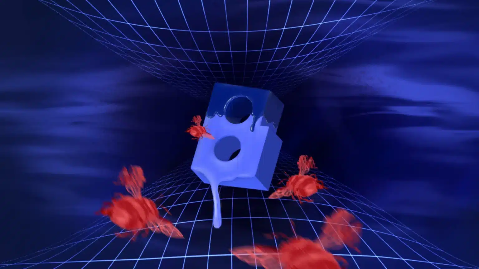
There’s something poetic about this. Bugonia is literally named after an ancient myth about bees being born from a dead ox. A body decays, and something new crawls out of it buzzing. That’s the film’s pulse: destruction as creation. And it’s exactly what happened with Churchward’s font. It was buried in an archive, inert, waiting. And then Marmatakis showed up, cracked it open and out came this unique old new thing.
“It has this sense of being futuristic, monumental, DIY and threatening,” Marmatakis said in an interview, “but at the same time it feels very brutalist: it has all the elements that I wanted.” In the film, that contradiction, the sleek and the handmade, mirrors its story of technology, ideology and myth colliding in the same unstable space.
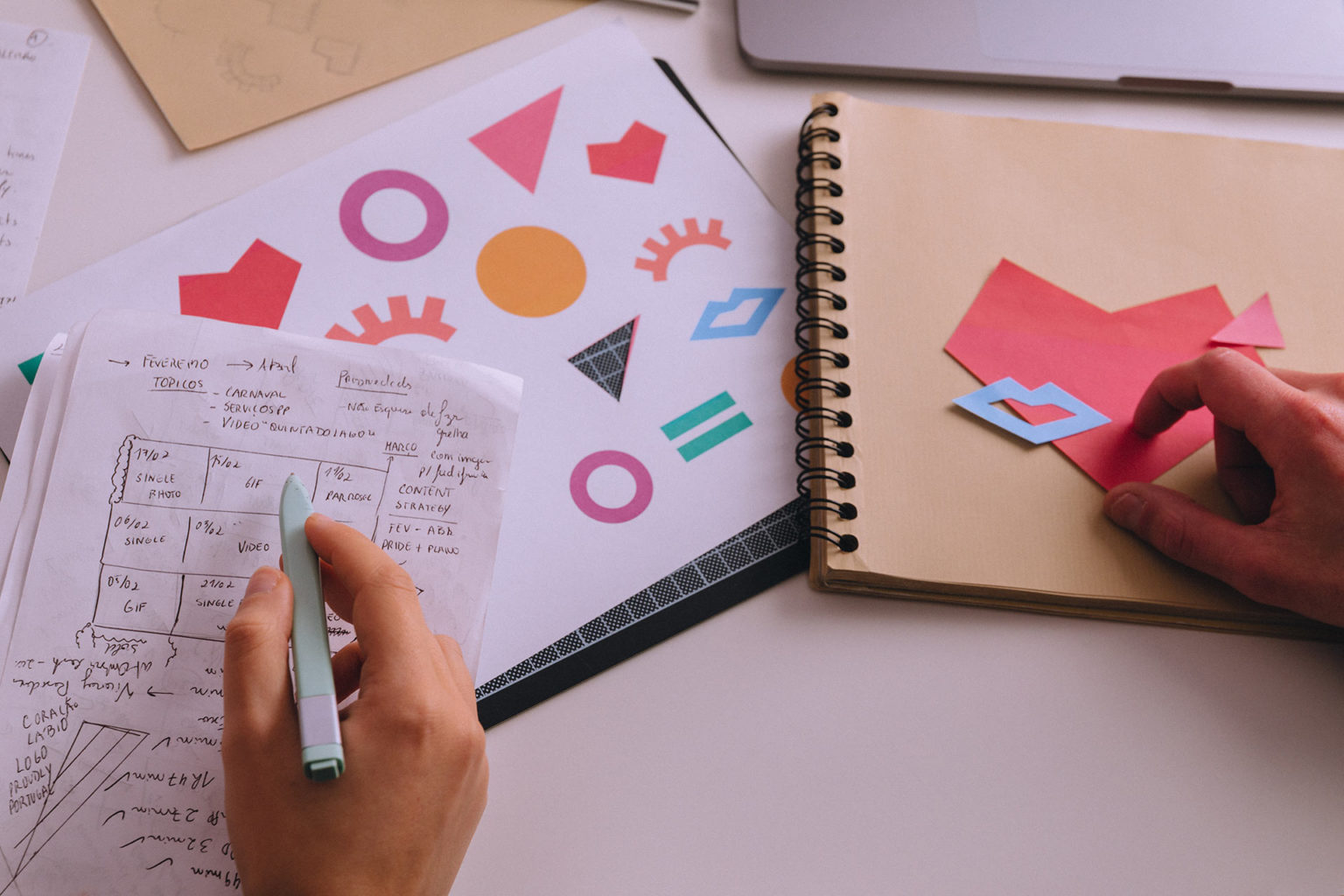
Marmatakis didn’t stop at digitisation. He worked against the digital grain. He printed the title letters, brushed them with water, scanned them back in — an analogue process that left the letters slightly smudged, imperfect, alive. “I just wanted to show more of that kind of DIY approach… how it connects to conspiracy theories and a ‘print-it-myself-at-home’ element”, he said.
The result is eerie and what should be mechanical becomes strangely human.
Design Meets Cinematic Narrative
For Marmatakis, movie titles aren’t just information, they’re punctuation. In Bugonia, the Roundsquare type flickers in at the beginning, one letter at a time, like an encrypted signal. By the end, it cascades across the screen in full force, the brutal geometry finally revealed. It’s unnerving and hypnotic, just like the film itself.
Visually, the film’s themes of technology, ideology, myth and ecology feed into that typography. The sharpness of the font, the analogue imperfection, the DIY feel, it all mirrors the film’s atmosphere of unease and rumination.
For designers and visual storytellers, it’s a curious reminder: the past is full of futures we haven’t mined yet. Somewhere in a drawer, or a museum archive, or an old printer’s cabinet, there’s another forgotten shape waiting for someone to look closely enough to see what it could become.
In a culture obsessed with the new, Bugonia offers a subtler thrill, the thrill of return. Because every form from yesterday holds the potential to inspire tomorrow.
At KOBU Foundry we explore our passion and curiosity for typography. We’re always seeking that spark where craft meets memory and imagination, shaping it into custom fonts that tell their own stories.
If you’re a type geek like us, go check KOBU’s article on the charisma of a custom font and its efficiency to convey identity.
Transparency disclaimer
Article written by Marta Gouveia
Illustration cover by Brígida Guerreiro (aka anotherbrigida)
Typeface by Joseph Churchward
Typeface featured in the movie: still from the movie
Movie Posters by Vasilis Marmatakis


