


In a field often marked by technical complexity and cautious communication, Nerai Bio set out to create a brand identity that balances cutting-edge innovation with trust, accessibility, and a clear commitment to patient outcomes. Positioned to stand out in the competitive biotechnology sector, Nerai sought to express its pioneering work in CRISPR-based gene therapies through a bold and distinct branding.
Headquartered in Switzerland, Nerai is at the forefront of revolutionising genetic medicine through its proprietary CRISPR and protein engineering technologies. Nerai focuses on creating highly precise, tailor-made genome editors designed to treat previously untreatable rare inherited diseases, initially targeting therapies for the liver and retina. Founded by a multidisciplinary team of scientists and entrepreneurs, Nerai is dedicated to translating world-class scientific advances into transformative, one-time curative therapies that challenge conventional healthcare paradigms.
Our collaboration with Nerai focused on crafting a visual identity that embodies the intersection of radical innovation and responsible science. The aim was to make Nerai’s complex technology tangible and approachable, building trust among partners, patients, and the broader biotech community. Through sharp messaging and distinctive design, the new brand positions Nerai as a visionary leader, poised to reshape genome editing and drive the next wave of transformative healthcare.
Redefining genome editing with CRISPR
With the biotechnology market projected to grow from approximately USD 1.86 trillion in 2025 to USD 5.85 trillion by 2034, it was clear that Nerai needed a distinctive brand identity to rise above the noise. This identity had to reflect scientific excellence while conveying safety, recognition, and a forward-looking vision for global health impact.
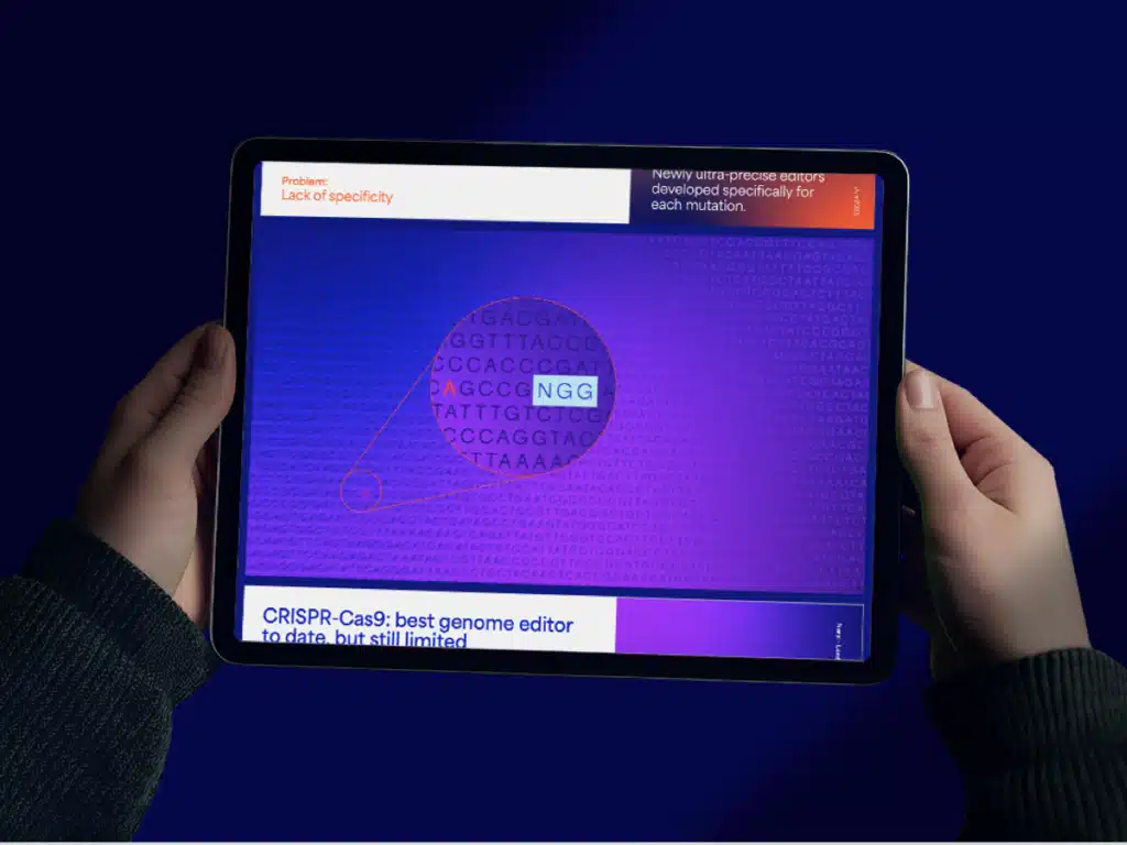
At the heart of Nerai’s innovation is an AI-assisted, high-throughput protein engineering platform used to create the next generation of genome editing tools at scale. The technology, CRISPR, is a revolutionary gene-editing technology that enables precise, targeted modifications to DNA, offering the potential to correct genetic mutations, combat inherited diseases and transform approaches to drug development.
However, current CRISPR proteins face significant limitations, and the field urgently needs next-generation tools with improved precision, efficiency, and scalability. Nerai addresses this challenge through its proprietary MORPHEME platform, which uses Phage-Assisted Continuous Evolution (PACE) to engineer personalised genome editors at unprecedented scale.
While PACE has long been recognised as a breakthrough in protein engineering, traditional methods have struggled with scalability and consistency. Nerai has reengineered the process to operate at 100 times the standard throughput, a transformative leap in the development of high-performance CRISPR proteins.
Our Approach to NERAI Branding:
- Brand Consulting & Strategy: Brand Identity: values, vision, mission, message, promise and tone of voice; Brand Positioning: competition and brand services analysis; strategic guidelines for Brand Communication
- Branding & Storytelling: Core Creative Concept and Brand Narrative; Tagline; Brand Visual Universe: logotype, colour palette, main graphic element, iconography, illustrations, branded customised photography style; visual guidelines for brand assets; Simplified Brand Book
- Brand Collaterals: Main stationery; templates; pitch deck presentation; PowerPoint templates and event materials (exhibitor stand, roll-up);
- Website: Temporary static landing page & website
A Narrative-Driven Identity
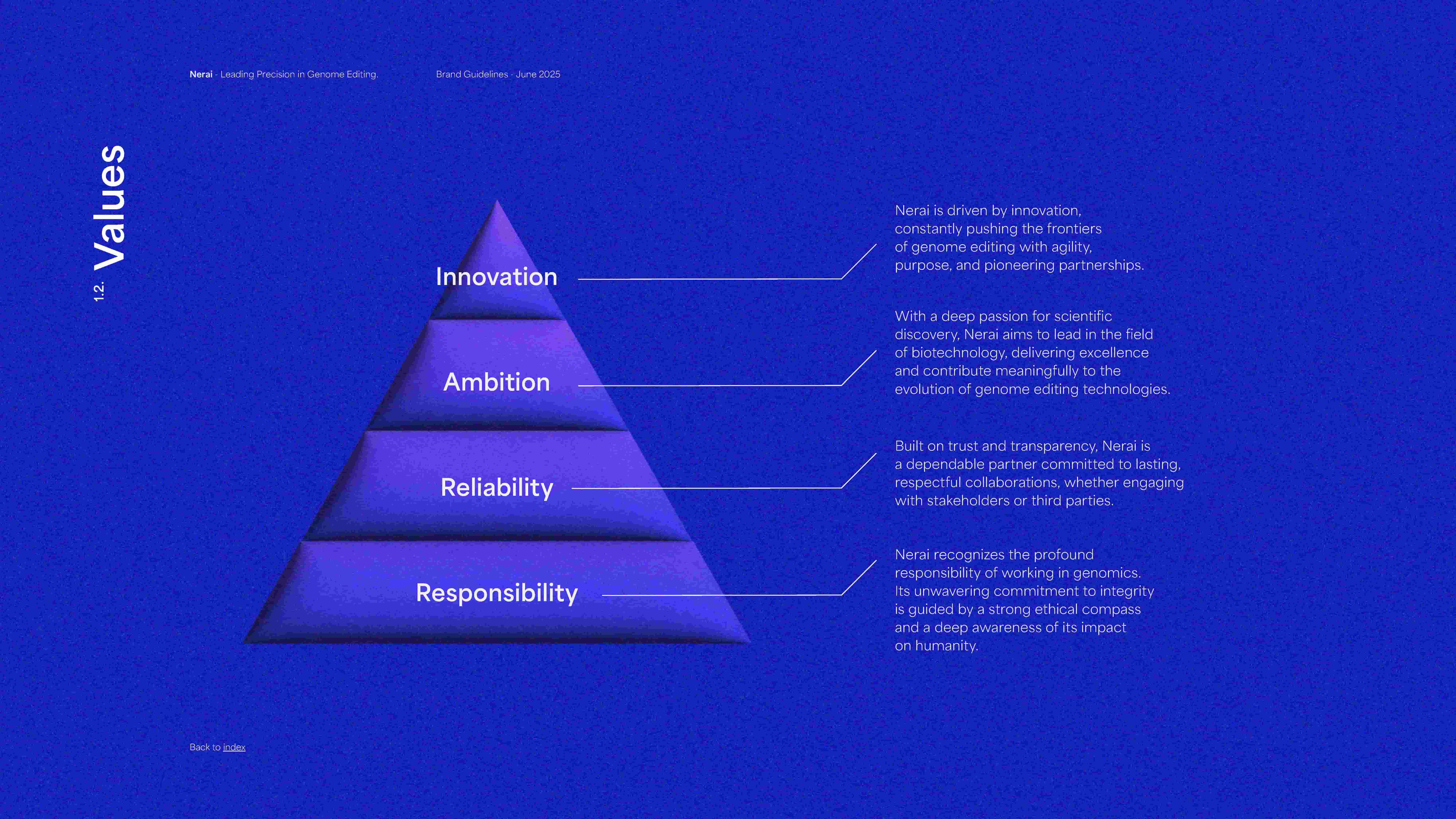
With a strong scientific foundation already in place, our focus was on building a brand identity that could translate Nerai Bio’s cutting-edge innovation into a cohesive and credible presence across all touchpoints. Our work began by defining the essential pillars of the brand: persona, values, mission, vision, and promise. We then define a brand system that would support both technical audiences and broader stakeholders, creating clarity without compromising depth.
The identity needed to reflect a company operating at the intersection of progress and responsibility. We articulated Nerai’s values around trust, innovation, and accessibility, aligning the messaging and visual expression with its mission: to deliver transformative genome editing solutions with precision and care.
Core Creative Concept: The Future Editor
After further reflection, and as soon as we agreed on the brand positioning, we knew the direction we needed to take to give the brand its desired look and feel. The core pillars (vision, values and mission) shaped the core creative concept: The Future Editor.
At Nerai’s core lies a powerful narrative: that the future of health isn’t something we wait for, it’s something we shape. To express the brand’s vision and values, we developed a creative narrative anchored in the idea of “The Future Editor,” which became the metaphor for the company’s pioneering work in rewriting genetic code to unlock transformative therapies.
From that point on, Nerai’s refreshed and elevated brand identity was established: a brand focused on envisioning a future to refine the human genome with the precision of a masterful writer, crafting a new path forward. The pioneering vision of Nerai – rewriting the human genome with the mastery of a storyteller – inspired the brand’s distinctive character, delivering contemporary and bold visuals with an assertive, confident and clear tone of voice that emphasises the state-of-the-art scientific technology and reliability of the results.
Nerai’s tagline
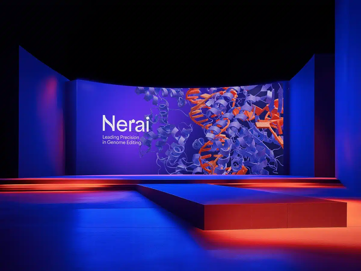
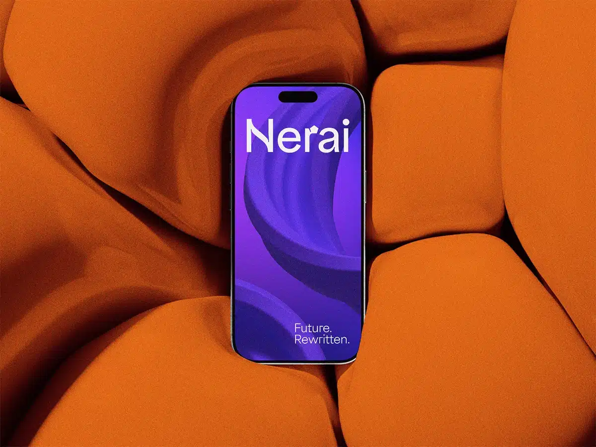
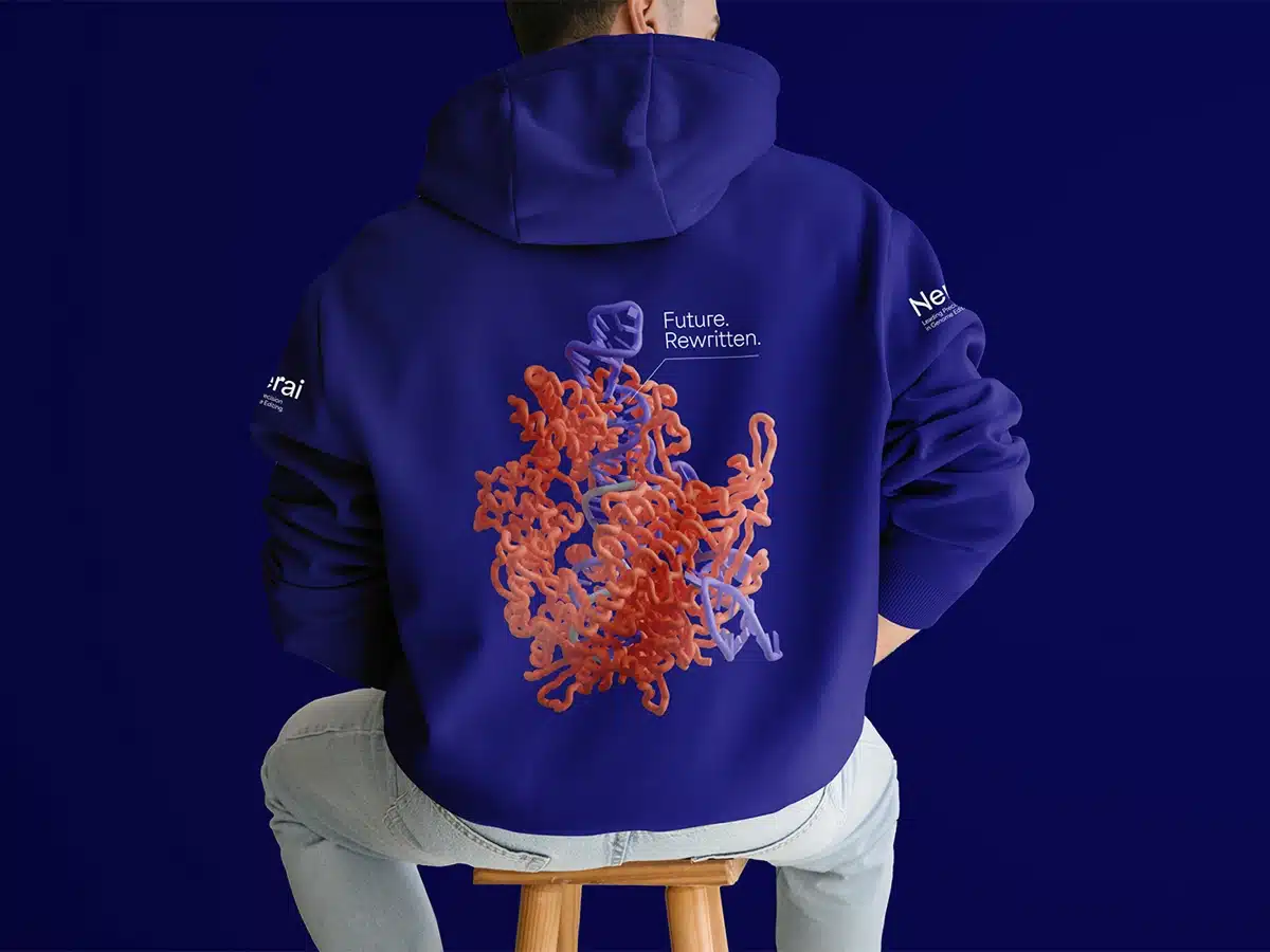
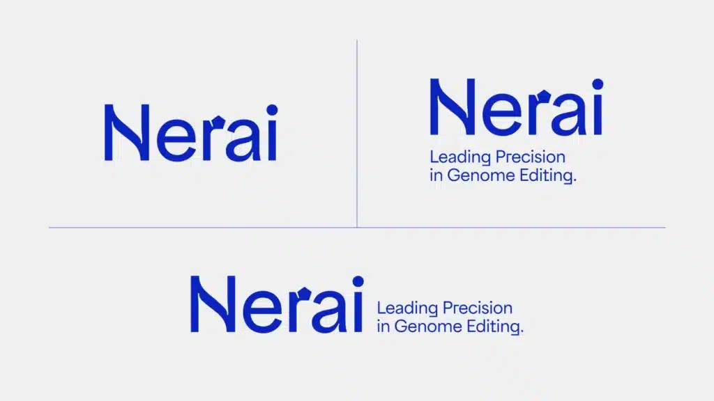
We were able to condense Nerai’s message into an inspiring tagline that reflects the brand’s purpose and values, while reinforcing the expertise and innovation of what the brand does: Future. Rewritten. Besides the tagline, we also came up with a complementary signature: Leading Precision in Genome Editing., in order to have both a more concrete description of what Nerai does (the signature), while at the same time pointing to a more inspirational message (the tagline).
RETHINKING THE BRAND’S LOGO
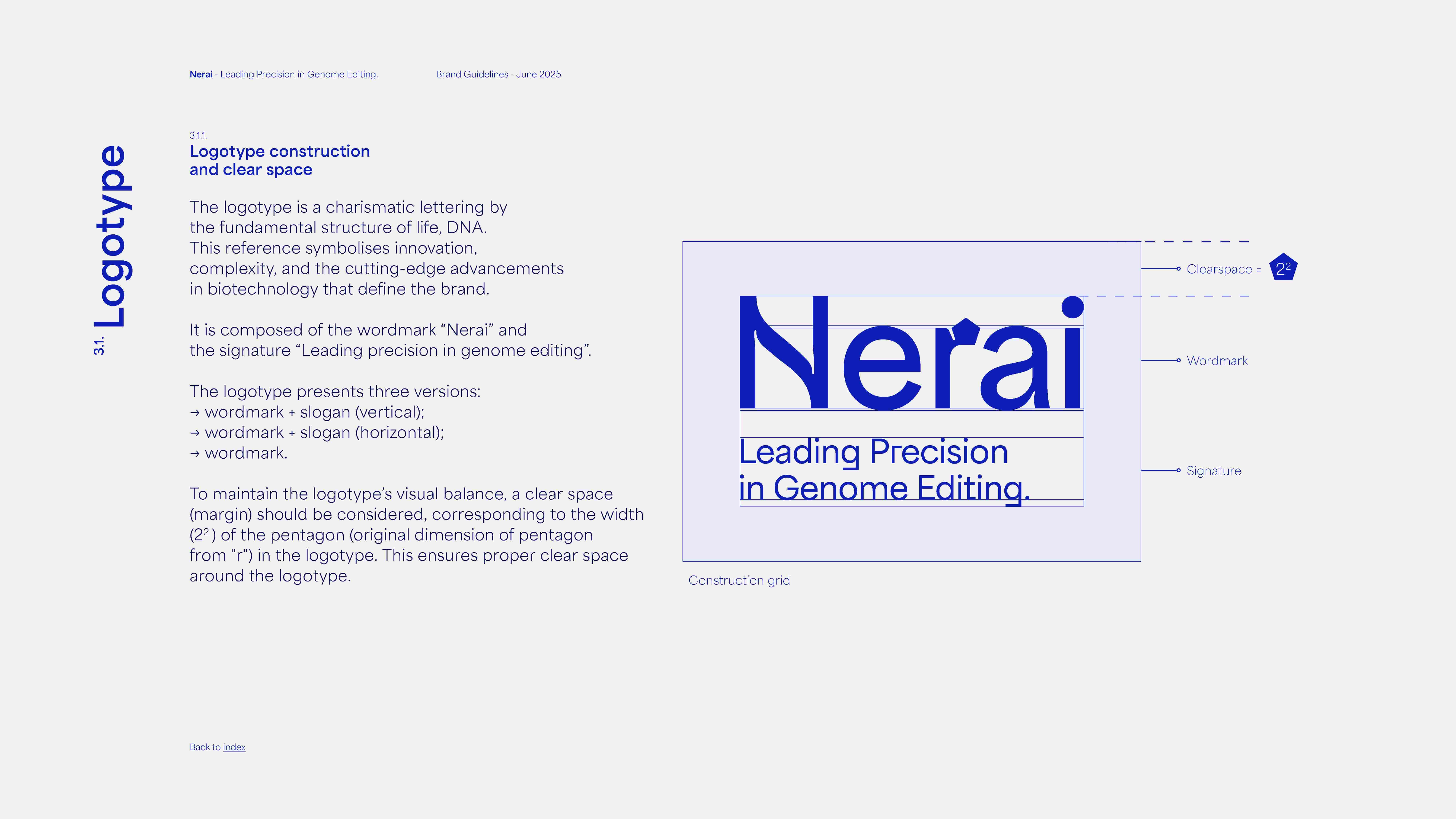
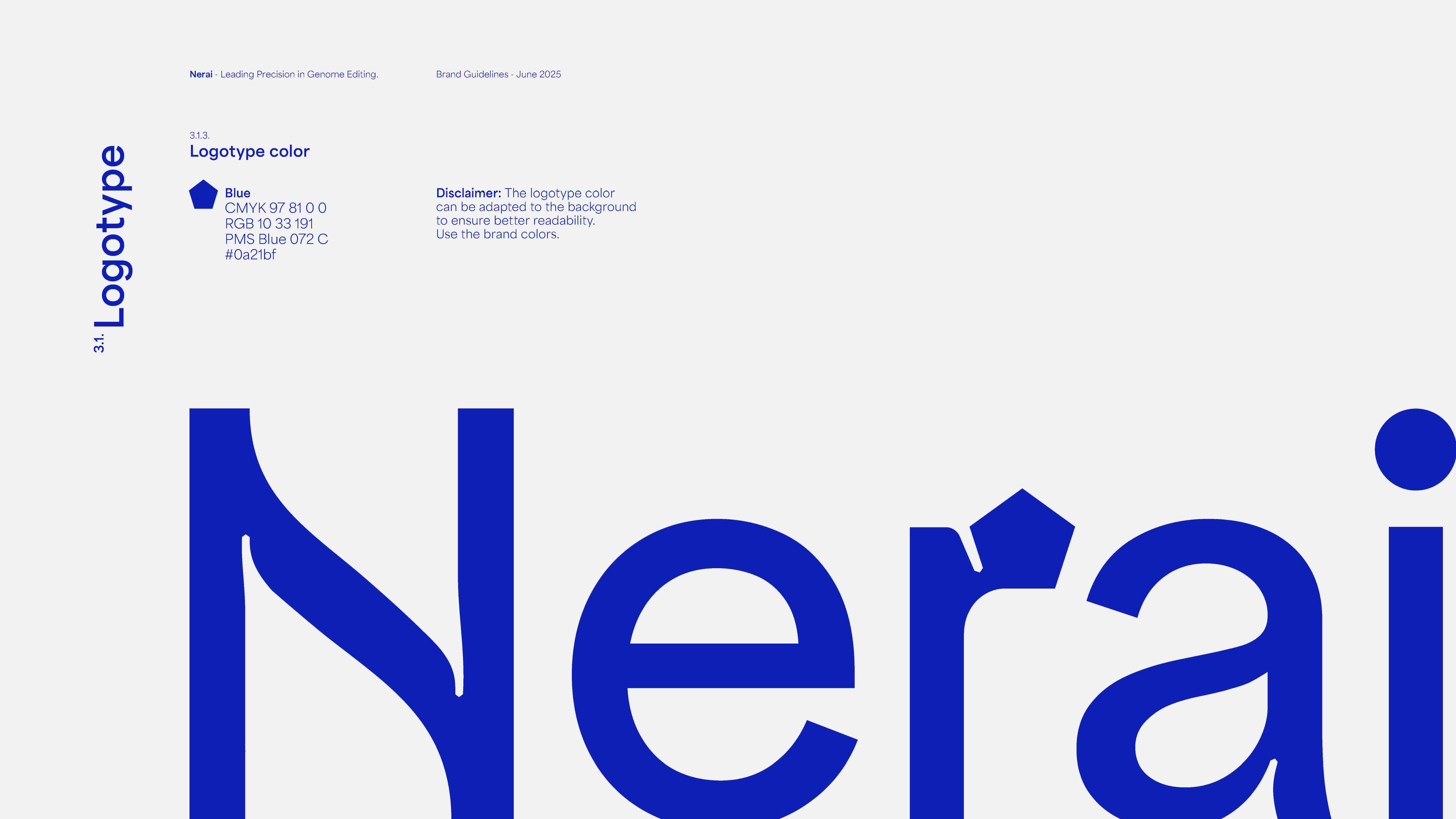
Visually, Nerai’s identity reflects both scientific rigour and human relevance. The logo draws inspiration from the fundamental structure of life, DNA, suggesting order, complexity and innovation. We also used geometric forms, reflecting the precision and structured approach of scientific research. The letterforms integrate subtle design elements that evoke molecular structures and genetic sequencing.
CREATING A MEANINGFUL VISUAL UNIVERSE
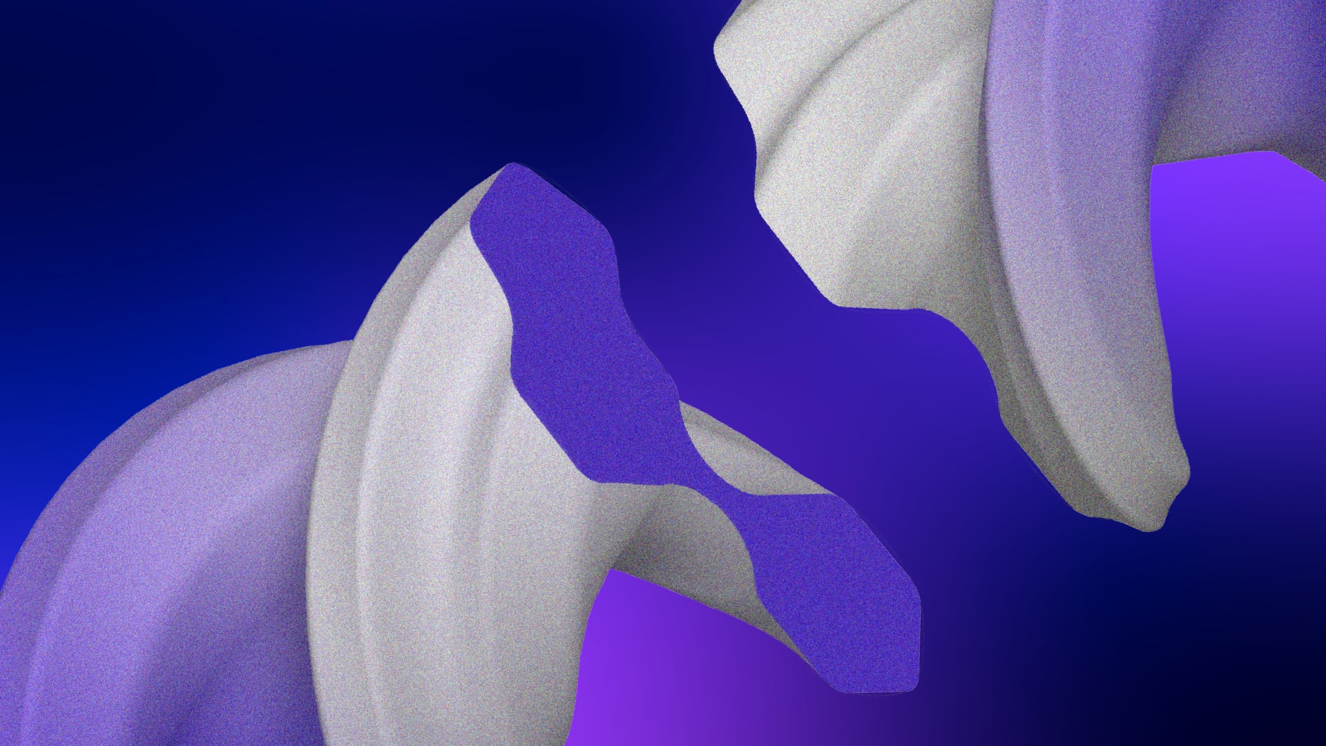
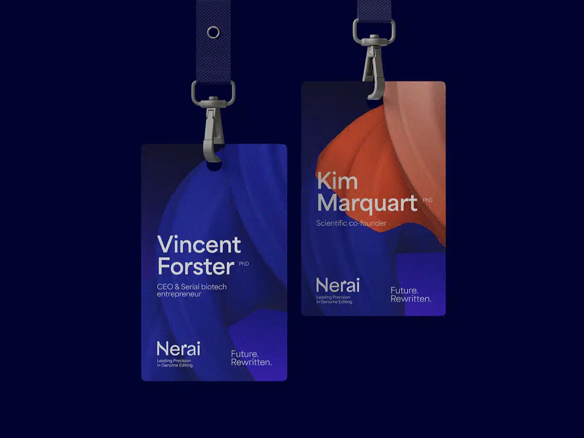
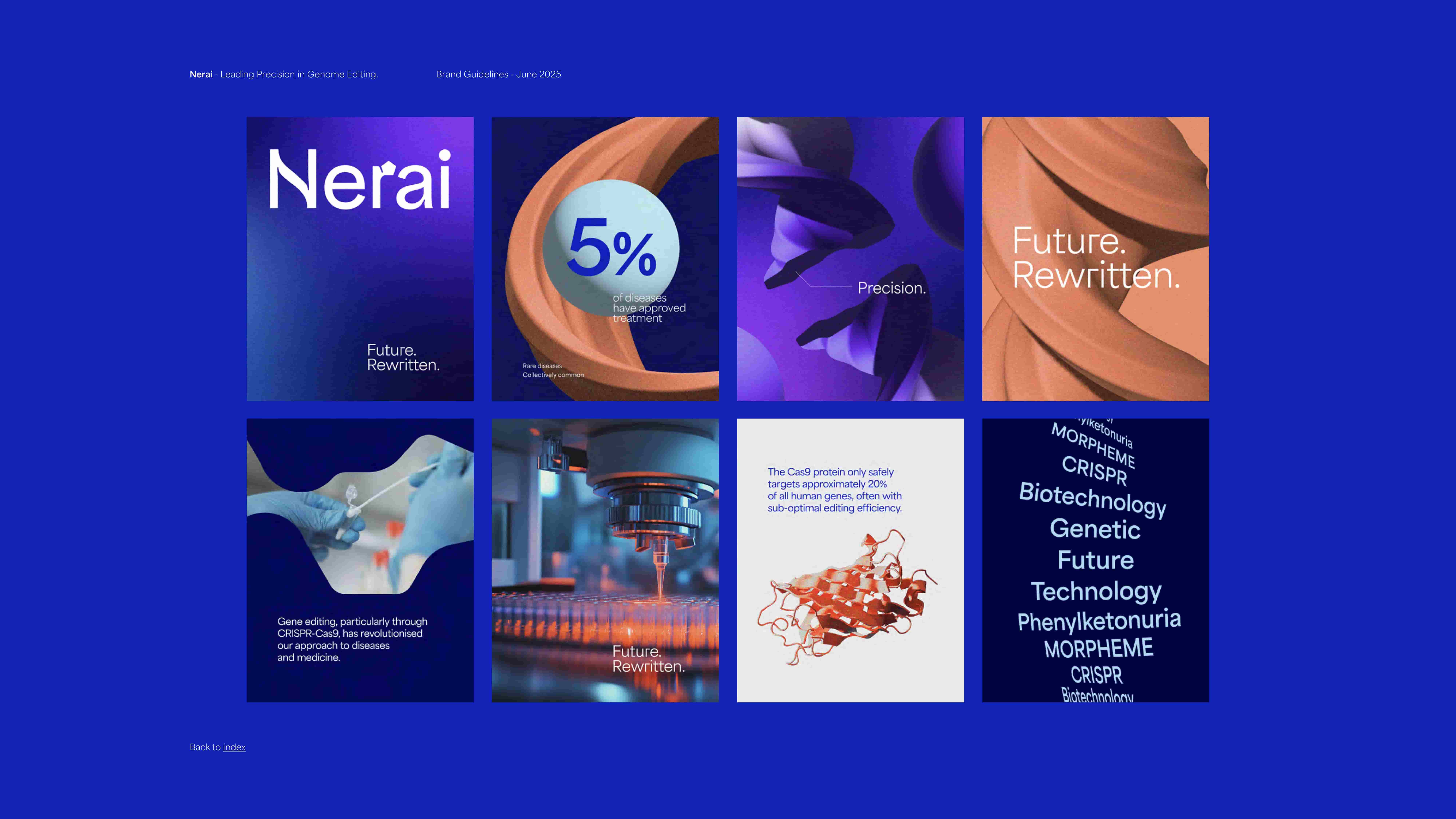
The brand’s visual identity is built around a bold and structured colour system, with blue as the primary colour, symbolising reliability, depth, and innovation. Complementing this, soft white, purple, and orange introduce contrast and vibrancy, adding energy and warmth to the design. Black and white act as neutral complements, ensuring balance and clarity while reinforcing a modern and sophisticated aesthetic. Their application is versatile: in print materials, copper foil may be used for a premium, refined touch and to add delicate detailing. The typography chosen was the Area Bold & Area Regular.
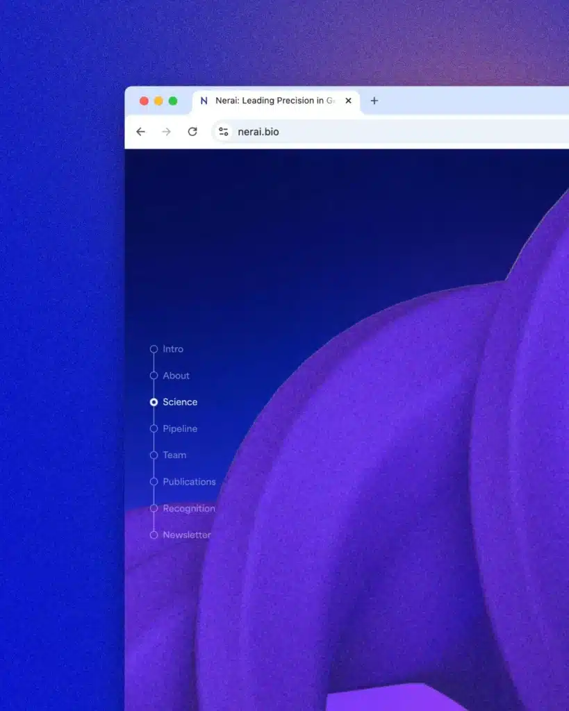
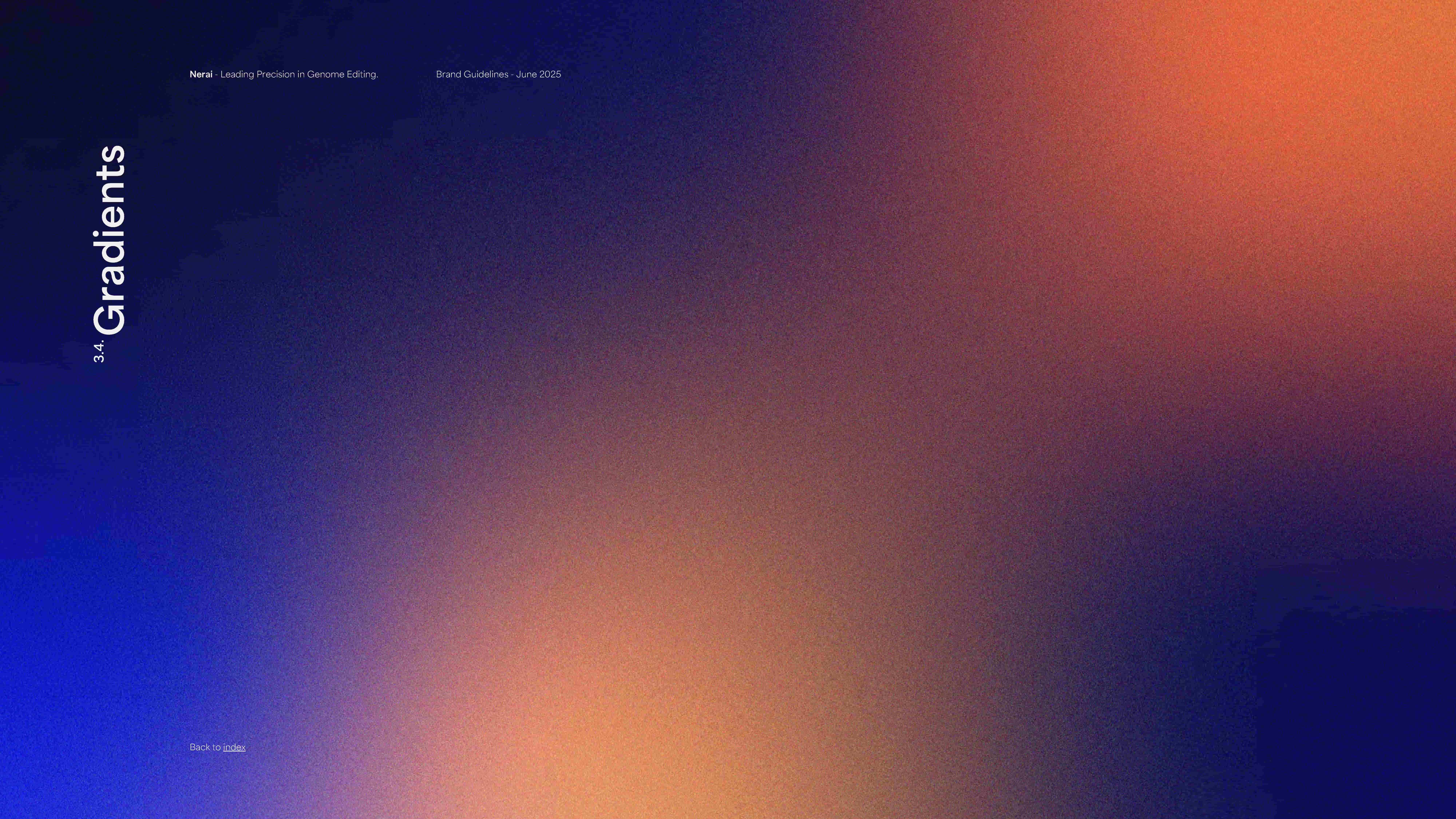
In Nerai’s brand identity, gradients also play the part symbolising transformation, innovation, and the fusion of science and technology. Their fluid transitions and colour palette convey depth, complexity, and progress. The subtle grain effect also adds a tactile quality, evoking both digital precision and organic texture, mirroring the interplay between AI and biology.
Designing a Brand that Balances Science and Humanity
Nerai’s graphic universe includes a set of visual elements that support the organisation of layouts. Nerai’s layout grid is composed of five columns, a structure derived from the DNA double helix. By leveraging a five-column system, the design maintains a balance between precision and adaptability, allowing for structured yet flexible compositions across different applications.
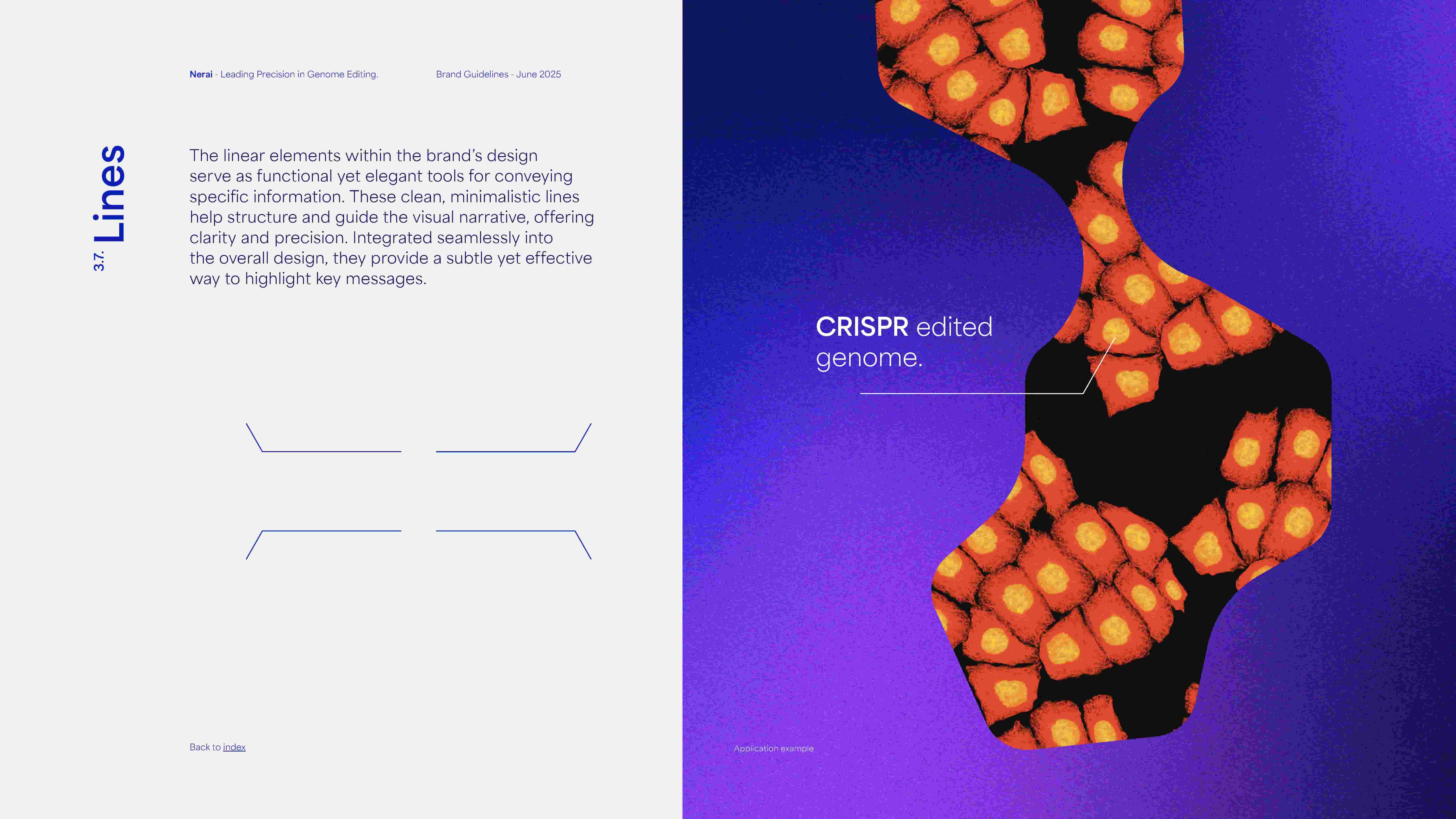
The iconography follows a refined, linear design, balancing clarity with sophistication. The use of isometric perspectives adds depth and dimension, reinforcing the brand’s technological precision. By incorporating both filled and outlined variations, the icons achieve versatility, ensuring optimal contrast and emphasis across different applications.
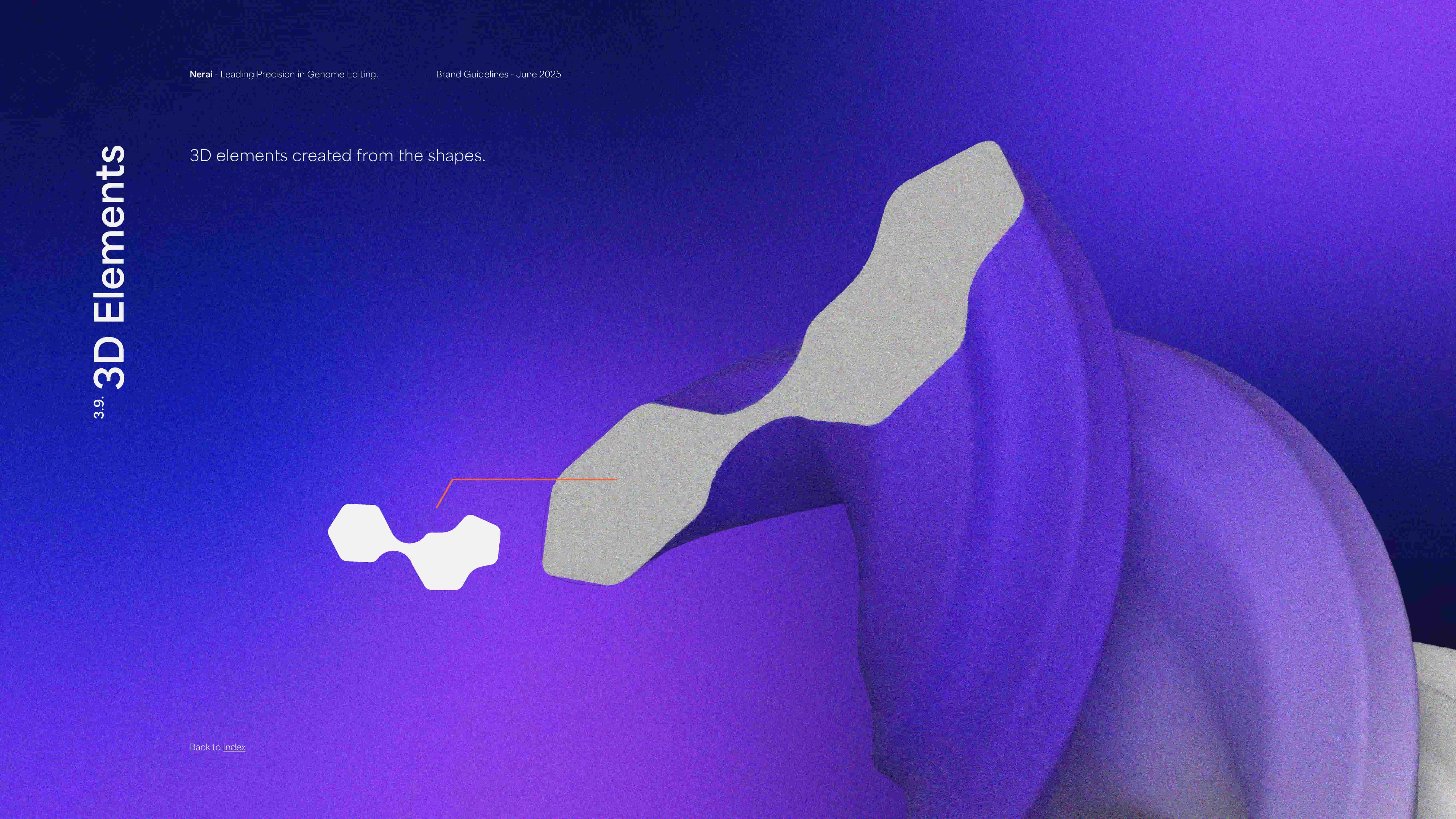
Nerai’s illustrations embrace a linear design, ensuring clarity and elegance. The selective use of filled and outlined elements enhances visual hierarchy, directing attention where needed. This approach creates a sophisticated yet flexible visual language that aligns with the brand’s innovative identity.
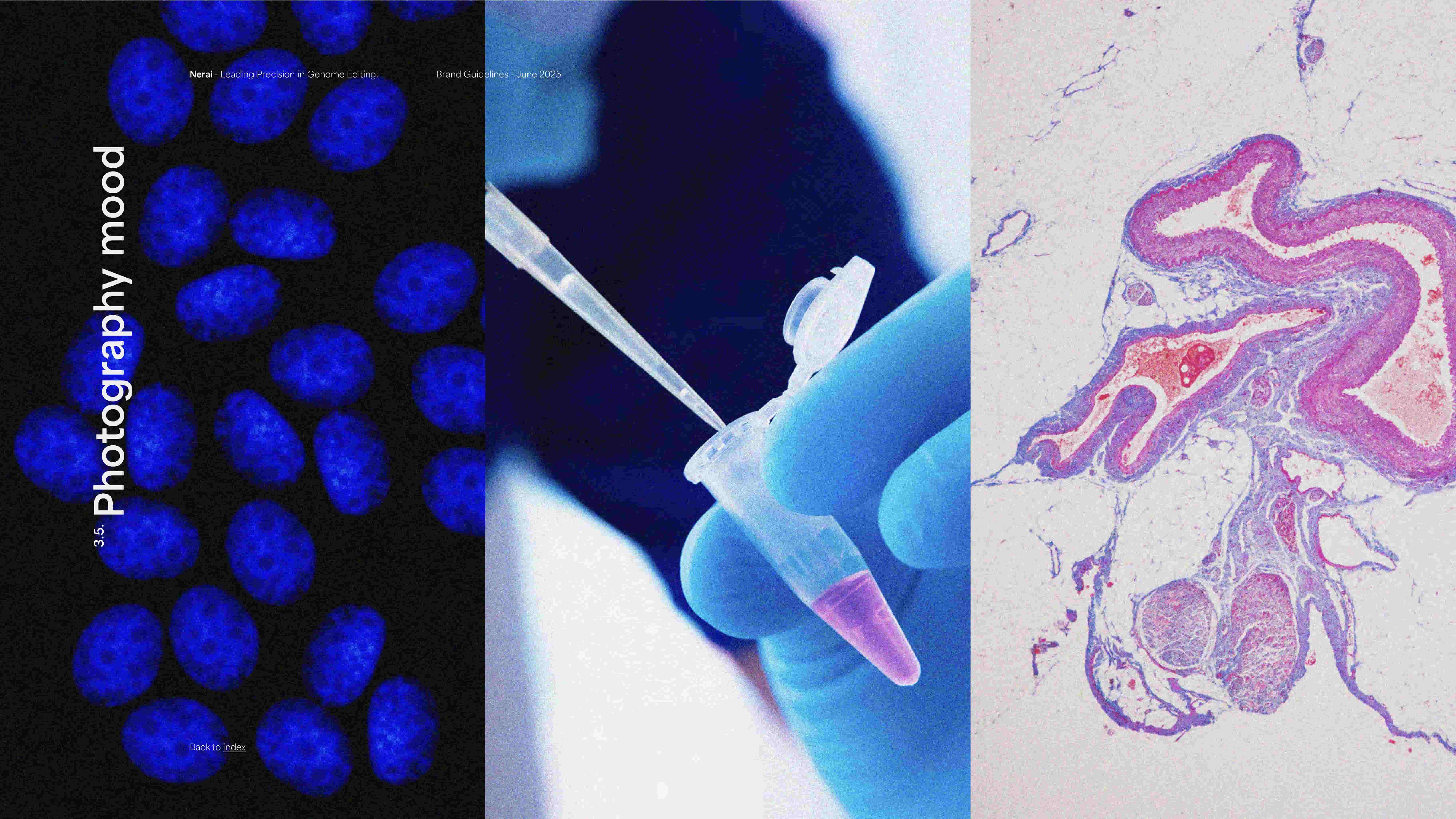
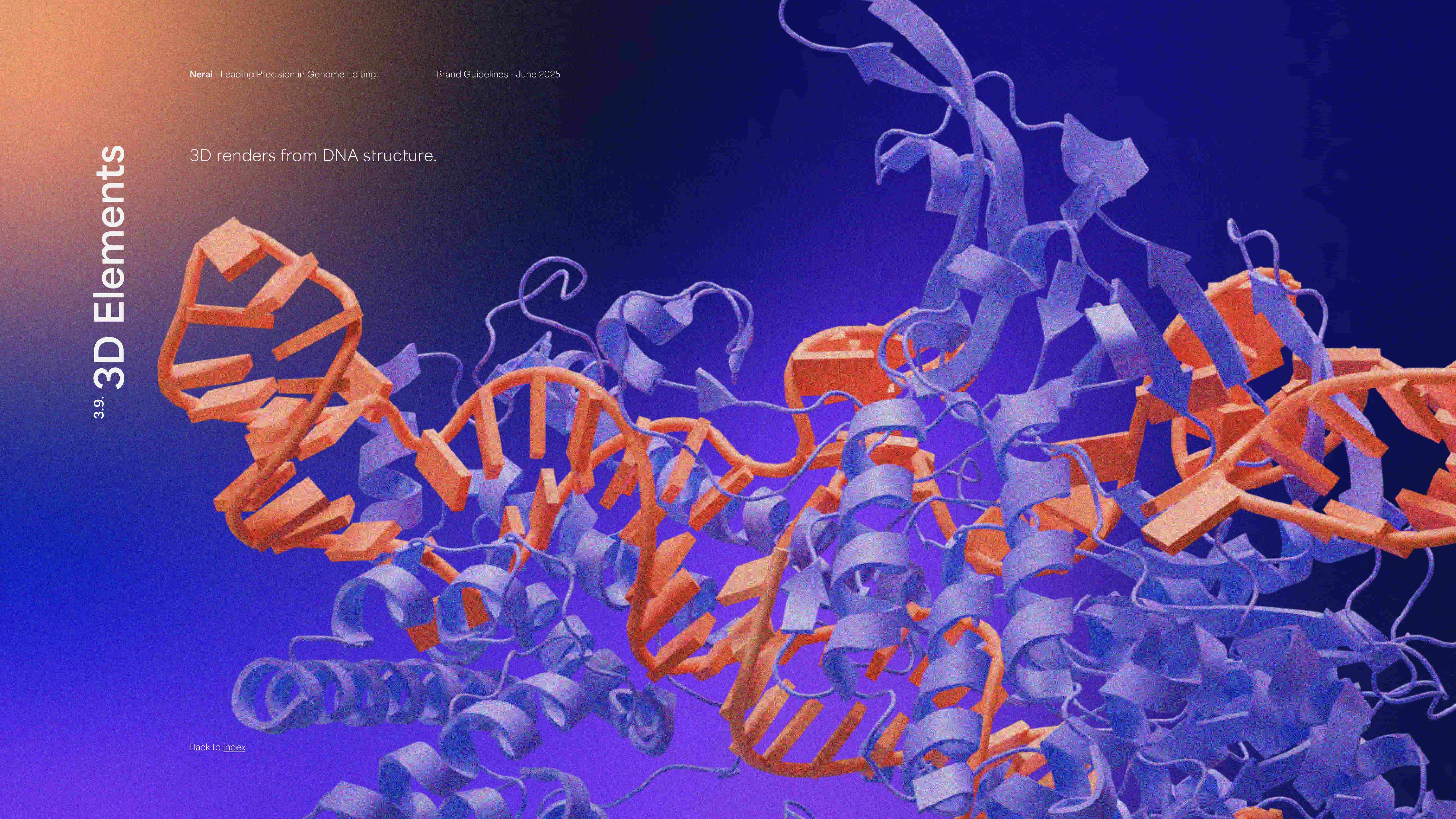
To complement the brand visual universe, we also defined a photographic mood, which embraces a textured, organic feel through the subtle application of noise. This visual approach enhances the narrative of innovation, exploration, and the seamless interplay between science and aesthetics.
We extended the brand into digital, starting with a content-driven landing page designed for clarity, discovery, and scalability. The layout, visual motifs, and interaction patterns reflect Nerai’s dual focus: scientific precision and human impact.
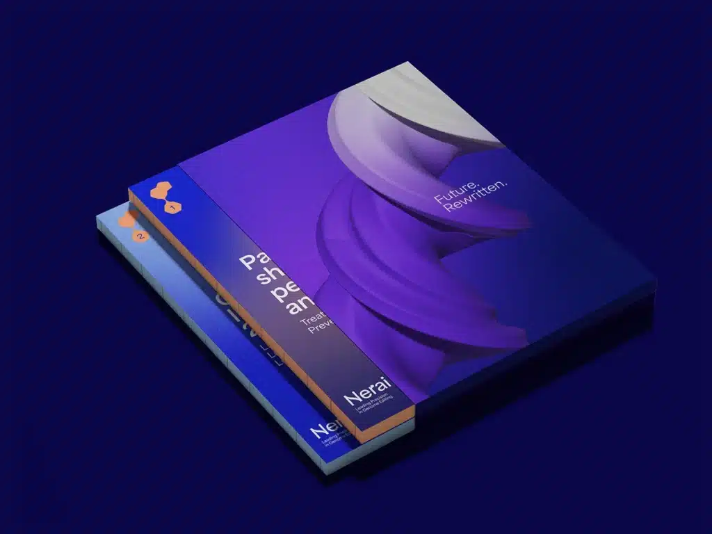
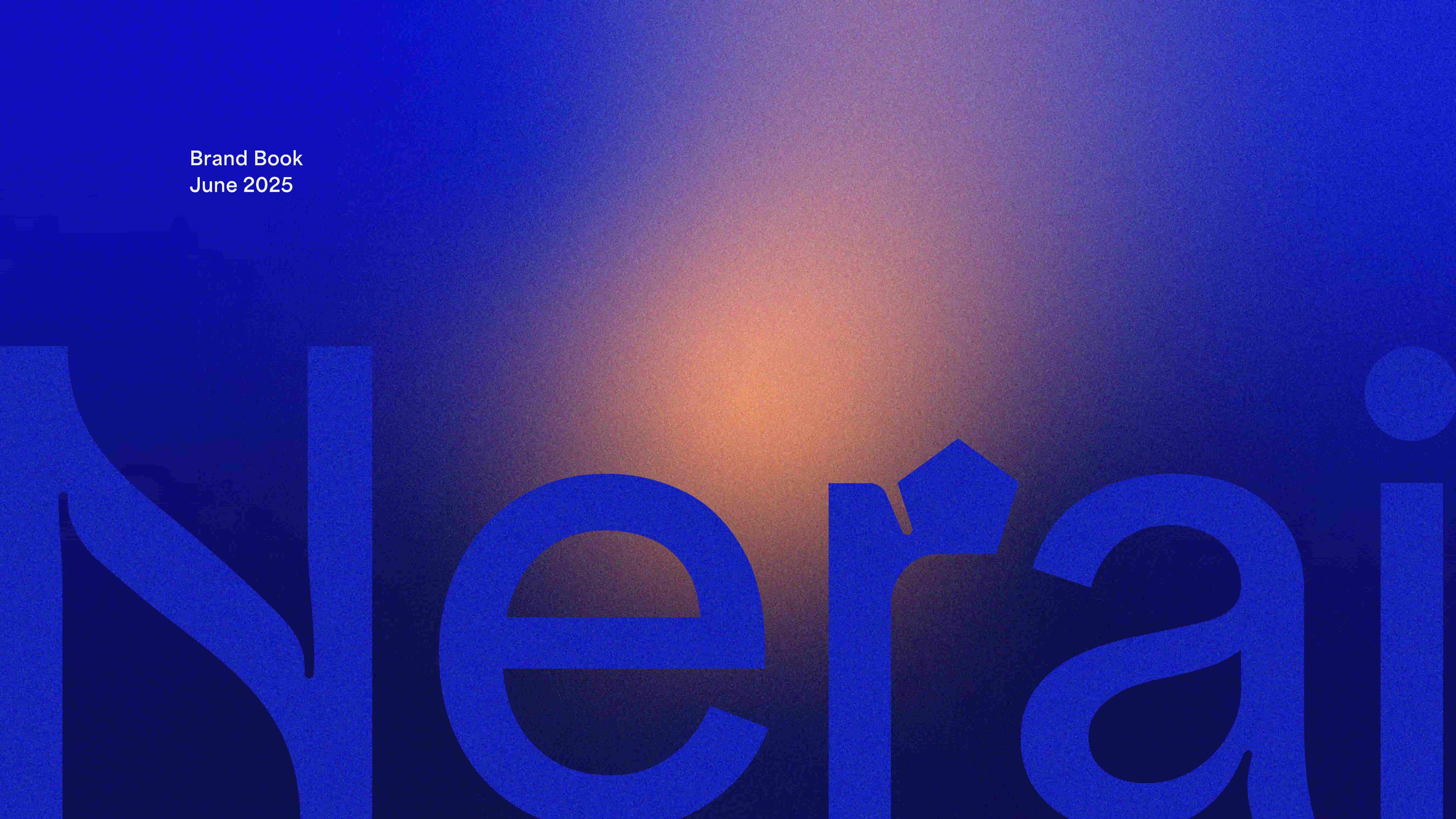
NERAI BRAND BOOK
This visual universe is consolidated within a brand book, which encapsulates not only the essence of the Nerai brand but also its copywriting guidelines, brand identity, and application and motion guidelines. The brand book serves as an essential tool to communicate the Nerai brand, covering everything from its core DNA to its visual presentation, whether in static or dynamic form.
SCIENCE Branding: Crafted for SuccesS
In the end, the goal was achieved: Nerai’s visual positioning now exudes a bold sense of scientific innovation and modernity, with a confident, vibrant character. This visual identity radiates sleekness and pragmatism while also allowing for a colourful and vibrant essence, effectively appealing to the affluent segment of the market.
From visual assets to messaging frameworks, every element was designed to grow with Nerai. The brand system supports future product lines, new partnerships, and expanded communications, ensuring coherence no matter how the company evolves.
Introducing edgy visuals and dynamic elements into a scientific brand led to a brand narrative that intertwines science, technology, and playfulness. This strategy not only elevated the brand within its segment but also imbued it with emotional depth and purpose, ultimately proving that the biotechnology sector and brand design can indeed be strong, inspirational and far more exciting.
Clear, flexible, and future-ready, Nerai’s new visual identity places the brand as a trusted leader in genome editing, ready to shape the next era of biotech.
On October 21st 2025, this project was featured on Behance.
PROJECT TEAM
Executive Direction: Nuno Tenazinha
Creative Direction: Marta Gouveia
Art Direction: Brígida Guerreiro
Brand Strategy: Isabel Evaristo
Copywriting: André Oliveira
Project Management: Sandra Lopes
Brand & Graphic Design: Beatriz Varela, Brígida Guerreiro, Vanda Pereira
3D Design: Beatriz Varela, Brígida Guerreiro
Motion: Design Beatriz Varela, Pedro Santos
Digital Product Management: Nuno Ramos
UI/UX Design: Brígida Guerreiro
Web Development: Cátia Dionísio