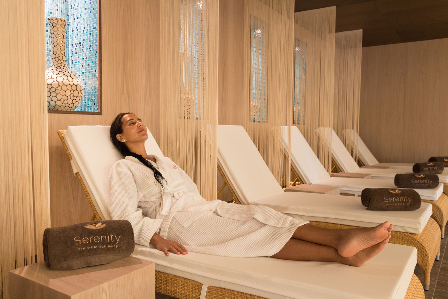
Working side by side with the Marketing team of UIP – United Investments Portugal we shaped a new and exciting product to deploy in the properties managed by this group: a luxury brand in the health and wellness sector, Serenity – the Art of Well Being.
Uncovering a brand story was the first challenge to address: a story that reflected the high standard practices and products but, more importantly, that inspired people towards an attitude of reflection upon their inner self. Inspired by oriental philosophy principles we looked for three pillars that stood as the basis for the concept: heart, mind and body. “The Art of Well Being” was coined as the path leading to the mastery of these pillars. To attain the state of serenity.
Following the initial research stage and working in this enticing brand story, we went on to define the brand identity and its visual universe – a universe inhabited by relaxing sceneries and a calming colour palette with a touch of gold. A representation of the path where one indulges in the Art of Well Being as a means to achieve a well balanced life.
The project continues on a day to day basis as we watch the brand grow in the two luxury resorts where it is now present in Portugal, receiving renowned awards both at national and international levels.
Pursuit of serenity
The brand represents a process leading to a transformation of the inner self. We defined these three pillars of the concept as the driving forces to work during the pursuit of Serenity.
Application
The logotype is built from a geometric representation of the lotus flower. Beige, white and light gray traverse the visual universe of the brand as they are applied to brochures, stationary, product packaging, signage, menus and outdoors.
White space is used thoroughly to convey this sense of calmness – simplicity is key to a meaningful life.
Photography
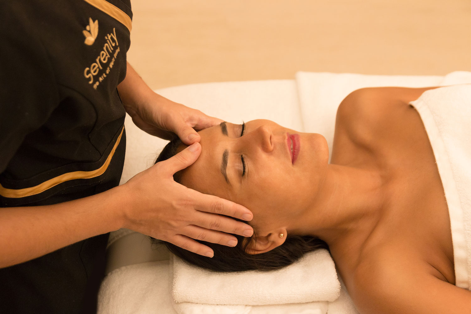
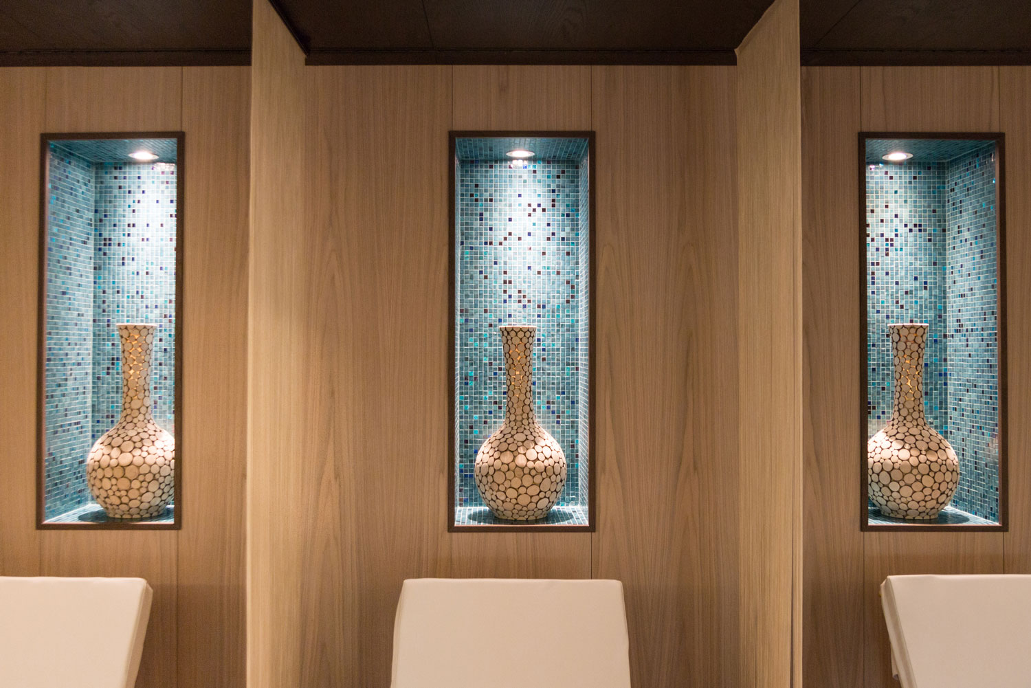
For its launching, we did a photoshoot focused on the interior design and architectural details of the first brand store at Pine Cliffs, a Luxury Collection Resort.
