


THE V branding project aimed to create a distinctive and compelling identity for a luxury real estate development in the Algarve’s Golden Triangle in Portugal. The concept of “Exceptional Living.” encapsulates the promise to deliver an unparalleled living experience. At the same time, it translates the brand’s value proposition: owning a bespoke property that allows for a unique lifestyle in the most perfect location.
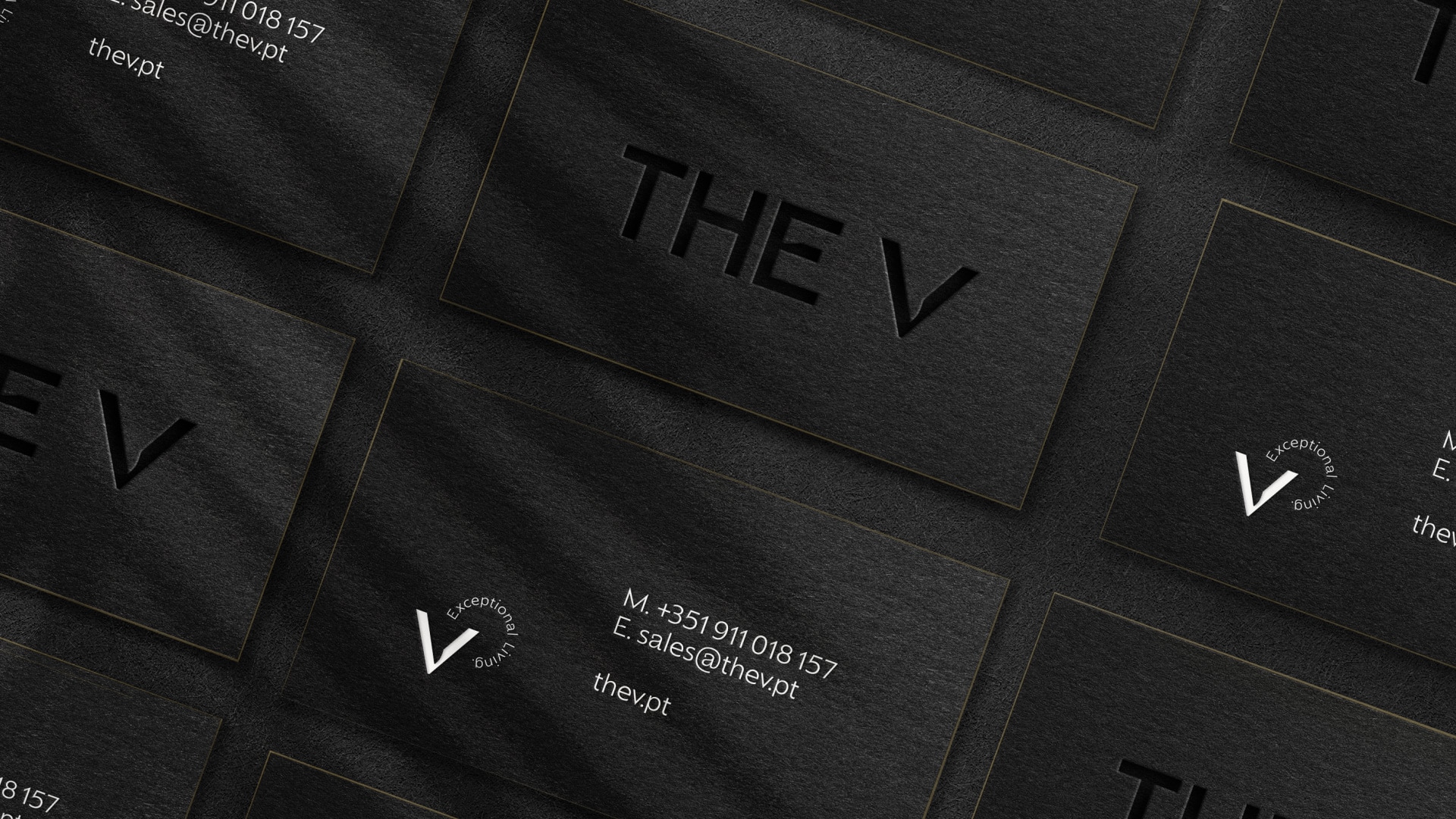
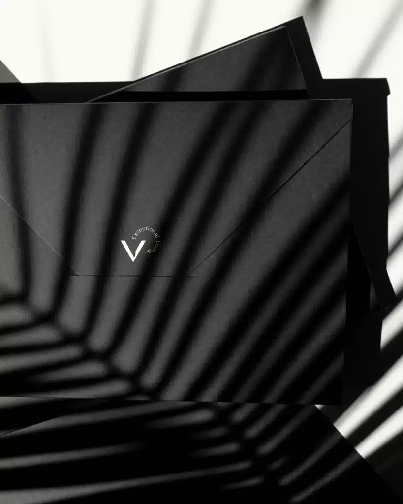
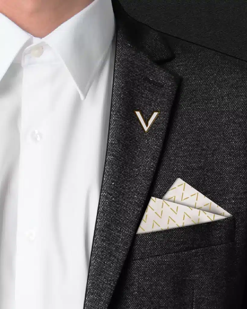
THE V has a comprehensive brand universe where the logo is the protagonist. It relies strongly on a modern serif typeface developed especially for this luxury real estate branding project, conveying the brand’s uniqueness, elegance and sophistication. The logo inspired a stamp and the brand’s customised pattern. A sober colour palette adds to THE V’s clean and appealing visual identity, while high-quality imagery showcases the properties’ design, materials, fittings and fixtures flatteringly. THE V’s brand universe also includes customised iconography.
Algarve’s Golden Triangle is a prestigious area and a competitive luxury real estate market, attracting affluent and discerning buyers from around the globe who can identify a differentiated value proposition. THE V’s brand identity conveys not only a sense of exceptional lifestyle and high-standard real estate offer but also the promise of a meaningful connection to the location by perfectly blending sophistication, convenience and serenity and securing THE V’s positioning in the exclusive affluent market.
luxury real estate branding: our approach
- Brand Strategy: naming and signature, brand persona, tone of voice
- Branding & Storytelling: core creative concept and brand narrative; brand visual universe: logotype, colour palette, main graphic element, iconography, branded customised typography, photography style; visual guidelines for brand assets; simplified brand book
- Brand Collaterals: main stationery; merchandising
- Website & Digital Channels: temporary vertical scroll landing page; website design and development; newsletter design; social media templates
- Content Production: brand teaser video
more than a luxury real estate in a strategic location
Creating a compelling luxury real estate brand in Portugal’s Algarve region presents unique challenges, particularly given the area’s competitive market and discerning clientele. The Algarve is renowned for its picturesque landscapes, pristine beaches, and luxurious lifestyle, making it a magnet for high-end real estate developments. This popularity, however, means that new projects must find ways to differentiate themselves to attract the attention of potential buyers and investors. When our client approached us for this branding project, we were already familiar with the challenge: crafting a brand that not only reflects the luxury and exclusivity of the development but also resonates with the target audience’s aspirations and values.
We can’t say we’re not experienced in developing projects for luxury real estate developments or hospitality. Whether branding or rebranding for launching or repositioning brands in an upscale segment, we have been creating and handling visual identities that appeal to contemporary luxury buyers for more than a decade now.
We have been observing that today’s affluent segment relates more to brands that convey authenticity and meaning than just pure flashy luxury, so it’s increasingly important to achieve a balance of several aspects, including heritage and modernity, to develop brands that feel genuinely connected to relevant storytelling but also look contemporary. It’s more than luxury; it’s premium.
Standing out in a saturated market
Designing a luxury real estate brand that can stand out in such a saturated market as the Algarve requires more than just an exceptional property development — it demands an understanding of the affluent buyer segment and a brand that caters to it. Telling a compelling story that evokes exclusivity and resonates with these high-net-worth buyers involves adding value and meaning to plain luxury – this is what makes a premium brand.
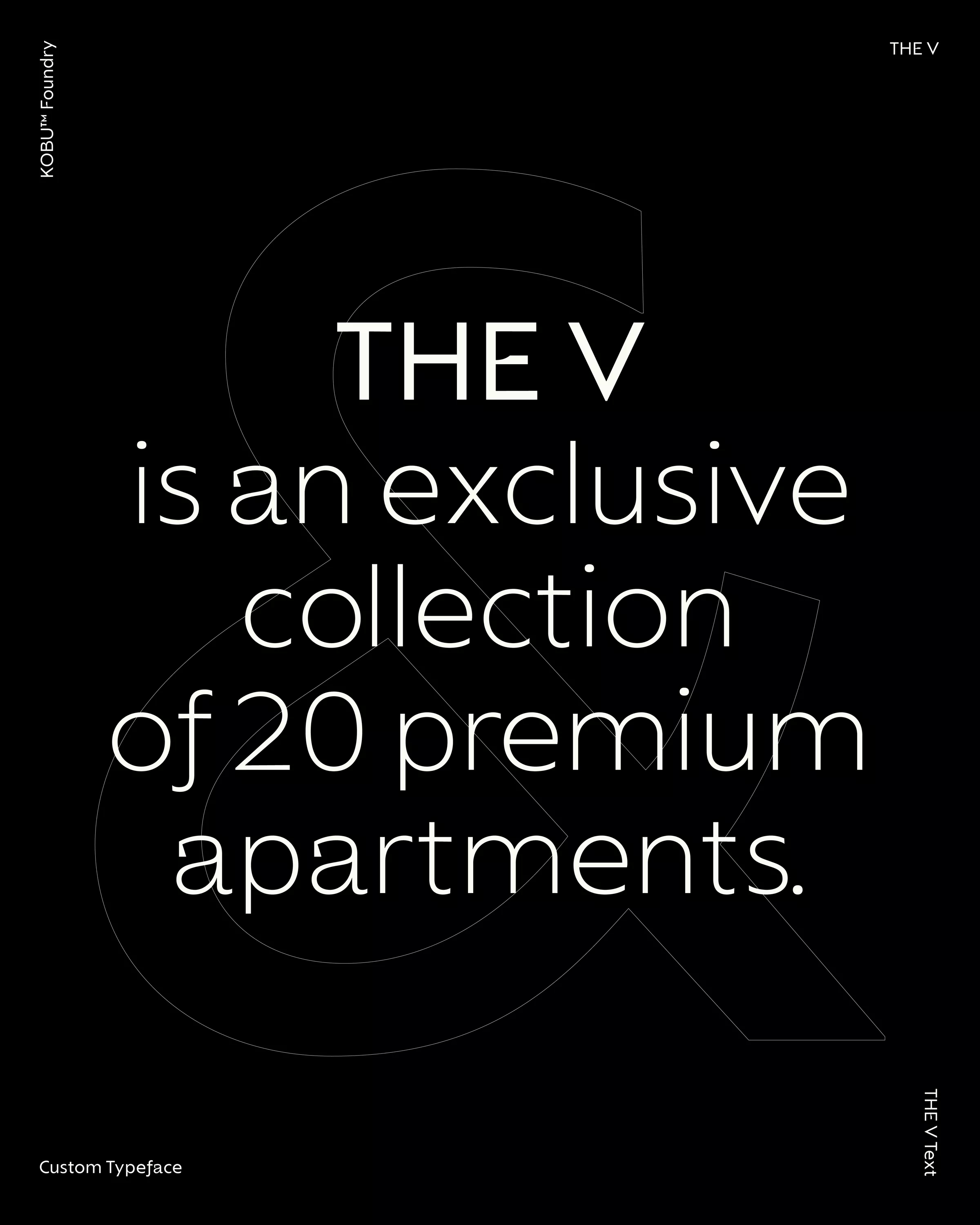
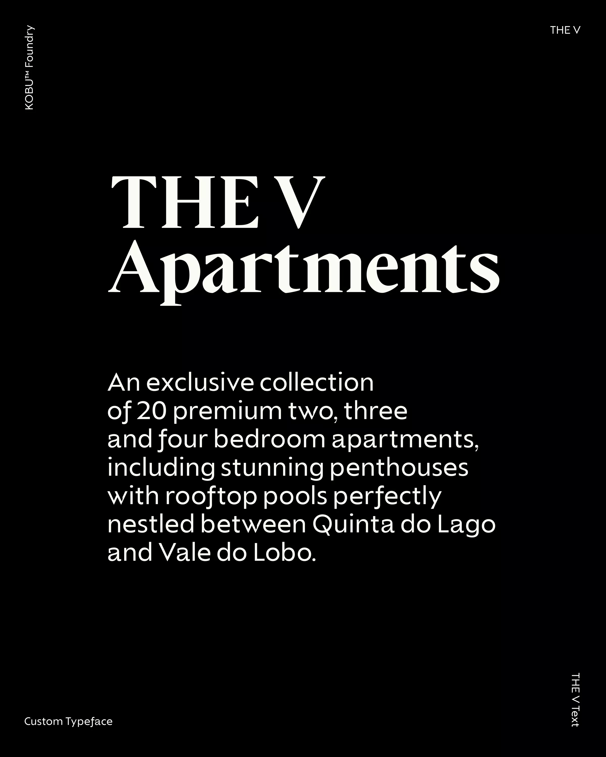
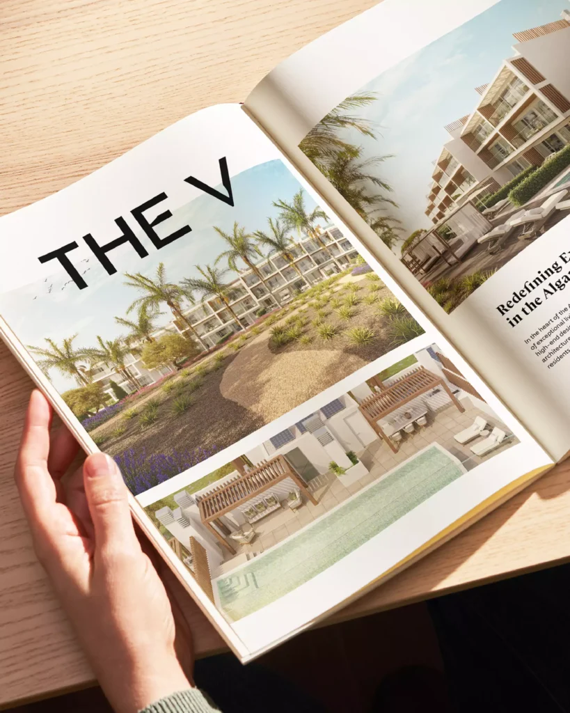
The Algarve is home to some of the most sought-after luxury real estate in Europe. However, this desirability creates a challenge for new developments: how to differentiate in an already crowded premium market? THE V Apartments, an exclusive collection of 20 premium residences nestled between Quinta do Lago and Vale do Lobo, required a branding strategy that was more than just a visual identity — it had to convey a unique living experience.
Our client wanted to communicate the properties’ exclusivity without feeling ostentatious. Their target was the international audience of discerning investors and homeowners looking for a balance of contemporary design with timeless sophistication. This meant that THE V’s branding needed to convey the promise of a lifestyle before potential buyers even stepped inside.
THE V Apartments is a meticulously designed collection of premium properties featuring bespoke details and private ambience. The development includes a natural pine parkland with communal areas, a garden, and a sports zone, further elevating the living experience and promoting harmonious indoor and outdoor living.
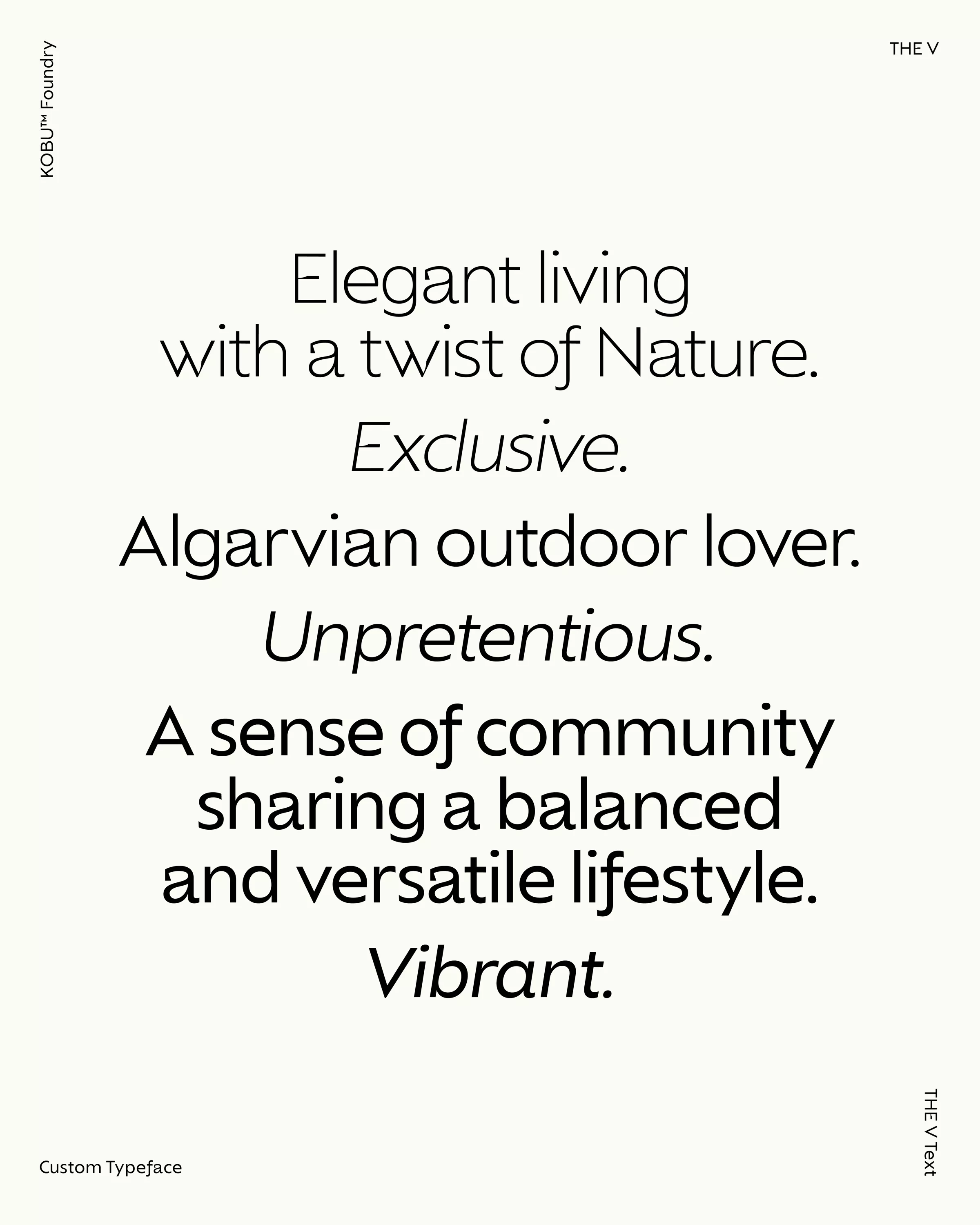
Our client emphasised it since the beginning: this luxury real estate was not ostentatious. Its promise was all about convenience, relaxation and familiarity. THE V aimed to attract like-minded people who could build a community around a shared lifestyle.
For this luxury real estate, it was clear that branding would play a pivotal role in communicating its unique selling points. Beyond quality and exclusivity, creating a brand identity that could encapsulate its exceptional lifestyle promise would be key to setting this development apart from competitors and elevating its desirability.
bringing a luxury real estate brand to premium level
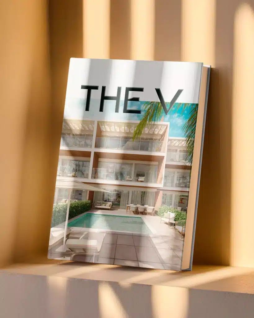
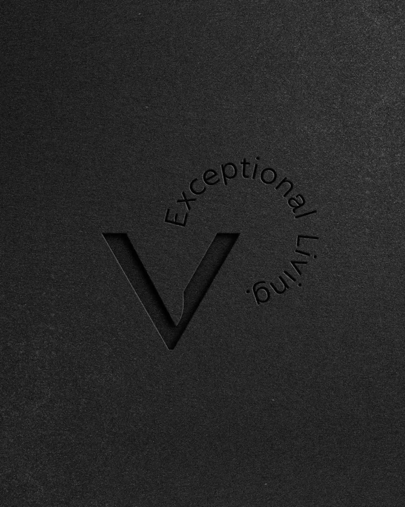
Our client was sure that their luxury real estate development offered this unique and differentiating combination of location, quality and connection to the surroundings, and they envisioned it becoming a geographical reference in the Golden Triangle. The brand naming, therefore, soon became clear: THE V.
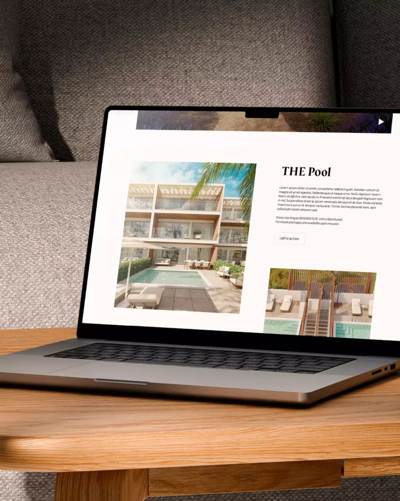
This would be the wisest choice as local people already recognised it as a specific place and the capitalisation was deliberate: THE V is THE place, like no other, and everything about the development adopted that uniqueness – we can find THE Park, THE Penthouse, THE Pool, and other variations in the brand universe communication.
The naming was already a powerful statement, but something was still lacking in the brand message. THE V’s uniqueness was more than its convenient location, property quality and connection to the surroundings.
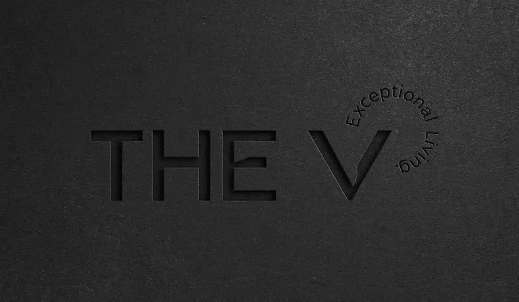
THE V’s actual value proposition lies in its aspirational promise of a lifestyle, so the brand’s storytelling focused on it and eventually even fed the brand’s signature: Exceptional Living. The word “exceptional” became THE V’s natural adjective and a communication tool to support the brand’s character: exceptional living, exceptional interiors, exceptional location, exceptional surroundings, etc.
This aspirational brand promise of an exceptional lifestyle leveraged the real estate product by strategically building an emotional connection and desirability. Instead of just selling property features, the brand emphasises that outstanding lifestyle promise of serenity, exclusivity, and harmony between luxury living, convenient location and connection to the natural surroundings.
a statement logo and a powerful typography
THE V’s brand identity lives at its best in its key visual elements, such as the logo. The modern serif typeface, especially customised for this luxury real estate branding project, is a bold identity statement. It feels distinct and sophisticated and allows for different uses, such as in the brand’s stamp and customised pattern.
Typography is one of the most understated yet powerful branding tools, particularly in luxury real estate. It proved to be a fundamental component of this brand identity, particularly in expressing the brand’s personality and conveying a premium feeling that targeted the affluent segment, where subtle cues can significantly influence perceptions.
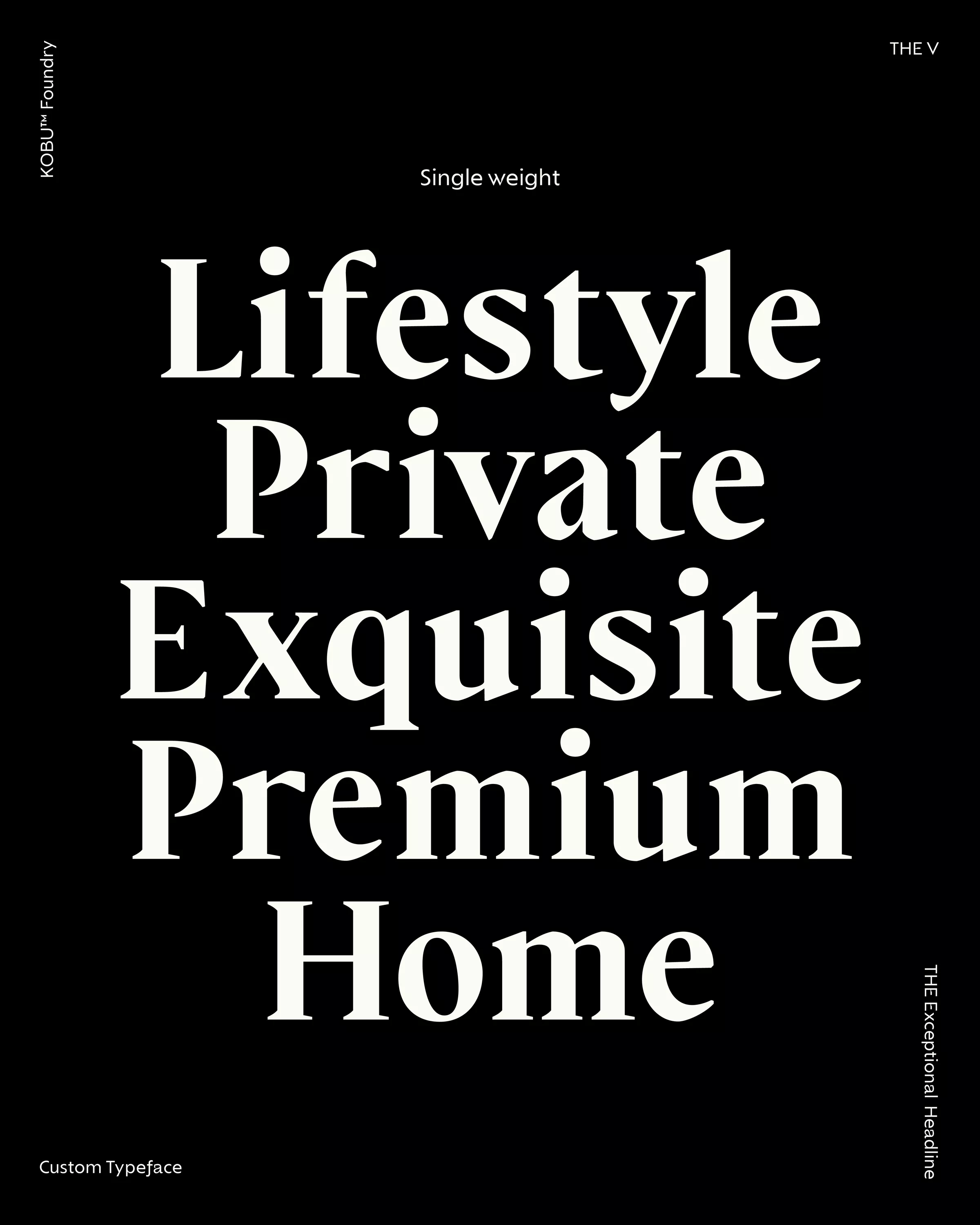
For THE V, designing a custom typography was a deliberate step to reinforce the brand’s exclusive character. We developed a sophisticated custom serif typeface family for text and headlines to convey the bespoke nature of the properties and a timeless elegance that is reminiscent of heritage luxury brands.
THE Exceptional Headline font features statement letterforms that make a bold affirmation without feeling overwhelming. Instead, they complement the visual elegance of the brand and add a refined sense of sophistication when paired with the THE V text.
THE V typefaces
Custom typefaces are powerful tools in establishing a distinct visual identity for a brand. They convey a brand’s personality, values, and aesthetics, helping to communicate its message in a way that is instantly recognisable and exceptional. A typeface reflects the brand’s visual personality. For THE V, custom typefaces are not only a means of communication but also an integral part of its identity, reflecting the brand’s essence and the modern architectural vision that defines it.
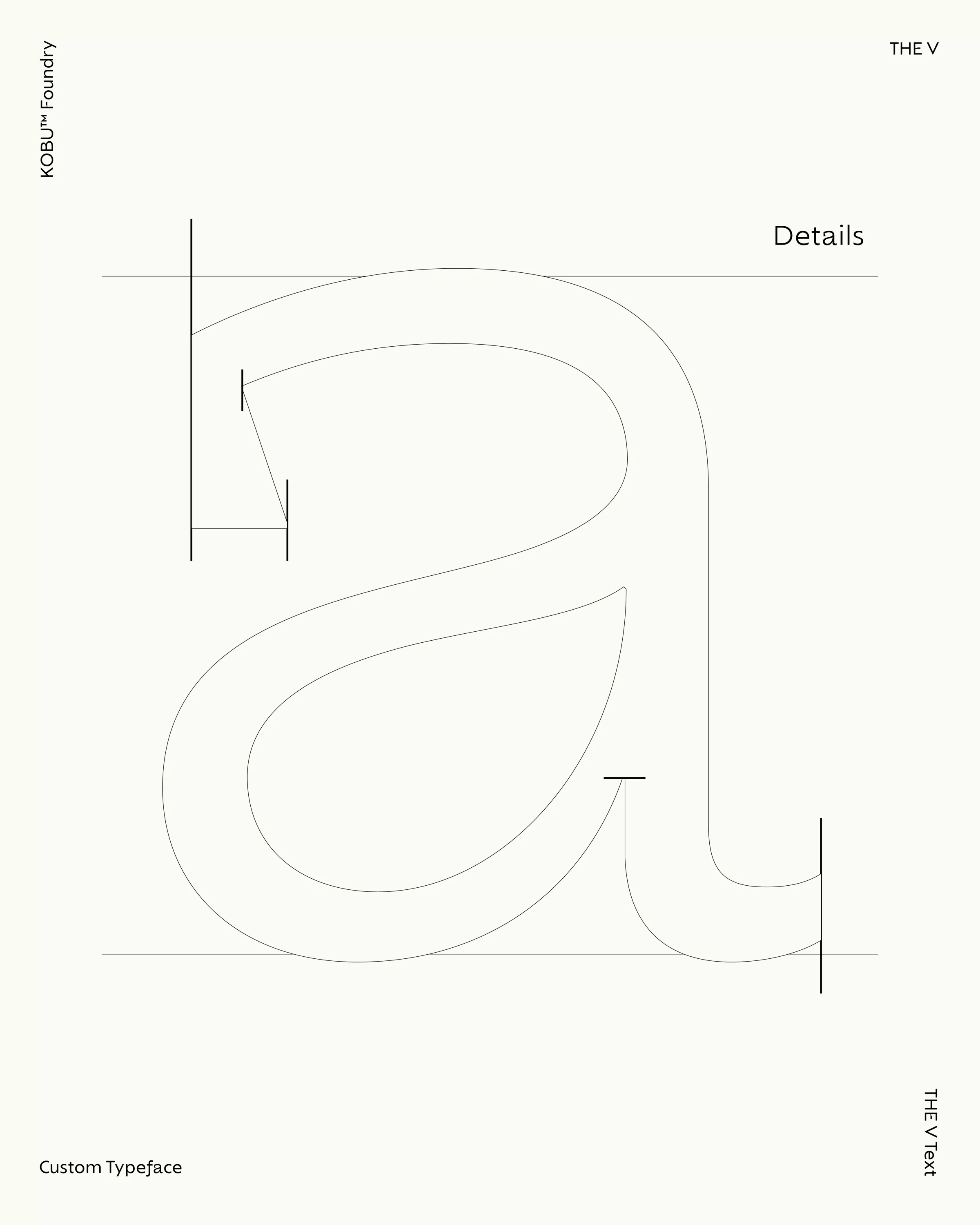
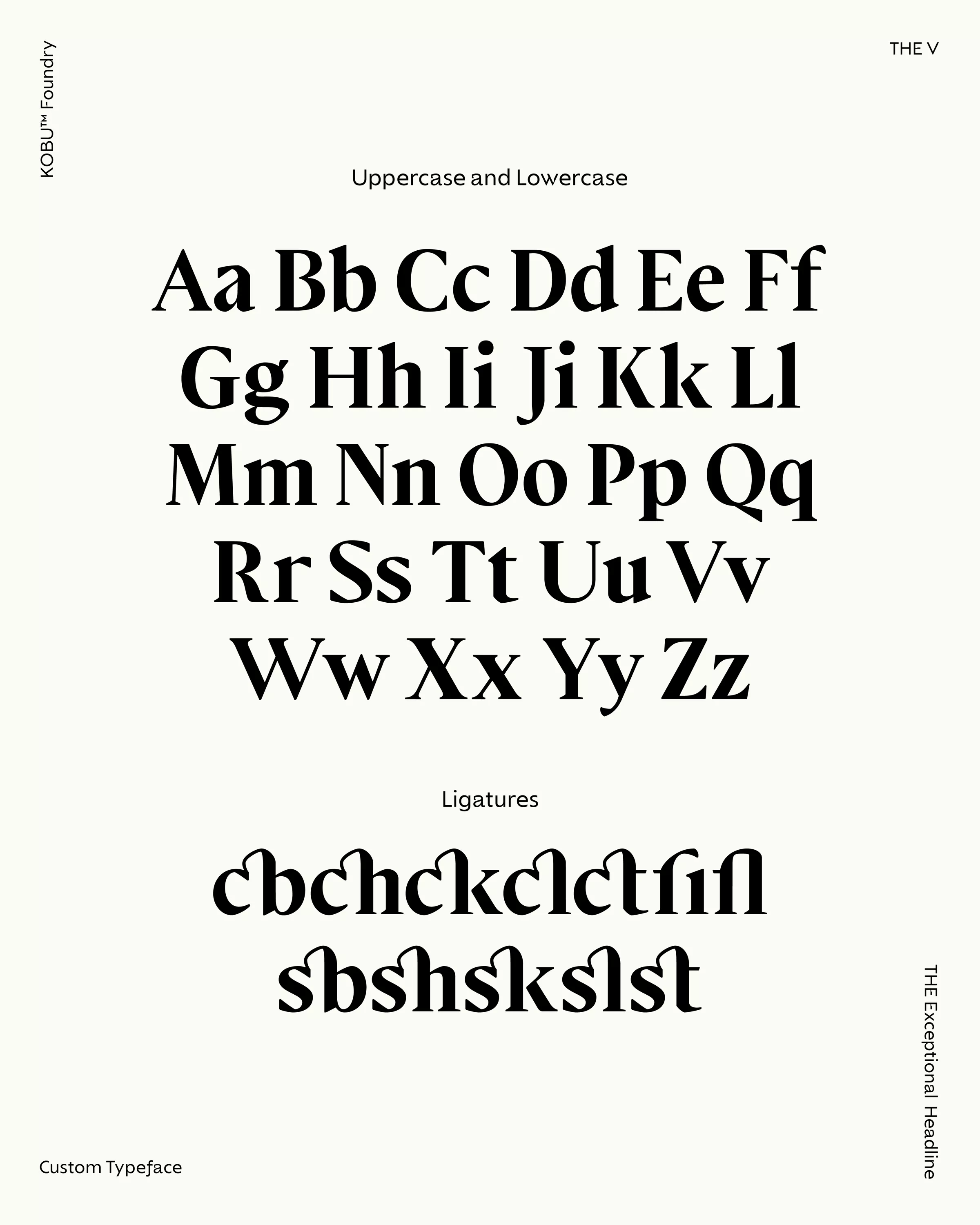
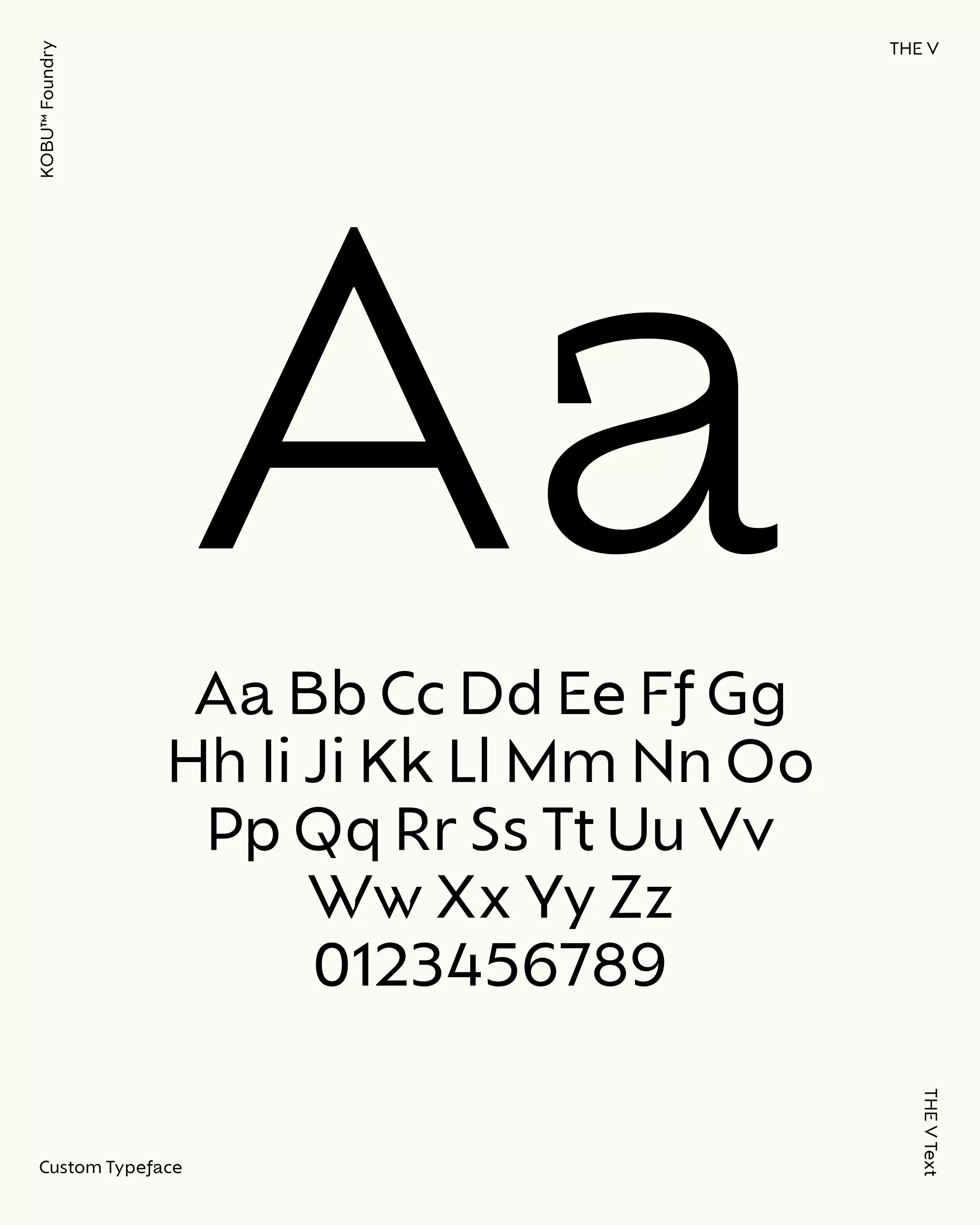
For THE V, we developed custom typefaces designed to reflect the brand’s personality, inspired by THE V’s architecture. This typographic family comprises THE Exceptional, for headlines, and THE V, for body text, available in two styles (regular and italic). These typefaces are influenced by the clean, geometric lines of THE V apartments, translating the brand’s design philosophy into the world of typography. The triangle, a fundamental geometric shape, is the foundation of the typeface structure, symbolising precision and modernity.
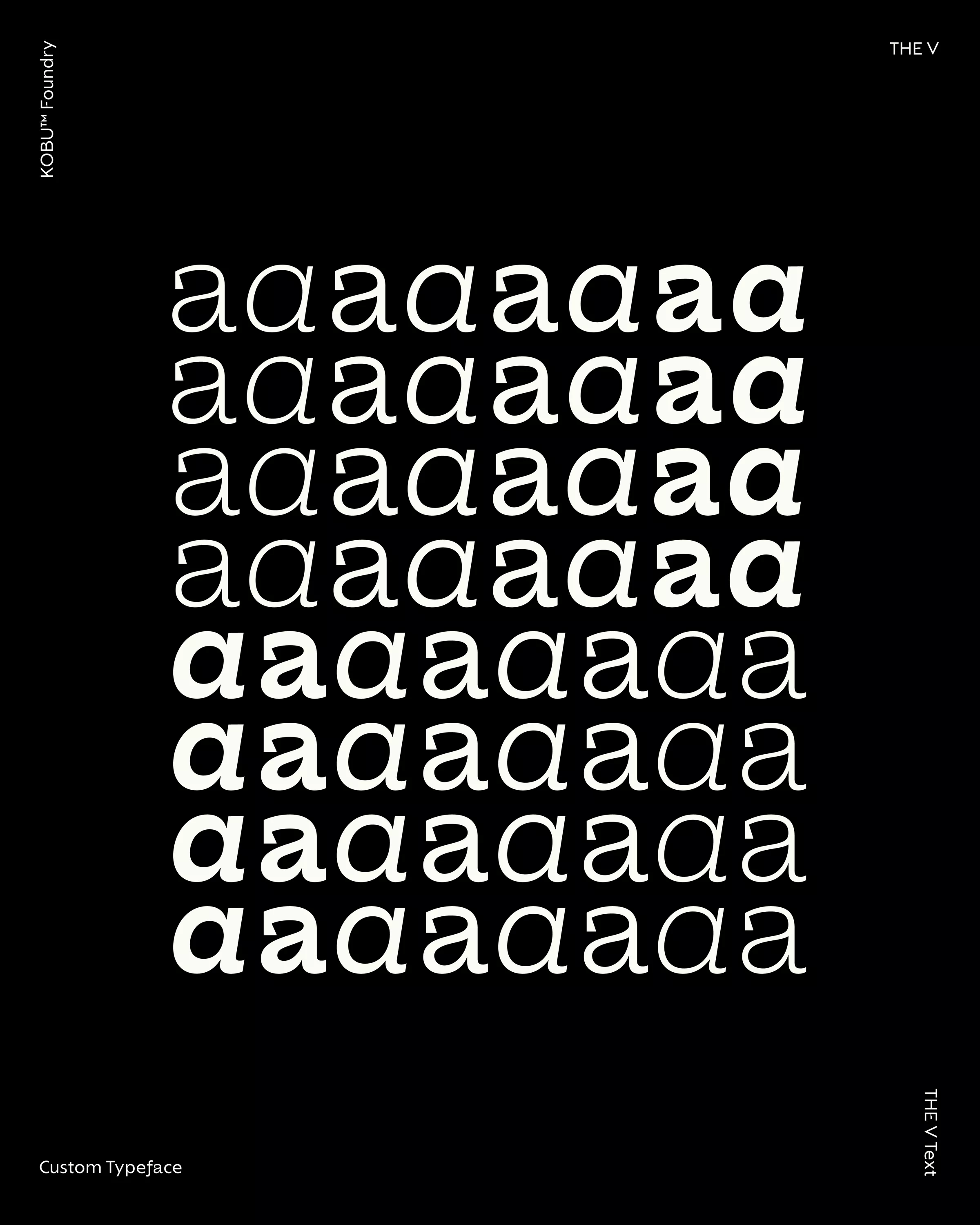
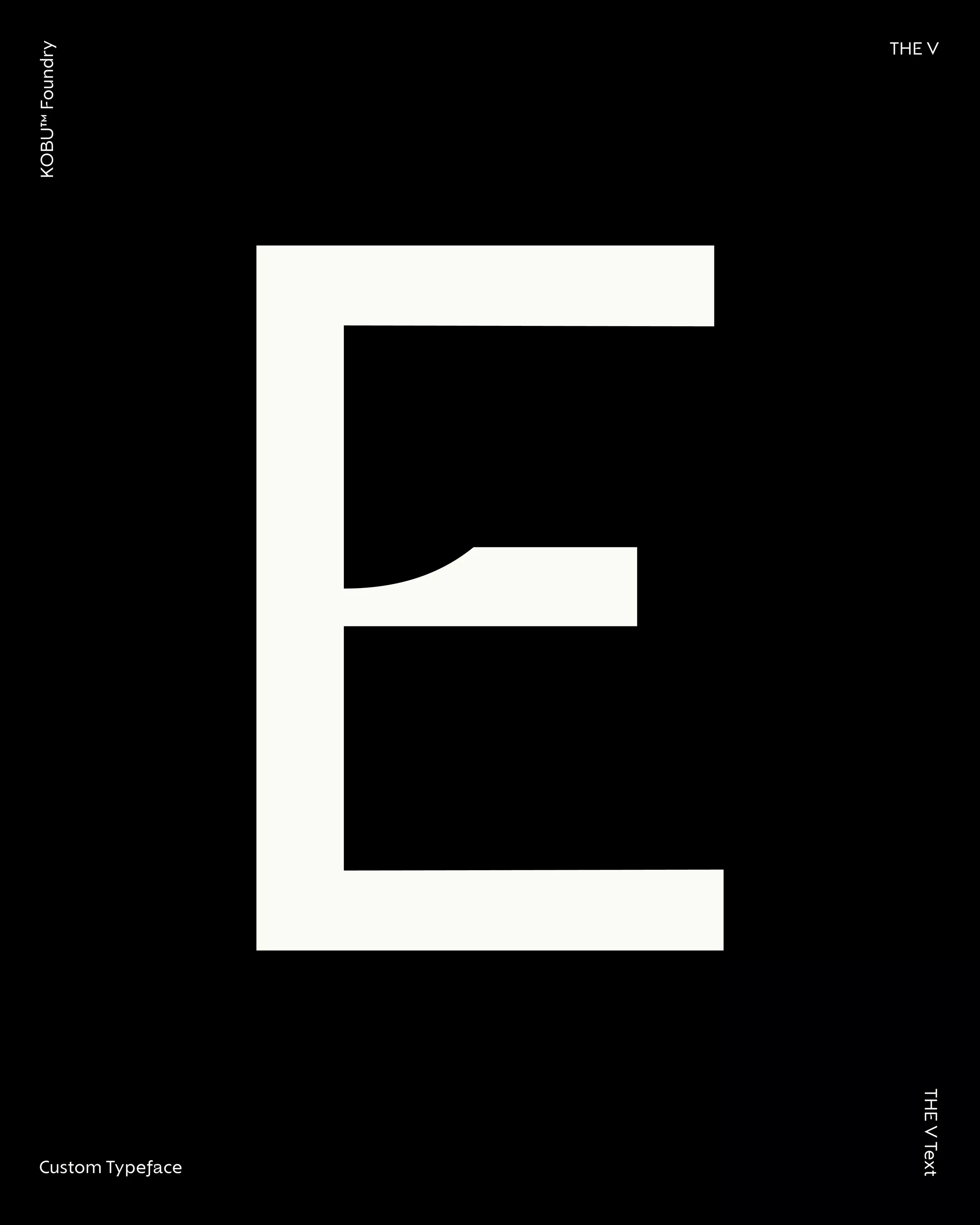
Furthermore, the Golden Ratio plays a significant role in shaping key characters in the THE V Text style, such as the lowercase “a”, and uppercase “E”, “F”, “V”, and “W”. This mathematical proportion ensures harmonious balance and elegance in the design of these characters, enhancing the brand’s modern and sophisticated look while maintaining readability and clarity.
THE Exceptional Headline
THE Exceptional is a serif typeface that blends classic elements with a contemporary twist, making it ideal for headlines and attention-grabbing titles. Its design is rooted in a transitional and modern style, but with a bold twist that gives it a refined character. The typeface is designed with a single weight, standing out for its elegance and visual clarity while maintaining a modern edge.
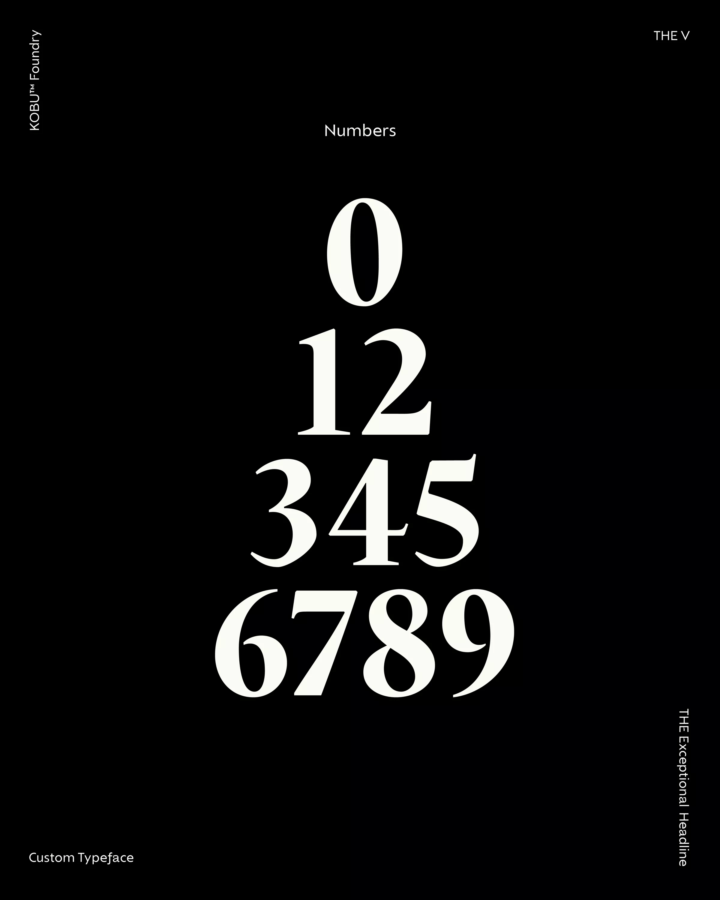
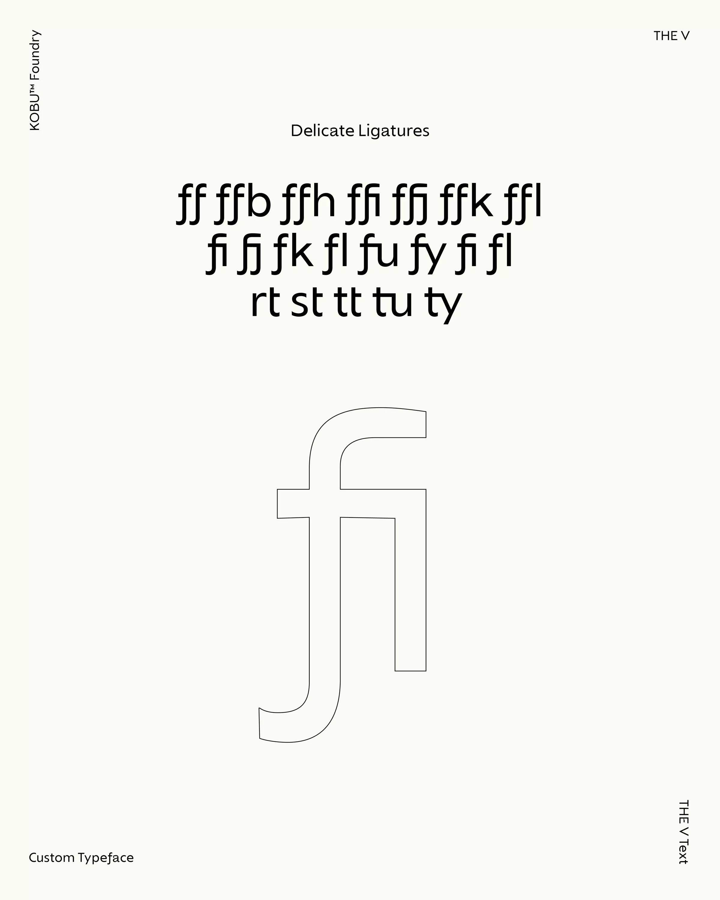
The contrast between thick stems and thin lines is one of the key attractions of this typeface, creating a strong visual impact and clear readability, even at smaller sizes. Its terminals with straight cuts, facet-style geometric shapes, and vertical modulation axis (no slant) provide a sense of stability and modernity, typical of modern typefaces. In addition, THE Exceptional offers a wide range of characters: uppercase, lowercase, numbers, punctuation, fractions, ligatures, and even arrows, providing flexibility and sophistication in any application.
This typeface is perfect for creating a strong and assertive impression, reflecting THE V’s identity through its distinctive and bold shapes. It serves not only to attract attention but also to express personality, conveying a sense of exclusivity and contemporary flair.
THE V Text
This blend of geometric and humanist characteristics is reflected in this sans serif typeface. THE V is designed for easy readability and high legibility. With two styles – regular and italic – and four weights (extra-light, light, regular, and bold), it is a perfect match for THE Exceptional, balancing clarity and simplicity with the elegance of a serif typeface.
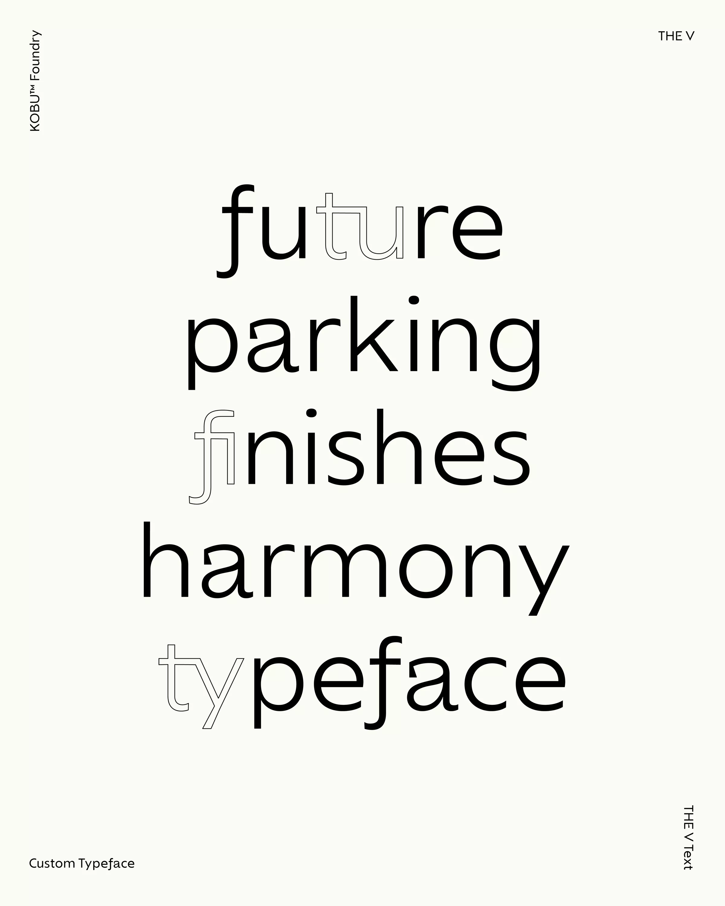
The typeface is characterised by straight, simple lines, giving it a minimalist and modern style. The terminal of the letter “a” represents part of the duality present in the brand’s visual identity, being half of a triangle—reflecting authenticity and uniqueness. Its clean structure and personality include uppercase, lowercase, numbers, punctuation, fractions, arrows, and special connections through ligatures (such as “t+u”, “t+t”, “t+i”, “r+t”, “t+u”, among others).
The italic style of THE V Text is designed to provide smooth reading, with a 9-degree slant that ensures fluidity and visual continuity throughout the text.
Both typefaces form a perfect combination: THE Exceptional for headlines, with its elegant and striking contrast, is ideal for attention-grabbing calls to action, and THE V Text, with its mix of geometric-humanist and minimalist design, adds a touch of sophistication and contemporary style, perfectly reflecting the personality of the brand.
Experiencing a luxury real estate brand across channels
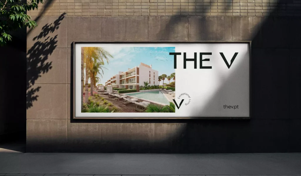
THE V’s branding was crafted to deliver a seamless, high-end experience across every touchpoint. The bold character of the customised typography is balanced with the sober colour palette to create a clean and appealing visual identity, while high-quality imagery showcases the properties’ design, materials, fittings and fixtures flatteringly. We had to make sure that all visual elements worked harmoniously across digital and print applications, ensuring a consistent brand experience that is minimalist yet bold, reinforcing the premium positioning of this luxury real estate development without the need for excessive ornamentation.
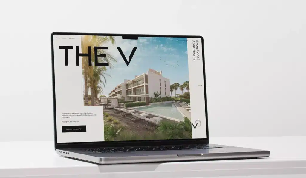
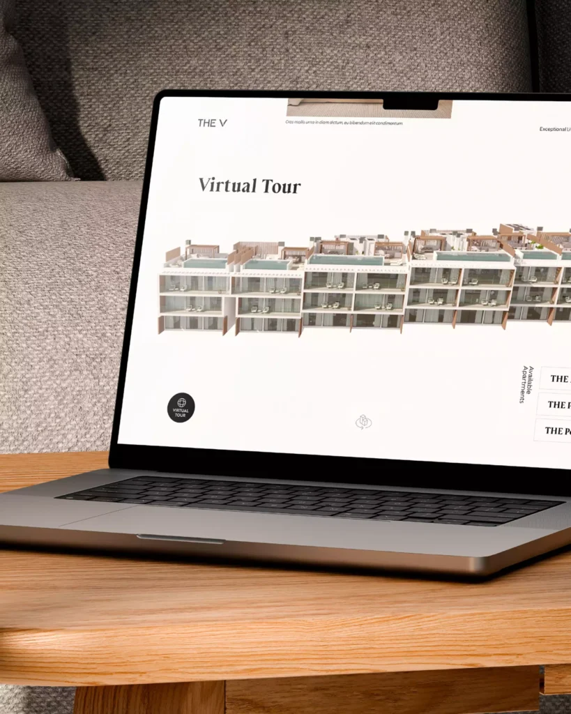
From Landing Page to Luxury Website: Building THE V’s Digital Identity
From strategic planning and user experience analysis to benchmarking, information architecture and development, creating a full website demands time. As THE V needed to go live quickly, we proposed a temporary solution: a launch-focused landing page.
Our team designed an immersive, horizontally scrolling experience that embodied the brand’s sophistication and visual essence. The result was a striking digital showcase that reflected THE V’s identity and generated immediate engagement.
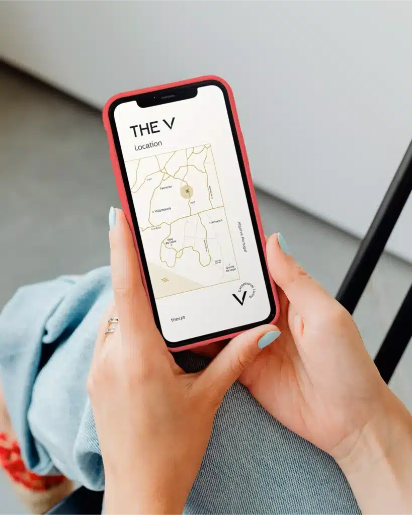
Building on the landing page, THE V’s digital presence evolved into a complete website — an immersive brand experience where minimalist UI/UX design conveys the project’s refined elegance. High-quality visuals capture the architecture and surrounding nature, while a well-structured, SEO-optimised content architecture ensures the project effectively reaches its target audience.

An exceptional luxury real estate branding project
THE V Apartments’ branding successfully positioned it as one of the most desirable new luxury real estate developments in the Algarve. The visual identity is a reflection of this project’s architectural excellence and its message encapsulates an aspirational promise of an exceptional lifestyle. The strategic use of typography, sober colour palette, and striking logo design were carefully curated to mirror the contemporary yet timeless appeal of THE V.
Creating a cohesive and resonant brand experience that feeds a successful luxury real estate brand extends beyond visual identity to encompass the entire digital experience, including the design and functionality of the development’s website, which serves as a digital gateway for potential buyers. Featuring a clean and elegant design, intuitive navigation, comprehensive information and high-quality imagery, the website provides visitors with a clear understanding of THE V’s exceptional value proposition.
Developing a compelling luxury real estate brand in the Algarve’s competitive market required a smart approach to achieve distinctiveness. Wrapping the brand’s heart around meaningful storytelling helped us design a luxury real estate brand that balances clean aesthetics with subtle luxury, resulting in a premium brand that speaks to the aspirations of an elite clientele.
This project was featured on Behance in the Typography category (05/17/2025).
PROJECT TEAM
Executive Creative Direction: Nuno Tenazinha
Creative Direction: Sandra Lopes
Project Management: Sandra Lopes
Brand Strategist: Isabel Evaristo
Copywriting: André Oliveira, Isabel Evaristo
Brand Design: Brígida Guerreiro, Vanda Pereira
Type Design: Brígida Guerreiro
UX/UI Design: Daniel Gomes
Motion Design: Pedro Santos
Digital Product Management: Karolina Guilherme, Paulo Sá
Web Development: Cátia Dionísio