

As the digital landscape paves its way to a more mature state, trends in web design evolve as we watch brands struggle for equity in a world cluttered with noise and where attention becomes an inestimable asset. Relevant content has finally reached a centre stage position as it creates real value to the user. This sets new and high standards for websites as they must integrate stunning aesthetics, brand messaging and speed while driving conversion of well defined business goals.
Web Design in 2019: a review on the 10 best trends to watch

27
5
2
In this article we review what we consider to be the 10 best web design trends for 2019. They are:
We’ll dive into each of these items, illustrating with examples we’ve been gathering around the web.
1. Everyone speaks emoji 🙂
We have been using emojis for some time now – since 1999 to be more precise. They first appeared in Japanese mobile phones and quickly spread through messaging apps. Now they are part of our everyday life and populate Twitter and Instagram feeds everywhere. We watched as Apple unveiled their natural evolution, the Animoji. And it even sparkled debate on social media as the weird design of the burger emoji by Google had its CEO, Sundar Pichai, tweet that it would be Google’s first priority to fix the design (as long as the community would agree on the best burger representation). [1]
Emojis unveil this primal need of our species to communicate visually. It is only natural then that they are now impregnating the world of web design. Emojis are used mostly to emphasise an idea, to give it a different tone or simply to make it more fun. Words and emojis complement each other – they strengthen our perception of meaning. And don’t fall into the trap that only Millennials and Gen Zers love them – their use is transversal. [2]

2. Seamless Motion
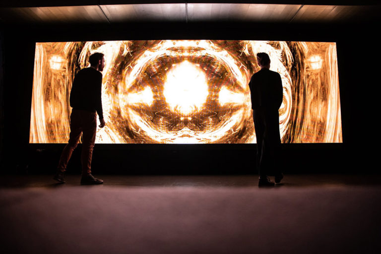
Motion sickness? Better take some pills for this one. This trend has been emerging in the last few years. Everything on a website started moving: from video to animated illustrations or iconography. Sometimes you may see it on some small interactions with micro animations, such as mouse over links, opening a menu or revealing text. But HTML5 canvas made it possible to start creating interactions that can be much more complex and that bridge the gap between design and web development. The massive resurgence of GIFs also plays a role in this trend.
Motion generates rhythm and this is essential for immersing the user into your brand message. But please be warned! The retina, a light sensitive layer of your eye, provoques a reflex that shifts the eyes to moving light. So if there is a lot going on at the same it time might confuse the user and end up being an awful experience. Motion and animation should be seamless and natural. You should give it a pace, much like composing a music piece.

3. Entertain Me
Another approach to turn content consumption on your website more engaging – besides the old boring scroll down, reading, seeing images, more reading, more images – might be playing a game or complementing that scroll down with small games or other interactions. We underestimate the power of good entertainment (yet, at the same time, we spend hours on the run, watching videos on Youtube… getting entertained). We need to look for creative solutions that generate value and result in a satisfying feedback so the user doesn’t get bored. Well you know, people get bored fast so you better give them something to play around – make it relevant and interesting.

4. Distortion, g.lit_ch effect and stuff
Wave, perspective or glitch are examples of distortion effects that have been increasingly used in websites. These effects usually come to life applied to typography, image or video. For example when applied to a menu they can induce the user into a more dynamic and immersive experience in navigation – almost mimicking a virtual-reality like experience.
The growth of this visual effects has been possible due to the increasing in graphics performance and the optimisation in video and 3D that allows for shorter loading times. Coupled with the popularity that WebGL [3] has gained as well as frameworks such as Three.js [4] it is only natural that we’ll keep seeing a continuous growth in the use of this distortion aesthetics – and gosh we like it! For a thorough review on these effects you can check this article on Awwwards.

5. Interactive 3D elements
For too long, 3D was away from web design. But as we are now getting better tools and the necessary optimisation to boost this trend, we are slowly embracing this new dimension. This has been possible with the same tools we mentioned in the previous trend (Distortion and glitch).
We have observed layout compositions where flat mixes with 3D and vibrant color palettes. All extremely balanced and pleasant to the eye.
We also encourage you to explore Google Poly for some inspiration and examples of amazing interactive 3D elements and scenes developed for the web.

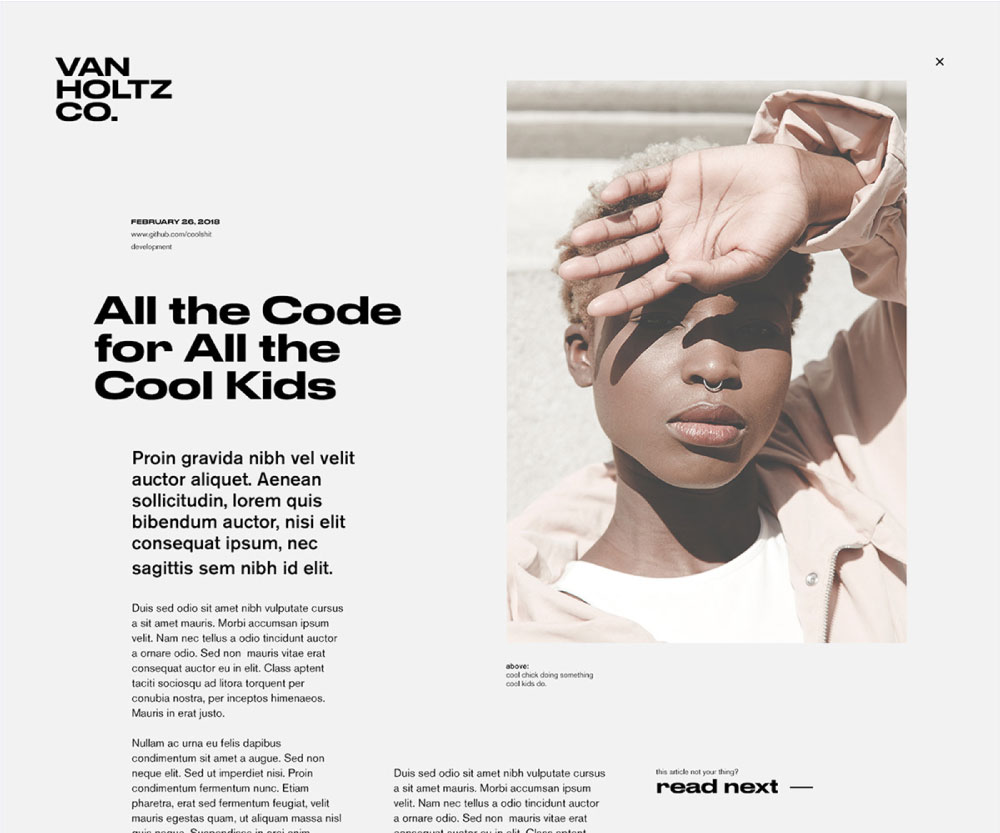
6. Bigger & Bolder
This is not new but it’s sticking around, and it is getting bigger and bolder so you won’t miss it. Typography is one of the fundamental elements of graphic design: it unveils our emotions while strengthening the brand message. In the last years it has reshaped how we approach web design and has finally gained a well-deserved space in the digital landscape.
As devices increase in resolution playing around with font faces and proportion brings a totally new dynamic into how the message is visually perceived. We are finally abandoning boring websites cluttered with information and embracing the old and efficient styles of poster design: where type, color and image, structured through proportion guide the user through the message – with obvious gains in user experience – it’s visual hierarchy coming to life in the web!
7. Flat like Newsprint
Flat websites have been around for quite some time – at least since 2010 when skeuomorphism in web design was cast aside. And flat has been persistently reinvented through new iterations of its basics. For 2019 we forecast that this need to make things feel more real and palpable will merge with flat design – to create a visual association to something physical like paper, the warm feeling of touching newspaper, a book or a magazine.
The trend relies mainly in neutral tones that range from calm pastels to greys, sometimes complemented with greyscale imagery – it becomes especially interesting and pleasant to the eye for long articles.
8. Nostalgia
Nostalgia is strongly emotional and stimulates our sense of identity. It revives memories buried within ourselves that we accumulated as we grew older. Oh, the good old days, when everything was great. Well, not really, but we just want the good stuff.
This trend is about bringing the old times aesthetic, color, typefaces, composition, even photography style, to the present. This is not just using a style from the past, it’s about converging an old style with something new that triggers some old memories and engages the user into an experience of its inner self.

Take the time to appreciate some references from the old times.

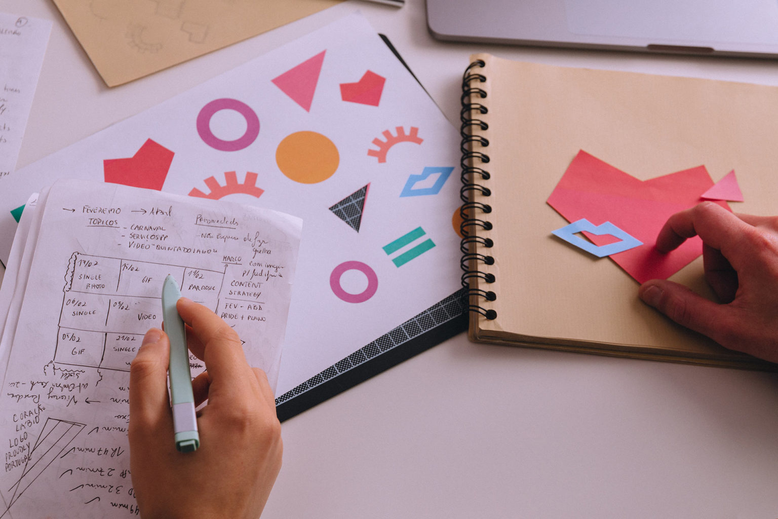
9. Layering & Collage
This trend is all about the layering of images or illustrations in different proportions combined with large or bold typography, making the layout more dynamic. It sometimes may resemble the collage style. It evolves from a trend that has been growing in the last years that embraces asymmetry and an apparent break with the grid systems. We say apparent because they’re still underlying the layout. But in a more subtle and elegant way and not staggeringly in-your-face as it was the case when grid systems appeared in web design.
It is also an excellent storytelling technique as the layered elements can reinforce the message being conveyed through text.

10. Enhanced Navigation Systems
When complex information architectures and responsive behaviours forced us to adopt new website navigation paradigms – the burger icon and hidden menus – it also unravelled a totally new user experience when looking for information on a website. We have been seeing the interaction of this trend a lot lately. It happens mostly in menu links that, on mouse over, reveal a sneak peek of content, e.g. an image overlaying these links. The style is visually related with the Layering & Collage but, although the text element seems to follow defined rules, the images look like they are placed randomly over it or sometimes even follow the movement of the pointer.
This is a clever way to create visual aids to the user when he is deciding on where to go next in the website.

Does your website actually serve a purpose within your business? Are you using it to build brand awareness, drive sales and building product advocates? The trends we identify in this article result from research work we developed here at KOBU Agency. They serve as a basis for understanding how your brand could reassess its current digital presence. They also showcase new ways to further strengthen the user experience your customer has in this crucial brand touchpoint; or maybe unravel new aesthetics that your brand could be pursuing in order to engage with increasingly demanding new customers. Nevertheless, they should never be used without a strict alignment with your brand message.
So these are the 10 best trends that we forecast will see further developments throughout 2019 in web design. Do you think we missed something here? We welcome you to join our KOBU Social Lab and discuss your ideas with us! Also, if you feel that we can bring insights to your business, please contact us and let’s build something vibrant!
Transparency disclaimer
Research, trend analysis and article structure by Daniel Gomes
Editing by Nuno Tenazinha
References
Credits
- Main Photo by Ales Nesetril
How do you feel about this article?
27
5
2

― recommended articles ―
read some more