

Let’s Peek at the cascade brand
Cascade Wellness Resort is an incredible resort in the extreme west location of Europe (Lagos, Portugal). Lagos city is a special place with tons of history and stories of brave sailors that sailed through new seas, through new worlds. Cascade Wellness Resort values this historical heritage and tries to integrate it into its brand identity.
The resort was built in 2011 and opened its doors under the name of Cascade Lifestyle & Wellness Resort. This 5-star elegant and sophisticated resort enjoys a privileged cliff-top location in Lagos, Algarve. It has private villas, apartments, and a hotel themed after the Portuguese Discoveries. By the year 2015, the Cascade Lifestyle & Wellness Resort changed administration, and from then until 2019, it underwent a thorough renovation of its facilities. The brand had grown organically and unstructured, building a loyal customer base upon a luxury hospitality service and top-class location. But the time came when the resort’s administration felt the need to rethink the brand’s positioning. The central concept of its offer was not very clear, and so the decision of letting go of the “lifestyle concept” from the brand’s promise seemed the way to go. The brand name was changed to Cascade Wellness Resort, immediately reclaiming a specific market niche for itself, embedded with a new expectation: the deliverance of luxury wellness services.
How we helped
- Strategy: brand analysis; creative concept; service design analysis; insights and remarks on business alignment; social media benchmark (Facebook, Instagram); content guidelines for social media
- Branding & Storytelling: tone of voice; narrative for the brand; tagline; website contents adaptation; core brand values; graphic identity; extensive brand book with visual communication guidelines; photography mood
- Stationery and hospitality collaterals: basic stationery; factsheets; sales brochures layouts; print advertising layouts; maps; doorknobs; keycards; valet parking; laundry list; towel card; spa collaterals; food & beverages collaterals
- Digital design: digital visuals for social media; guidelines for Instagram feed; Google Display ads; email signatures

THE CHALLENGE: chasing the essence
The image conveyed by the Cascade Wellness Resort brand in the last few years had been widely related to its known reputation of being a sports resort, with a strong appeal for the outdoor activities. Exceptionally well-equipped sports facilities, a stunning location in the sunny south of Portugal and high-quality cuisine were the assets upon which the brand had been building a specific community that identified with those aspects. But Cascade felt that an essential part of today’s travellers was not being reached by its message, namely families, couples, and solo travellers looking for immersive well-being experiences. Something in their message and image was missing, and they decided to partner with us to better understand what would be the best way to engage with these audiences while meeting their expectations.
In the early stages, we had a strong sense that there was not an a priori understanding of the concept to be implemented. What kind of wellness were we talking about? What would that concept entail? After some meetings and conversations with the various stakeholders, we all recognised that the priorities had to be rearranged.
Let’s talk about strategy
Our approach was very straight forward. First, the brand had to clearly define which would be their mission, vision, and values, in order for us to shape an image that would indeed resound their message. An in-depth rebranding was needed because several aspects of personality and identity were unclear or even non-existent.
Before jumping into action, the first thing to do was to step back and go looking for the basis of a clear and robust wellness concept that would underpin all the subsequent brand design and communication work. The analysis of the latest trends in tourism and travelling led us to conclude that wellness concepts in hospitality have been divided into several subgenres, mainly around fitness and sports, spirituality and health. Moving forward with one or a combination of these categories would have a deep impact on the brand’s perception as we needed to ensure alignment with business products and services.


We gathered statistics and relevant reports and provided our very own insights and remarks to the client and, together, we came to the conclusion that the best-suited wellness concept would be a blend of Fitness and Sports and Spirituality. Several factors were taken into consideration in this decision:
- the well-reputed resort’s sports infrastructures and the already existing community, very much fond of outdoors’ activities and physical fitness;
- the resort’s objective of reaching a specific range of travellers that are more interested in spending their holidays in a place that provides a balanced mix of body and mind activities;
- the benchmark comparing local players in the wellness segment that helped shed light into Cascade’s differentiation.
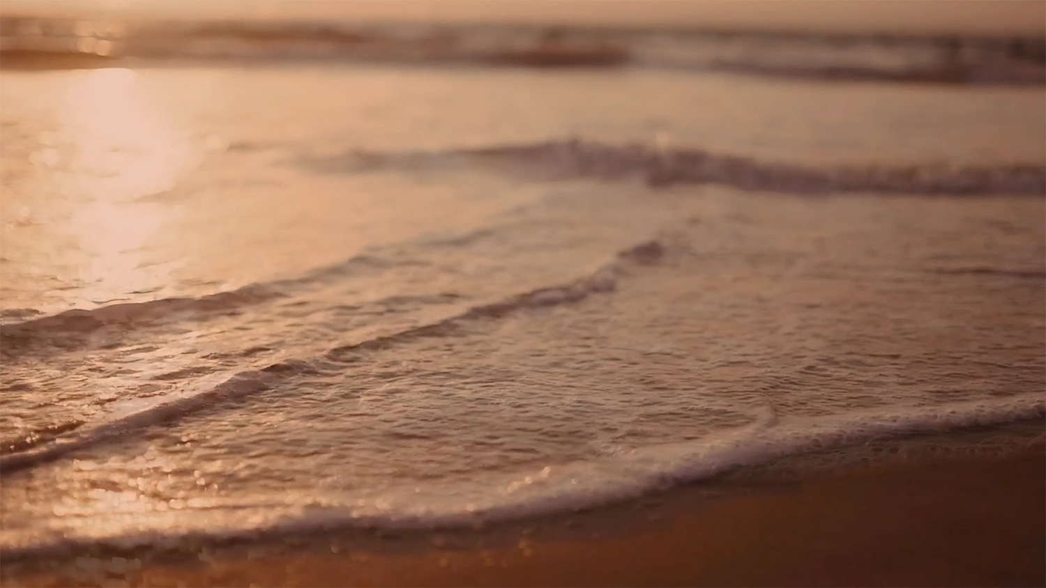
To strengthen the concept of wellness, we decided to take advantage of another built-in feature of the resort, which is the fact that the hotel is themed after the Portuguese Discoveries. The Portuguese Discoveries were challenging times when navigators embarked towards the unknown seas, seeking for new lands and peoples and also in hopes of wealth and riches, defying their own fears and uncertainties. A meaningful parallel quickly emerged: the Cascade Wellness Resort is the place where each guest embarks on a personal journey of wellness, challenging inner insecurities, to enjoy an immersive experience of well-being. The tagline that sums up the Cascade concept was born on that moment: “Sail the path of wellness”.

CASCADE’S LOGOTYPE AND VISUAL UNIVERSE
After having set the objectives, having the audience identified and the concept very well defined, the graphic execution flowed naturally. We tried to understand the graphic evolution of the brand and it was essential to switch the brand’s image in the right direction. In a previous soft rebranding, the administration had already drastically shifted the previous brand perception, leaving behind a relaxed brushed symbol and wordmark. The last version of the Cascade’s logotype was characterised by a deep blue and a serified uppercase typography. Despite conveying a simple and luxurious image associated with high-end services it also transpired an overly classical and somewhat unrelatable mood – something probably appropriate for an overtly classical luxurious 5-star hotel but not adequate to convey the hospitable warmth of a wellness resort. Additionally, it was clear from our initial Discovery process that there was a tendency of female audiences to seek wellness hospitality as the main decision-makers [1][2]. With these facts in mind, it made sense to aim for a warmer, empathic identity, embued with a subtle feminine mood.

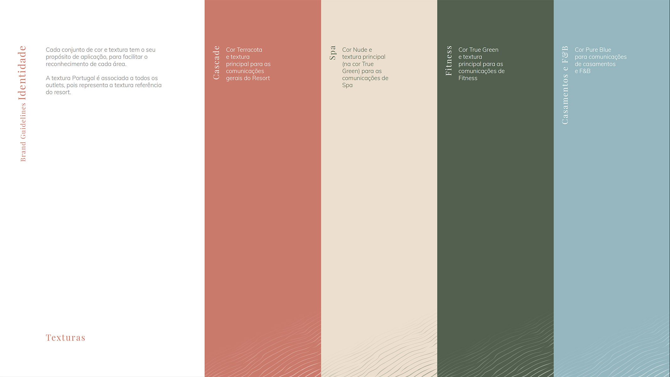
The Cascade Wellness Resorts brand identity should represent nature, connection with the land, wellbeing and tranquillity. The visual elements should reflect all the previously mentioned essential points while being balanced enough not to exclude an influential target audience of the resort: professional football teams. To maintain this equilibrium between luxury accommodation, wellness services, and sports, we opted for a total colour shift.
For the main brand palette, we chose a warm colour, with some mild terracotta vibes associated with the cliffs that circumscribe part of the resort.
This earthy tone can also be associated with the woman uterus, a deep connection with the origin of the human being and the inner being – thus, filled with strong symbolism.
Our experience acquired over the years in the tourism and hospitality sectors helped us foresee some of the operational issues the new brand could forego. Therefore, to ease the brand implementation across departments, we decided to widen the colour palette to differentiate relevant operational segments of the resort while maintaining the essential connection to nature. A green tone was suggested for the spa and fitness & sports facilities with a blueish tone being chosen for restaurants, bars or other food & beverages facilities as well as all wedding organization efforts.

Regarding the logotype, we tried to solve the problems we identified in the previous version. This was particularly obvious in smaller scales applications of the old brand, where the serif font used created critical legibility issues. We redesigned the wordmark and balanced the kerning to create a stronger composition that combined the name, signature, and star-raking simply and elegantly. Finally, some lightness and dynamism were added to the “Cascade” name, imprinting a more casual feel to the “A” character.

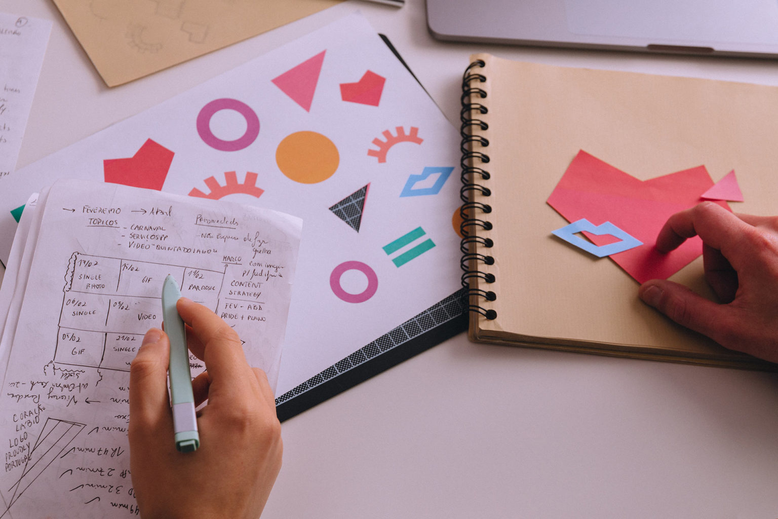
To expand the brand’s visual universe, other key visuals were important to consider to generate identity. As previously mentioned, the resort had already implemented the Portuguese Discoveries as part of the brand concept, and different hotel wings were developed with this logic in mind. It was essential to integrate this into the hotel’s visual language, as it had direct implications for its daily operation. Conceptually, the relationship between “discovering the world” and “inner discovery journey” was immediate, and it made total sense to strengthen Cascade’s identity. Graphically, it was a challenge. How could we include references to different continents of the world while maintaining elegance and luxury?


After some iterations, the solution came in the form of creating textures from some smooth and distinctive visuals. We selected specific textures to identify each of the hotel wings along with the already existing division by continents. Sand waves, leaf nerves, fur, bark and feathers are depicted in the rooms’ key cards, as well as in several other hotel collaterals, to complement the around the world journey experience. Thinking about the established concept of the wellness journey, we enhanced the sensorial experience to enrich the viewer’s perception of luxury and distinctiveness of the brand.
Creating hotel Collaterals

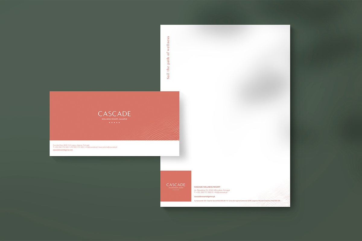


We redesigned every stationery and hotel collateral from this new brand perspective: from key cards to maps of the city of Lagos or the resort map itself, laundry lists, doorknob signage, business cards, envelopes, and so on. They all emanate the new Cascade Wellness Resort identity, bringing together the intensity and elegance of the brand. Every visual piece is understood as part of a whole. Everyone one of them is embued with the resort values and message.
SHARING A VOICE
The brand’s tone of voice was also adjusted to a more compelling and inspirational discourse, alluding to keywords related to the brand’s new message. We introduced expressions and words regarding the personal journey, the wellness experience, the search for inner balance and making time for self-care into the brand’s communication. The tonality was also harmonized to become more personal, warm and friendly.

All collaterals and website content were reviewed and adapted according to the new guidelines. Messaging and tone of voice guidelines were collected into the Cascade Wellness Resort Brand Book, the rebranding’s most crucial piece of work in the project where one can find the DNA of the brand.
SAILING FORWARD
As a result of this rebranding process, the Cascade Wellness Resort now has a renewed image, a charismatic visual identity, a distinct tone of voice and a clear communication line that speaks directly to their target through all the several online and offline channels. A strong concept works as the cornerstone upon which all materials breathe the same graphic alignment, adding up to the brand’s already top class service on-site.


As in all rebranding processes, some time is needed to let the changes sink in. Adaptation requires some effort as the renewed image and voice of the brand must find echo inside the company itself. As years go by, the resort’s services and daily life will adapt to reflect the message that is now being conveyed in order to keep delivering the new brand promise. We are convinced that all the tools are in place for Cascade Wellness Resort to continue sailing the path to wellness and we’re eager to see the brand evolve over the next years.
The final outcome is one that leaves us with the feeling of “mission accomplished”. On the one hand, it ultimately responds to what was asked of the rebranding – to communicate to the wellness tourists and travellers. On the other hand, it reflects the brand’s new charismatic personality through the combination of an exciting story, rooted in the history of the country itself, and elegant visuals that appeal to the luxury wellness tourism segment seeking an immersive experience.
PROJECT TEAM
Creative Director: Sandra Lopes
Business Strategist: Isabel Evaristo
Copywriter: Isabel Evaristo
Brand Designers: Sónia Duarte, Beatriz Varela
Communication Designers: Sónia Duarte, Beatriz Varela
Motion Designer: Pedro Santos