Bruma’s rebranding was one of those projects that evolved significantly from the initial client contact. What began as a request for a new website quickly transformed into a full rebranding journey.
Bruma is a Portuguese taps manufacturer based in Vila Nova de Famalicão, in the northern region of the country. When the brand’s Marketing & Sales manager reached out to us, he was seeking a partner to develop a new website. He explained that the company was undergoing changes in its marketing strategy and aimed for a new target positioning, which necessitated a website refresh.
After listening carefully to the client’s initial briefing, we took a step back and started asking questions about the brand’s core identity. What is the brand’s vision, desired positioning and what are the brand’s medium-to-long-term objectives?
Together with the client, we determined that a rebranding was essential to solidify Bruma’s foundations and lay the groundwork for the company to tackle the market. Bruma required a renewed visual identity, one that would resonate with its new target audience and align with the company’s evolving business goals.
How WE helped
- Brand Consulting & Strategy: brand identity (values, vision, mission, message), brand positioning, brand communication analysis and realignment
- Branding & Storytelling: Core Creative Concept and brand narrative; tone of voice; copy guidelines; logotype adjustment; typography, iconography; photography style; brand book
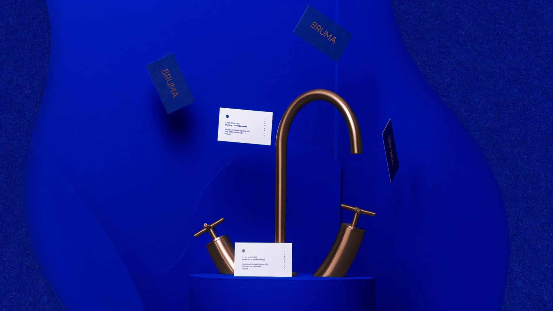
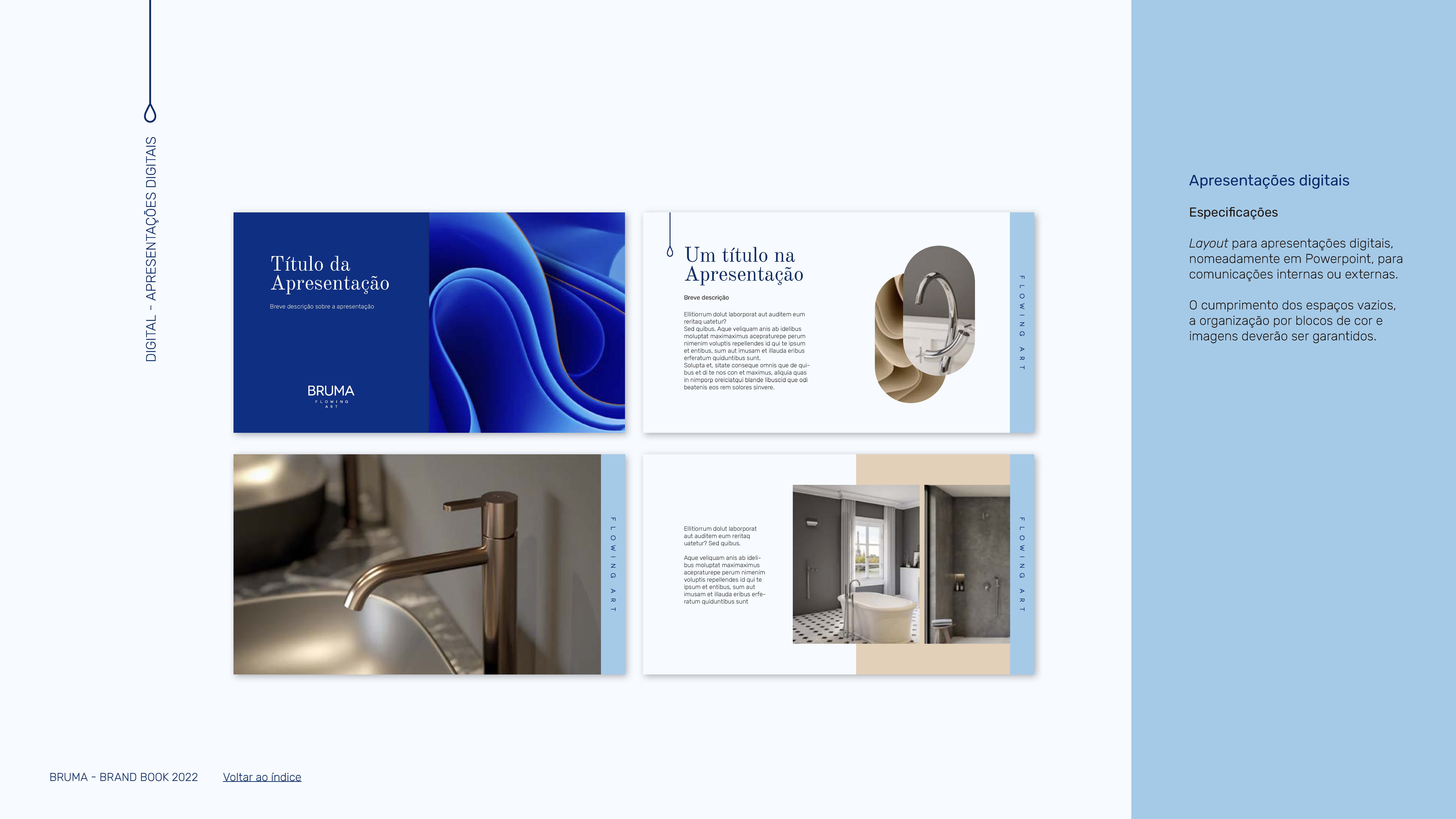
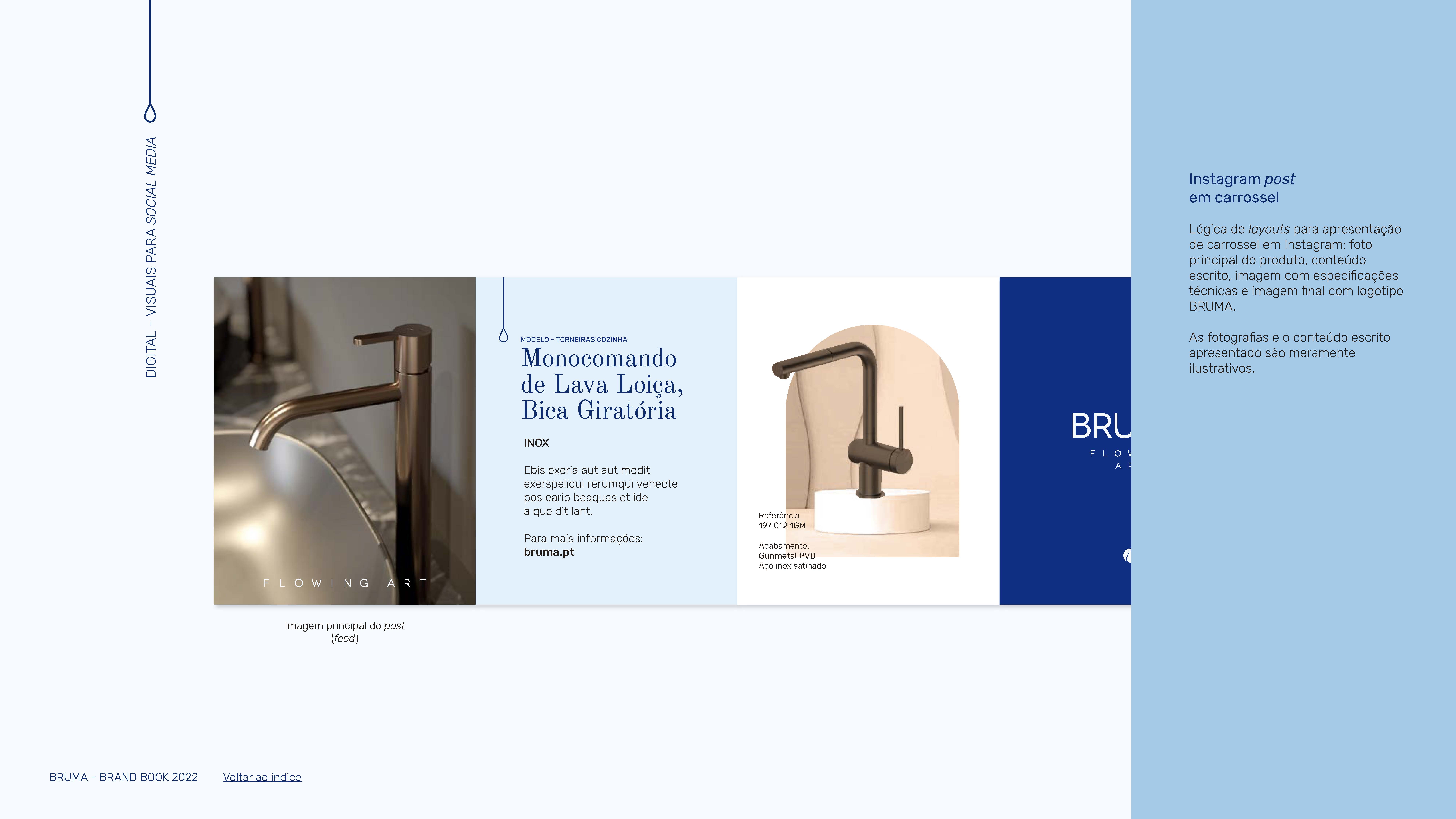
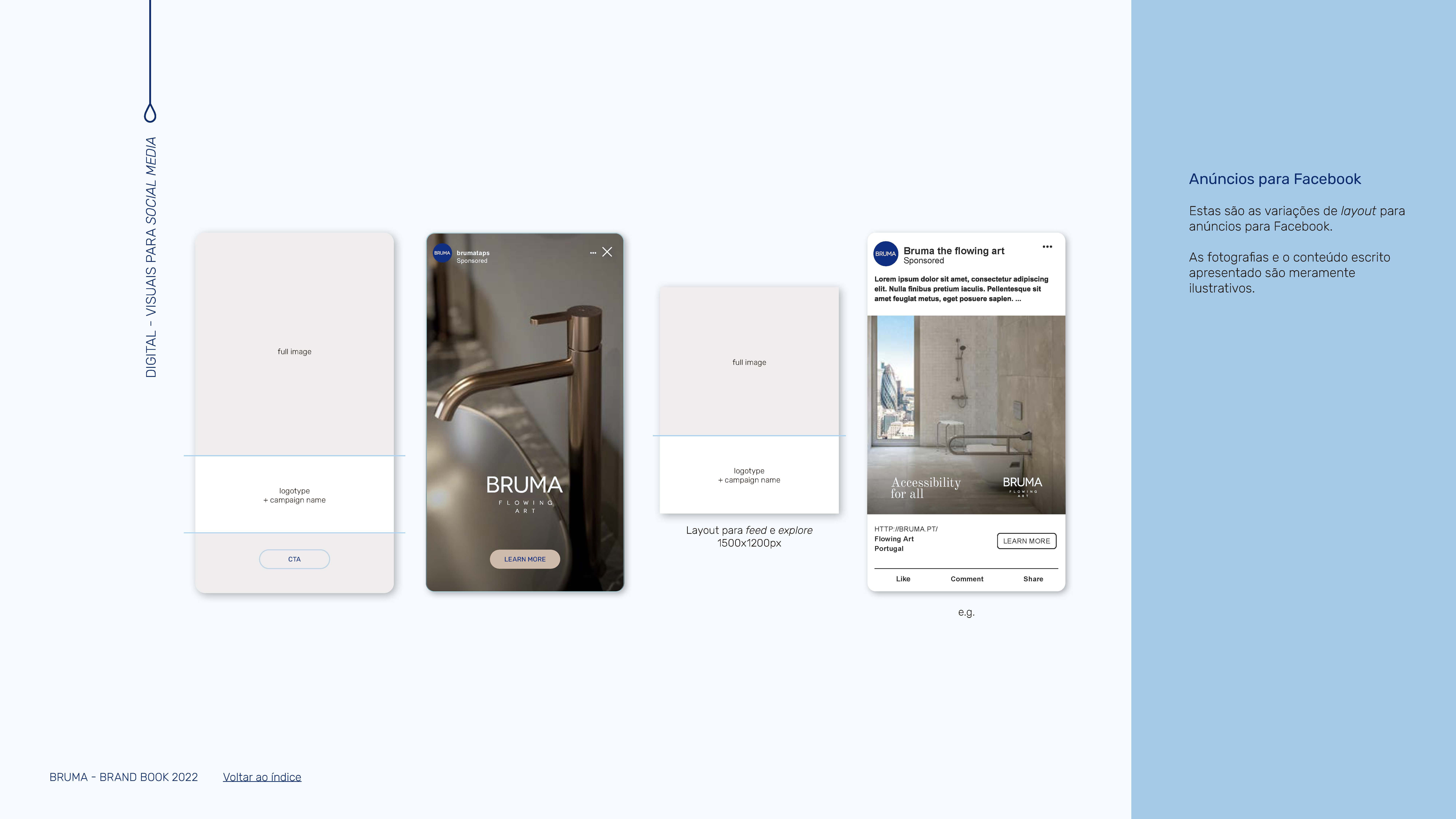
- Brand Collaterals: stationery; product catalogues; packaging, templates and guidelines for social media
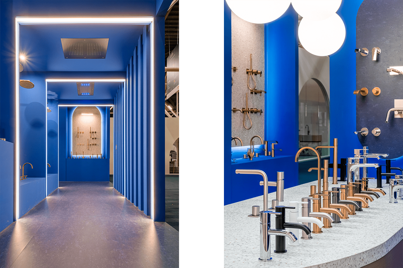
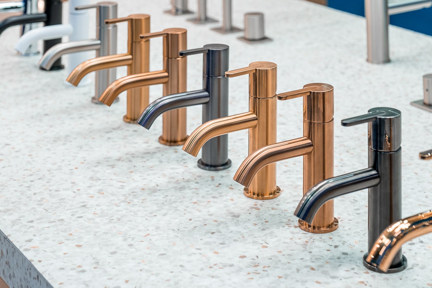
- Brand Modular Product Displays: product design (definition of structures, materials and finishes)
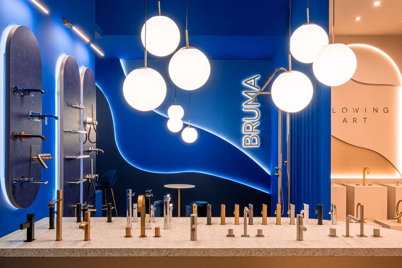
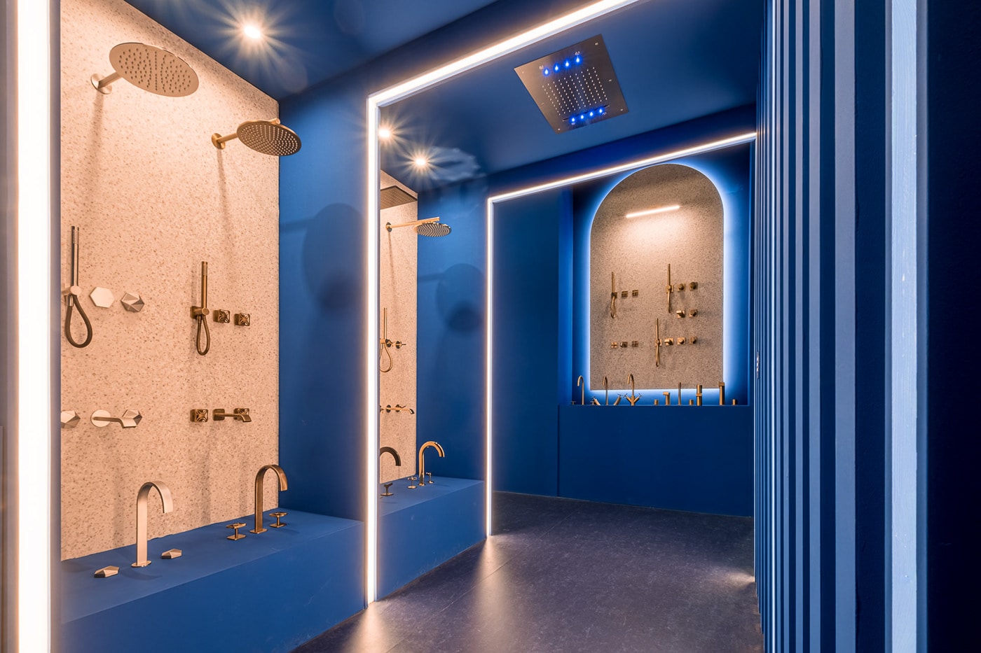
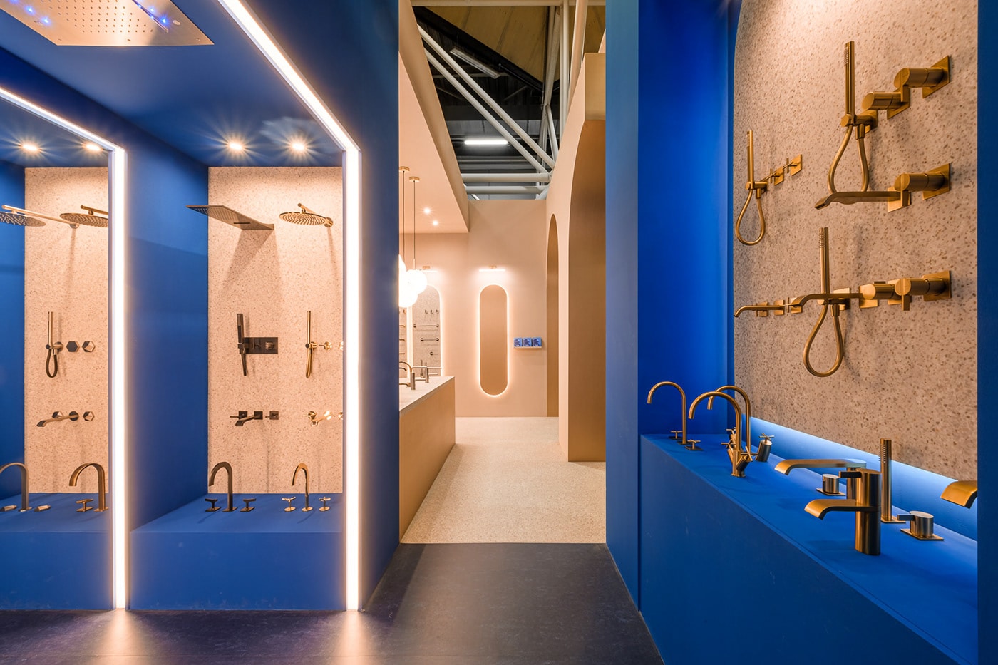
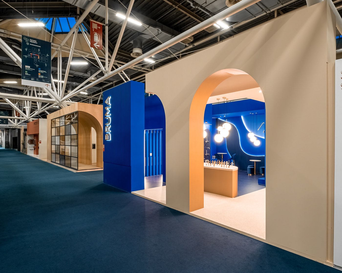
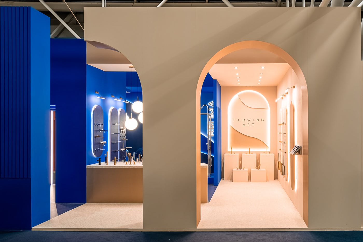
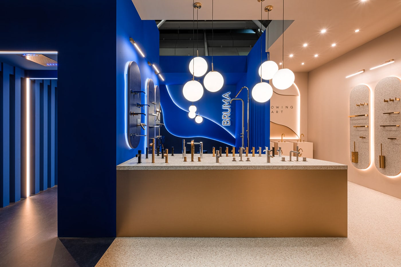
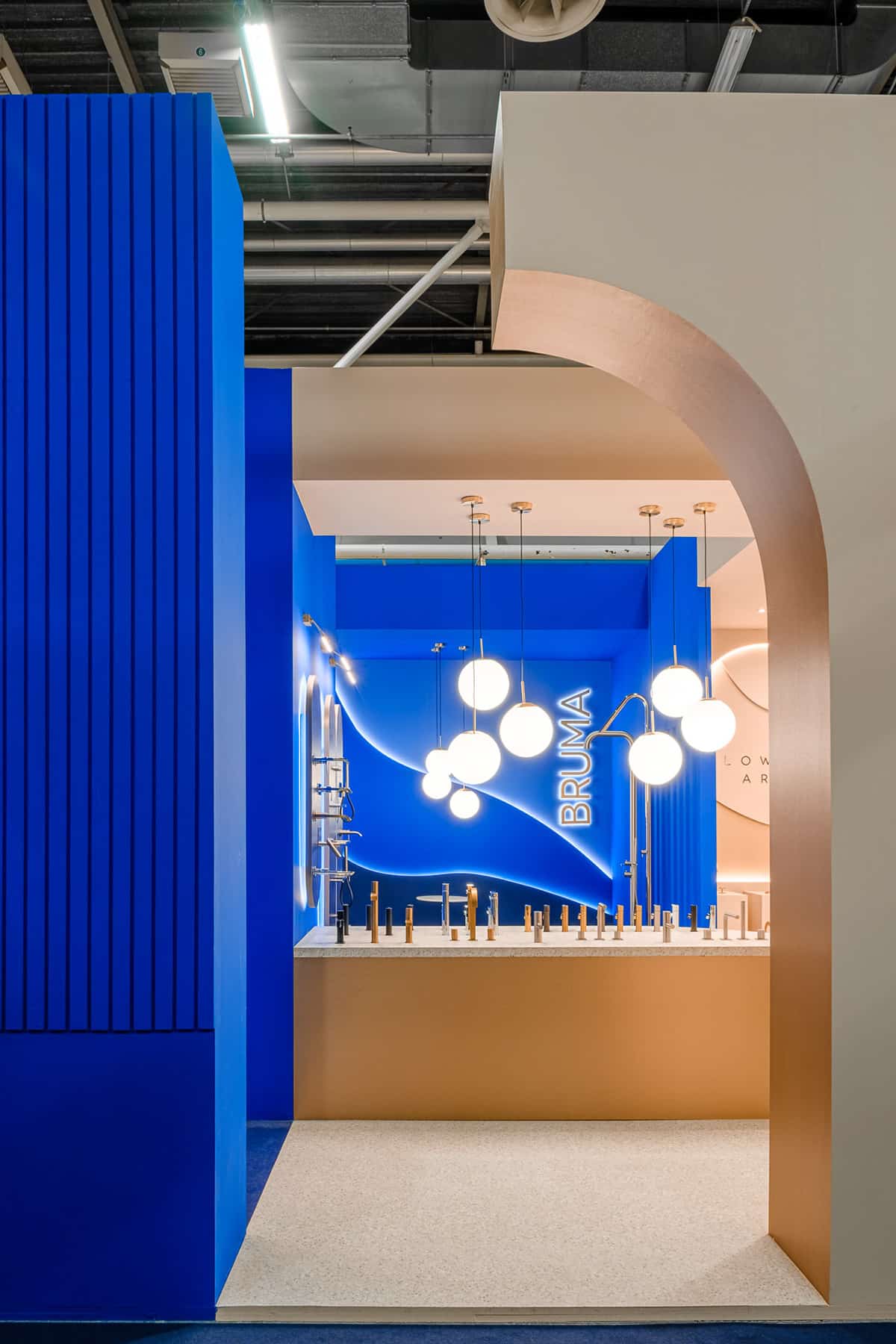
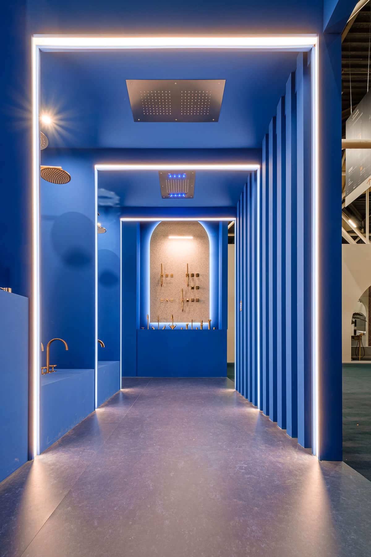
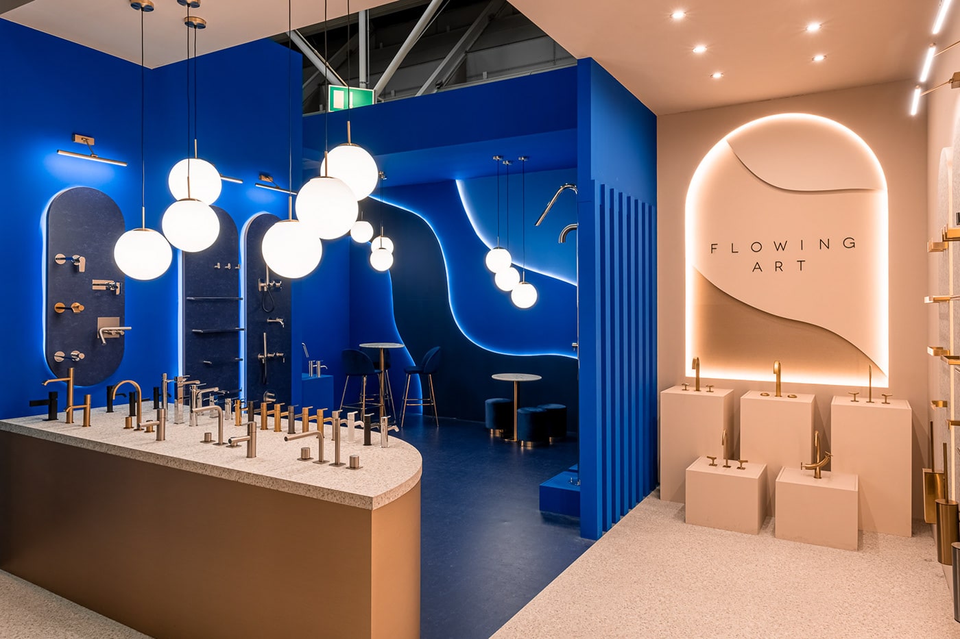
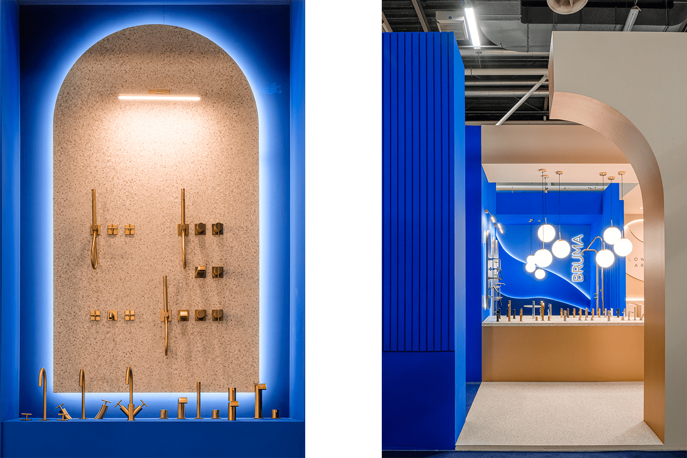
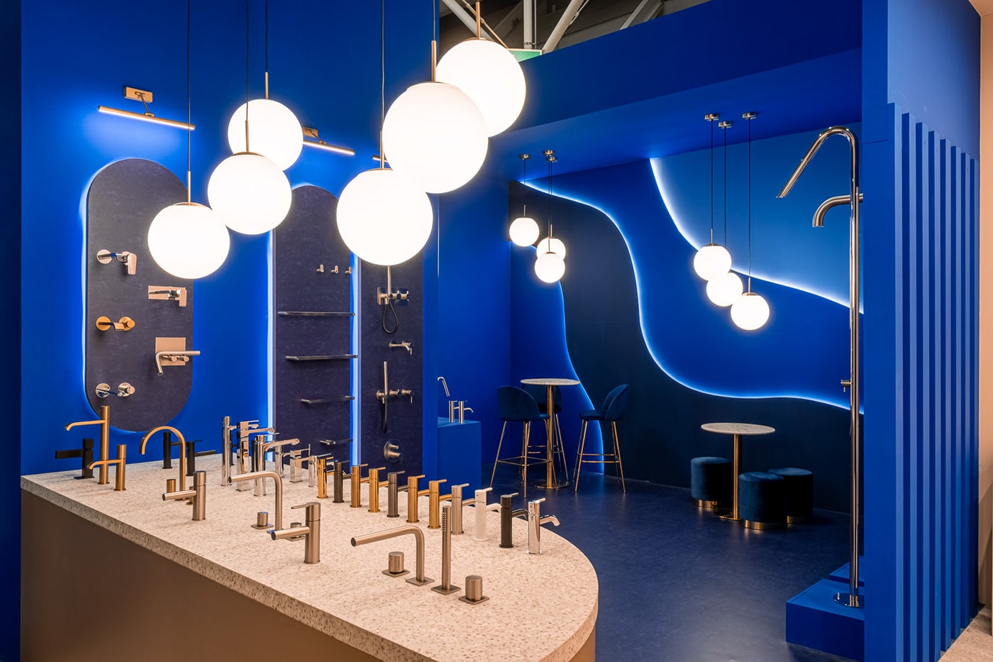
- Brand Exhibition Stands for Cersaie 2022, ISH Frankfurt 2023 and Salone Del Mobile 2026: service design, interior design, product distribution in space. Space organisation and circulation (exhibition spaces and immersive spaces), the definition of architectural structure, materials, dimensions and finishes, lighting design
- Brand Showroom: service design, interior design, product distribution in space. Space organisation and circulation (exhibition spaces and immersive spaces), the definition of architectural structures, materials, dimensions and finishes, lighting design, window display.
BRUMA: REBRANDING six decades of experience in TAP DESIGN
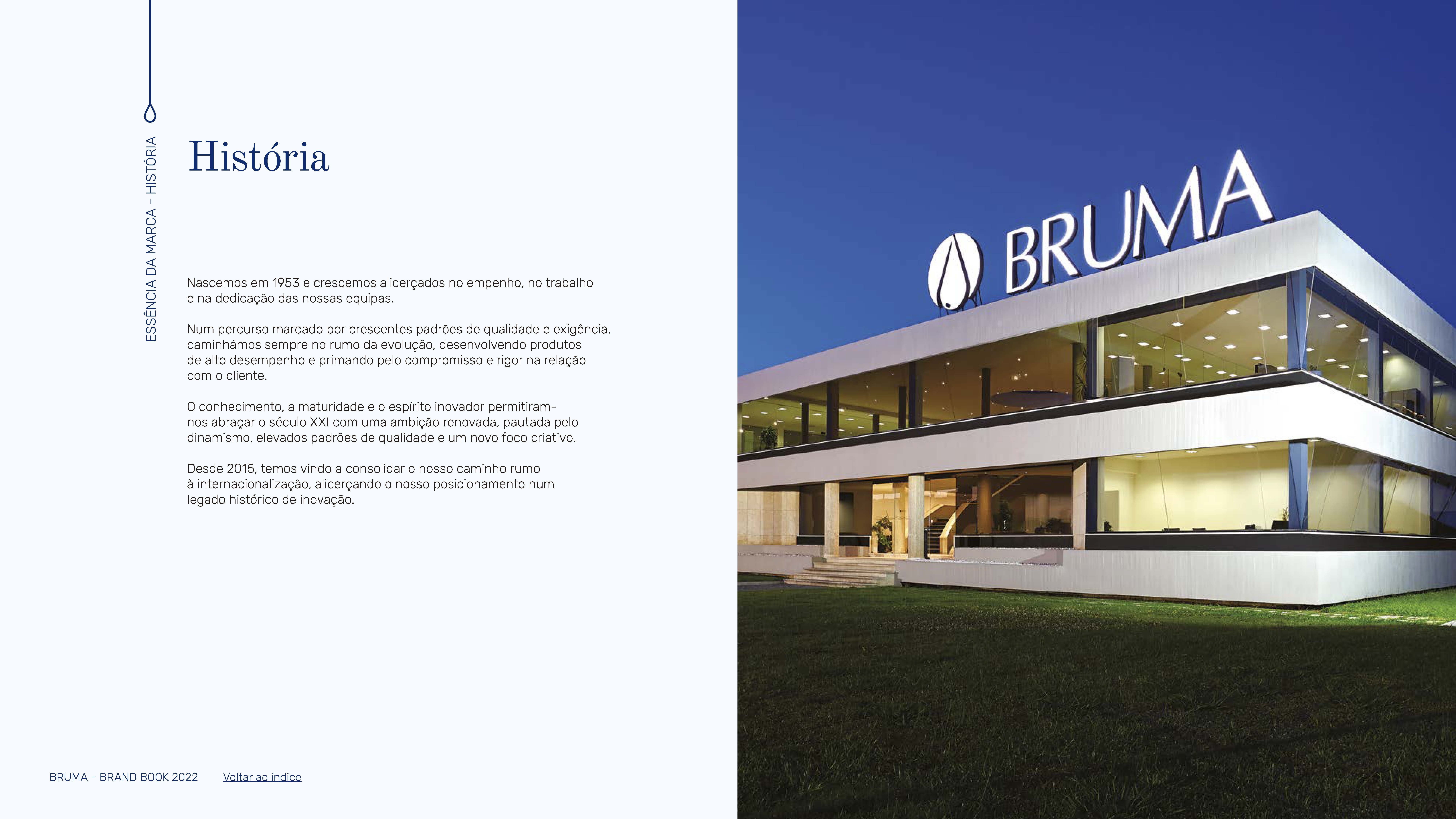
Bruma was founded in 1953 in Vila Nova de Famalicão, in northern Portugal. For more than six decades, this taps manufacturer has persevered through various social and economic shifts, navigating a landscape shaped by globalisation and rising standards of quality and market demand. The company thrived within a B2B model, catering to the mass market segment and reaching a performance peak driven by high-quality products and a strong commitment to fostering healthy customer relationships.
Over the years, Bruma’s teams accumulated valuable knowledge and experience, continuously nurturing an innovative spirit. This culture propelled the company into a new phase of evolution in 2012, when the brand was officially reborn, establishing itself as a dynamic industry leader with a renewed creative focus. From this evolution, the tagline Flowing Art emerged as a testament to Bruma’s brand commitment. Since 2015, Bruma has been investing in international expansion, striving to secure its place within a higher market segment.
the challenge: reaching out to the accessible luxury segment in THE TAP DESIGN INDUSTRY
This intention to shift the brand toward a new target audience led us to approach the website briefing with a broader and more strategic perspective. As part of this evolution, the Marketing & Sales Director shared the company’s vision to refine its marketing approach and reposition the brand, ensuring it resonates with an “accessible luxury” audience while supporting its growth and long-term objectives.
We proposed guiding Bruma through an introspective exercise of reflecting on its past and present, while envisioning its future, in order to lay solid foundations for a realigned marketing strategy aligned with their ambitious business goals. We believed that Bruma’s chances of success would significantly improve by undergoing a rebranding process, which would equip the brand with the tools necessary to enhance awareness and consistently build its reputation in the new market segment.
Bruma had been positioned within the mass market segment for years, but its visual identity and brand messaging were lacking in strength. The brand had grown organically over time and was not adequately structured to support the changes necessary to achieve the desired marketing repositioning.
As we delved into the discovery phase of the brand consulting project, we found that Bruma was a large, yet traditional business with many team members who had been dedicated to taps production for years. We visited the factory facilities and observed the brand’s experience reflected in the meticulous attention to detail at every stage of the production chain. We had the opportunity to meet the experts behind each specific task and engage in discussions with management and operations about the processes, products, challenges, and aspirations for the brand’s future growth. KOBU was there to assist in resetting the brand identity to facilitate this transformative shift.
For this project, we opted for a more focused approach by conducting a targeted stakeholder survey instead of the usual broader team survey. The Marketing & Sales Manager played a central role in providing insights into the brand’s values, vision, mission, and messaging, as well as its current challenges, expectations, and future aspirations. We also inquired about Bruma’s historical legacy, focusing on how it had embraced creativity and innovation since day one. This stage was crucial for understanding how Bruma’s values and vision were intertwined with the team’s working ethics. The most distinctive existing element was the “Flowing Art” tagline, which referred to the premium product line collection.
The brand required greater visual consistency and the development of a distinctive tone of voice. We focused on four primary objectives: revising, realigning, and reinforcing the brand’s identity pillars; highlighting the company’s strengths; creating a brand experience that would reflect the premium quality of Bruma’s products and services; and facilitating a swift repositioning into the accessible luxury segment.
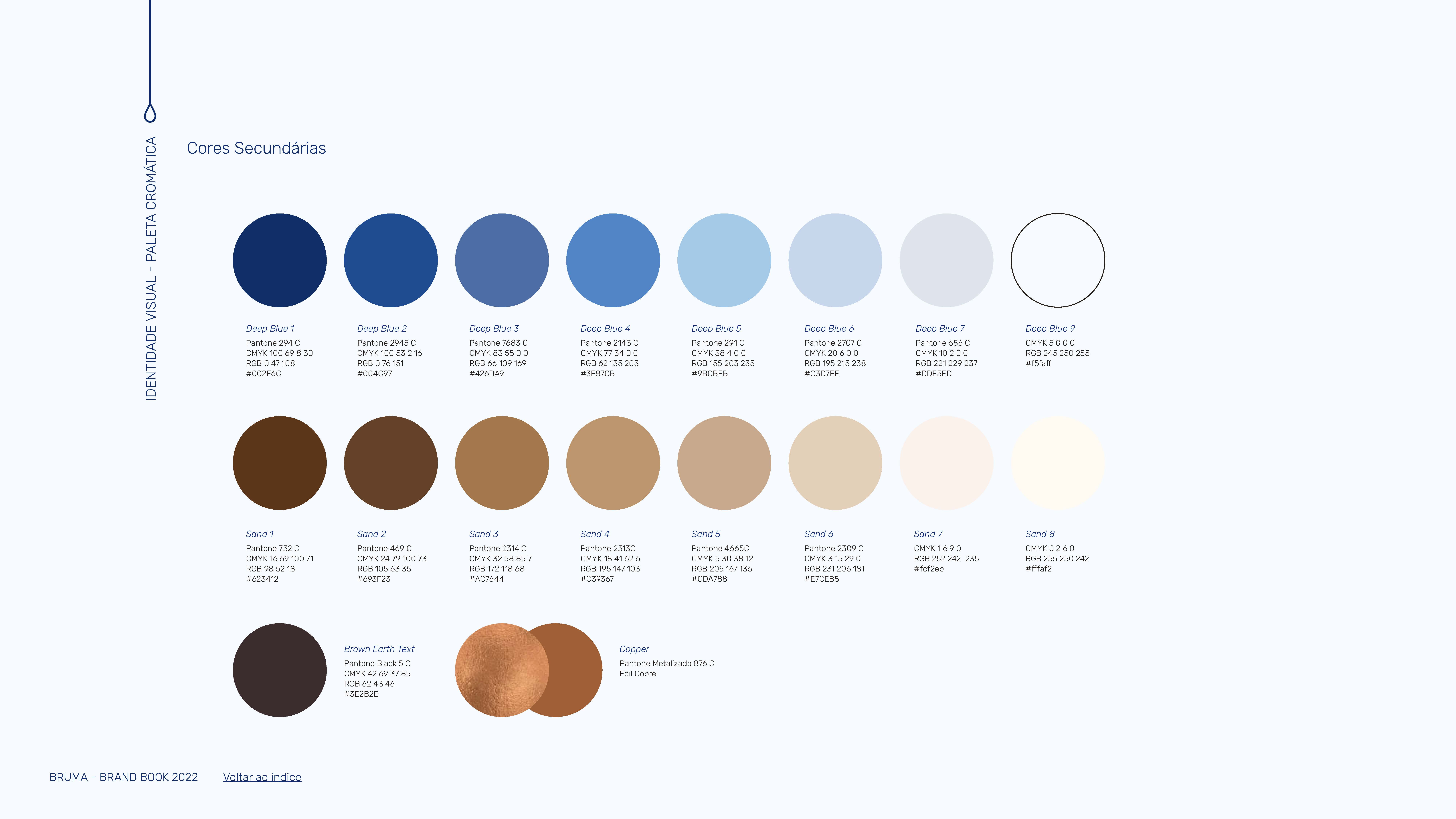
We created a visual positioning map to assess and align with the client on what “accessible luxury” entailed in terms of elements, colours, tone of voice, and the overall dynamics of the brand’s communication.
flowing art: materialiSing the core creative concept
Once the brand identity foundations were realigned, we proceeded to the crucial phase of defining the core creative concept—a key moment in every KOBU branding or rebranding process. As a branding agency that cherishes the power of storytelling to captivate people with concepts and ideas, we focused on crafting a narrative rooted in the brand’s core values and mission. This narrative was essential for uncovering the meaning and purpose behind the brand, which in turn supported a compelling brand message and a visual universe that effectively represented these concepts.
We brainstormed extensively with the information we had gathered, including concerns, historical context, and existing products and collections. The tagline became the focal point of our creative exercise. We zeroed in on the concept of immersion and the dynamic relationship between humanity and the primordial element—water. Delving into the mysticism of water’s fluidity and sacred nature throughout the ages, we considered representing these ideas through the mythological figure of the nymph. Her ethereal aura, femininity, and delicate beauty led us to Pre-Raphaelite influences and Renaissance-inspired oil paintings—a creative approach that vividly embodied the brand’s core commitment.
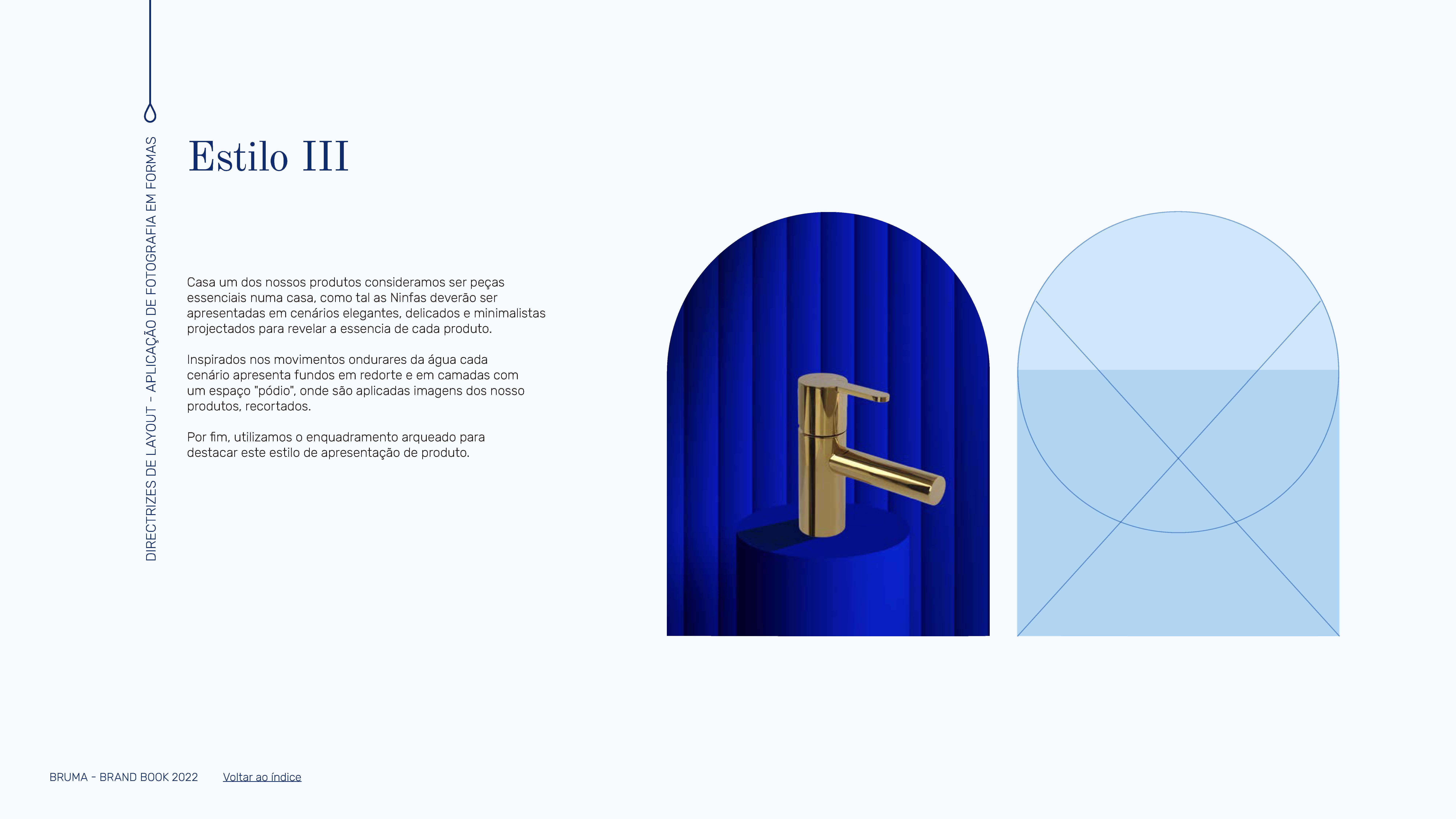
We took the enigmatic nature of the nymph figure and transformed it into artistic, abstract movements applied to digital elements, crafting brand visuals that immerse the audience in a fluid and engaging brand experience. Our goal was to convey exclusivity through a visual metaphor, portraying BRUMA faucets as nymphs—guardians and protectors of the precious primordial element that is water. Thus, the core creative concept of “Flowing Art” emerged, seamlessly connecting the ideas of movement and artistry.
We materialised the core creative concept across the visual universe and integrated it into the brand touchpoints.
fluidity translated into visuals
After defining the core creative concept and interpreting the “Flowing Art” brand tagline, we moved into the phase of materialising these abstract ideas into visuals. Our goal was to translate the fluidity of Pre-Raphaelite nymphs into a contemporary, abstract, and digital expression. We focused on the feminine aspect, representative of the BRUMA product, and viewed the nymphs as guardians of water. By deconstructing their fluid forms, flowing hair, and draped garments, we explored and translated their figurative and abstract representations into sequences of moving layers, reminiscent of immersion in water.
Our visual mood board and visual abstraction sequence:
For the logo and signature, we made a few necessary balance adjustments and introduced a new typography to enhance the signature. This new graphic composition would guarantee an elegant set, representing a more refined and cohesive alignment with the brand’s updated positioning. Previously, the icon was used alongside the brand name, but we felt it needed to stand independently in certain contexts and touchpoints to strengthen the brand’s identity and presence.
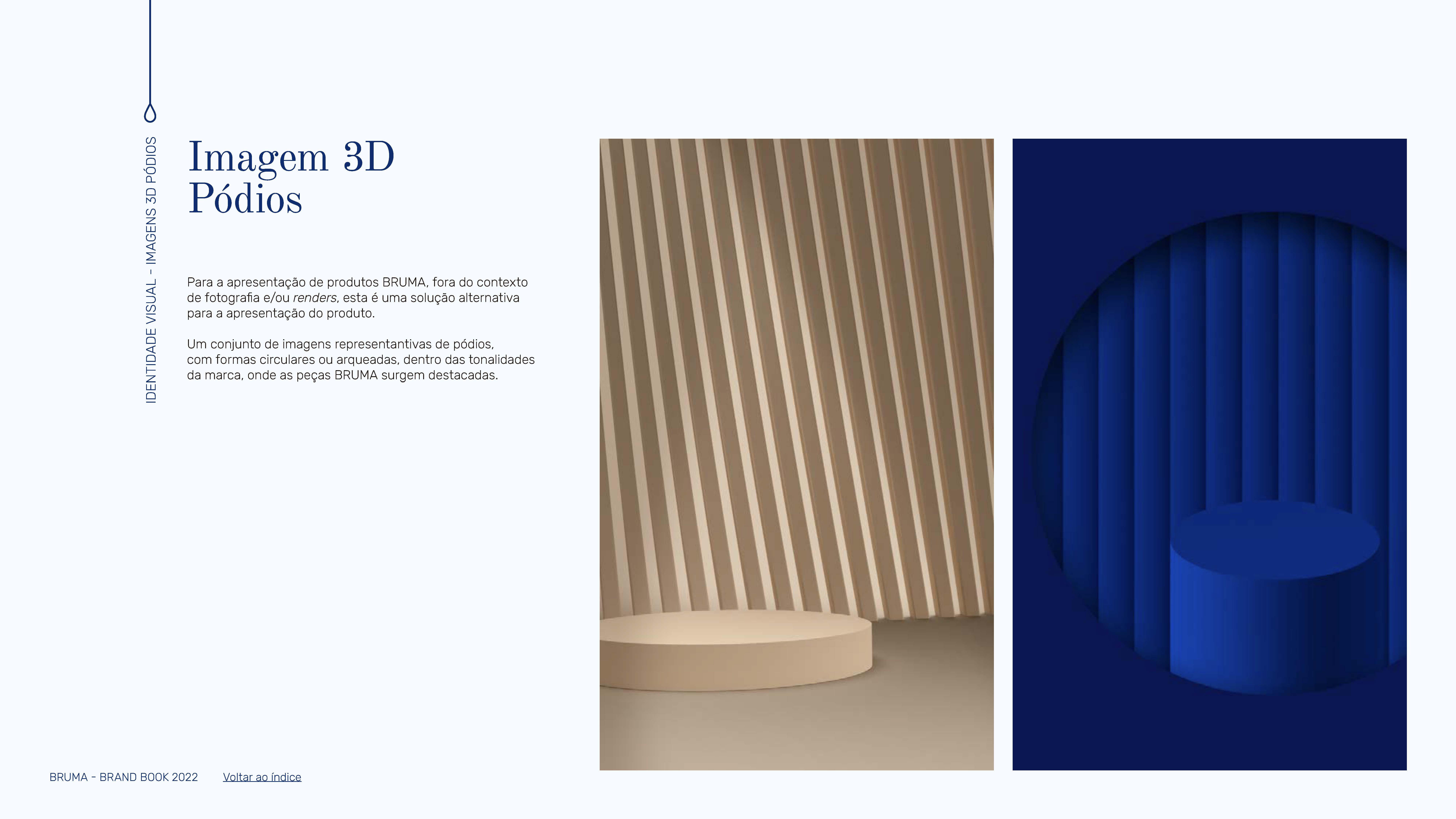
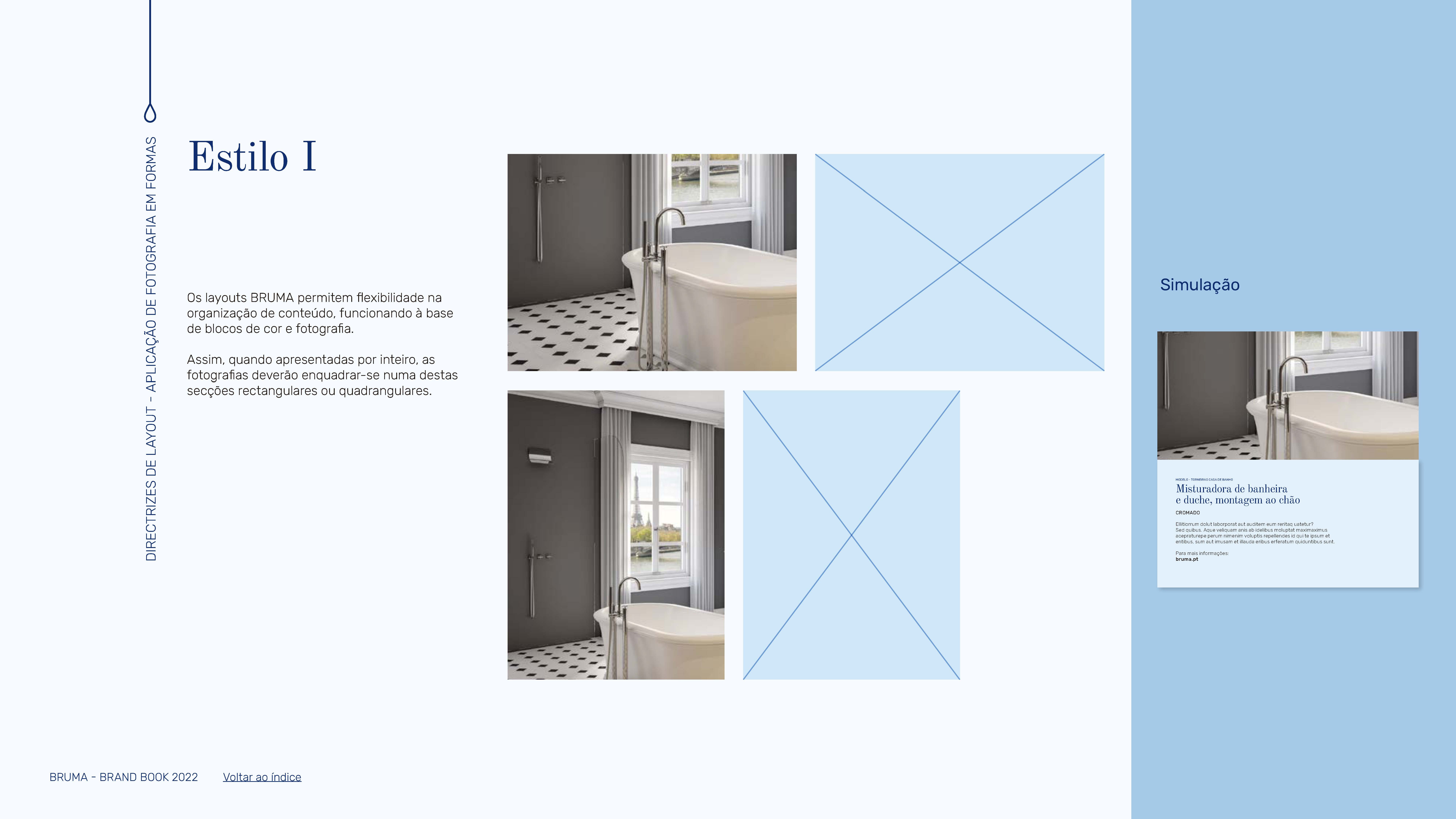
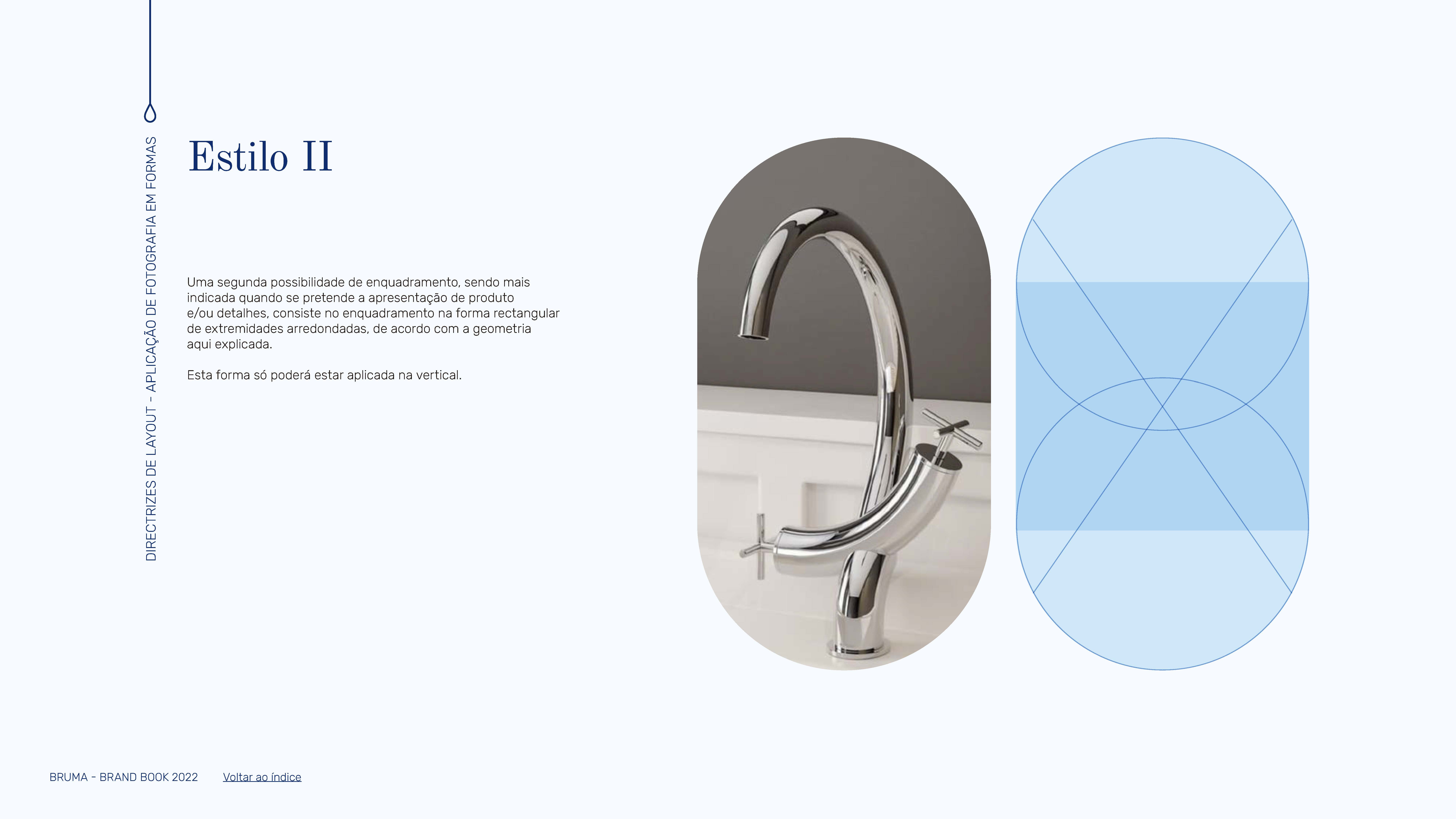
These steps laid the groundwork for developing the entire visual universe of the brand, encompassing everything from stationery and packaging to wall displays and product showcases on balconies.
brand in different spheres
The next challenge was to envision how the brand would translate into physical spaces. How does the brand manifest through architectural structure and interior design?
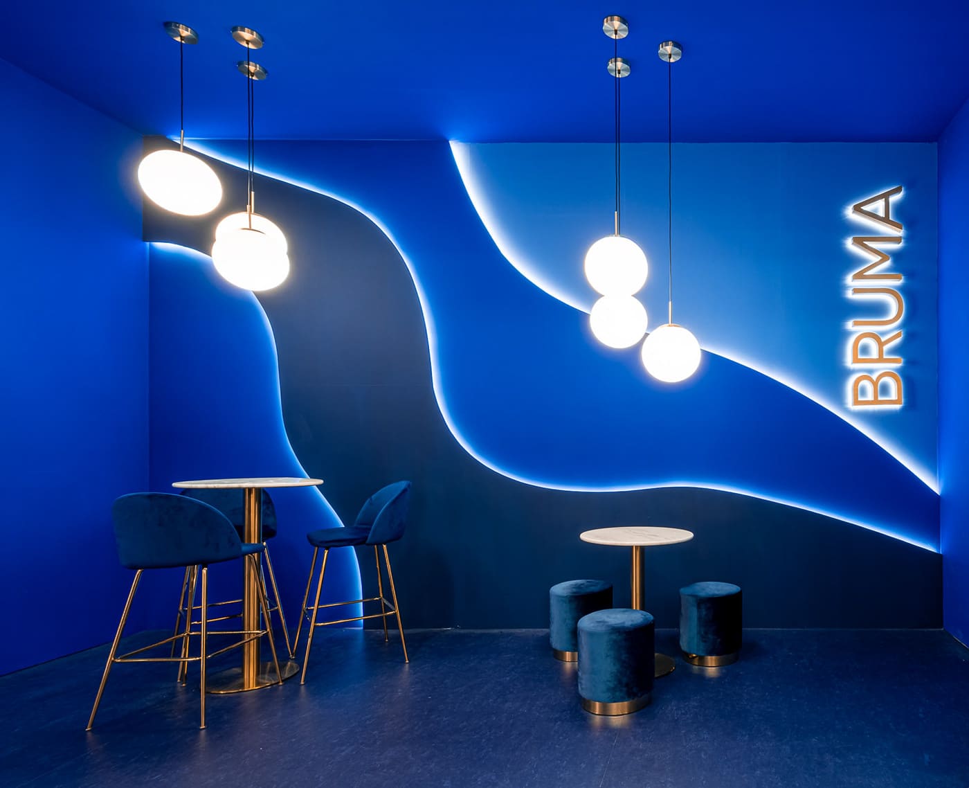
In order to figure it out, we collaborated with Taini Creative Studio to develop the architectural and interior design project. We integrated the brand’s aesthetic and key visuals, creating a circulation plan to craft an immersive brand experience. This experience was enhanced by the brand’s dominant colours, curvilinear lines, and arcades, all woven into a mythological narrative. The taps were envisioned as nymphs—ethereal and divine beings of nature—displayed on elegant, feminine altars.
The first brand space we created was for the 39th edition of Cersaie, the International Exhibition of Ceramic Tile and Bathroom Furnishings in Bologna, Italy. The second was designed for ISH 2023, held in Frankfurt, Germany. Later, in 2025, we also developed the brand’s own showroom at the company’s headquarters in a space that fully embodies the brand’s identity as a whole.
In 2026, we collaborated with architect Rita Perez from Studio Ekroo to design BRUMA’s brand new immersive exhibition stand for Salone del Mobile 2026, held in Milan, reaffirming this Portuguese brand’s growing international presence in contemporary design and innovation for bathroom spaces.
TAP DESIGN REBRANDING: from mass market to accessible luxury
Aligning with the client’s vision and securing their trust throughout the rebranding process was crucial for delivering a cohesive project that accurately reflects the brand’s goals and values. By focusing on essential aspects of the brand universe—strategic planning, tone of voice, storytelling, graphic and digital materials, product displays, and architectural design—we successfully revitalized Bruma’s brand positioning.
Seeing Bruma’s rebranding come to life and witnessing its positive effect on brand perception has been immensely gratifying for our agency, filling us with pride in the work led by our team of creative nymphs.
Awards and Recognition
In December 2022, the project received a Bronze Award at the Prémios Lusófonos, in the “Imagem Corporativa” category. In the same year, it was also distinguished with a Bronze Award in the “Lançamento de Produtos” category, underscoring its cohesive design language as well as the strength of its visual and strategic approach.
PROJECT TEAM
Creative Direction: Sandra Lopes
Project Management: Sandra Lopes
Brand Strategy: Isabel Evaristo
Brand Design: Brígida Guerreiro
Graphic Design: Vanda Pereira
Photography: James McCowan
Set Design: Brígida Guerreiro, Sónia Duarte, Pedro Santos
Architect: Rita Vicente
Editing: Brígida Guerreiro, Pedro Santos
Motion Design: Pedro Santos


