


Facialteam is an internationally recognized brand in the field of facial feminization surgery. They’re headquartered in Marbella (Spain) with additional clinics in Barcelona and Brazil. Over the years they’ve grown both as a company and as a brand and were able to create a meaningful relationship with their patients: transgender women.
Facialteam’s Marketing & Sales team reached out to us during 2020 looking to rethink their website. The Covid-19 pandemic impacted world travel and imposed a change on how they approached new patients which led them to revise their digital presence. They wanted an elegant website with a particular emphasis on a visually vast and striking gallery of pre-and post-op photos to display the astounding surgical results that they offer.
As we immersed into the project with the marketing team, analyzing all the nooks and crannies of the brand, some issues reached the surface: there was this notion that the brand communication was not reflecting the premium service that Facialteam delivers every day to its patients. There were indeed technical and usability issues regarding the website, but, most of all, there was a misalignment between brand pillars, visual universe and service level that needed to be addressed first.
Understanding the root problem was pivotal to drive everyone involved on a rebranding journey that would completely reveal a purpose-driven brand.


How we helped
- Brand Consulting & Strategy: brand identity (values, vision, mission, message), brand positioning, brand communication analysis and realignment
- Branding & Storytelling: Core Creative Concept and brand narrative; tagline and signature; visual universe: logotype adjustment, illustrations, iconography, typography, photography style, brand book
- Brand Collaterals: stationery; customer documentation (triptic folder); sales documentation (brochures, flyers, bags, etc)
- Service Design: customer journey analysis and redesign; contact form analysis and redesign
- Website & Digital Channels: user experience analysis; website design and development; template and guidelines for social media; newsletter design
- Content Production: copywriting; visual assets for website content and social media; photo editing
Facialteam: a purposeful brand
Facialteam as a brand was founded by Dr Luis Capitán and Dr Daniel Simon, about ten years ago, when they decided to maximize their medical and scientific knowledge and explore a medical field that was still unfamiliar at the time: facial feminization surgery. Their target audience was a specific niche, the transgender community, which added to the novelty of their project. Dr Capitán and Dr Simon invested their time and resources studying this specific medical field, developing innovative techniques and approaches to each particular area of the face and learning how to manipulate the bones in order to achieve the desired outcome: natural results and invisible scars. Along the way, they got to know many transgender patients with life stories of struggle, including many borderline cases of suicide mostly motivated by gender dysphoria and social non-acceptance.
Dealing with such cases brought the doctors and their team’s awareness of the difficulties this particular community faces every day and allowed them to understand the underlying identity problem behind every patient’s intent to get the surgery. Respecting each individual identity and only performing surgeries that preserve the patient’s identity became one of the brand’s unique selling points, adding to the superb medical results, impeccable customer care and overall understanding and support of the transgender community.
The interesting and inspiring roots of Facialteam continue to play a key role in their day-to-day activity. The brand makes a point of contributing to an informed dialogue around transgender issues, sharing science-based facts and empowering every transgender person struggling with social non-acceptance.
Facialteam is a fine example of a purpose-driven brand, and our goal with this rebranding was to highlight and maximize the potential of the three vectors: provide, share, and endeavour [1].

THe CHALLENGE:
The biggest challenge of this project laid in the immense unexplored potential of Facialteam. Going through the extensive work the company has been doing over the years, pinpointing the key issues that needed to be tackled and transforming those insights into an actionable set of ideas and visuals that could efficiently translate the vision of Dr Simon and Capitán.
We thought we knew our brand. We didn’t.
Simon Beekman, Marketing Manager at Facialteam Group
THROUGH THE NOOKS AND CRANNIES
Our main goal when starting any project is to understand how to accomplish it ensuring we are expanding and aligning how the brand is perceived, both internally (company) and externally (audience). The process for Facialteam included some long hours to generate a holistic view of the brand.
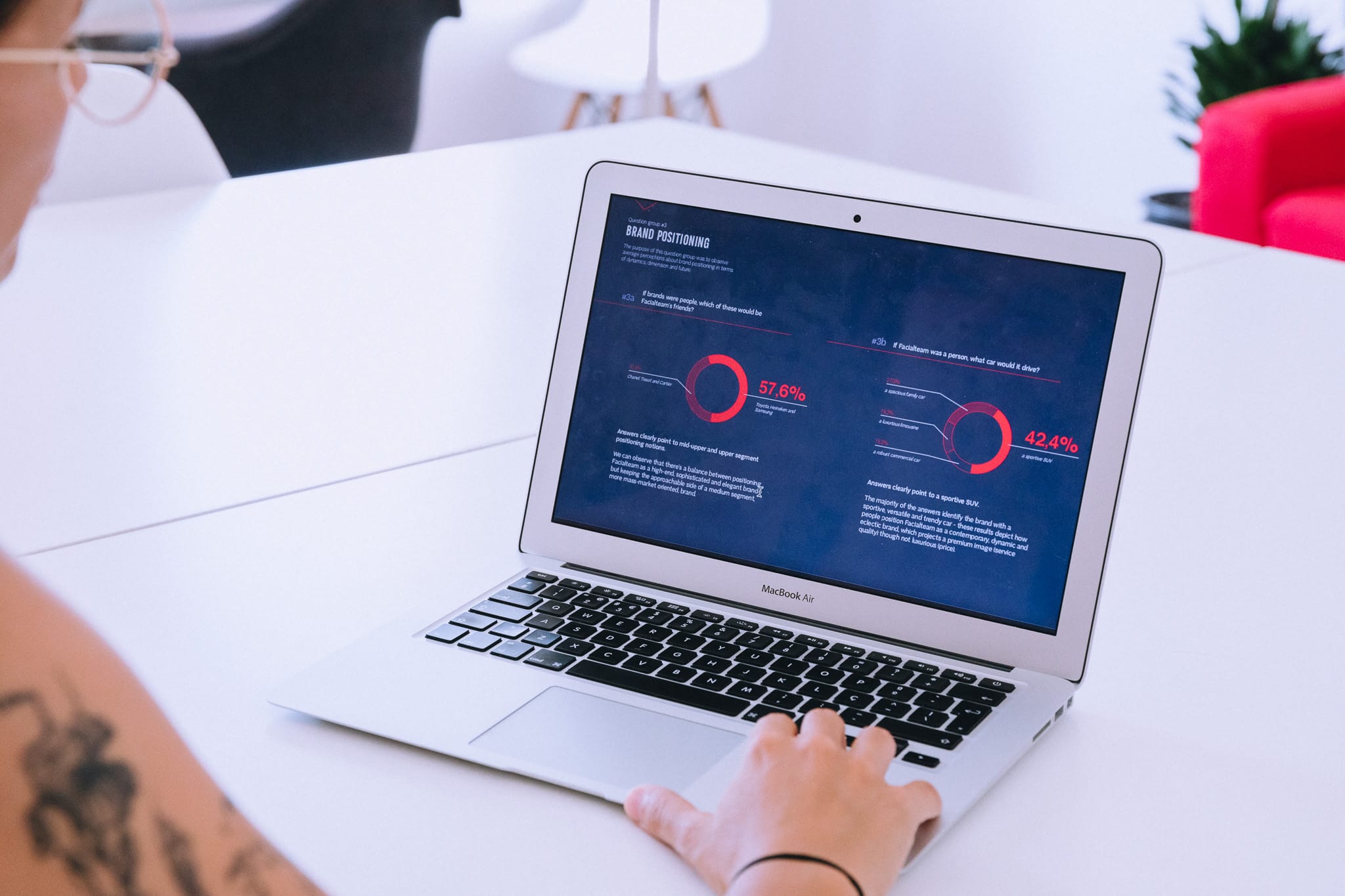
- Analysing a brand survey answered by 30 members of the team
- 1-on-1 interviews with 15 team members, from founders to operational staff
- Going through written testimonials of patients
- Social listening on digital channels, including Youtube content, and comments, among others.
We needed to know more about the brand’s audience. This is a niche brand: they perform facial bone surgery specifically for transgender women who wish to feminize their features.
In order to evaluate how the brand communication could meet this specific community, we needed to get to know it and understand its characteristics, needs and language, but especially the struggles and the underlying value that this medical procedure represented in people’s lives and identity.
The gathered data and insights born from our own analysis were put together in a Brand Consulting Report that guided the creative process from then onwards.


An audience or a fandom?
Getting into close contact with the reality that the transgender community faces every day made us realize even more the importance of raising awareness of the need to bridge the still-existing gap and embrace diversity. We learned that Facialteam’s work with facial feminization surgery was a matter of individual identity alignment and social acceptance; for many of their patients, getting facial surgery also meant a way of breaking free from isolation and suicidal thoughts.
Going through the patients’ testimonials was an emotional exercise: we found so many stories of resilience and revelation from people who, many times for years, struggled with non-acceptance. Testimonials showed that they found in Facialteam a group of professionals who could not only help them achieve the facial features they identified with but also provide an understanding and caring haven where they could share their experience with like-minded people.
The brand has a legion of faithful fans. Fans from the heart. Because Facialteam has the strongest asset any brand can have: its team’s deep compromise with the mission and genuine care about the transgender community. The level of empathy we found in each and every person we interviewed during the brand discovery stage was impactful. We could feel how deeply involved everybody is with the job at hand. In every step of the customer journey, Facialteam wants to deliver the best service, the closest support, the most understanding hand and, most importantly, second-to-none unexpected surgical outcomes.
Realigning concepts and visuals
The brand’s service was premium from top to bottom, having worldly renowned doctors, top surgical techniques, a committed and motivated team and even a community that praised and advocated for the brand. The brand’s pillars were also very clear in the founders’ minds.
They started the business to dive into the unexplored surgical area of facial bone feminization surgery; however, as they got to know the transgender community through each patient’s personal story, they understood the social stigma and the life impact that Facialteam’s work had on the transgender person. Today, the brand is more than a business and holds a greater purpose: Facialteam allows transgender people to endeavour on a journey of letting their inner selves shine through their facial features.
So why couldn’t we perceive that through their visuals and communication? The message was there but didn’t reflect the full circle of care and support that sustained and enriched the medical service. The inconsistencies were all over their brand touchpoints and showed that, despite its success as a company, the brand had grown organically over the years with no clear backbone.
From key insights gathered during the brand consulting stage, we defined core values and three solid pillars for the brand’s vision and mission. We were also able to draw a picture of the target audience from patients’ testimonials, and we summarized the brand’s message according to the brand’s beliefs and purpose of helping the transgender community through each patient.
The brand’s promise was restructured along 3 different axes:
- Delivering the most reliable results in facial feminization surgery;
- Providing a thoughtful, dedicated and caring experience;
- Empowering the transgender community.
This promise is supported by grounded values around empathy, ambition, reliability and expertise.
Now we only needed a Core Creative Concept that could bind all of this together coherently. That’s when “The Revealing Self” was born.

Facialteam’s Core Creative Concept came to light when we understood that the brand’s purpose is to reveal the true identity of transgender patients after they endeavour a path of inner and outer struggle, finding help and support in Facialteam. Defining this new concept unlocked a visual universe that is vibrant and colourful, that embraces diversity and speaks to the heart of its audience with an approachable and understandable tone of voice, providing relevant, educational and enlightening content to the transgender community as well as to the general audience.
Bringing a Core Creative Concept to life
As a branding agency that believes every brand should grow upon a meaningful purpose, we saw in Facialteam a clear example of how this can truly make a difference. We materialized “The Revealing Self” core creative concept across the visual universe and integrated it into the brand touchpoints.
In the light of its core creative concept, Facialteam’s message was also synthesised into a tagline: “Your Revelation Journey”
The revelation line became a key visual element within the brand universe as it helps tell each patient’s story before, during and after their experience with Facialteam. It is a simple, uninterrupted line that represents the full journey of the patient with the brand, imprinting the patient’s own story onto the brand. It was further expanded into a line-based illustration style that enriched the visual universe. We also needed the brand to visually portray the human and empathetic side of this company that empowers transgender women: the solution was to create a set of 20 continuous illustrations depicting real Facialteam patients that are now an integral part of the brand’s history and visuals.
logo and Colour palette
A key decision in the project was whether to maintain the brand’s logo as it was or change it. It was redesigned in 2020 by designer Jesus Gilabert, and we went through several iteration stages with the marketing team to understand if changing it was the way to go. In the end, we kept it and expanded the visual universe around the core creative concept. The brand’s colour palette also needed to become more versatile and, above all, convey the empathy that was lacking in its former version: the pink hues were adjusted, and we added vibrant versions of orange, blue and purple to it.
Facialteam’s cUSTOM TYPEFACES:
FT Headline™, FT Text™ and FT IconS™
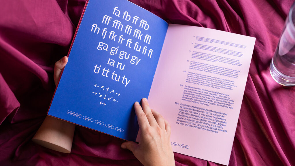
Building a diverse and rich brand universe for a company with the level of service that Facialteam provides to transgender women required us to step up the game, and it was very clear that we needed to design custom typefaces to imprint this sense of uniqueness on Facialteam. After all, a custom typeface’s main goal is to reveal the brand’s true identity. Brígida Guerreiro created three different custom typefaces: FT Headline™, FT Text™ and FT Icons™.
- FT Headline™ is a digital typeface designed to be exclusively used on titles. Its grand and elegant design is a tribute to transgender women, visually exploring the sans serif charismatic beauty. Its weight contrasts best with the embedded humanist style and allows the message to stand out.
- FT Text™ was created specifically for subtitles, body text and descriptions/captions. It is a hybrid between the grotesque and humanist styles, resulting in a perfect match for readability. Additionally, it offers a set of basic and special ligatures allowing sublime typographic compositions that perfectly suit subtitles.
- FT Icons™ is a font designed to feature Facialteam’s iconography, allowing the team to easily apply the brand’s icons across print and digital touchpoints.
The Facialteam custom typeface project received awards and recognition, reflecting its role within the brand’s visual identity:
Transform Awards Europe
– Best use of typography – Bronze Award
– Best visual identity from the healthcare and pharmaceutical sector – Highly commended
Behance
– Featured In Typography — 07/31/2022


Walking through the brand experience in the patient’s shoes
One specific aspect of our approach is understanding the brand experience throughout the customer journey, either online or offline. In our perspective, a brand must deliver what it promises, so if it claims to offer a premium service, it must be at the top of its game at every touchpoint. In fact, Facialteam had already identified bottlenecks across the workflow, and we tapped into those pinpointed aspects during the individual interviews to later explore and enhance them in the light of the rebranding process.
From e-mail tone of voice and mail signatures to social media content (posts, stories, youtube videos), to newsletter design and automation, landing pages and the overall experience throughout the website, we made a thorough evaluation to improve these assets.
A particular focus was given to the Before/After Cases section of the website – the main place where patients can understand the outstanding results they can achieve with facial feminization surgery.
We worked closely with the client to improve the user experience for their important lead generation source: the contact forms on their websites, to make them more agile regarding information flow. We also eased the documentation and photo uploading process and gave some suggestions for software to assist with the consultations’ schedule. The new contact form was designed to be fun and engaging instead of clinical and discouraging. The email chain that follows every lead was also analysed to automate part of the process. Other digital assets included the newsletter, which we redesigned according to the new brand visuals and provided insights regarding the type of content that would be more suited to share with the mail marketing tool. We also developed different social media templates according to the type of content the brand creates.
In the offline plan, we redesigned the brand assets delivered to the patient at every stage of the customer journey. We dove into the mandatory medical instructions to collaborate in its reorganisation.
The My Revelation Journey folders are aimed at optimising that brand touchpoint by giving it a dual function: on the one hand, inform and advise about the medical procedure, surgery scheduling and all mandatory instructions; on the other hand, contribute to the brand loyalty stage of the customer journey. To achieve this goal, we revised all content to include aspirational content based on the brand message to make the experience even more close and supportive.
“The Revealing Stories” is also a new content segment that was suggested by our team to create a new way for transgender women to learn about the life stories of patients with Facialteam.
Head to facialteam.eu to see the brand alive and kicking or learn more about the redesign of Facialteam’s website on our Behance.


Measurable Results and Business Impact
One asset that we worked on very thoroughly was the Facialteam website. We fully redesigned the user experience and improved how they generate new leads, specifically how new patients schedule consultations with the surgeons.
As a result, they saw an increase of around four to five percent in lead conversion, which represents a significant improvement. Another metric that improved substantially was time on site. The bounce rate decreased from around 80% to approximately 40%, which is a very positive outcome.
Patients are now spending more time on the website, learning about the technicalities of facial feminization surgery. This has had a strong impact on their sales process, because by the time patients reach the sales team, they already have a wealth of information provided through the website. As a result, they are more informed, more engaged, and more immersed in what the brand has to offer.
Overall, this represents one of the major changes achieved since we started working with Facialteam, and it stands out as a highly successful project.
You can learn more about these results in the interview Nuno Tenazinha and Isabel Evaristo gave during the Transform Awards Europe 2023 Ceremony, held on 22 March 2023.


A COMPREHENSIVE BRAND BOOK TO BRING IT ALL TOGETHER
The Facialteam’s values, mission, vision, promise, message and visual universe were systematised into a comprehensive Brand Book that lays the brand foundations and guidelines for visual communication namely: logotype applications and examples, colour palette, typography, key visuals and illustration style, claim, among others.


Awards and Recognition
As of March 2022, Facialteam had been slowly but steadily implementing the new brand. Later that year, in October 2022, the Facialteam website design (made by KOBU Agency) received international recognition at the CSS Design Awards, winning a Special Kudos Award, alongside the Best Innovation Award, Best UI Design Award and Best UX Design Award. These distinctions highlight the quality of the UX/UI design, digital innovation and user-centred experience developed as part of Facialteam’s healthcare rebranding.
In 2023, KOBU Agency was recognised at the Transform Awards Europe for Facialteam’s branding project. The work received a Bronze award for Best Use of Typography and was Highly Commended in the Best Visual Identity category within the healthcare and pharmaceutical sector.
The project has also been gaining specializsed media attention, with featured on Behance, Abduzeedo, Indústria Criativa and Domestika.
Built to last.
Rebranding Facialteam was a 12-month-long process that made us engage deeply with this team of surgeons and their marketing department to understand how exactly to position the brand. The result is, we believe, a vibrant, dynamic, premium, highly empathic brand that now has strong pillars to keep growing over the next decade. We’re thrilled to be part of this process and eager to keep a close eye on how the brand evolves.


And given that Facialteam is built around empathy and the team members’ relationships with their patients and partners, it is only natural that we end this case study with two testimonials that really make us proud.
“When I first contacted KOBU and explained we wanted to renew our companies’ websites, I received several questions about the brand and audience we were targeting. I was struck, not able to answer many of the questions I was asked. Nuno explained and recommended starting with a branding process. What initially felt like upselling, looking back, it has been the best decision ever. The exercise of the rebranding of Facialteam forced us to take a step back, zoom in on our audience and the way we wanted to position ourselves. The discovery phase gave us insights into where we wanted our brand to be and how we thought it was conveyed to our audience – there was a clear misalignment between our conception and reality. Although we were really eager to get started on the development of the new website, we had to be patient. Before the brand identity and visual universe were worked out, we had to sit tight. Once we received the initial visual universe and first drafts our minds were blown. KOBU’s team managed to perfectly grasp our requirements, wishes, needs and desires in a dynamic, outside-the-box way. Sparring about the many custom features we wanted to be implemented on the website was fun due to their willingness to think along with us and their honesty to now and then say “stop, this is a bad idea, let’s do things in a different manner”. Both the process and the final outputs have been and are a great aid in maintaining the website and defining, designing and developing new assets for our efforts to put the company on the market. The brand book clears out many doubts and allows us to make informed decisions, rest assured they are aligned with the brand and our desired audience. I want to thank both Nuno and the entire team for their great efforts, patience and availability during our work together. Congratulations to all of you for exceeding all our expectations and delivering a website that perfectly reflects our values.”
Simon Beekman,
Marketing Manager at The Facialteam Group
“We have worked with KOBU for Facialteam’s complete brand strategy, and I can highly recommend them. Our first contact with KOBU was a request for a new website, and the reply we got from them blew our minds: it was a class on how a brand’s digital presence should be built in order to have consistency and reach the correct audience. That completely changed the scope of the project and became a larger study of our business and brands, and the new website was just one of the many outputs we had from the project. Additionally, I recommend any company reaching out to Kobu to let them help you prepare your briefing because at least in our case, being open to hearing them out (and not sticking to what we thought we needed) and letting them free do their wonderful work was the key to the great results we had. “
Gabriel Smirne
Sales and Marketing Director at the Facialteam Group
PROJECT TEAM
Creative Direction: Nuno Tenazinha
Art Direction: Brígida Guerreiro
Brand Strategy: Isabel Evaristo
Project Management: Marta Gouveia
Brand and Type Design: Brígida Guerreiro
UX/UI Design: Daniel Gomes
Web Development: Cátia Dionísio
Motion Design: Pedro Santos
Photo Editing: Liliana Guerreiro
3D Design: João Alves (COLA Collective), Diana Neves and João Ventura
Sound Design: Ramiro Mendes