When EO.workspace (EOW) got in touch with KOBU for a commercial ad, we got to know a young and dynamic team of professionals with a clear idea of what they wanted – a promotional film that could depict their product’s USP: efficiency, affordability and security. They even had visual references of what they envisioned their video to be like – some sleek, elegant and clean graphics that could immediately convey technology and dynamism.
As usual, we first listened, asked questions, took notes… and then asked some more questions. We kicked off the project with our client’s expectations between hands, considering the visual references and the objectives we were given. EOW is a corporate brand, a B2B business, and the client was leaning toward a proven formula, what we would call a safe bet. Carried away by those guidelines, we started to outline a script, but it didn’t take much for our restless minds to begin questioning… Clean and sleek graphics? Why? A corporate brand? A B2B business? Come on, it’s all about people, people! Will that grab someone’s attention? It has to make an impact! And so began another wild ride to come up with a very unlikely commercial ad.
How we helped:
- Creative and Art Direction: core creative concept; narrative and storytelling; script writing
- Brand Strategy: insights and recommendations for brand activation; exploration of brand concepts
- Film Production: copywriting, storyboard and animatic, film production: management of film crew/talent (DoP, gaffer, make-up artist and hair stylist, actor), sound design, motion design, set design, wardrobe
b2b vs b2c: a communication dilemma?
Enterprise Open Workspace, or EO.workspace, is a company that offers other companies the ability to access applications, desktop and online services in one single platform through a streaming service. They wanted to raise brand awareness through a commercial ad that could present their product to the market and generate leads as a central piece of their marketing plan.
Aware of our previous projects with film campaigns, EO.workspace contacted KOBU Agency requesting a film to focus on their product’s strengths: efficiency, affordability and security. Considering their target audience, this film would not only serve its purpose on digital platforms but it would also be broadcasted as a TV spot. Our briefing included a series of visual references related to a universe of corporate brands in the tech segment, from which Apple stood out. Here is a recurrent situation: many brands from the tech sector (but not only!) tend to look at Apple’s brand identity and communication style as a beacon of success. But theirs is not a one-serve-all formula – one must recognise dimension, context and other specific aspects that will decisively influence a brand strategy.
After receiving EO.workspace’s briefing, the KOBU team gathered for the kick-off meeting and started to analyse options, taking our client’s visual references and building up from there – a motion graphics based video with fluid elements (a line, perhaps?), putting a human at the centre of the narrative and complementing with a piece of pungent (maybe classical?) music would serve the purpose of depicting a brand that is agile, solid and rigorous. Ok. We were meeting the client’s requirements… like a checklist.
Of course, something felt off!
After a couple more discussions to digress on ideas without getting to that “Ah-ha!” moment, we realised we were pushing a recipe that would not distinctively present our client’s brand. EO.workspace would be another fish in the sea of corporate brands. This segment tends to walk a safe path in communication. We see the blues and greens and the serif fonts in their identities; we see their ads with people in suits with inexpressive smiles and standard handshakes trying to convey reliability, consistency, trustfulness, experience, etc. As a consequence, corporate brands’ identities and communication tend to feel already-seen and dehumanised. The reason may be that B2B communication is observed as being very different from B2C communication. But is it? After all, decision-makers are humans. And humans like to feel wow-ed!
To prove our point, we dove into research and found some fantastic examples of advertising that use humorous and unlikely visual metaphors – our favourite was this one! This ad uses a fun and catchy mood to present a service that would otherwise reach the audience in a more descriptive or even boring way. No one wants that, and big brands and agencies have already understood that the public appreciates and engages more naturally with this type of advertising. It’s only human!
core creative concept and narrative: the power of visual metaphors
With this in mind, we decided to approach the project with a new perspective and came up with an idea for the ad’s Core Creative Concept. We intended to use visual metaphors to create three scenarios representing the product USPs: efficiency, affordability and security. We put ourselves in the shoes of a potential EO.workspace client and designed our character: the man in the suit, the decision-maker. What struggles does he go through daily? Where can we find him? How can EO.workspace help him? We put him in different working environments, and then we threw at him all the problems, constraints and difficulties he would face throughout the day only to present the solution to all those troubles: engaging with EO.workspace. It’s simple and straight to your face, but we had to make it pop!
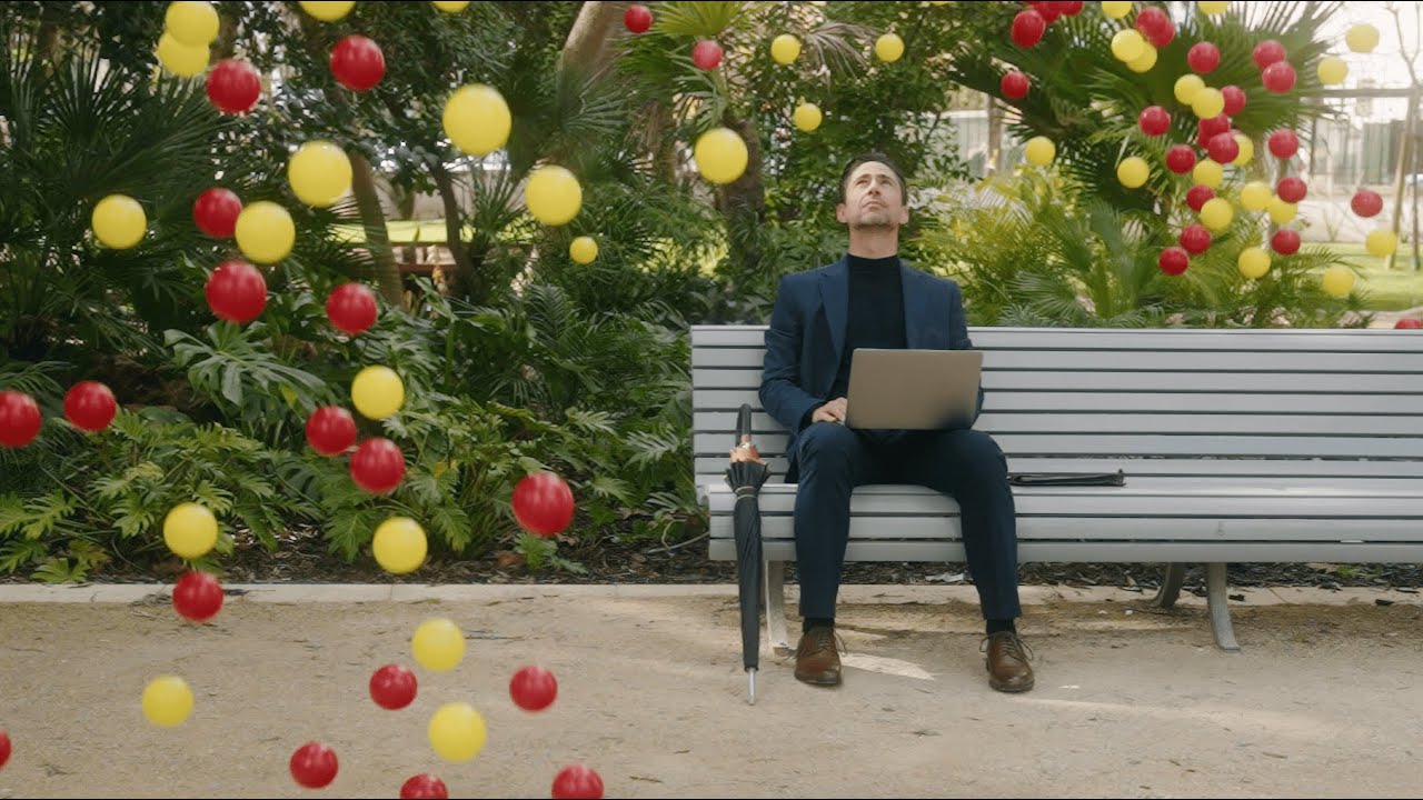
Since EO.workspace is a streaming service, it is available anywhere, so our protagonist is seen working in a garden, in a pool, and, of course, in his office. In each of these scenarios, problems kick in in different shapes: in the garden and the pool, they appear as a mass of coloured balls either raining from the sky or covering the water, and in the office, it’s a wind whirl of fleeing money. In the face of each stressful situation, the decision-maker finds a way out as he proactively chooses EO.workspace by pulling out the umbrella, grabbing the buoy or pressing the escape button.
The money wind whirl, the yellow and red balls flood and how they all suddenly invade the protagonist’s context is a visual metaphor for all the problems’ volume and unpredictability to which the protagonist is helplessly vulnerable. He finds himself in three different places that represent situations of low efficiency (pool), insecurity (garden) and lack of cost control (office), precisely three aspects in which EO.workspace’s product delivers successfully – Sometimes, the biggest challenges are the easiest to overcome!
What a leap from planning a motion graphics-based video to developing a whole creative narrative that uses visual metaphors to sell a product! We were super excited about this new idea and wanted to jump into the production stage ASAP! However, we still needed to collect our client’s feedback on this unlikely approach to the initial briefing. Would they be on board and follow through with our uncanny proposal?
Luckily, we have the best clients! EO.workspace wanted to understand the concept and its details, and we all agreed that we were taking a less travelled path. Still, it would definitely result in a distinctive and eye-catching commercial ad.
from concept to production: let’s go!
The pre-production and production stages are always a rollercoaster! We briefed our partners – one big shout-out to all of them, who immediately loved the idea! – and went to repérage together. The initial script had to take some turns as we had to adapt the locations. We were filming close-ups of the action and wide shots to frame it, so dimension was an important aspect, but we also wanted to control the space. Also, we were somewhat dependent on the good willingness of the weather Gods – who’s worried, right?!
The staging was challenging as we wanted to recreate detailed settings where objects would have to fit the dynamics we had in mind. One of our goals was to balance the outdoor and indoor moments of the video to make them look and feel seamless. We listed the props essential to tell the story – the suit, the umbrella, the fins, the keyboard… Heck! An entire office! – and then added as many others as we felt were necessary to create the right atmosphere in each situation. Did we go a little crazy? Maybe a bit!
We had three very intense shooting days. See that rain of yellow and red balls in the park scene? We shot 800 balls pouring effortlessly down on the actor sitting on a public park bench… And then picked them all up… And then we did it again… Times 10! Let’s say we’re lucky everyone on the team had good fitness!
And how about those 2000 fake Euro bills flying around the actor in a wonderfully coordinated wind whirl? That scene only took an entire afternoon! Btw… Let us share a little secret: a scene involving those bills didn’t make it to the director’s cut. What was it? Just the 2000 of them casually flying out of a window! By chance, there was no wind that day, and we even got a spontaneous round of applause from the people passing by on the street!
stay weird: sparking curiosity and reflection
After we got it all on film, the post-production stage was focused on the sound. We selected a catchy and distinctive beat – those opening piano notes! – and it plays on a crescendo that perfectly fits the narrative and our protagonist’s actions.
We had it fine-tuned to emphasize specific moments of the video and to flow along with the voice-over, which kicks in with a question directly at the decision-makers in the audience. We wanted to plant the seed of curiosity and spark reflection only to present a solution – “EO.workspace. Your business, everywhere, now.”
We prepared versions in different languages and formats to adapt to the required channels – especially TV, where the ad started rolling out by the end of September 2023. From start to finish, we worked with new partners and kept learning and evolving our branding, communication, and production knowledge and skills. It was hard work, but it paid off!
We had a great time creating, planning and executing this promotional film. Our client trusted us, and together, we took the chance of stepping out of our comfort zones and venturing into an audacious commercial ad. It is great to see it out there on TV! Thank you to our client and our partners, as we hope you are all as proud of this project as we are.
Awards and recognition
In December 2023, the project was distinguished with a Bronze Award at the Prémios Lusófonos in the category “Produção Áudio – Uso de Música Adaptada”, highlighting the contribution of music to its overall impact.
You can now check the full version of the commercial here:
PROJECT TEAM
Executive Directors: Nuno Tenazinha, Sandra Lopes
Producer, Co-Director & Art Director: Mónica Loureiro
Head of Brand Strategy, Continuity, Script Writer: Isabel Evaristo
DoP, Co-Director, 1st Editor, Colorist: Carlos Costa
Actor “Businessman”: Miguel Martins Pessoa
Copy Writer: André Oliveira
2nd Editor, Sound Mixer: Herman Delgado
Gaffer, 1st Assistant Director: Fabio Mestrinho
Assistant Producer, Graphic Artist: Pedro Santos
Motion Graphic Designer: Tiago Duarte
Hair and Makeup Stylist: Nicole Soares
Wardrobe: Vanda Pereira
Composer: Francesco D’Andrea
Additional Sound Mixer: Adrian Santos
Trainee: Lowen Scrittori


