

Psychedelics have always played a prominent role in several cultures across the globe. In recent years, compounds such as psilocybin, MDMA and ketamine (not considered traditional psychedelics) have shown promising results in patients with severe mental health conditions [1]. Despite the regulatory changes still required, the positive scientific results led to an emerging market of mental health brands trying to guide patients with psychedelic-assisted therapy protocols, as is the case of Field Trip [2], Mindbloom [3], Cybin [4] and COMPASS Pathways [5]. Given the potential impact of a brand in this new segment, rebranding Klarisana posed an exciting creative challenge for our team.
Klarisana is a North American behavioural health company that offers ketamine-assisted psychotherapy to help patients struggling with mental health disorders. At the basis of the project is its founder’s belief that “each person was created with a God-given purpose” and reason for living, which can get obscured by the burdens of life circumstances. His experience as a military doctor in the Afghanistan war became embedded in Klarisana’s ambition to help people see that they have a choice and that self-destruction is not the solution. This evident sense of mission behind the foundation of Klarisana is also engrained in the brand’s vision of providing affordable and accessible ketamine therapy to every person struggling with borderline mental health conditions.
How we helped:
- Brand Strategy: brand identity (values, vision, mission, message, tone of voice), brand positioning, brand communication analysis and realignment
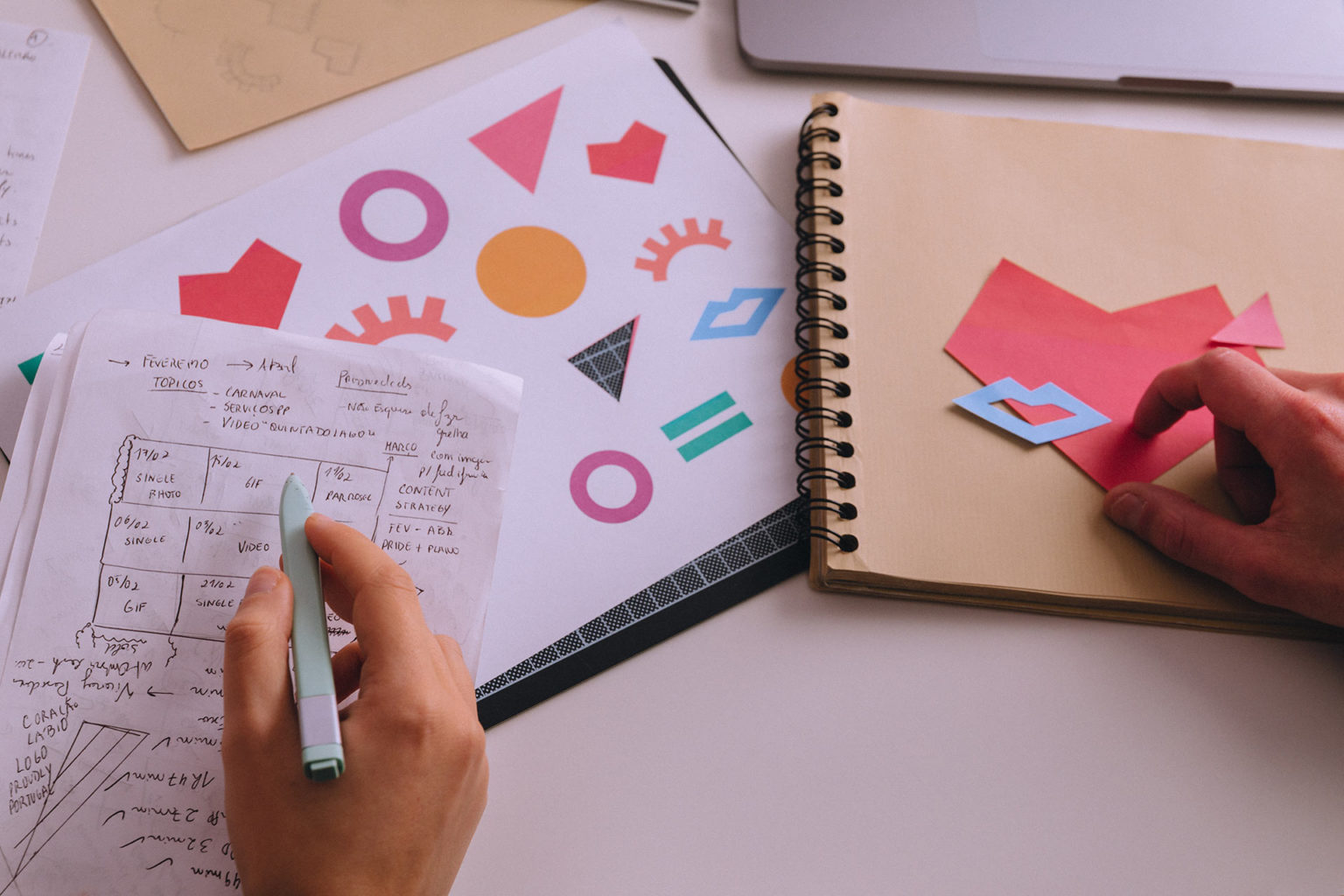
- Branding & Storytelling: Core Creative Concept and brand narrative; tagline and signature; visual universe: logotype, illustrations, iconography, photography style, brand book
- Brand Collaterals: stationery; customer documentation
- Brand Consulting & Service Design: customer journey analysis and redesign;
- Website & Digital Channels: user experience analysis; website design and development; template and guidelines for social media; newsletter design
- Content Production: copywriting; visual assets for website content and social media; photo editing
Breaking Through Chaos: a rebranding that goes beyond what meets the eye
PTSD is not birds, flowers, or yoga poses. We want something that feels true not poised. We want to rock and roll.
Carl Bonnett
From the very first meetings, the client was adamant in saying that “PTSD is not birds, flowers, or yoga poses. We want something that feels true not poised. We want to rock and roll.” And just like that, we were presented with our client’s perception of mental health issues. To be honest, they caught our immediate attention because the thing we most love about a client is when they’re open to the unexpected!
Nevertheless, we pondered, “Are they really ready to present something different from what this kind of market accepts as appropriate?” Our creative idea would bring them out of that safety net, which could obviously come with a risk. Presenting the brand with bold visuals that would stand out from the competition was risky because, as we dug deeper into research, we understood that practically every brand in the mental health sector looked smooth and calm (and boring, to be honest!). Cutting ties with that standard image could cause distrust in the audience and hinder the business. So, was Klarisana up to the gamble? Well, our client was not just aware of the risks; they actually wanted to take them! And that was music to our ears. We immediately set out on a mission to bring Klarisana’s rebranding to life as rock and roll as possible!
Klarisana’s rebranding was a project that touched us all for several reasons. On the one hand, we learned about behavioural and mental health topics from people who deal with its complexities daily; we were overwhelmed by the intensity of the patients’ testimonials and Klarisana’s reports. On the other hand, we tackled the thrilling challenge of developing a brand universe that wanted to cut ties with the peaceful and harmonious standard image associated with medical services while contributing to deconstructing a decades-old bias around ketamine-assisted psychotherapy.
This was definitely one of our favourite rebranding projects so far!
Klarisana grew and expanded in a record time, and by 2021 they decided to reach out to us requesting “a full website redesign to be more in line with our representation of the psychedelic experience and our patient’s experience and journey.” We also mentioned that they wanted to “fine-tune our branding and media presence.” The truth is that a rebranding was overdue not only because the company and the brand had evolved and its image was not conveying it; but also because they wanted to position themselves disruptively in the market. Their wish was to have a renewed image with bold visuals that could convey their particular understanding of mental health issues and struggles.


We soon understood from exploratory questionnaires and interviews with the stakeholders that there’s a strong spiritual and existential component behind the brand since the project was created upon the will to help as many people as possible to realign themselves with their purpose by bringing accessible and affordable psychedelic therapy closer to anyone in need. This was a team that dealt with people experiencing some of the darkest of human feelings and thoughts; anxiety, depression, PTSD and suicidal thoughts that lingered in people’s minds after a traumatic event or maybe years of trauma.

Mental health and psychedelics: still a controversy?
We’ve never imagined how strongly the mental illness topic would impact the team. The first step that usually launches any rebranding project is the research stage, and this one hit hard. We felt sad and anguished as we read through patients’ testimonials describing their feelings and states of mind before contacting Klarisana and engaging in their treatment programs. As we became aware of how these illnesses impact each patient’s mental balance and how they can impair one’s ability to run what is to us an everyday day-to-day life, we had a pale glimpse of Klarisana’s patients’ dark reality as they deal with a world of trauma, depression, anxiety, chronic pain and suicidal thoughts.
On the other hand, during the research stage, we got to know and understand the role of ketamine-assisted psychotherapy. And it also struck us, but this time it was as if a powerful ray of light had been shed over a very dark room! The patients’ testimonials after the treatment included words like “hope”, “relief”, or “purpose”. Klarisana is providing their patients an affordable way out of confusion and despair by using a science-based, verified treatment – how amazing is that?! Despite the social stigma that grew around even the mention of the word psychedelics since the 1970s, the fact is that many academic and scientific research studies, as well as clinical trials, have been developed to prove that these substances can play an active and decisive role in improving mental conditions.
Rebranding Klarisana: The Gap
Rebranding Klarisana was a super interesting project: we were approaching the burning issue of mental health and the divisive topic of psychedelics usage to its treatment. That, for itself, was controversial! But, on top of it, we were also being asked to develop a brand image that could candidly portray the dark reality of mental health struggles using bold visuals to achieve a standout positioning within a market where all brands look calm and peaceful. Talking about a challenge!


A shooting star called: Jean Michel Basquiat

After gathering those initial insights, we went into brainstorming mode and searched for possible visual paths we could follow. Jean-Michel Basquiat came up during our discussions, and although we were quite familiar with his art, we learned more about his struggle with addiction and how it impacted his work [6]. After analysing it under this project’s scope, we discovered in Basquiat’s artwork a faithful portrait of much of the trauma, confusion and chaos that people with mental conditions experience.
We felt the empathy and alikeness between this artist’s own personal path and the descriptions we read from Klarisana’s patients, so we went into a spiral down Basquiat’s pieces, and in this rampage of drawings and paintings, we found inspiration to bring to life all the concepts we were already clinging to – especially the chaos. The harsh lines, the bold colours and the intuitive brushes were all raw expressions of intense feelings of anger, confusion, sadness, despair, and self-judgement, and they were all vehicles we could use to convey that dark state of mind and the search for a way out the inner chaos that mental trauma brings.
A lullaby called Lateralus,
by Tool
At roughly the same time we were learning about the brand identity and exploring possibilities for its future visuals, some rhythms, chords, and feelings emerged. We knew Carl Bonett, Klarisana’s founder, and his penchant for rock music, so we were already scanning our own music playlists for some beats and tunes that could fit the project’s mood. Until André presented “Lateralus” to the team, and it became our official soundtrack! In fact, Tool became a part of this creative process as much as this creative process became a part of the team – it’s incredible how music can spark feelings and drive us to externalize and create!
And since we relate different soundtracks to different seasons of our lives, why not do it with creative projects? In Klarisana’s particular case, we wanted to create brand visuals that would transpire the exact soundtrack we identified it with – rock and roll!
What happens when we shed light on chaos?
The raw chaos and the conquering of it were at the core of our conceptual and visual construction for the rebranding of Klarisana. Now that we were aware of Klarisana’s patients’ reality and the role Klarisana played in their lives as a beacon of hope, we wanted to explore their journey going from dark to light. To light… Would it even be accurate to say it that way? We pondered and discussed our doubts with the client. Klarisana is very transparent regarding what a mentally ill patient can expect when going through therapy: the truth is that the trauma never really disappears.
Despite each patient living their individual experience with ketamine-assisted therapy, no magic outcome can bring the patient to a fabulously peaceful state of mind at the end of the day. Klarisana is invested in casting a light into every patient’s chaos, but what happens when you cast a light into chaos? The fact is that it doesn’t disappear: you just see it better and become able to navigate through it. You are no longer engulfed by chaos; instead, you conquer it. This was the rationale for the tagline Break Through Chaos.

Klarisana conveys an honest message: dealing with a mental condition is rough, not pretty and not easy. Klarisana offers a way out, but the process can be harsh, and it requires a commitment to achieve an outcome that doesn’t mean you’re cured. So what would chaos look like after we cast a light on it? How do people feel after therapy with Klarisana?
Conquering chaos
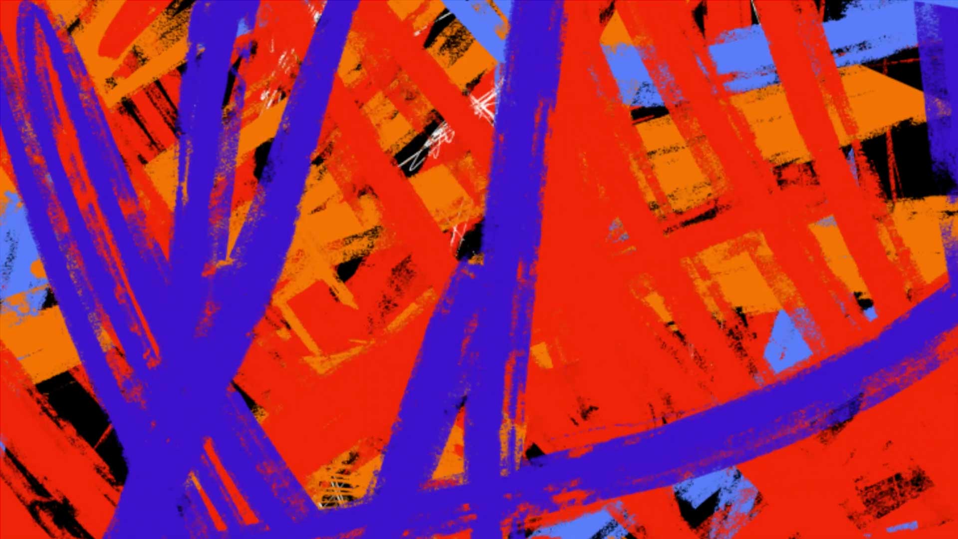
We definitely could not go for a clean and smooth aesthetic to describe such a nuanced process; the brand story needed a full-on gradient composition with layers of meaning to convey the complexity of mental health issues. We also needed it to express dynamically, almost violently, since we were describing continuous struggle and conquest. Colourwise, it would have to be intense, strong and assertive, but it would also have to be reassuring and uplifting.
Klarisana’s visual universe tells the story of a patient’s journey to conquering his inner chaos and breaking through it to re-find hope and purpose. This story shows, at first, a chaotic structure that surrounds you, a composition of brush strokes like a wild forest of paint. Then, as you start to see it from a distance, it suddenly becomes weaved into something else where layers and layers of colour imprint a meaning, an understanding of what was once a chaotic structure.

With Basquiat’s works inspiring our creation, we explored the idea further. Technically, getting the kind of rustic nature of brushed paint to construct this was a conundrum. As we tested the design and kept chasing a result we were happy with, we understood there were limitations in using only vector images to build this part of the visual universe. We used Procreate to replicate each chaotic brush stroke from the first structure in order to develop a gradient: the Break Through Chaos Gradient.

A note for the geeks: We wanted to recreate the bold RGB colours into print, but this is quite difficult if you use CMYK (one is adding colours while the other is extracting colours). So, how did we do this? We turned to screen printing techniques and transformed every brush stroke of The Chaos and the Break Through Chaos illustrations into bitmaps; these bitmaps can be used with a Pantone correspondent colour. Even the Pantone colours don’t have the same brightness as RGB, but we came close.

Klarisana’s symbol:
the work of an artisan
From the beginning, we knew that the hummingbird presented in Klarisana’s logo was an important symbol conveying a powerful message of resilience and hope. We could not discard such a relevant element – probably the only existing brand element. Nevertheless, as our creative concept evolved, it became clear that we needed the hummingbird to evolve as well and become an ambassador of the brand story where rawness and honesty are central.
We wanted the hummingbird to look ragged, distorted, and imperfect; we were not aiming to be precise. More than a perfectly proportioned and well-balanced symbol, we wanted something that felt crafted by human hands, recognizable and lasting. We turned to good-old pencil sketches and iterated dozens of versions of the same hummingbird, creating different positions and angles. We came up with a result that speaks for itself: Klarisana’s hummingbird has its own charisma. It is an important element in the website and a constant presence across the brand universe with a looking eye that guards and steady wings that guide us to break through the chaos.


An extensive BRAND BOOK
Klarisana’s persona and the visual universe were systematized into an extensive Brand Book that lays the brand foundations and guidelines for visual communication namely: logotype applications and examples, colour palette, gradient, typography, key visuals, hummingbird illustration, claim, brand sounds and music, among others.


MORE THAN JUST A WEBSITE: designing a trip for the user
When rethinking the User Experience on Klarisana’s website, we wanted to ensure we invited the user to delve into the brand’s visual universe to experience its different layers of meaning. The information architecture was fully restructured to guide the user in the search for solutions that psychedelics can bring to severe mental health problems: that was accompanied by a carefully crafted navigation experience that includes an immersion in the role of colour in Klarisana, sound (through patient spoken testimonials) and the hummingbird (an agent liaising the contact between the user and the brand).
The Klarisana website project earned several awards, reflecting its approach to digital design and usability.
Prémios Lusófonos
Digital · Site – Silver Award Winner
CSS Design Awards
Special Kudos Award
Awwwards
Honorable Mention
Orpetron Web Design Awards
Web Design Appreciation Award
Head to klarisana.com to check Klarisana’s new website or check our Behance profile for more information on this part of the project:
Rethinking the website for Klarisana
paving the way to psychedelic-ASSISTED MENTAL HEALTH treatment
Klarisana’s rebranding project was, first and foremost, a huge learning opportunity for us. Tapping into the complexities of behavioural health services and becoming aware of the darkest effects of mental conditions taught us about empathy, struggle and resilience. It was also an opportunity to unveil the potential of psychedelics in helping to ease those effects as a safe but still overlooked alternative to traditional protocols. We were very happy to collaborate with Klarisana and be able to learn, develop and deliver a rebranding that was built upon so many layers of meaning and value and for which we are very proud.
In December 2023, this project received a Silver Award at Prémios Lusófonos in the category Design/Rebranding.
PROJECT TEAM
Creative Direction: Mónica Loureiro
Executive Creative Direction: Nuno Tenazinha
Brand Strategy: Isabel Evaristo
Project Management: Marta Gouveia
Brand Design: Mónica Loureiro
Illustration/Design: Marina Ferrari
Copywriting: André Oliveira
Digital Product Management: Karolina Guilherme
UI/UX Design: Daniel Gomes
Web Development: Cátia Dionísio
Motion Design: Pedro Santos