


New Metrics is a management and training consultancy founded in 2013, with headquarters in Oman. In 2017, our paths crossed for the first time when they contacted us to develop a new website and make some style decisions, a task that we accomplished with success! Since then, the company carried on and evolved, led by a young and skilled team of dynamic people. Over the last four years, it matured its character, building knowledge, experience, reputation and opening new locations. In mid-2020, they contacted KOBU Agency looking to revamp their website once again. After digging deeper into their main concerns, something became clear: brand misalignments were showing up as the company grew and underwent structural transformations in its services. The “perfect storm” was put in place and all the stakeholders were ready to start a new chapter in the New Metrics journey.

Our mission was very clear: we needed to push the brand universe and identity to a new level and update the brand’s core message. The goal was to realign them with the brand’s more mature personality.
As a result of our rebranding process, New Metrics now presents a renewed identity, consistent with its updated message: a charismatic and vibrant brand universe, with a clear communication line, allowing the company to reposition itself among its sector-top players.
HOW WE HELPED
- Branding: brand message, tagline, logotype and key visuals; iconography, stationery, brand digital assets and brand book with visual communication guidelines;
- Design and Digital Strategy: website design and development; guidelines for social media;
- Content Production: copywriting; visual assets for website content;
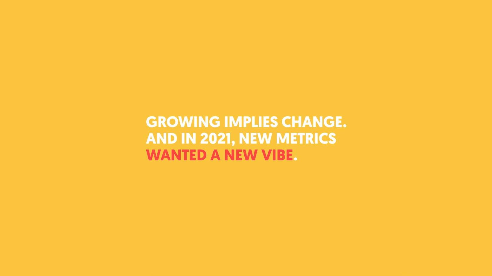
Brands mature as companies grow
New Metrics is a management and training consultancy founded in 2013. It operates from the Sultanate of Oman, but its action extends to the whole Arabian Peninsula. The company is specialised in Experience Management (EX), enabling organisations to measure and improve the various experiences they provide to both their external and internal stakeholders and also organisational effectiveness, ensuring that organisations achieve their business goals most efficiently and effectively. Over the last years, New Metrics also develop two new segments of their business:
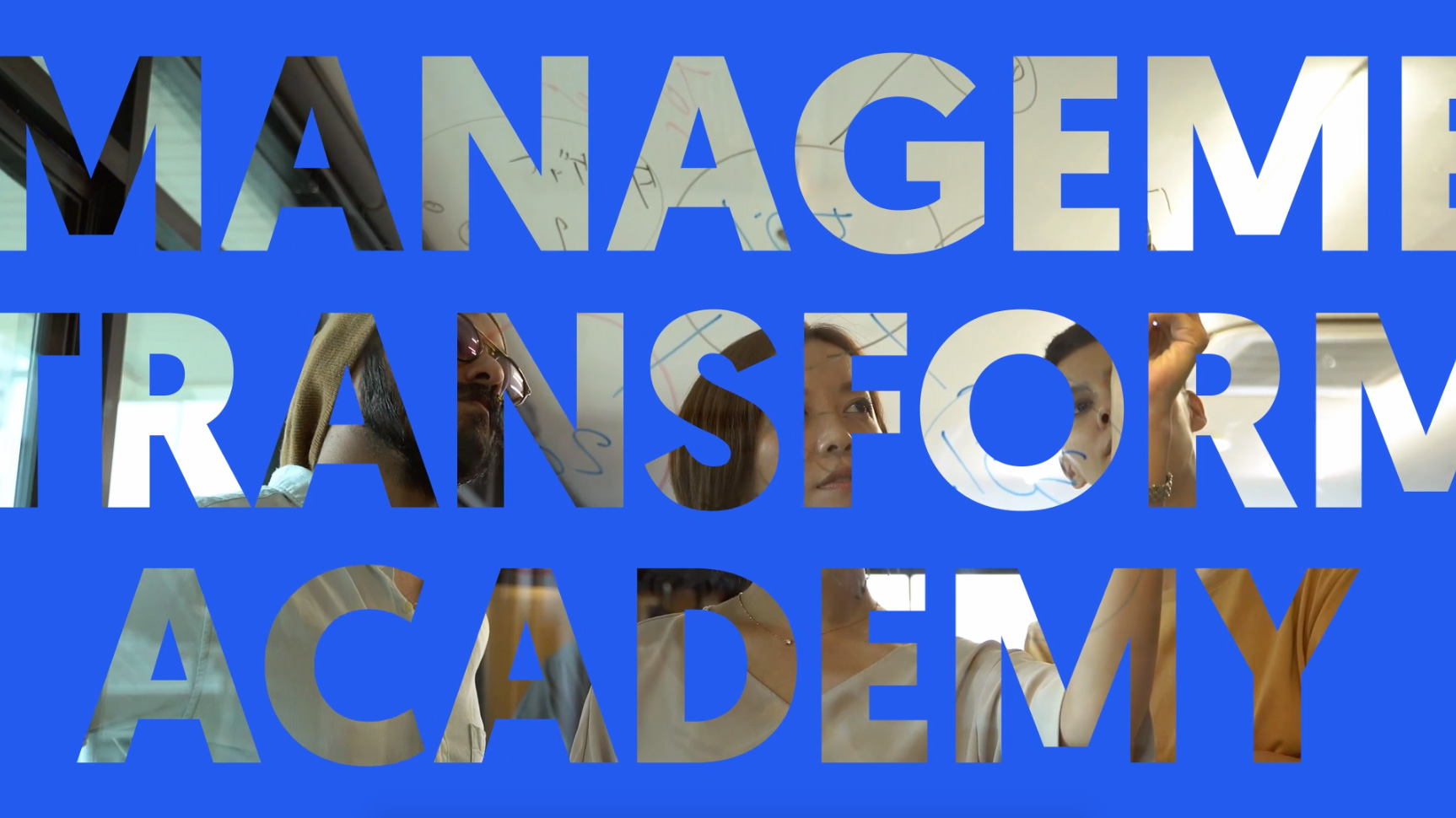
- New Metrics Academy: where they provide training programs aiming at leadership skills development and employee engagement with the promise of increased levels of productivity, satisfaction and excellence.
- Transformation: where they commit to equipping businesses to compete in the future, employing strategies to inspire employees, maximise the power of products and embrace innovation.
After a few years in the market, New Metrics evolved as a company. It gained experience as the client portfolio expanded, and the brand started to become notorious within its niche. The operation successfully engaged in a growth path and the company’s business goals broadened. In the face of this progression, New Metrics’ CEO contacted KOBU Agency to rethink their website in order to reflect all these structural changes – given that we had developed their first website, back in 2017, we felt honoured to be once again brought on board.
Initial discussions with the main stakeholders took place and we realised their concerns were actually broader than expected: as the company grew, there was some difficulty in ensuring it remained consistent across touchpoints; they lacked pillars for a consistent visual message; the biggest players in this market were consolidating their brands and they didn’t want to lag behind (e.g. Accenture and Cap Gemini had refreshed their brands since 2017); among others. As the company plans to expand the business with a professional and dynamic approach, everyone agreed that it was time to look inwards and outwards, to build strong brand pillars that facilitate the years to come, with a transparent and authentic message.
“We want our brand to have the same visual impact as our people and our work does to our clients. It should reflect our new status as a leader in Experience Management consulting.”
M. Debouk, CEO of New Metrics

THe CHALLENGE:
To rebrand New Metrics, we required a firm understanding of the company’s position and a perfect fine-tuning of the vision the main stakeholders had for the future: the goal was to achieve a well-balanced solution, respectful of the brand’s legacy but, at the same time, pushing it towards the future with vibrancy.
LET’S TALK MESSAGING: BRAND STRATEGY!
After the initial meetings to understand the problem at hands, we engaged in the Discovery stage. This stage is a crucial part of our internal creative process. It’s when we strip the brand off of its armour and objectively address the preconceptions around itself. During New Metrics’ Discovery stage, we became aware of the company’s evolution in terms of services’ portfolio and expansion plan. In terms of brand identity, the aim here was not only to reach a clear redefinition of the brand’s mission, vision and values but also position its message and communication in today’s big picture. We wanted to put it side by side with other players in the same sector while understanding how it could evolve towards the desired positioning. From this analysis, we were able to validate our work’s premise: the brand had matured, and its communication was not showing it. Therefore it was not competing at the same level as its competitors, and probably the target audience was not being impacted.
Despite the rebranding ahead, we were firmly convinced that the current visual identity should not be entirely overridden given that it still reflected part of the brand’s DNA in many of its aspects. It’s important to stress that a brand behaves as if it was a person – it grows and evolves from being a child until it becomes an adult. We have to give it time to build trust, become recognised and create a legacy. That’s why it is of the utmost importance to truly get to know a brand when tackling a rebranding process – starting from scratch is seldom the most fruitful approach to it, except in very specific conditions.
Some cornerstone elements in the company’s foundation needed to be maintained. The company had grown upon a high delivery capacity, a professional attitude and a dynamic working method. But although the assumed desire to become a top player in the region, the brand wanted to keep its authenticity, its approachable character and the fresh, curious and bold way of engaging with clients. These aspects were responsible for the company’s success, and they had to shine through the rebranding while also vesting it with the maturity and value brought by the years of added experience.

To ensure coherence in the brand’s communication, we defined three pillars for its message, reflective of the brand’s values:
- Character: declares the values that express the brand’s identity and history
- Business: emphasises the value of products and services through a commercial approach to communication
- Relationship: expresses the commitment and importance of customer care
To further strengthen our analysis, we collected information on the major players in the consultancy sector, as well as direct regional competitors, bearing in mind to include good and bad examples of coherent and cohesive communication, both visually and in terms of message. The aim was to achieve a benchmark, to position New Metrics and discover a desired evolutionary path for the brand in the short, medium and long run.
NEW METRICS, NEW BRAND: MAKE IT POP!
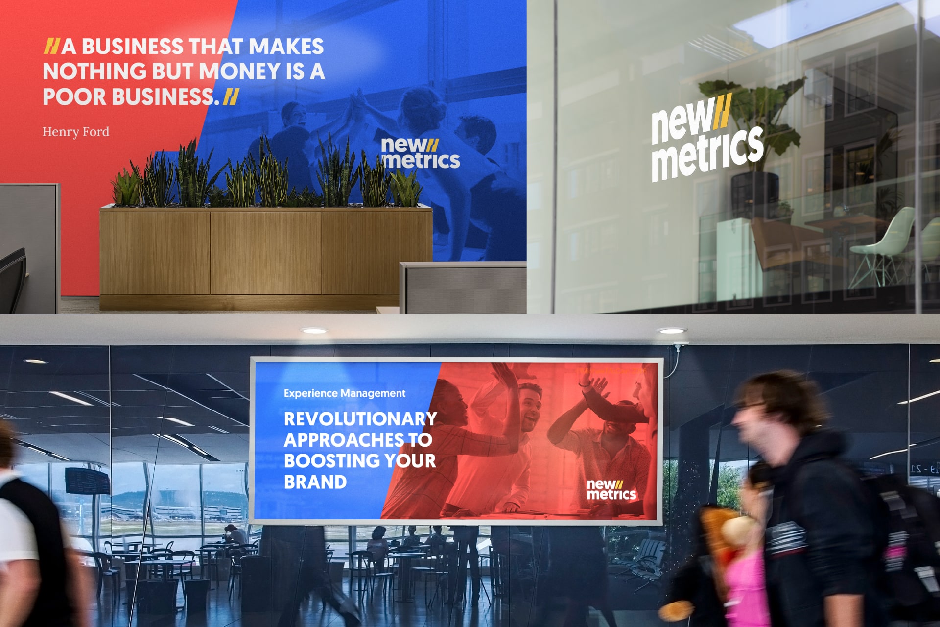
The previous colour palette of the brand was one of the other elements that we wanted to bring along for the new visual universe. Despite being very narrow (with an urgent need for more versatility!), the blue and yellow conveyed the brand’s dynamic and agile method and its approachable character, which are New Metrics pillars. They had to be maintained. But to tackle today’s more ambitious goals, the brand’s visual universe lacked visual pungency and assertiveness. To solve this problem, we imbued the brand with an extended palette with vibrant colour hues that work in tandem.
Illustration played a significant role in the previous visual universe of New Metrics and it was one of the first elements we felt the need to let go of. They made sense during the company’s early years when it wanted to communicate the experimental approach to its processes. But it didn’t match today’s more mature and professional character.
And as for the logotype: despite its crucial role, it had to be reconsidered in its entirety. It presented a severe perception problem as it lacked the brand’s full name. Additionally, the symbol used, a double-coloured bar chart crossed by a line graph, didn’t reflect New Metrics’ core business as a management consultancy and training company.
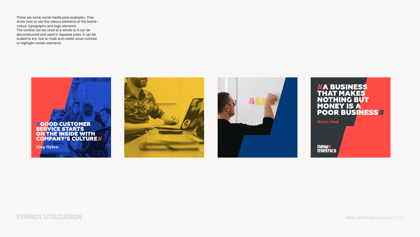
Considering these internal aspects of the brand and the external analysis we undertook, we decided to focus on the logo first. The bar chart disappeared, and the graph line was reimagined. We needed to find an intangible solution for it that brought abstract symbolism to the brand while bringing alignment with its values and message. As a result, “The Bolt”, as we call it, was born to energise New Metrics with vibrant curiosity and genuine human relationships. This specific element ended up working as the core pillar of the whole visual universe. The graph line, in the empty space of “The Bolt”, conveys several aspects of the brand’s identity like growth, dynamism and strength. It is also versatile and can be transformed, deconstructed, scaled and adapted to all graphic supports and materials. It works as a whole or in separate parts, to mask or to create visual contrasts applied to images, photography, or other elements. It can serve to emphasise a sentence or quote, or it can be used as a separator to create visual balance. “The Bolt” adds novelty to New Metrics as it introduces “New Business”, “New Training”, “New People”, and so on. At the same time, it acts as a glueing agent between the redesigned elements of the wordmark, based on a pungent, non-serif, lettering.

Blue and yellow remained the primary colours, with their hues slightly adjusted, but three new colours were added to provide the brand with options. A darker shade of blue and several shades of grey represented the professionalism and maturity in the revised image, and we all agreed on those. On the other hand, the red colour was added as a disruptor (although some initial hesitations, it was heart welcomed later on). Our purpose was to empower and sharpen the communication and provide the brand with a visual tool kit aligned with its ambition, boldness and fearlessness. We believe this choice is crucial to the pursuit of the company’s business goals.

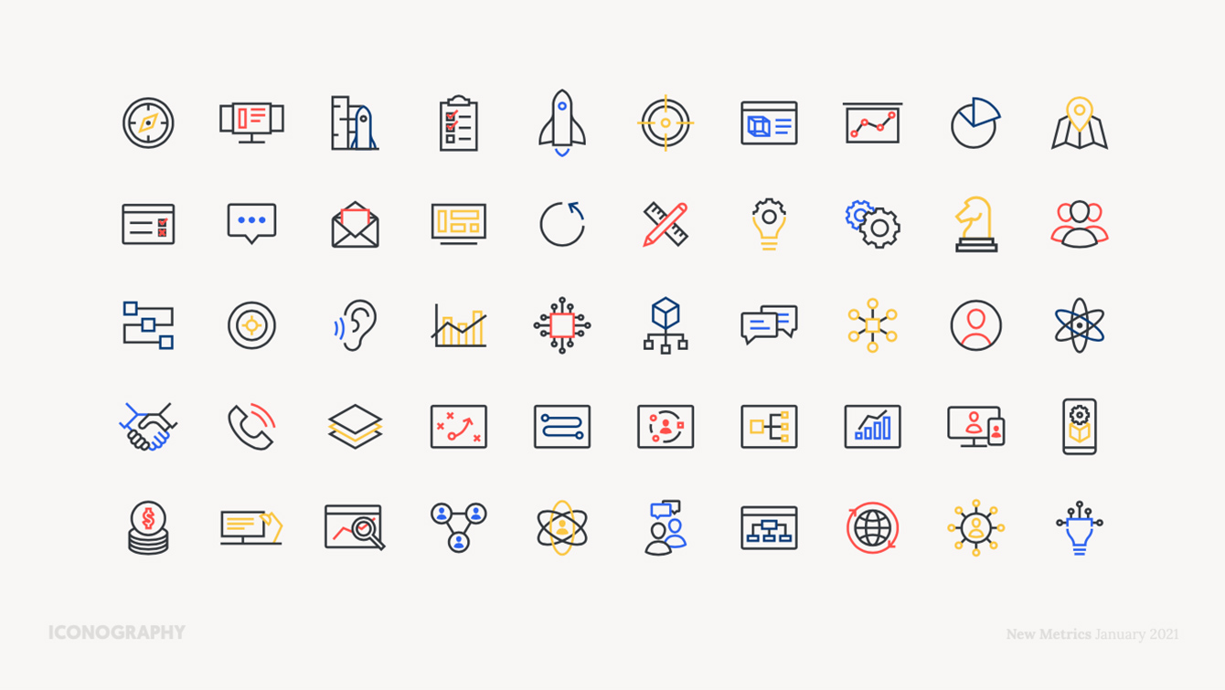
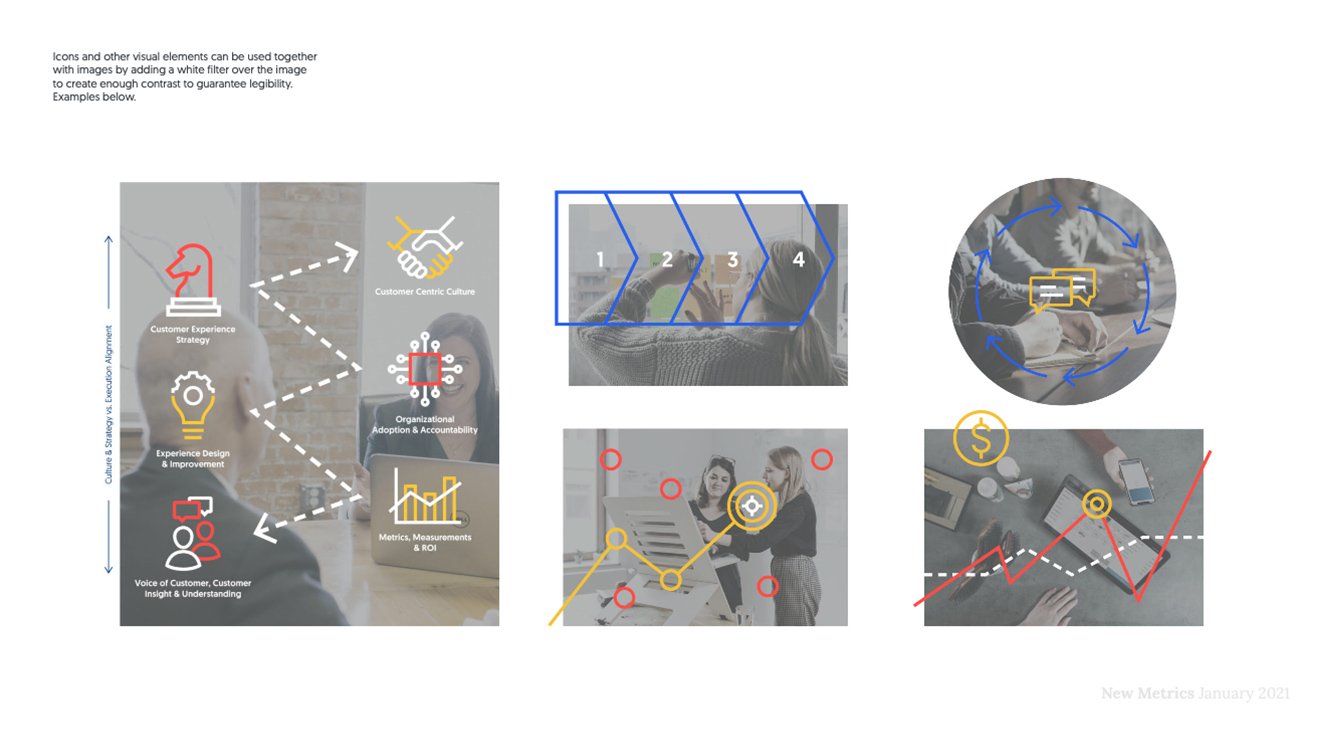
Given that we let go of the old illustration style, we wanted to ensure that the brand remained versatile and included enough visual assets. Very often consultancies require detailed infographics for reporting and presentation purposes. We then created an extensive iconography set as an important working tool. We paid special attention to make it easy and diverse, and each icon was adapted to be coherent with the whole visual universe.
The iconography set was later on coupled with photography that depicts New Metrics’ core values, thus translating their brand message into the visual assets that explain their processes and services.


After ensuring that the cornerstone pillars were set in place, we breathed life into the brand, implementing it across touchpoints. Besides the main stationery and print collaterals, a great emphasis was put on their digital presence, especially on social media channels and website. In Lucy Delicata’s words, Director of Communication: “We required a new online presence that translated our position in the market and illustrated the full scope of our business offerings.”
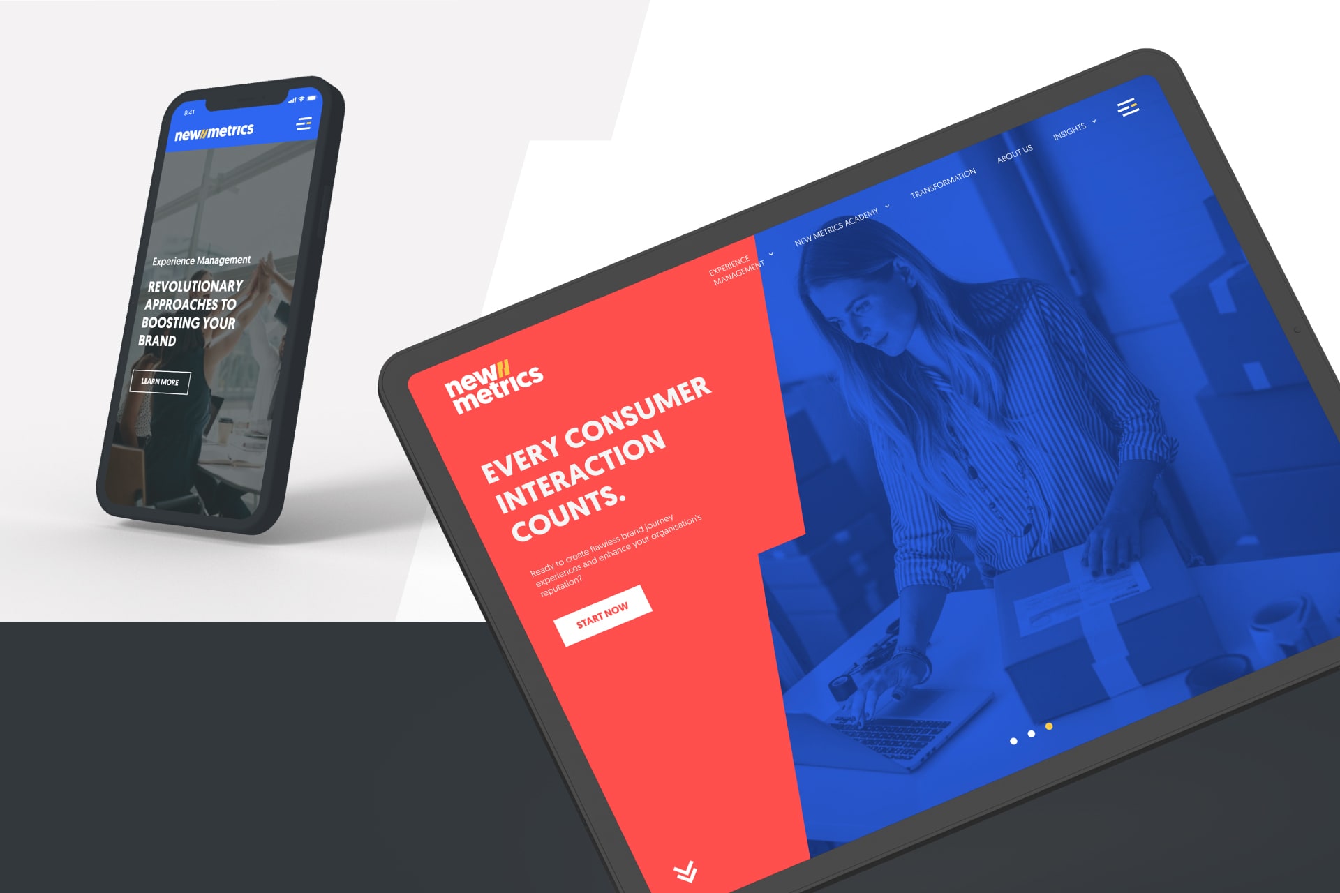
In order to adapt the website to this new reality, together with the New Metrics team, we laid out the updated information architecture, and adjusted old content to match the new brand – above all, we wanted to make their website more scalable, to allow it to grow over time.
Their two new Service segments, “New Metrics Academy” and “Transformation”, gained relevance and the “Brand Experience” services were subdivided into standalone landing pages to facilitate Lead Generation and analytics. Every piece of content was augmented with imagery that translates from their core values, easing the message’s perception. In case you’re interested in having a look at the final result, head to newmetrics.net.


RAISING brand coherence
The New Metrics reimagined visual universe was established into a Brand Book that lays the graphic foundations and guidelines for visual communication. As in every human endeavour, change requires time to adjust and the Brand Book is meant to serve as a tool to help existing team members or newcomers learn and embrace this exciting new language.


New Metrics: Built TO ENGAGE
All rebranding processes involve a considerable amount of conversation. It’s important to discuss the purpose of the rebranding and all plausible options. Companies undergoing rebranding processes need time to let changes sink in, and agencies need to consider that when preparing and presenting alternatives. In New Metrics’ case, cooperation and negotiation were fundamental for a positive synergy between us. And that’s why we feel heart-warmed by some of the feedback we’ve been getting: “We enjoy the smooth experience offered by KOBU, their flexibility, responsiveness and the fact that they take the time to know the brand and understand how we want to present ourselves. We also appreciate their straightforward way of working and their good reasoning behind every decision when it comes to design. When they pushed back on certain ideas it was always done pragmatically and with clear explanations.“
We found a team willing to adapt and ready to commit to the renewed visuals and voice of the brand. We truly are convinced that New Metrics’ rebranding prepared the company for a new stage in their life.
We are really pleased with the outcome of the New Metrics rebrand. It’s been a great process that has resulted in achieving what we were envisaging for the brand […] The feedback we have received both internally and externally has been very positive. It’s now aligned with the complete scope of our business services and conveys our company’s culture.
Lucy Delicata, Director of Communication of New Metrics
We are really glad to have partnered once again with New Metrics, this time to elevate the brand to higher grounds and contribute to the company’s business goals. By providing their team with appropriate tools to communicate effectively, with an updated image and message, we honestly expect their growing success.
In case you’re interested, you can also check our Behance profile for more visuals.
PROJECT TEAM
Creative Directors: Nuno Tenazinha, Sandra Lopes
Business Strategist: Isabel Evaristo
Brand Designer: Miguel Spínola
UI/UX Designer: Daniel Gomes
Front-end Developer: Cátia Dionísio
Communication Designers: Miguel Spínola, Daniel Gomes
Motion Designer: Pedro Santos