Skullpture’s rebranding challenges the traditional approach in health branding, where restrained visuals are often used to communicate trust and professionalism. At KOBU Agency, we believe this conventional style can limit a brand’s potential. Instead, we crafted a bold and innovative identity for Skullpture, blending precision and artistry to elevate their expertise in facial bone surgery while captivating their audience.
Skullpture is a facial bone surgery clinic integral to the Facialteam Group. We had previously collaborated with this client during the rebranding of Facialteam, their flagship brand specialising in facial feminisation surgery. Even though they both navigate the same medical field, their target audiences, messaging, and positioning are very different. While Facialteam specialises in transgender facial feminisation, Skullpture caters to a broader cisgender audience.
Given our thorough understanding of the clients’ services, customer journey, and unique selling points, we were able to anticipate their challenges effectively. Still, we delved into the brand strategy phase to realign our client with its brand’s purpose and objectives, while also refining the core pillars of its brand identity. From there, we identified inconsistencies, explored potential investment options for the company, and ultimately developed a brand strategy aimed at achieving the desired repositioning.
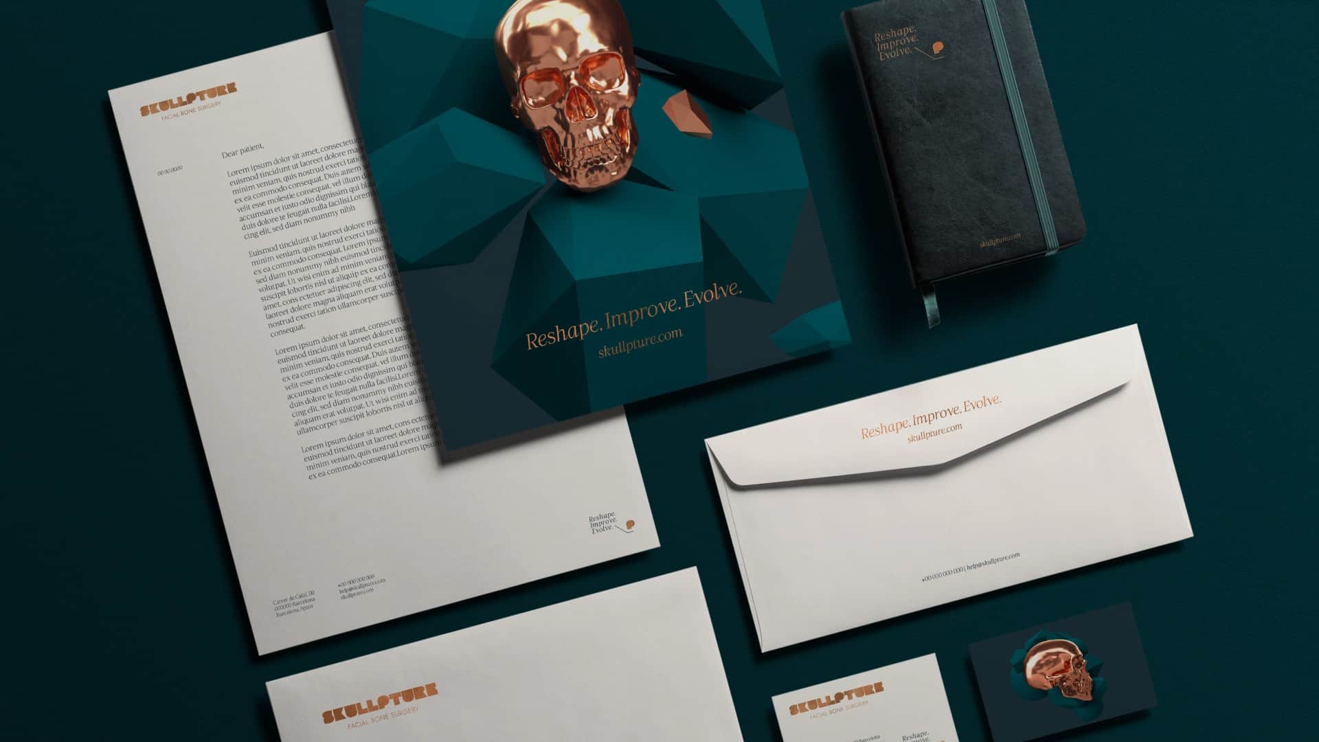
The result is a striking visual identity that sets the brand apart from its competitors through an elegant, futuristic, and premium aesthetic. The tone of voice was refined to convey assertiveness and credibility, while the brand’s charisma was further enhanced through customised typography. The visual rebranding equipped us with all the necessary tools to create a new website that integrates every element of the visual universe to deliver a fluid and engaging navigation experience. Head to skullpture.com to see it in action.
Our Approach to Health Branding:
- Brand Consulting & Strategy: brand identity (values, vision, mission, message, promise); brand positioning; brand architecture analysis; target audience identification and brand communication realignment.
- Branding & Storytelling: Core Creative Concept and brand narrative; tagline; visual universe: logotype adjustment, illustrations, iconography, branded customised typography, photography style, comprehensive brand book.
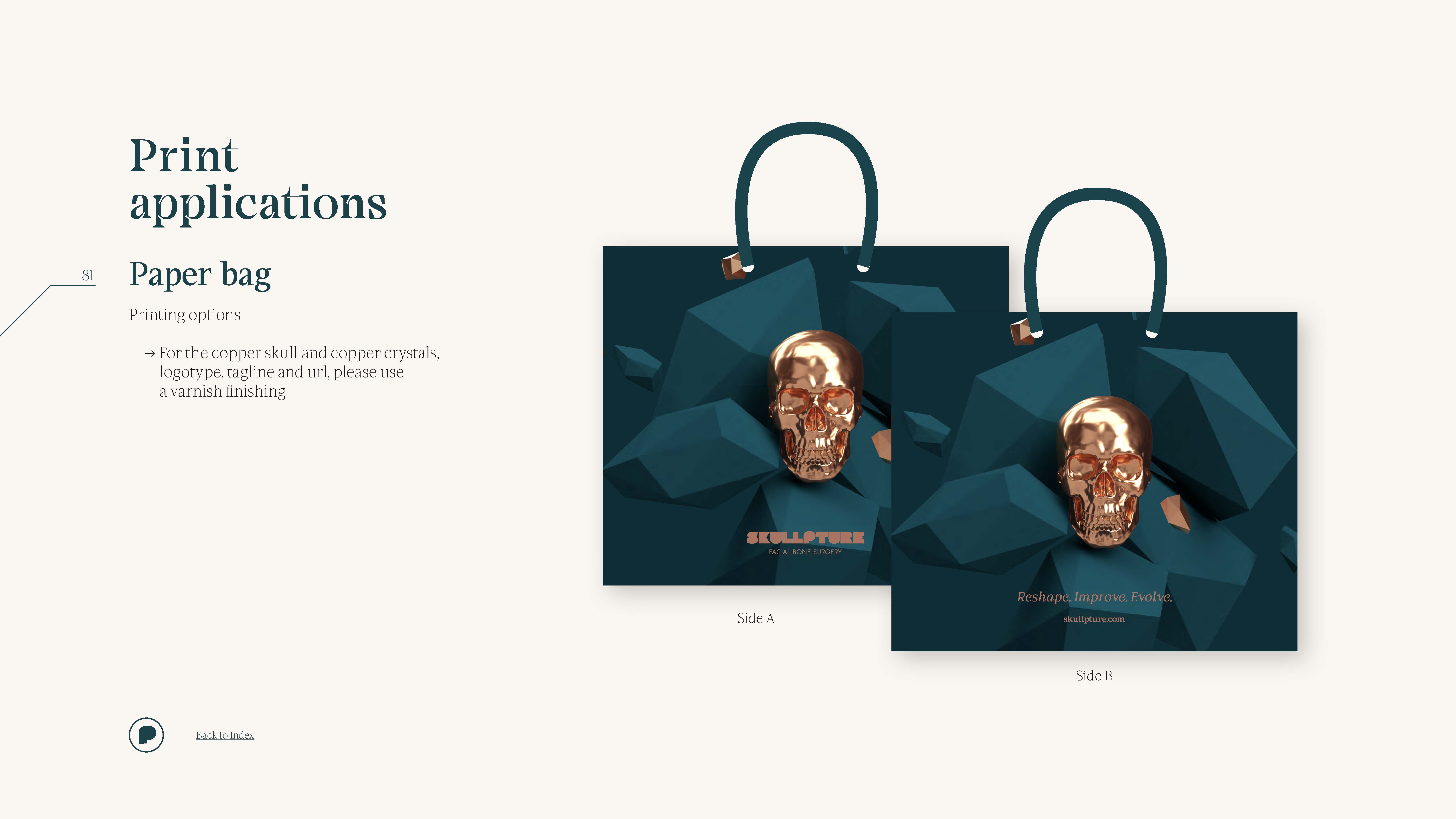
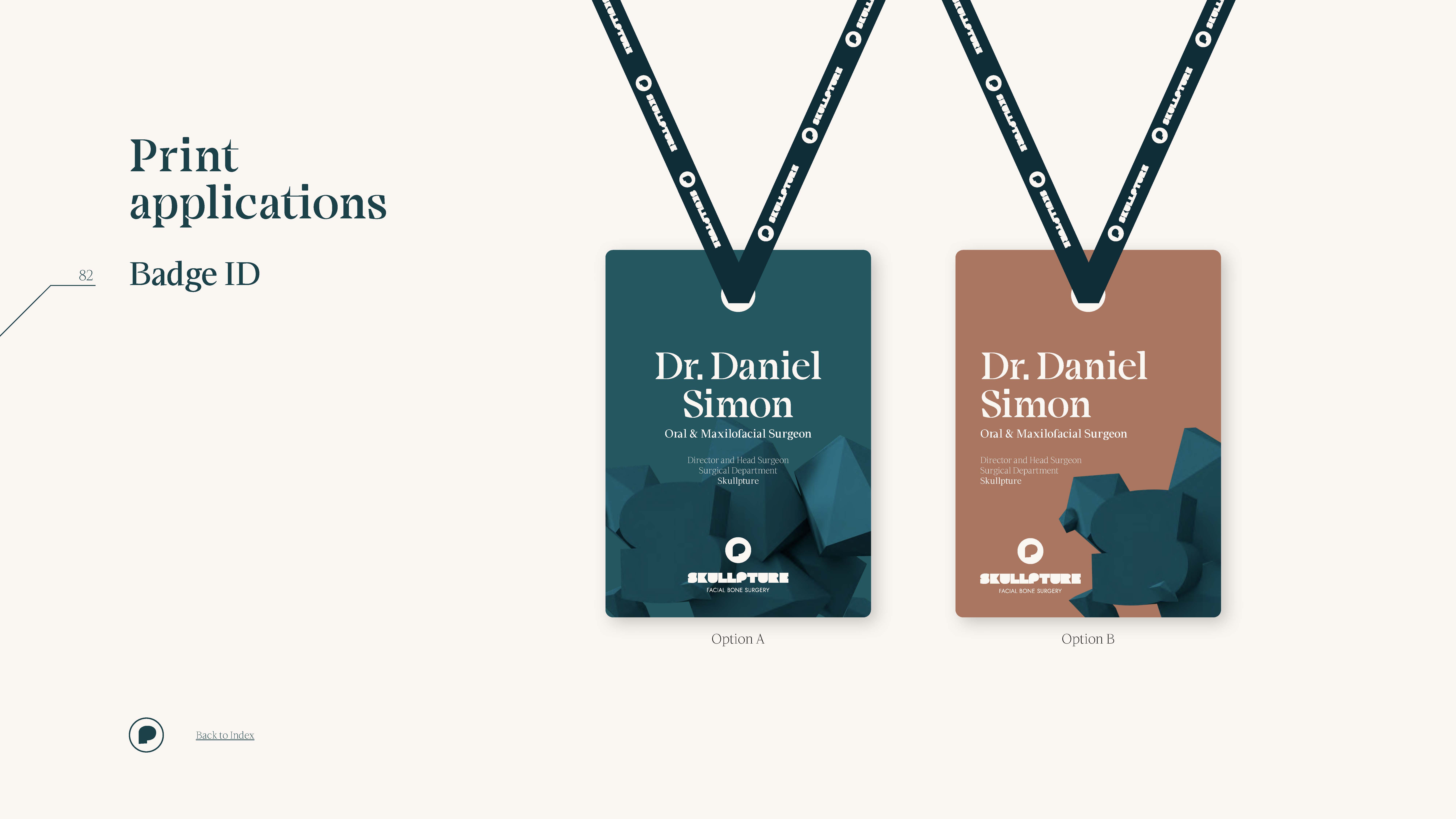
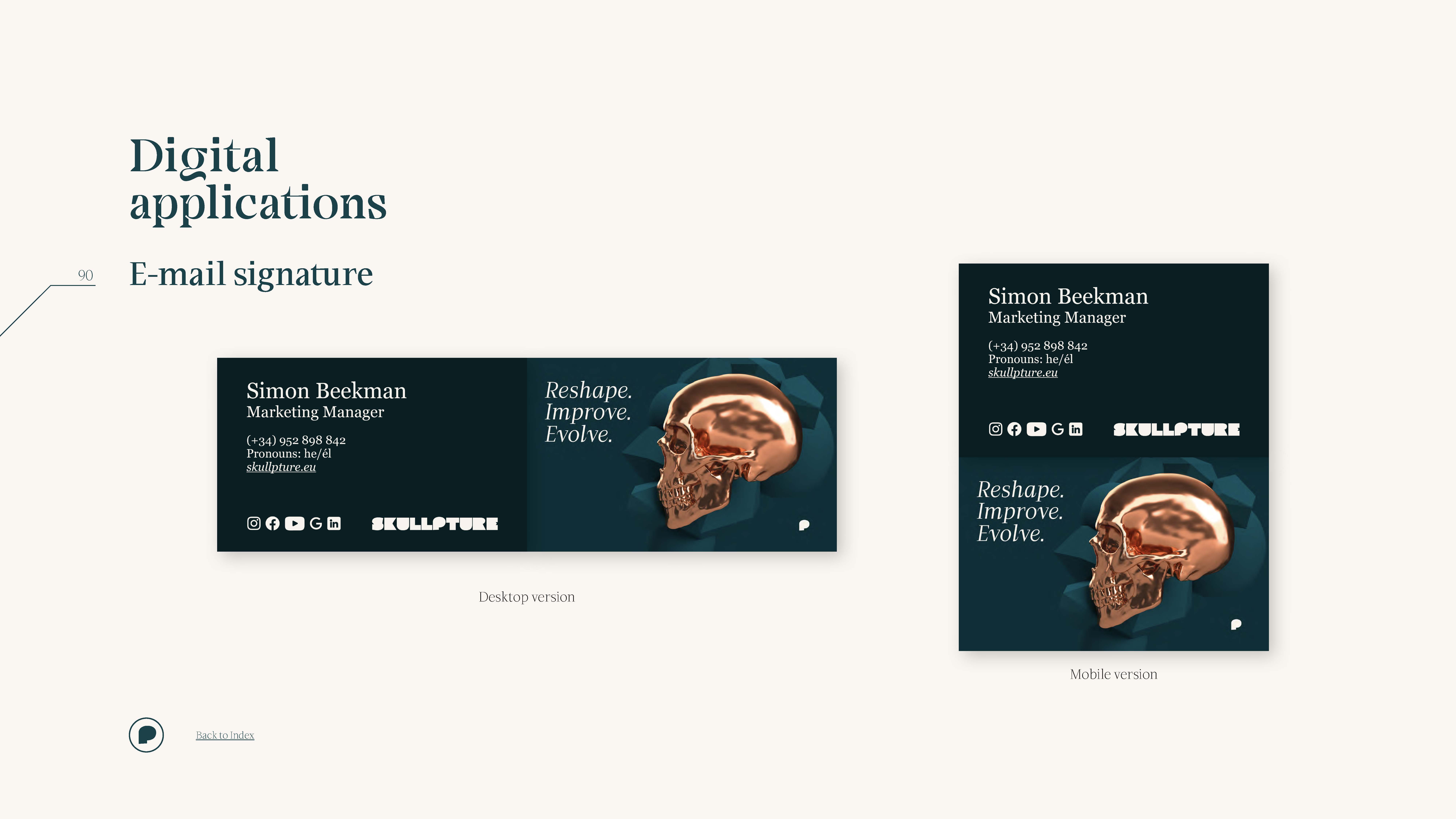
- Brand Collaterals: stationery; customer documentation; sales documentation (brochures, flyers, bags, etc.).
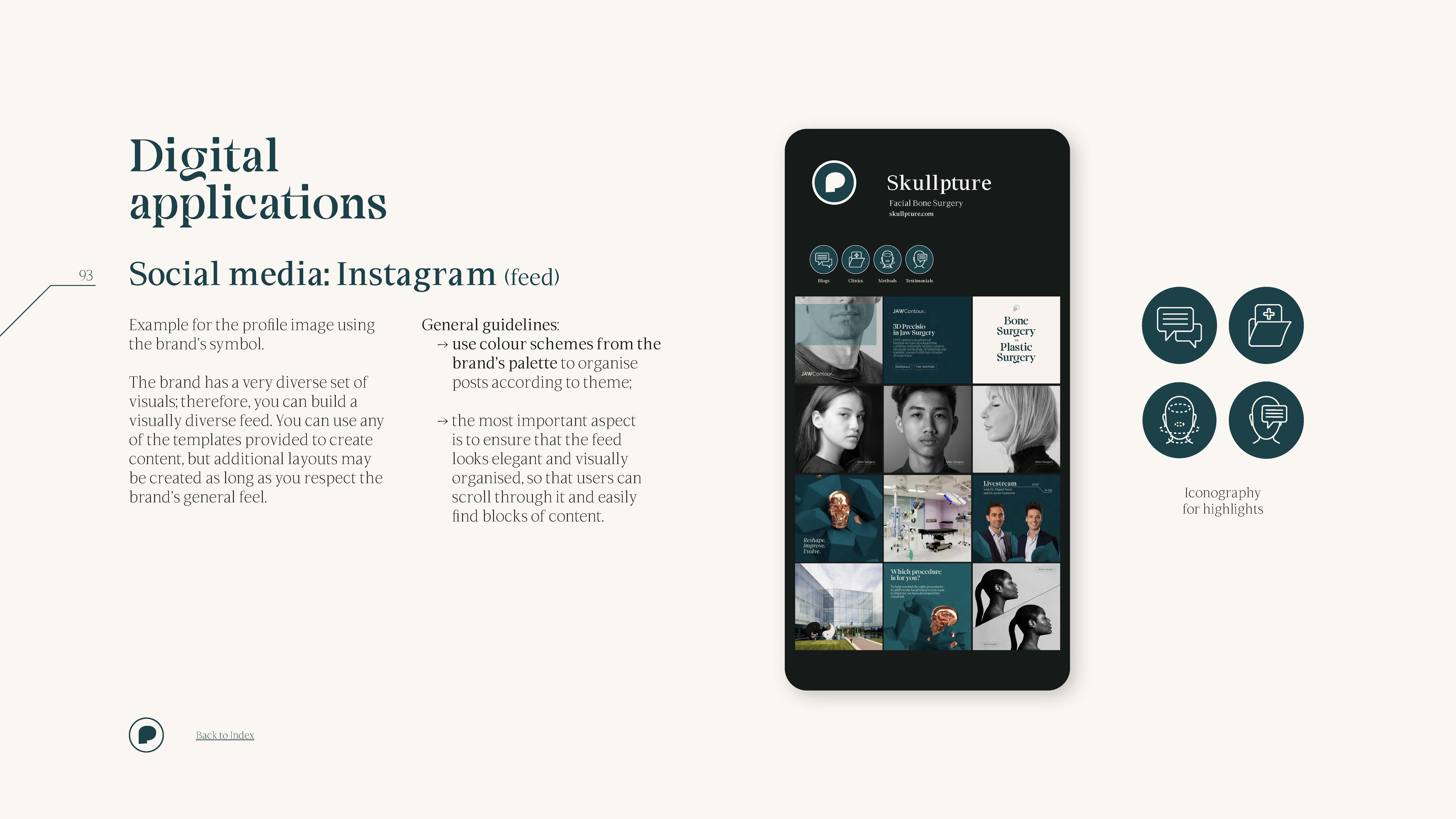
- Website & Digital Channels: user experience analysis; website design and development; template and guidelines for social media; newsletter design.
- Content Production: copywriting; visual assets for website content and social media; photo editing.
Navigating Health Branding: Same Core Business, Distinct Audiences
Skullpture is a brand that belongs to the Facialteam Group, a client we had already worked with for their leading brand, Facialteam. This brand is totally focused on the transgender audience looking for facial feminisation surgery, having achieved international recognition for its specialisation and surgical methodology. Such success caught the attention of the cisgender public, who would proactively ask for a consultation, opening an opportunity for our client to embrace this target and expand their business.
Eventually, Facialteam decided to create a brand to respond to the specific enquiries of the cisgender audience, as they were completely comfortable with their operational capacity to do so. However, it was clear that the new brand needed to operate and position itself differently, as it was entering a new market with uncharted areas to explore.
So, how would Skullpture present itself to a cisgender audience? With the same marketing team, customer assistance team, medical team, and even medical facilities now engaging with both types of clients and sharing the same customer journey, how could they do this without causing confusion? Also, who exactly is the cisgender audience, and what are their expectations when seeking facial bone surgery? Our client is undoubtedly a leader in their field, but this situation is akin to taking a duck and throwing it into the ocean: it might not drown, but it could quickly become prey to sharks.
discussing brand positioning: do you know your target?
The problem of needing a clearly pre-defined target audience was something we spotted immediately as soon as we started the rebranding process. When we looked at the service, there was no doubt about its unique selling points: Skullpture’s surgical team had built a relevant reputation for their expertise, innovative approach and natural results in the field of facial bone surgery, and they delivered premium customer service and support throughout the whole customer journey.
The brand values, vision and mission were relatively easy to define; there was a clear sense of the brand’s character and how it differed from its older sibling. However, in terms of its promise and tone of voice, there was no consensus because the brand positioning was still open for discussion. There were fuzzy areas that needed to be addressed and clarified.
Collaborative Insights for Strategic Positioning
Through interviews with stakeholders, we uncovered varying perspectives on the brand’s positioning. Analysis, reflection, and discussion are key components of our brand consulting and strategy process, and we value doing this collaboratively with our clients to ensure all sides stand completely aligned. Engaging in a thorough dialogue, asking questions, clarifying answers, and addressing doubts led to a productive debate among Skullpture’s partners, marketing and sales teams, and ourselves.
The discussion centred on whether to position the brand within the medical or beauty niche or to target the broader mass market. To inform this debate, we examined prominent brands in these sectors and outlined target profiles to identify potential leads. By narrowing down the options, we could explore the specific requirements for each path regarding brand design and behaviour, recognising that each choice would cater to different segments within the extensive cisgender market.
Core Creative Concept: Carving Beauty
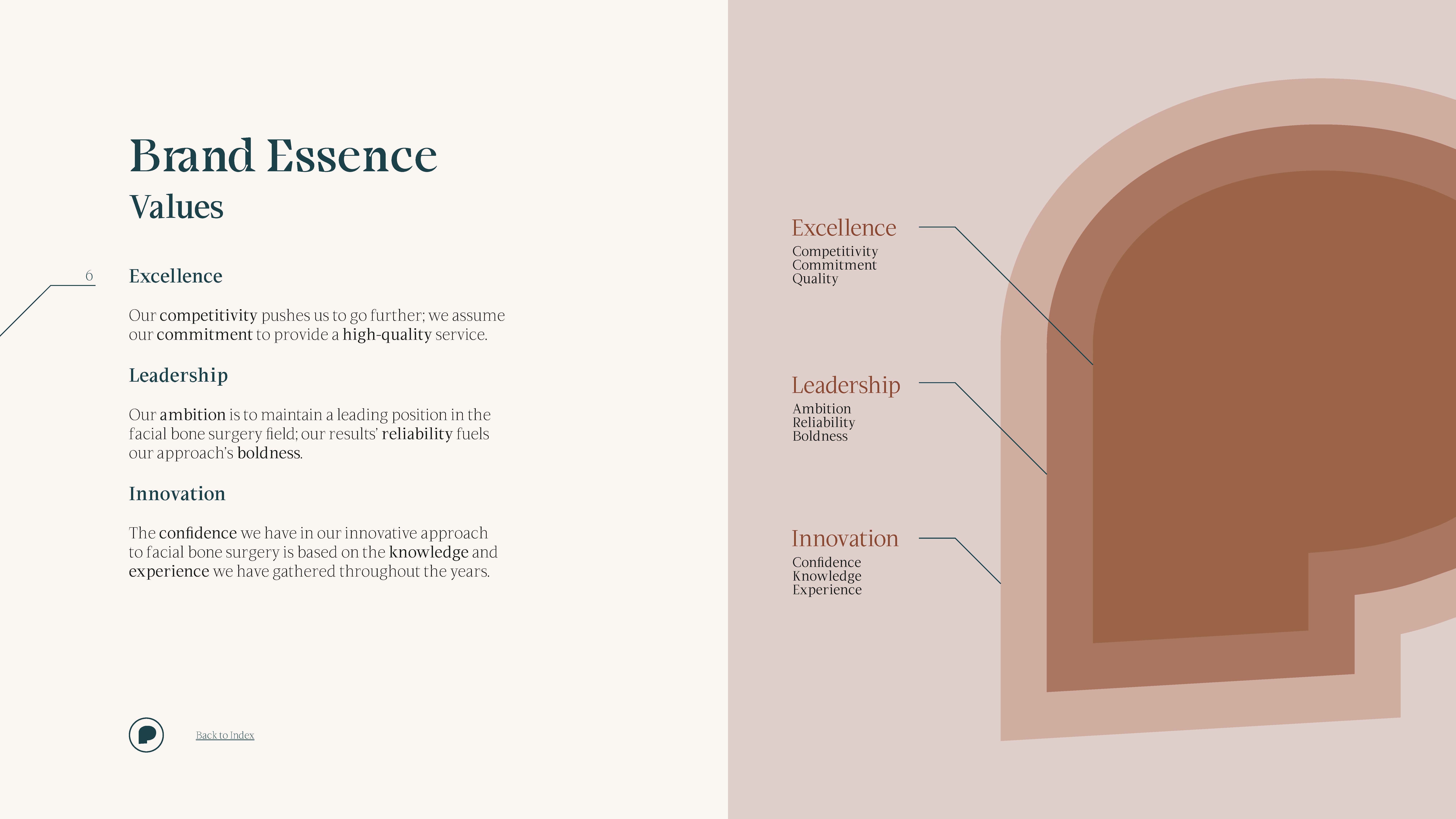
After further reflection on business goals and operational capacity, decisions were made, and the path forward began to unfold. As soon as we agreed on the brand positioning, we knew the direction we needed to take to give the brand its desired look and feel. The core pillars—vision, values, and mission—shaped the core creative concept: Carving Beauty.
From that point on, Skullpture’s refreshed and elevated brand identity was established: a brand focused on the concept of craftsmanship applied to facial bone surgery. The surgeons’ mastery inspired the brand’s exquisite character, delivering contemporary and bold visuals with an assertive and confident tone of voice that emphasises the state-of-the-art surgical technology and reliability of the surgical results.
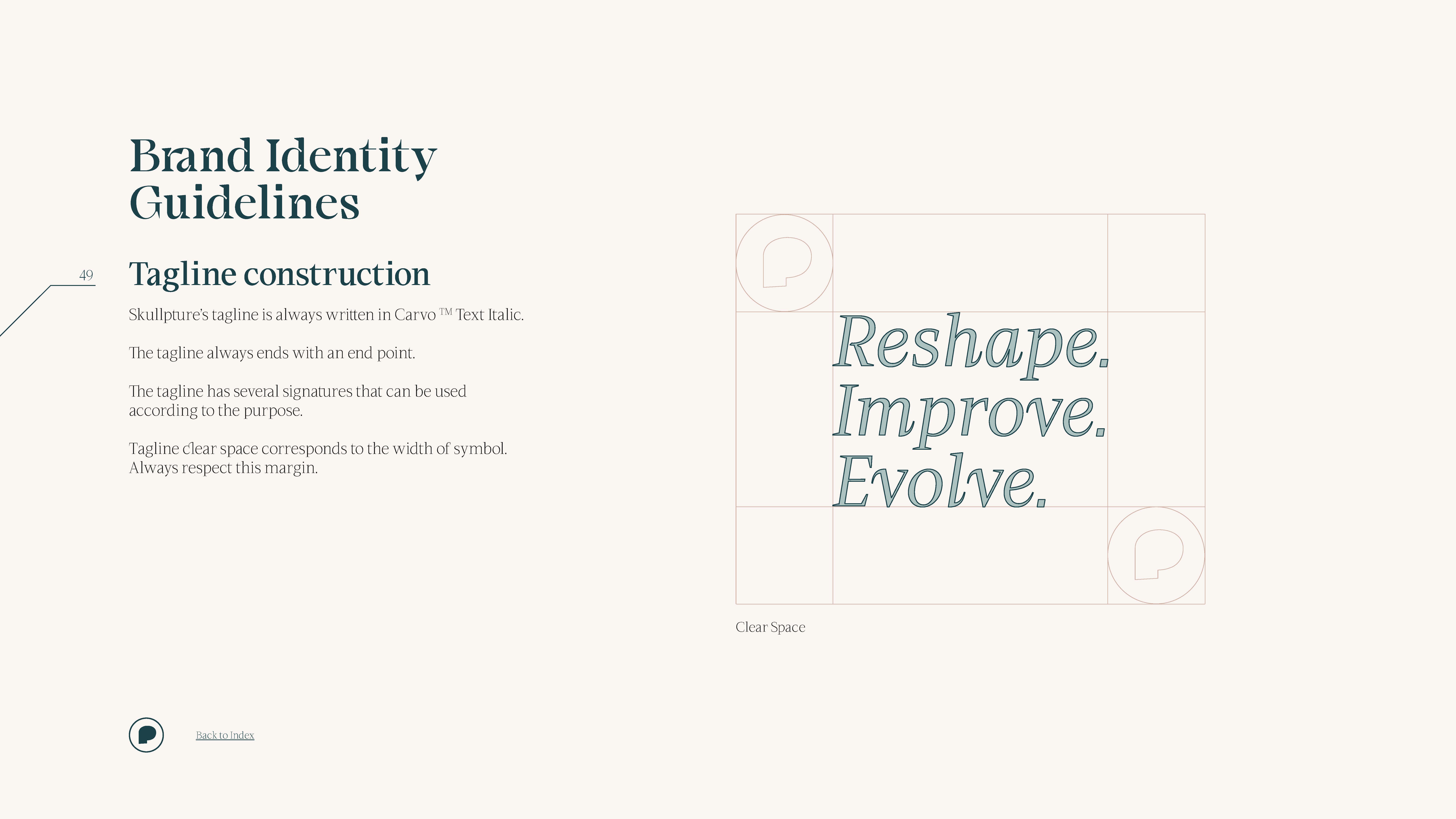
We were able to condense Skullpture’s message into an inspiring tagline that reflects the brand’s purpose and values and encourages anyone looking for their best version: Reshape. Improve. Evolve.
The narrative encapsulated in this tagline tells a story where Skullpture represents the craftsman who uses his expertise and experience to reshape the patient’s facial features and reveal the uniqueness underneath. Skullpture understands that facial bone surgery represents a challenging endeavour, so, like an artisan carving beauty from raw stone, Skullture responds to the patient’s pursuit of his best version and celebrates the search for self-esteem.
breathing life into the brand’s bones
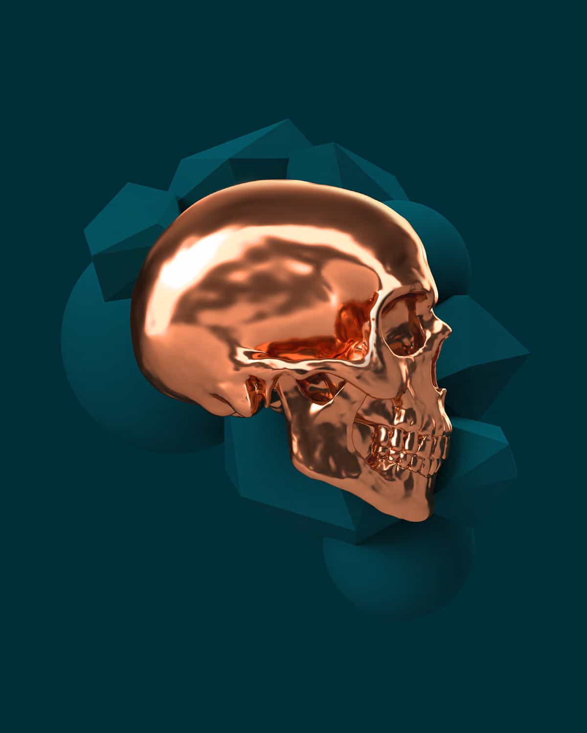
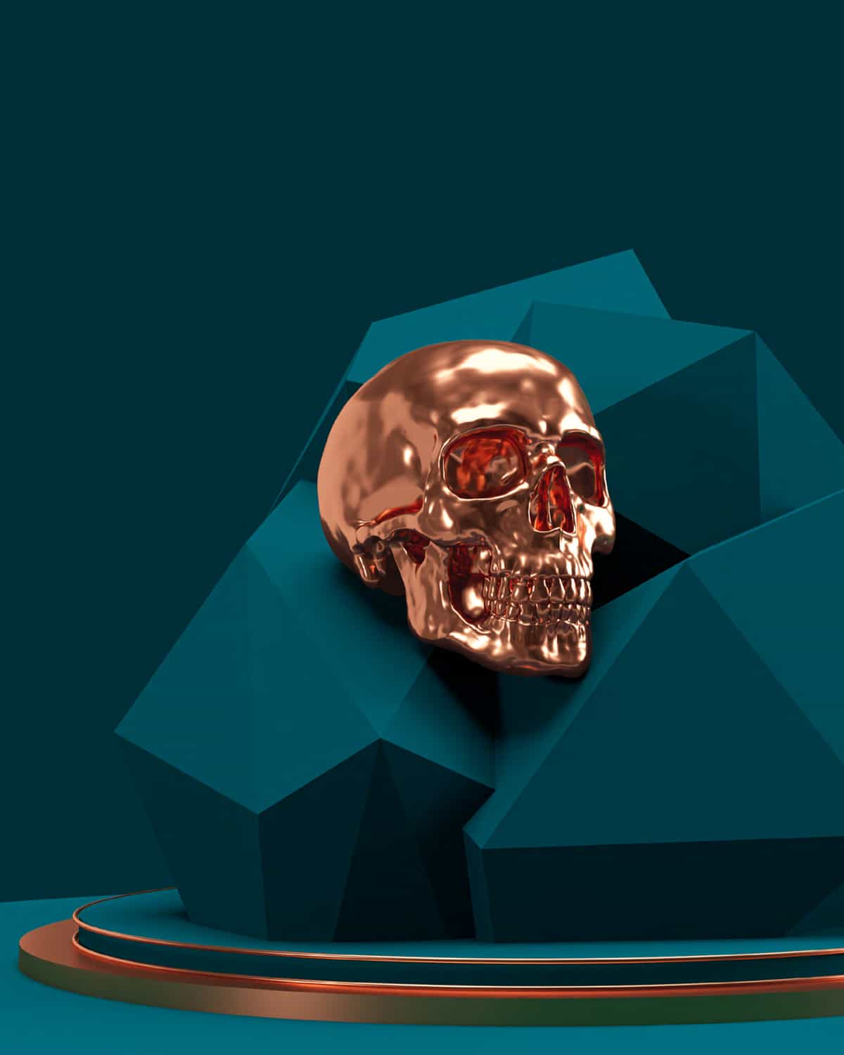
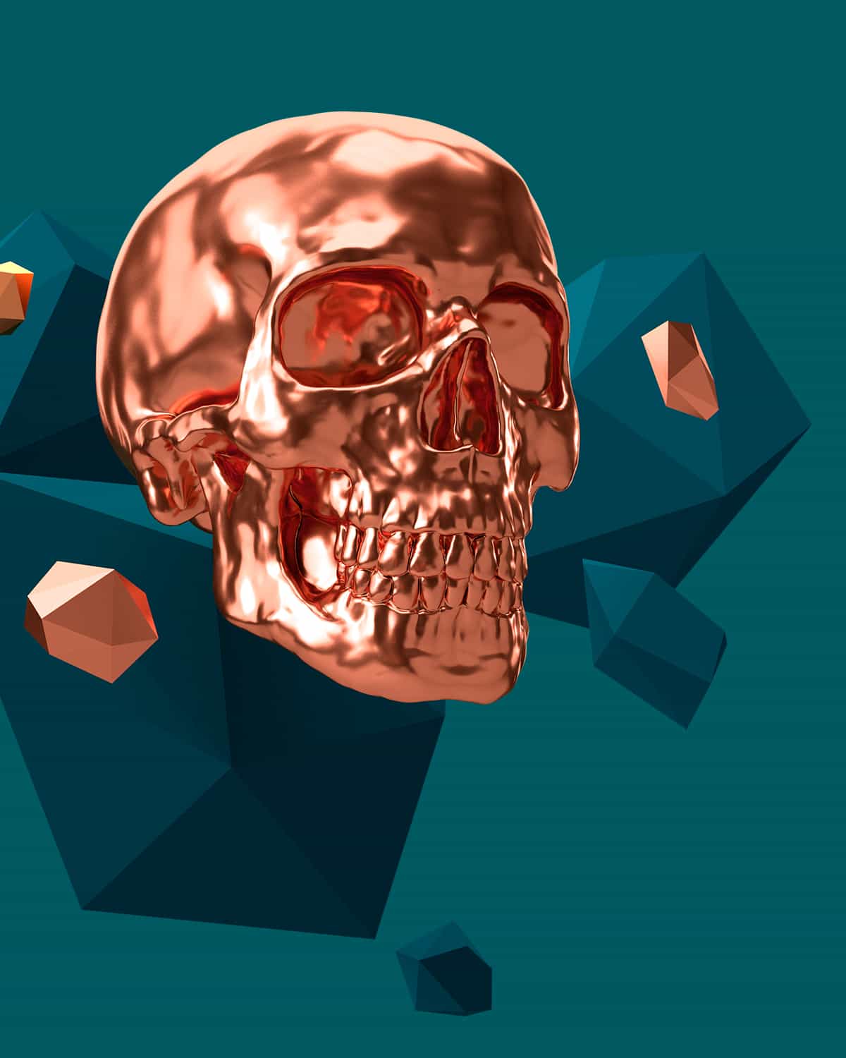
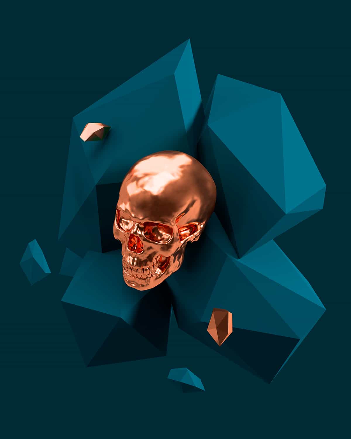
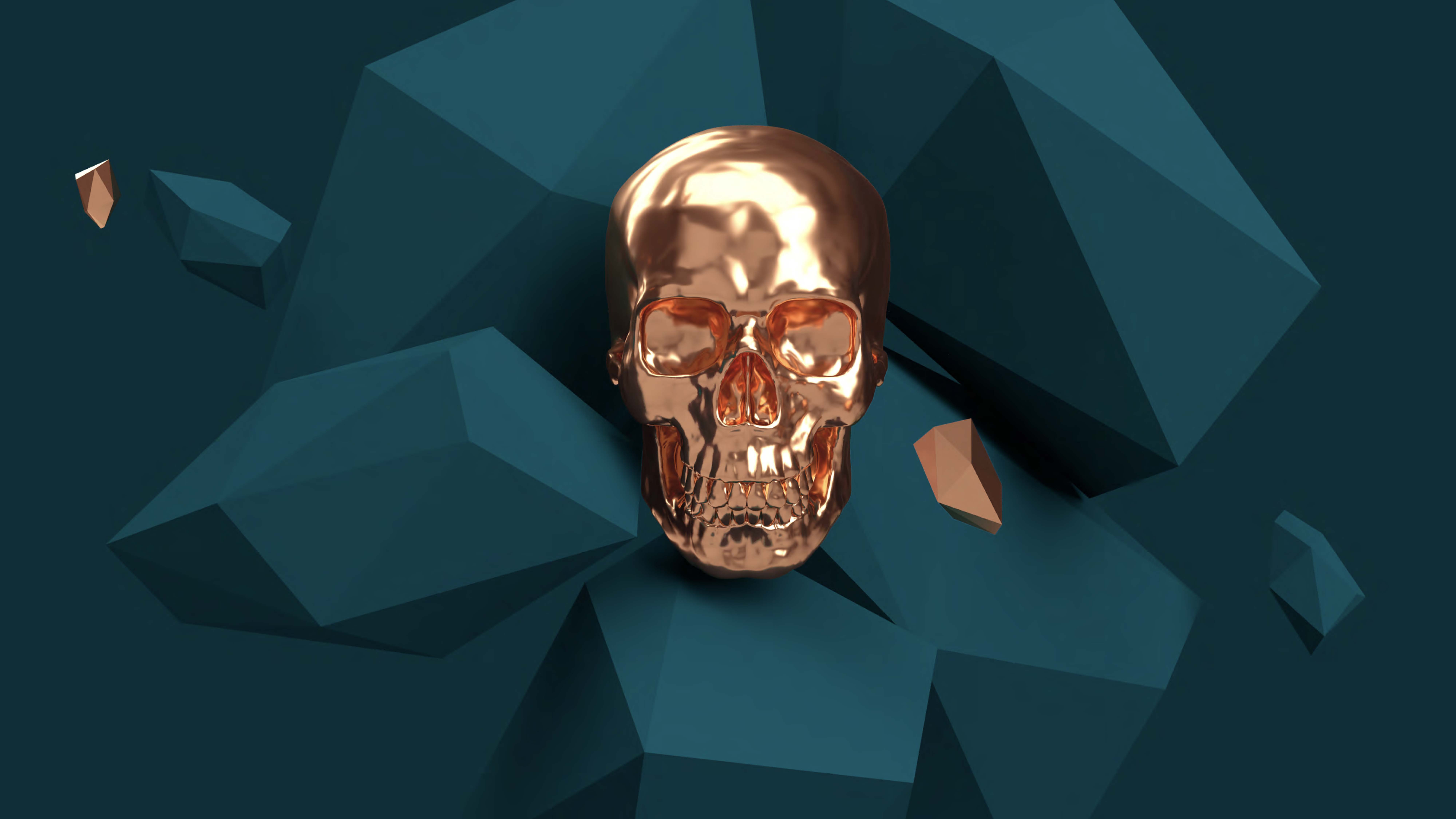
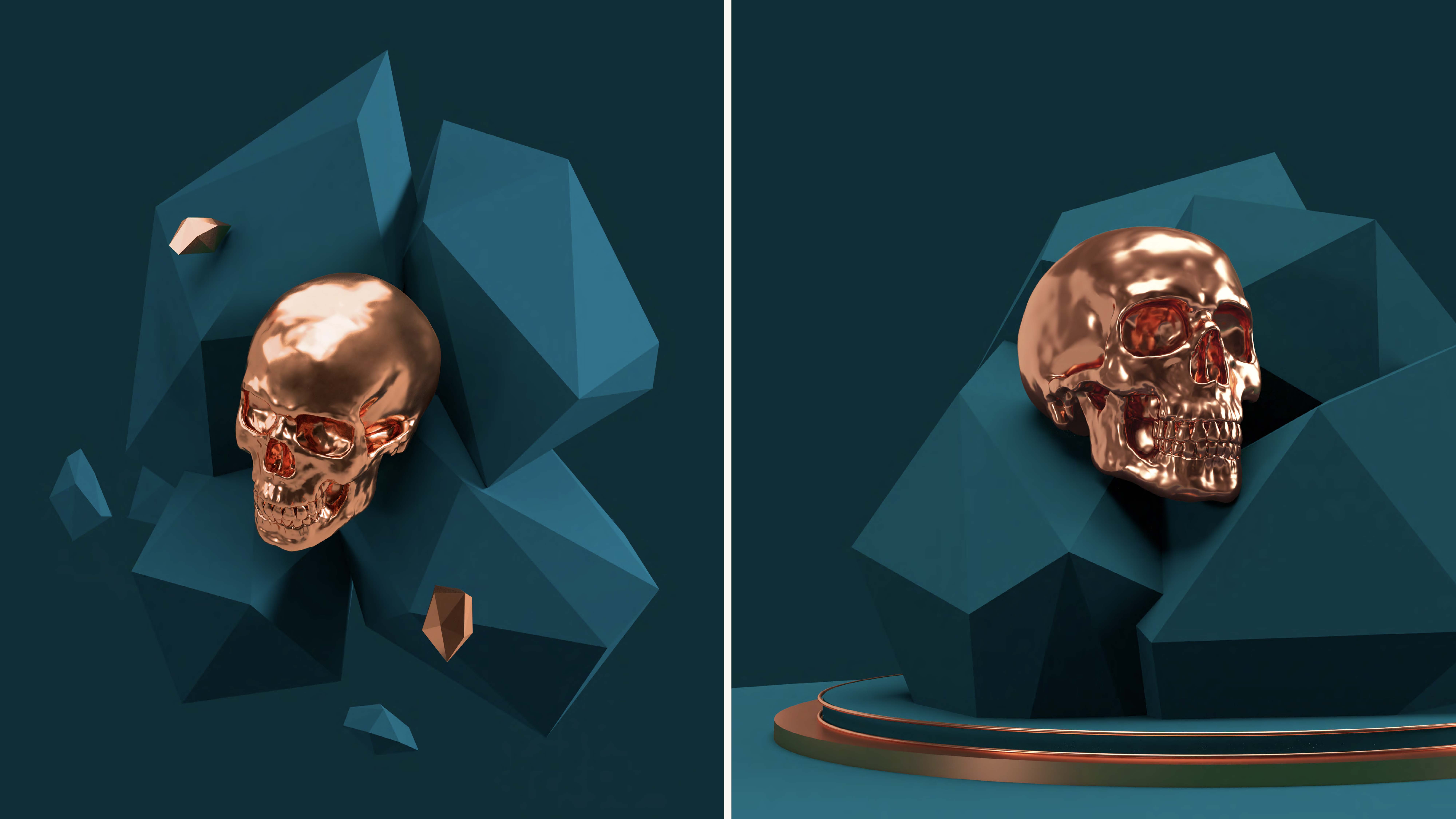
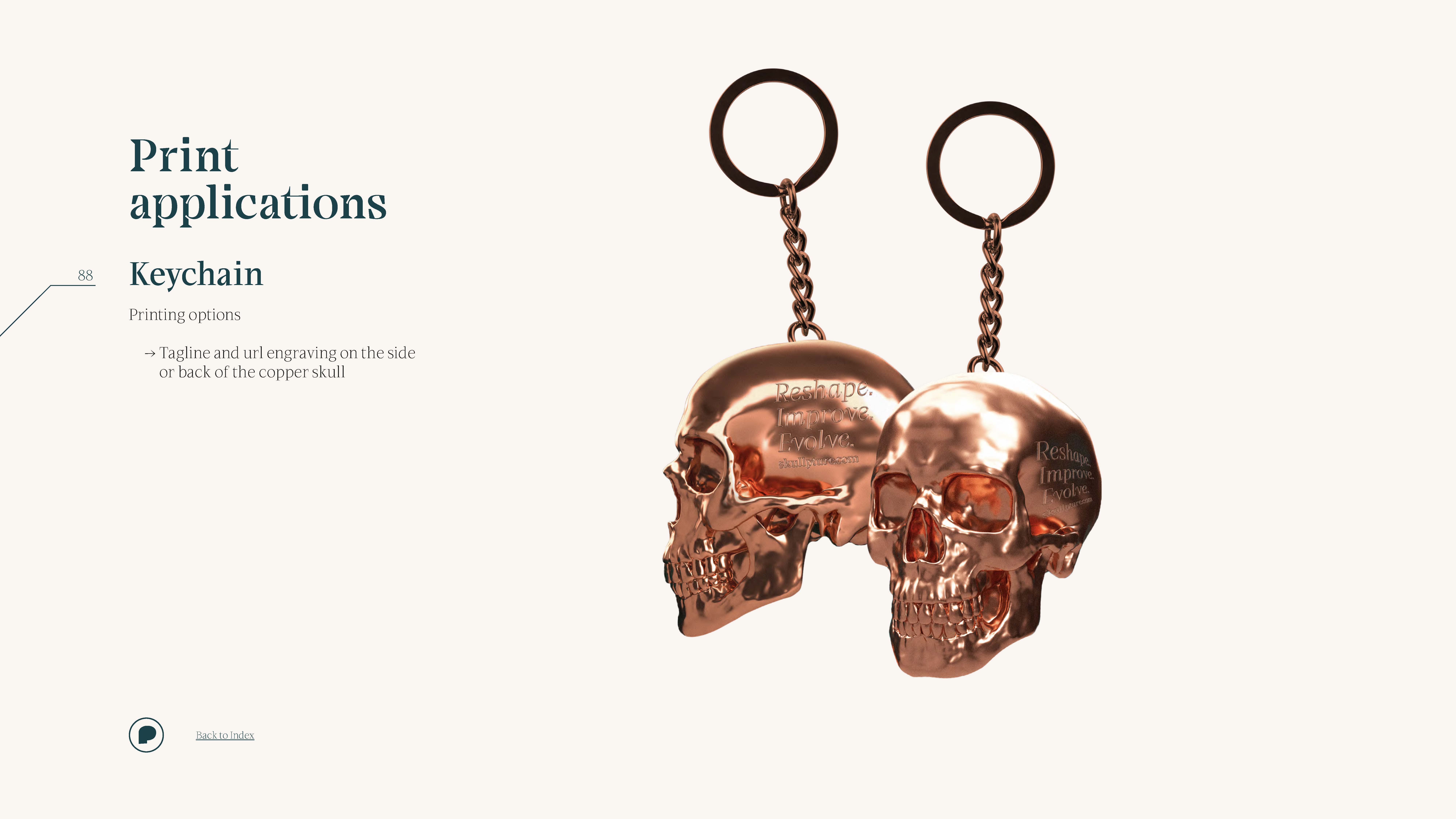
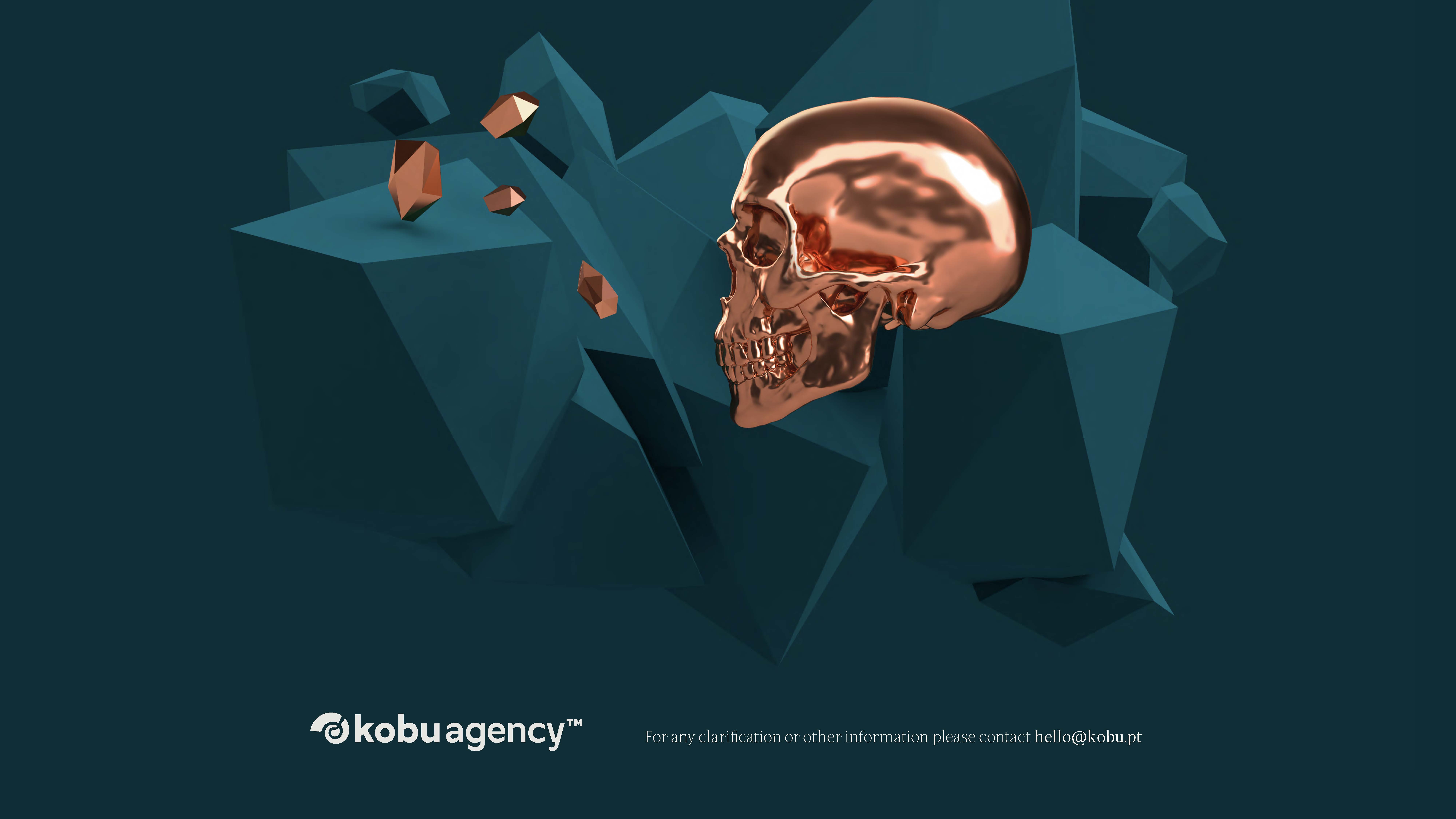
From the very initial discussions about the visual universe, one element that immediately stood out was the skull (obviously!) It became the centerpiece of the logo, which later inspired the idea of exploring tridimensional shapes. Also, the skull plays a central role in communicating Skullpture’s brand on the website, where a large and shiny copper skull prominently features on the homepage, guiding users as they scroll through various sections. The colour palette also plays a pivotal role in enhancing the brand’s web experience, making the navigation smooth, captivating and engaging.
RETHINKING THE BRAND’S LOGO
With this rebranding, the logo’s lettering has been slightly adjusted to allow for a more fluid reading experience, addressing the complexity of the typeface. Previously, the logotype existed in two versions (vertical and horizontal), but it has now evolved into a logo that is versatile in its application.
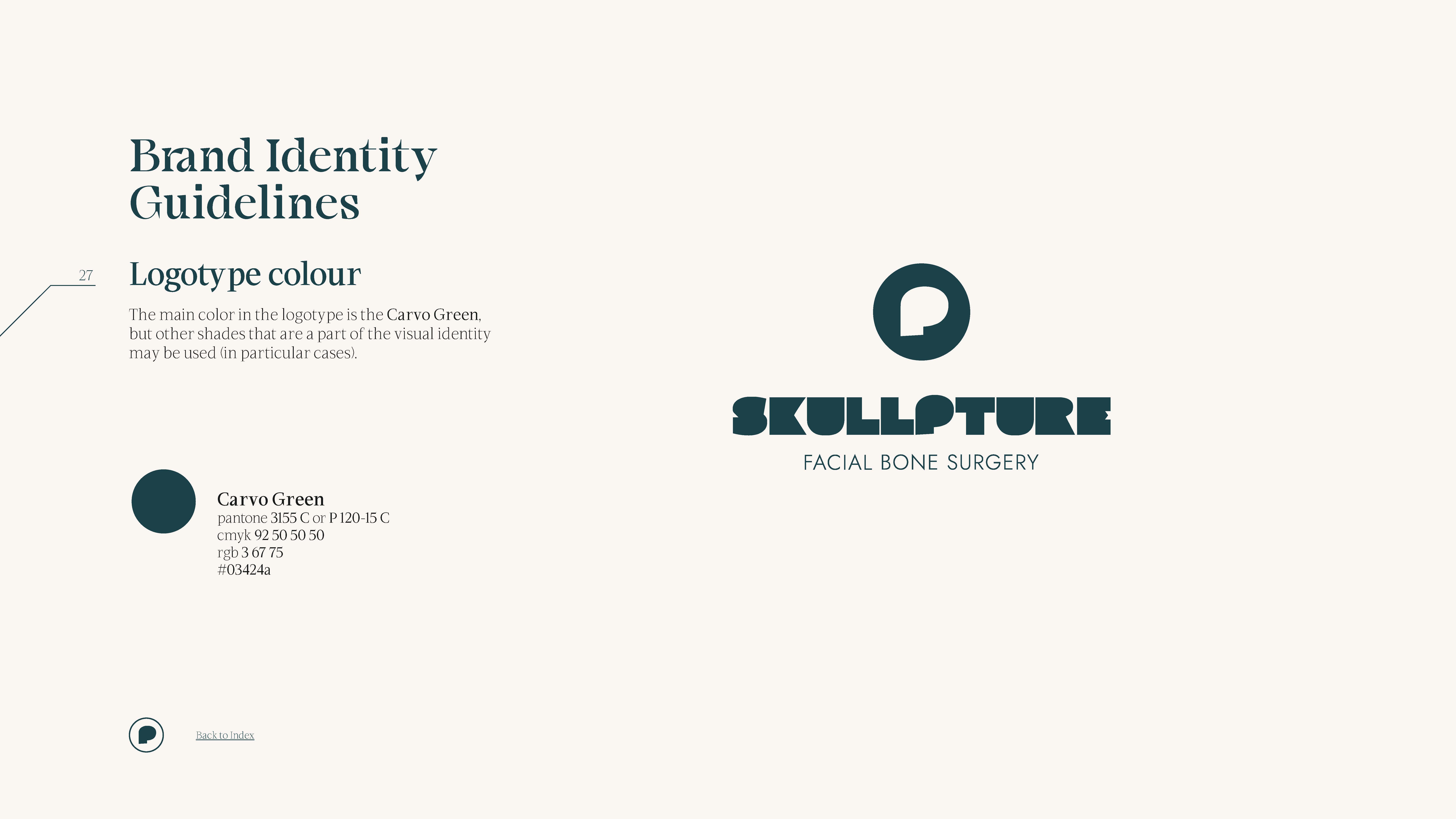
The current Skullpture logotype encompasses the symbol, wordmark and description. It offers three types of signatures: the main signature (vertical and horizontal), the logotype without a signature (vertical and horizontal), and the symbol alone. The primary colour of the logotype is Carvo Green, but other shades from the visual identity palette may be used in specific cases.
CREATING A MEANINGFUL VISUAL UNIVERSE
The brand’s colour palette consists of green, brown, grey, and beige. These colours are elements of balance, reflecting the brand’s dynamic essence and its association with the brand’s core pillars. Their application is versatile: in print materials, copper foil may be used for a premium, refined touch and to add delicate detailing.
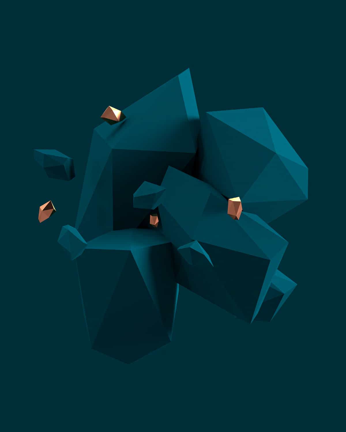
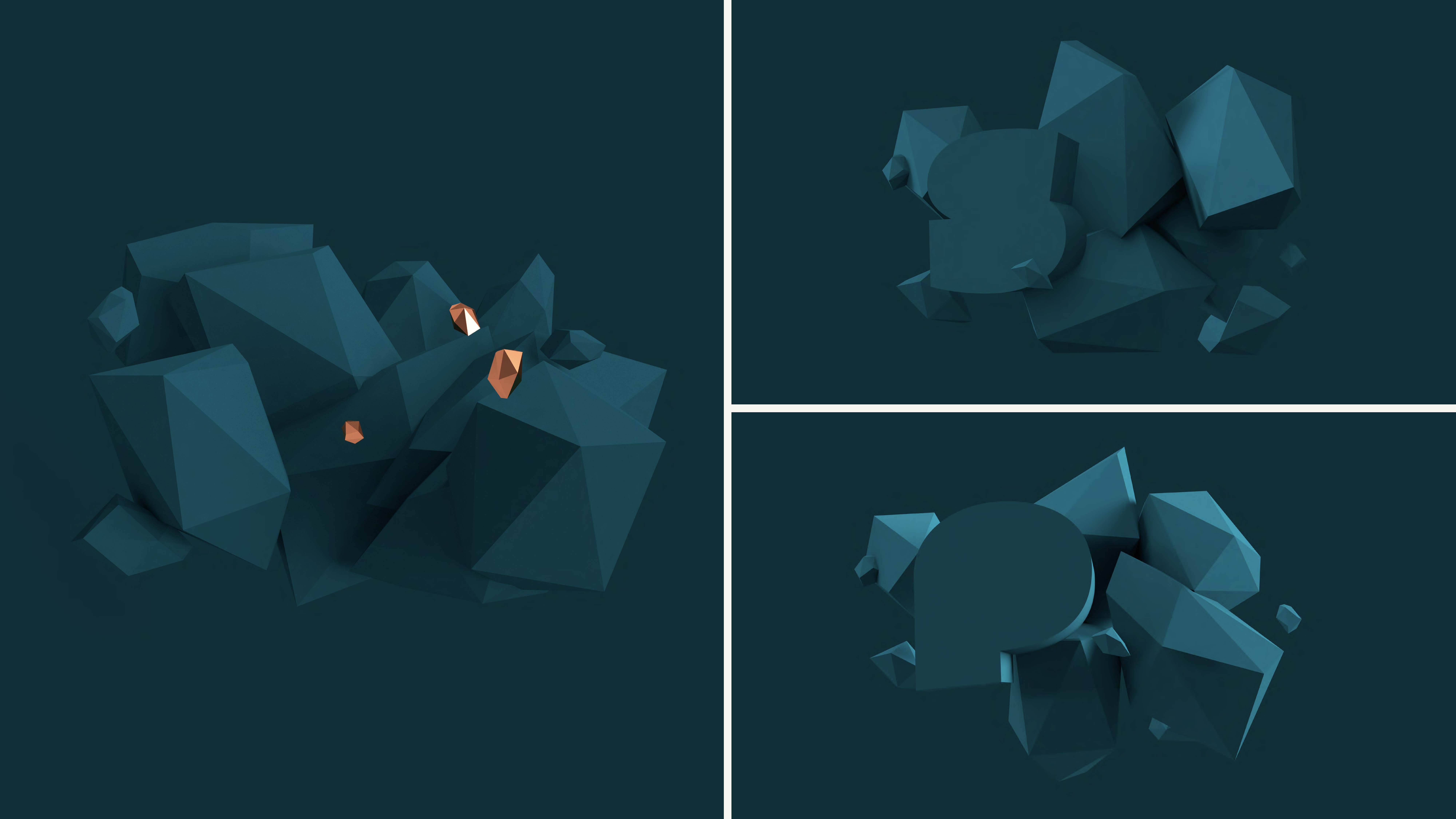
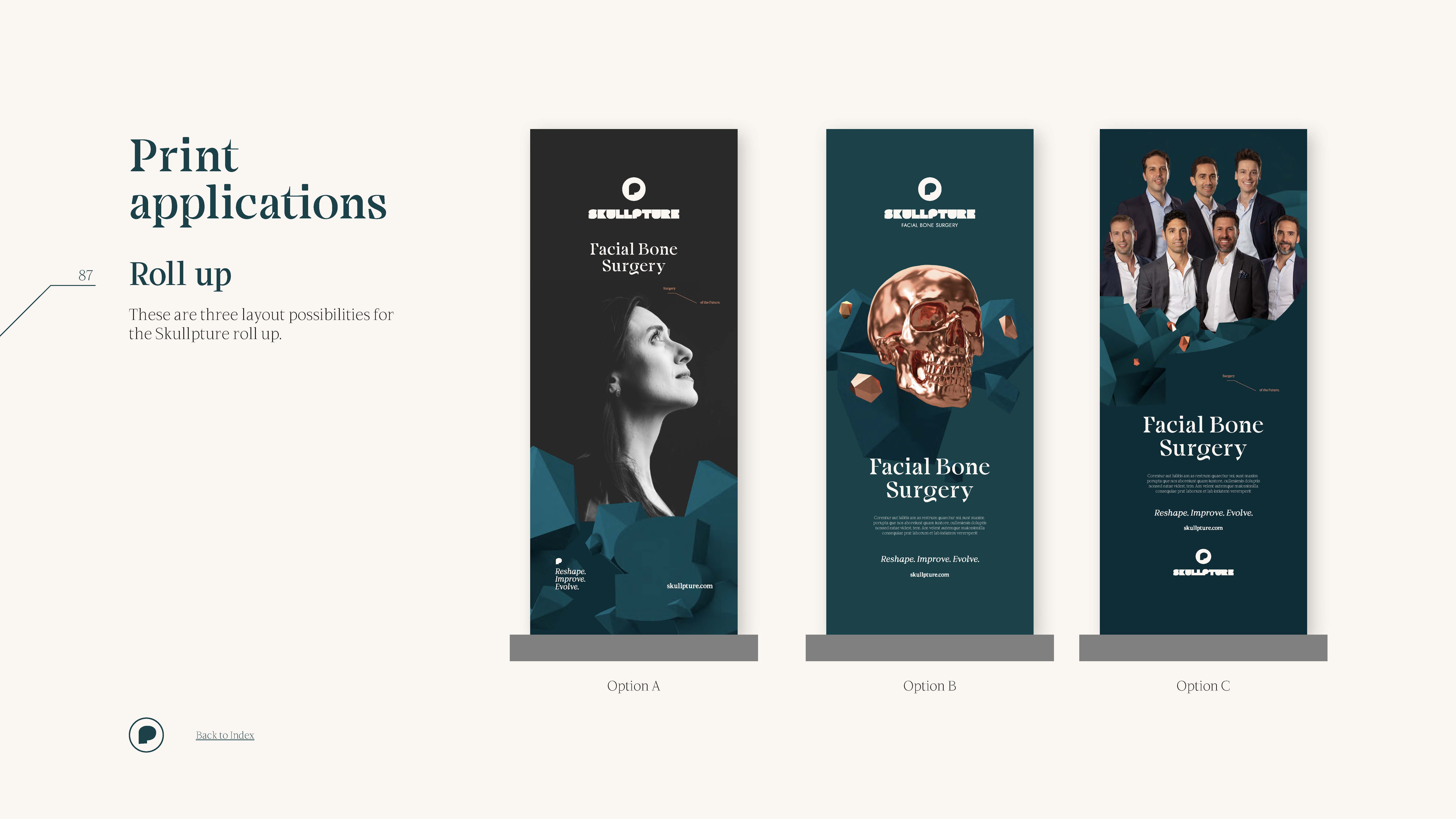
For Skullpture’s visuals, the three-dimensional compositions serve as a visual narrative of the process behind layering the copper skull. The rough, misshapen forms evoke the image of a raw, uncut precious stone that, through the expert craftsmanship of the Skullpture team, transforms into the most exquisite skull. This concept draws an analogy to the delicate and extraordinary work of the Skullpture medical team.
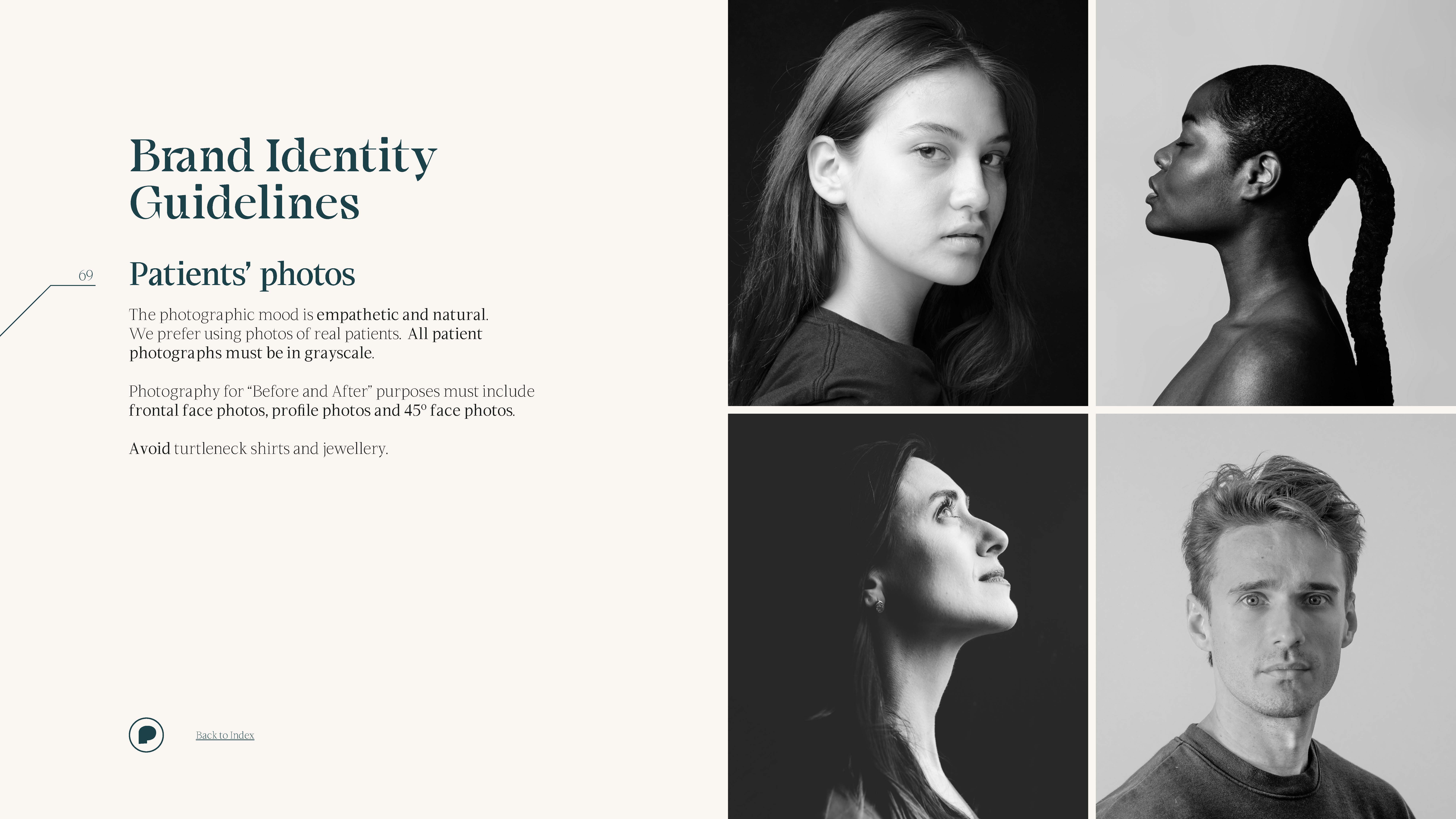
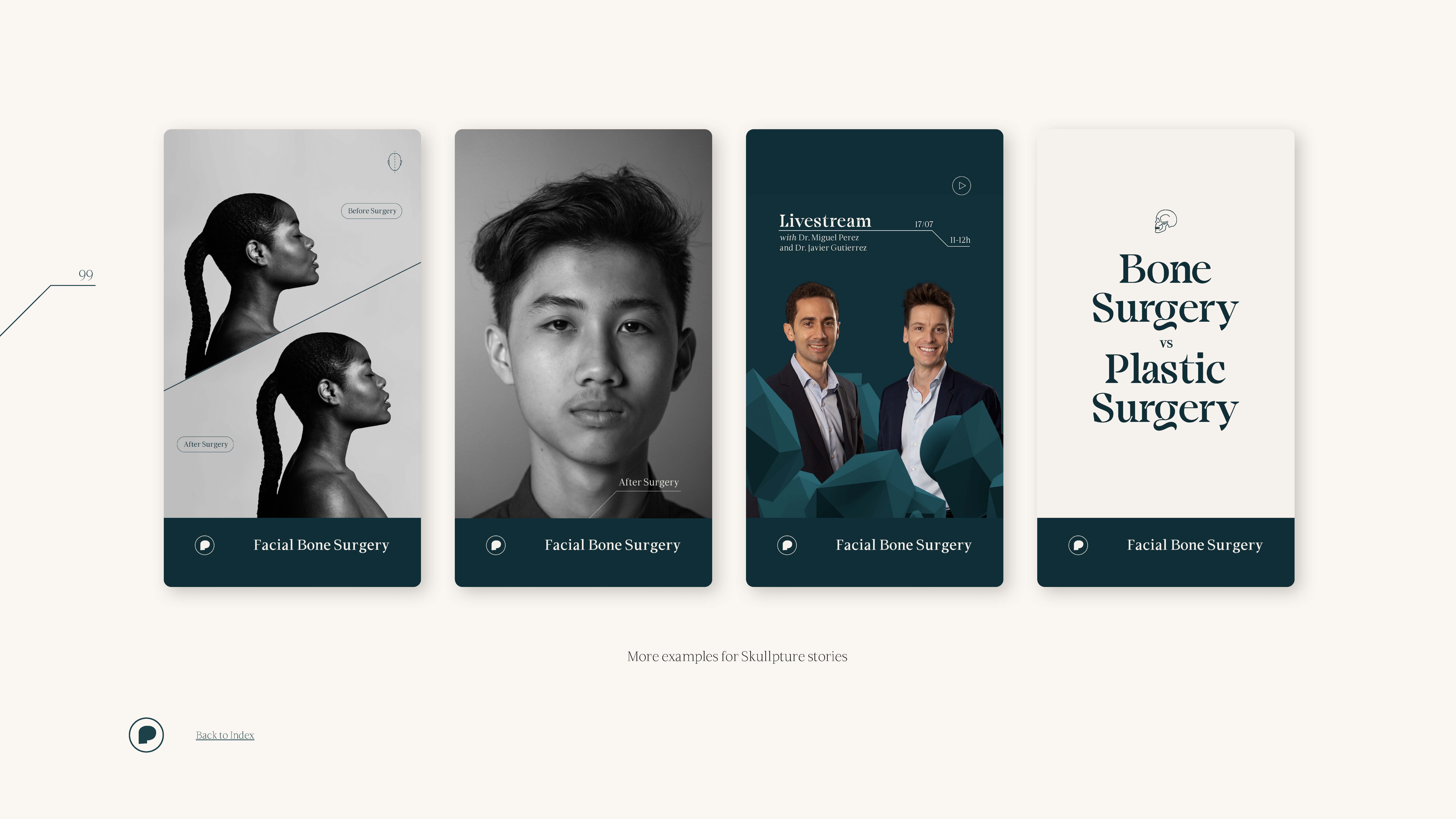
Skullpture’s graphic universe includes a set of visual elements that support the organisation of layouts, creating text sections and separators, notes, captions, word highlighting, page numbers and others. Additionally, it includes a distinctive set of iconography, primarily in linear drawings, which represent various aspects such as facial poses, arrows, specific website symbols, social media elements, and, of course, the bold and striking presence of the skull.
FUTURE-PROOFING HEALTH BRANDING: THE BRAND BOOK
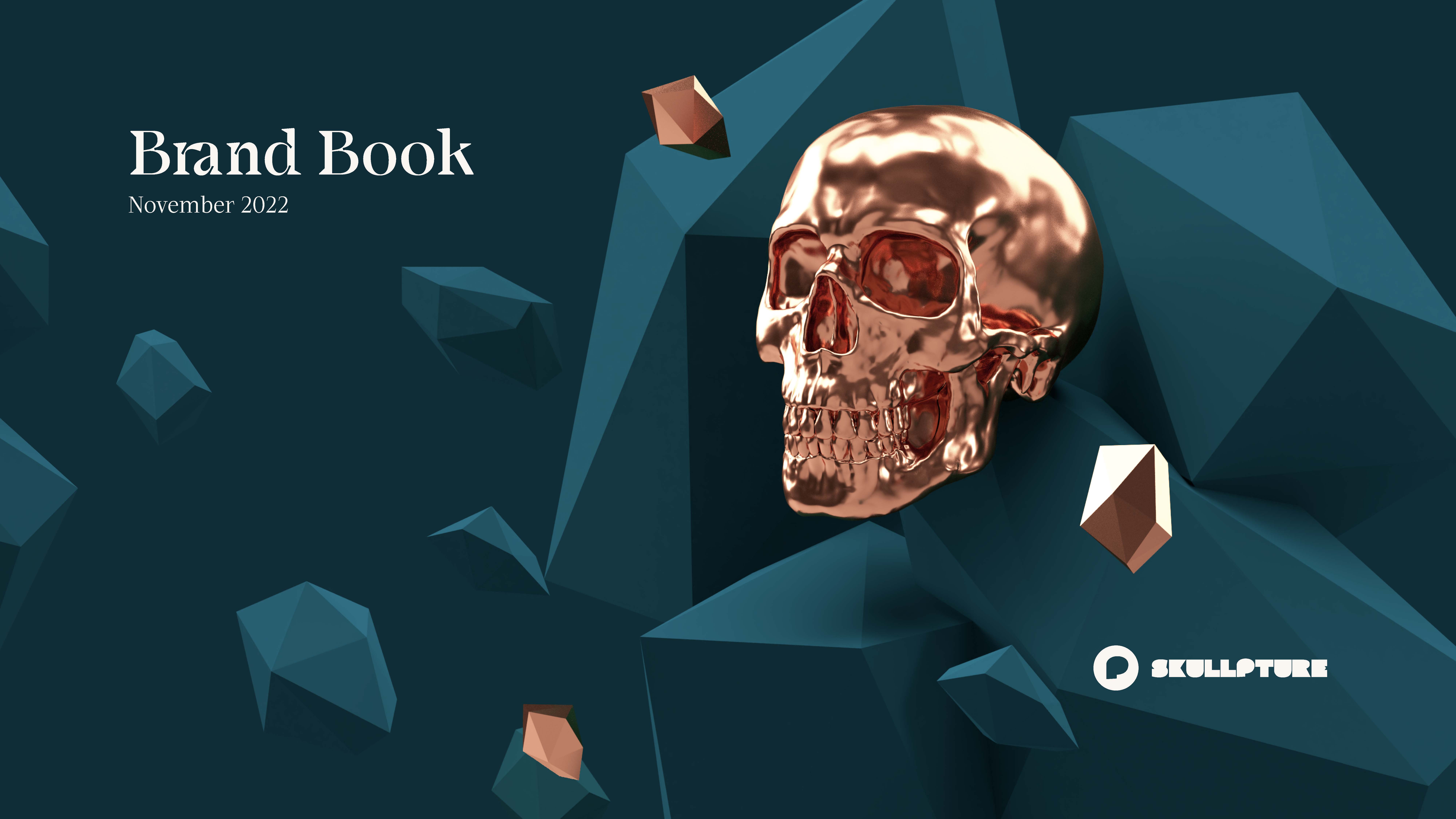
This visual universe is consolidated within a brand book, which encapsulates not only the essence of the Skullpture brand but also its copywriting guidelines, brand identity, and application and motion guidelines. The brand book serves as an essential tool to communicate the Skullpture brand, covering everything from its core DNA to its visual presentation, whether in static or dynamic form.
Custom TYPEFACES FOR HEALTH BRANDING: sculpted in detail
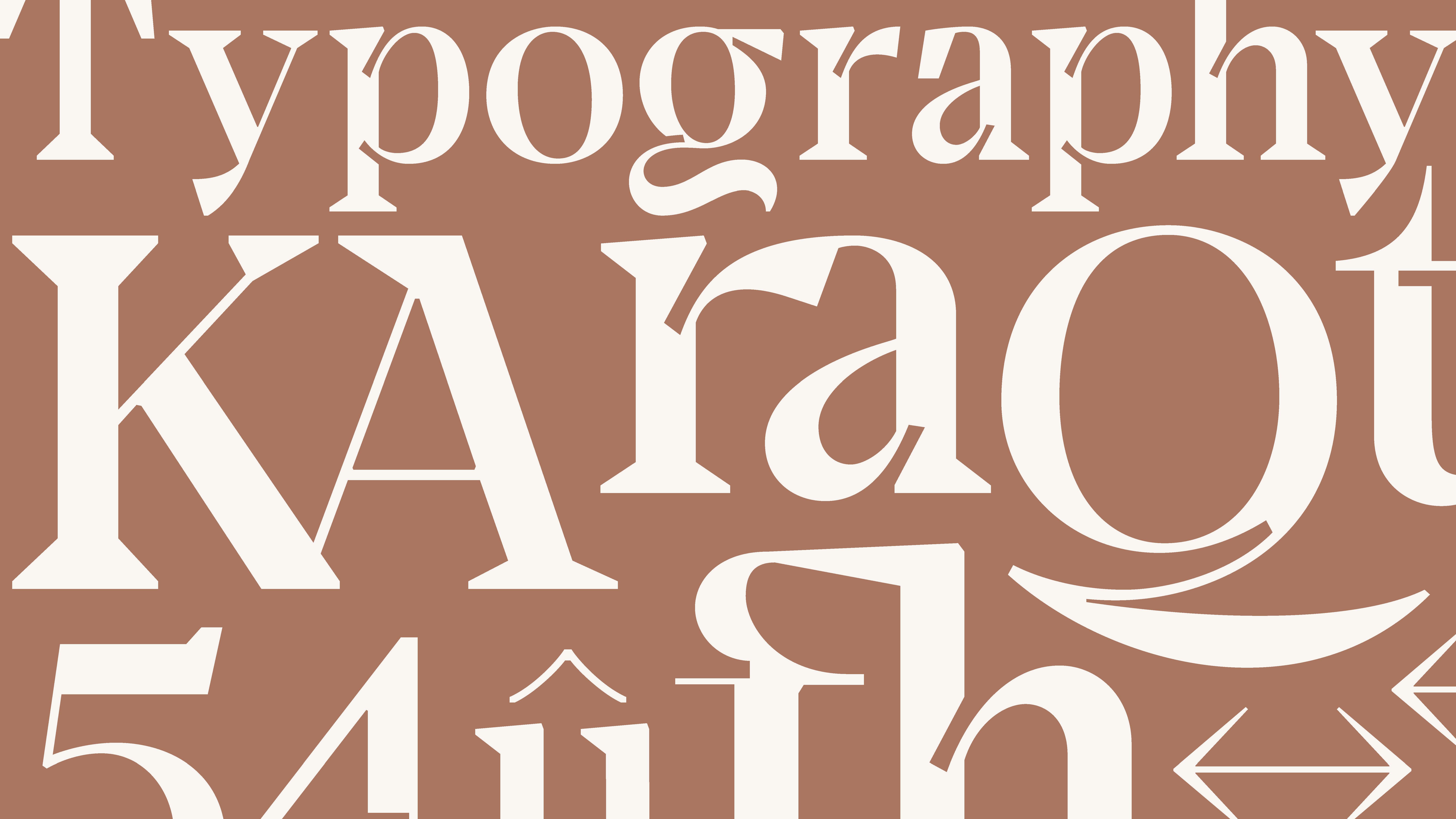
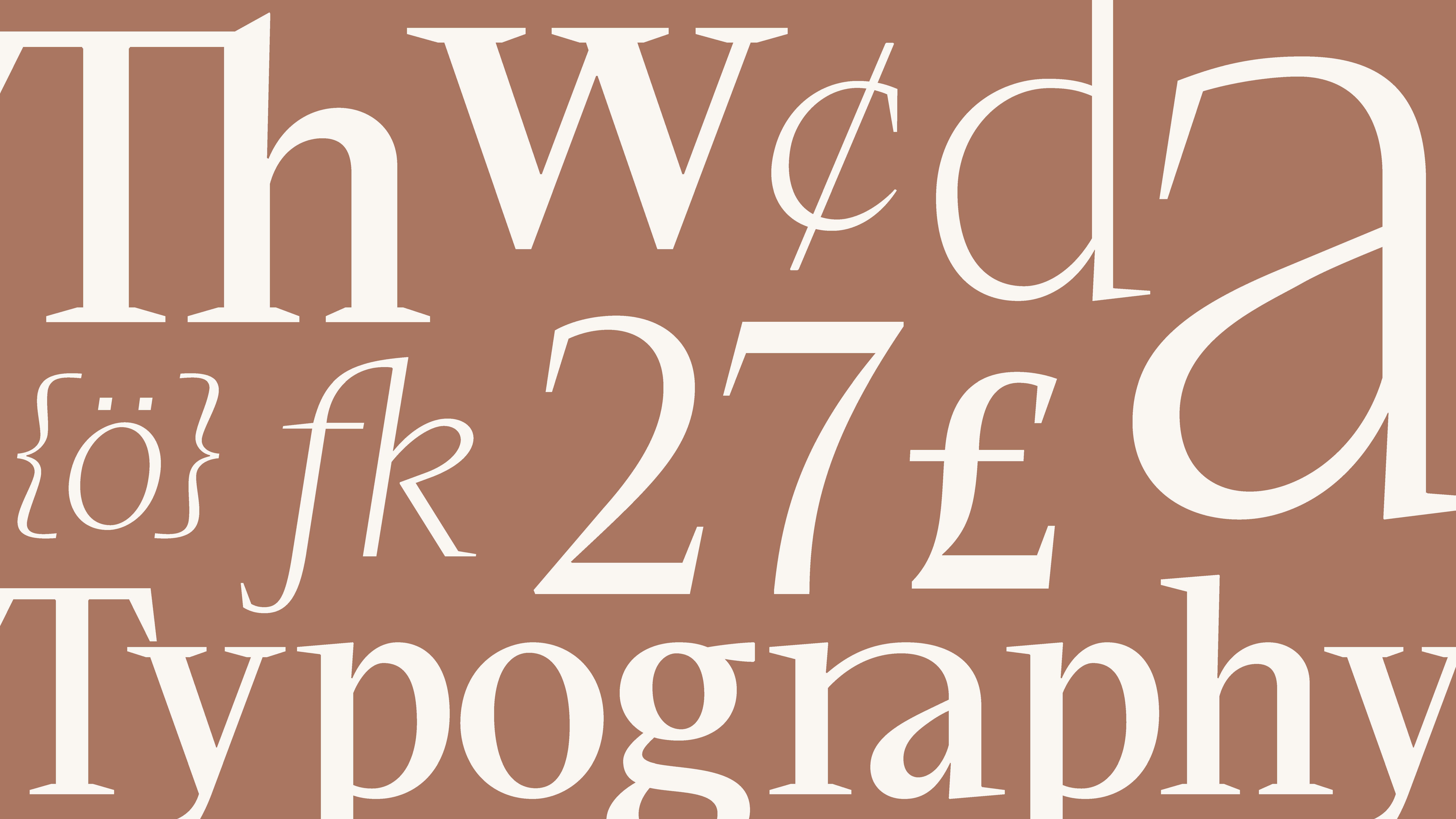
KOBU™ Foundry developed a custom typography for this rebranding project: Carvo™ Poster (for headlines) and Carvo™ Text (for body text), two serif typefaces that comprise the Carvo Family. Rooted in the “Carving Beauty” concept, Brígida Guerreiro, our type designer, undertook an in-depth exploration of the tools and techniques used in facial bone surgery. Drawing inspiration from the intricate shapes of these surgical instruments—crucial for achieving fine detail in sculpting—she infused these elements into the design of the Carvo glyphs, mirroring the meticulous attention to detail that Skullpture provides to its patients.
The details in each glyph were meticulously sculpted, achieving an optical balance between organic and angular shapes. It is crucial to understand that before being read, the shapes of letters are visually interpreted, conveying emotions and meanings.
Carvo™ Poster and Carvo™ Text
Guided by this principle, the Carvo™ Poster typeface achieves a harmonious balance. Its design embodies the concept of “carving beauty,” likened to carving a diamond from its raw form, comprising uppercase and lowercase characters, numerals, ligatures, punctuation, symbols and arrows.
Carvo™ Text features three weights (Extra Light, Medium and Extra Bold) with character sets encompassing uppercase and lowercase letters, numerals, punctuation, ligatures, symbols, iconography and arrows. Additionally, this typographic family offers two styles (roman and italic) and supports over 60 Latin-derived languages, making it an ideal choice for diverse typographic compositions. This custom typeface was developed as an integral part of Skullpture’s visual identity, tailored for subtitles, body text and descriptions or captions. Both Carvo™ Text and Carvo™ Text Italic are serif typefaces designed to align seamlessly with the brand’s new positioning.
The Carvo™ Poster and Carvo™ Text font are not only visually striking but serve also as a testament to the brand’s commitment to excellence and detail, enriching the overall visual identity of Skullpture while aligning perfectly with its “Carving Beauty” ethos.
In December 2023, this project received a Bronze Award at Prémios Lusófonos in the category “Design – Tipografia”.
Health Branding: DESIGNed for Success
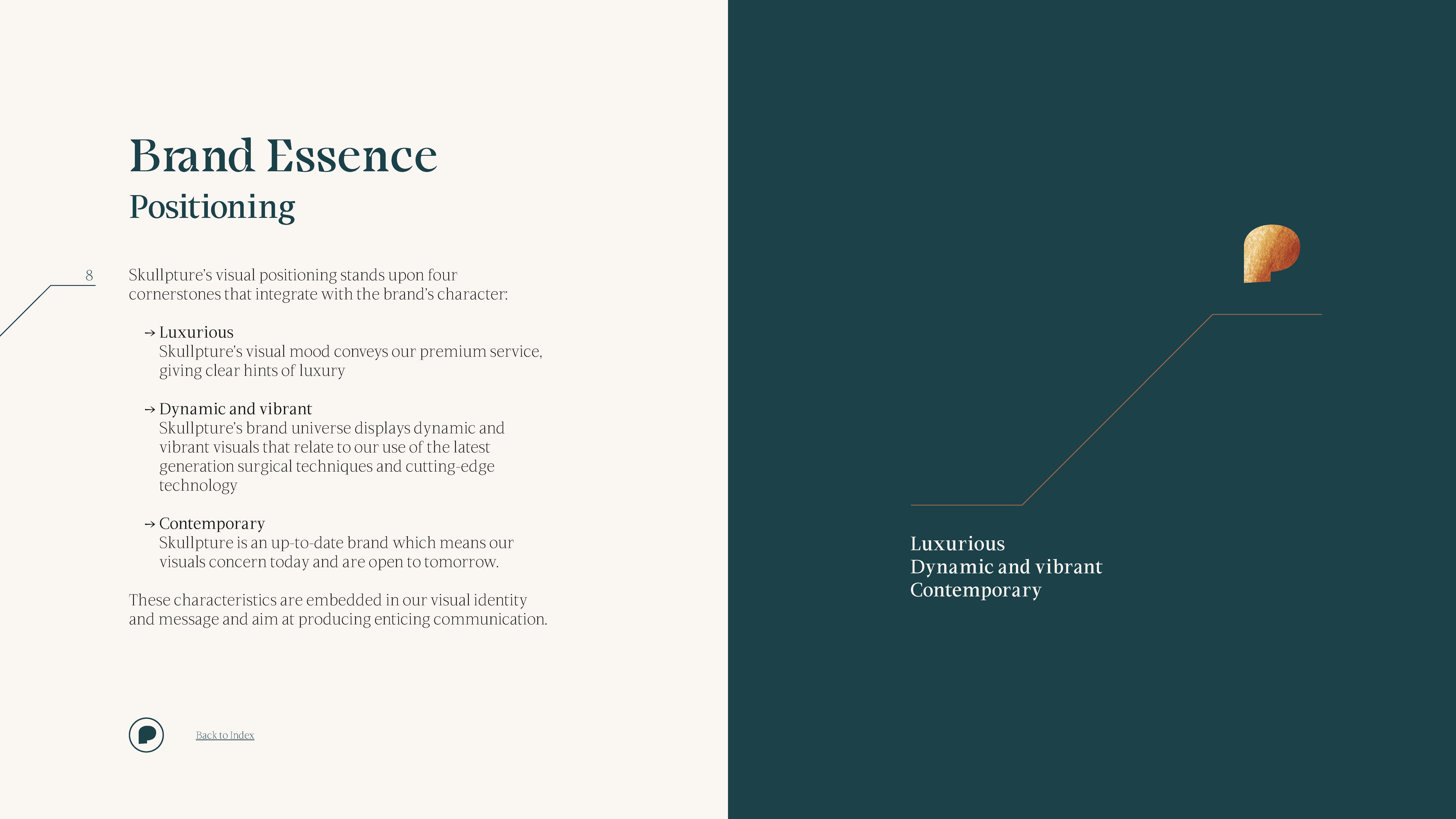
In the end, the goal was achieved: Skullpture’s visual positioning now exudes a bold sense of luxury and modernity, with a confident, vibrant character. This sophisticated visual identity radiates refinement, effectively appealing to the affluent segment of the market.
One thing this project has reassured us of is that pushing boundaries and challenging conventions pays off. Introducing edgy visuals and dynamic elements into health branding, led to a brand narrative that intertwines art, technology, and vulnerability. This strategy not only elevated the brand within its segment but also imbued it with emotional depth and purpose, ultimately proving that healthcare and medical brands can indeed be strong, inspirational and far more exciting.
In May 2024, this project received the Web Design Appreciation Award at the Orpetron Web Design Awards. Also, in July 2025, the project won the Orpetron Web Design Appreciation Award at the Orpetron Web Design Awards.
PROJECT TEAM
Executive Director: Nuno Tenazinha
Project Manager: Marta Gouveia
Creative and Art Director: Brígida Guerreiro
Brand Strategy: Isabel Evaristo
Copywriting: André Oliveira
Logo Designers: Jesus Gilabert, Brígida Guerreiro
Type Designers: Brígida Guerreiro
3D Designers: Brígida Guerreiro, Vanda Pereira
3D Motion Designer: Rui Xavier
Graphic Designers: Brígida Guerreiro, Vanda Pereira
Iconography: Brígida Guerreiro, Catarina Marques
Digital Product Management: Karolina Guilherme
UI/UX Designer: Daniel Gomes
Web Development: Cátia Dionísio, Diogo Valongo
Motion Designer: Pedro Santos


