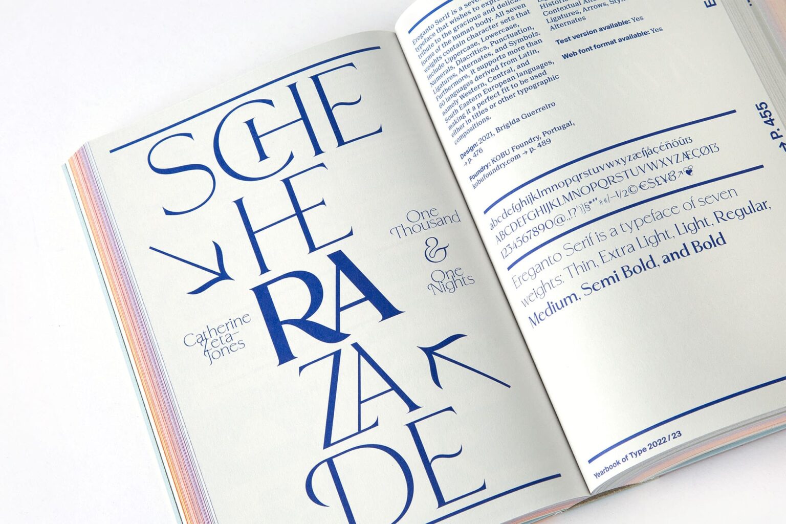
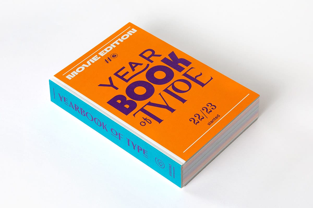
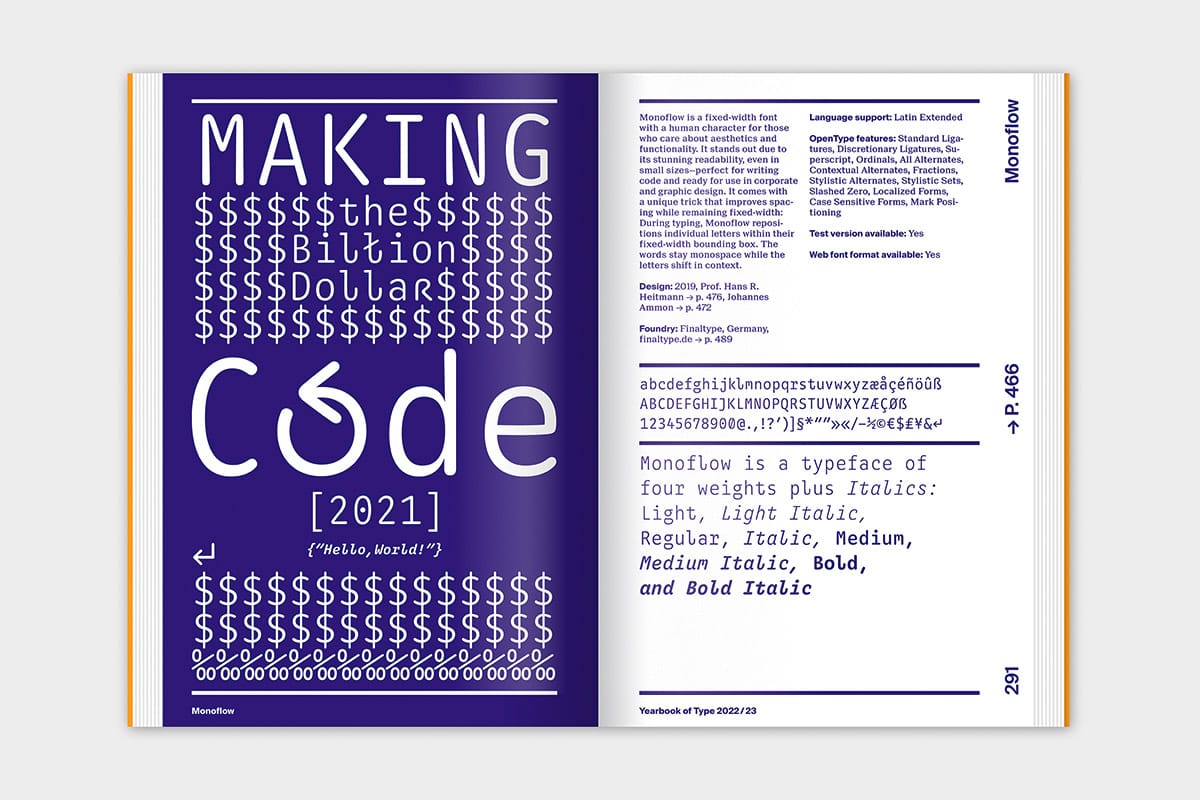
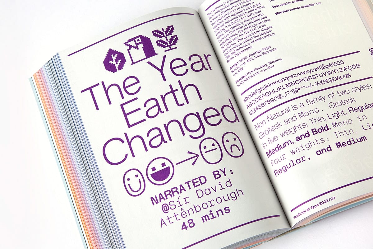
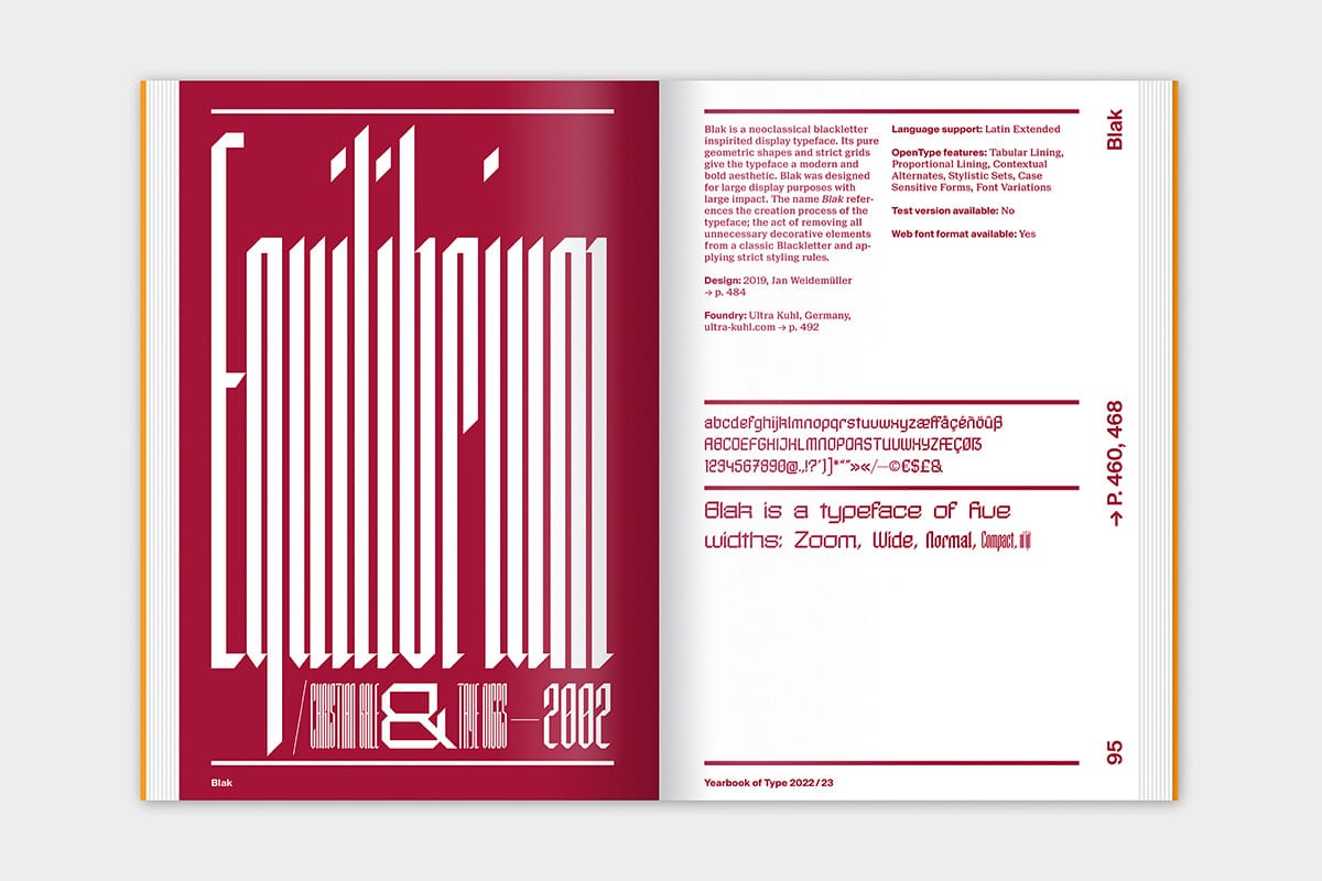
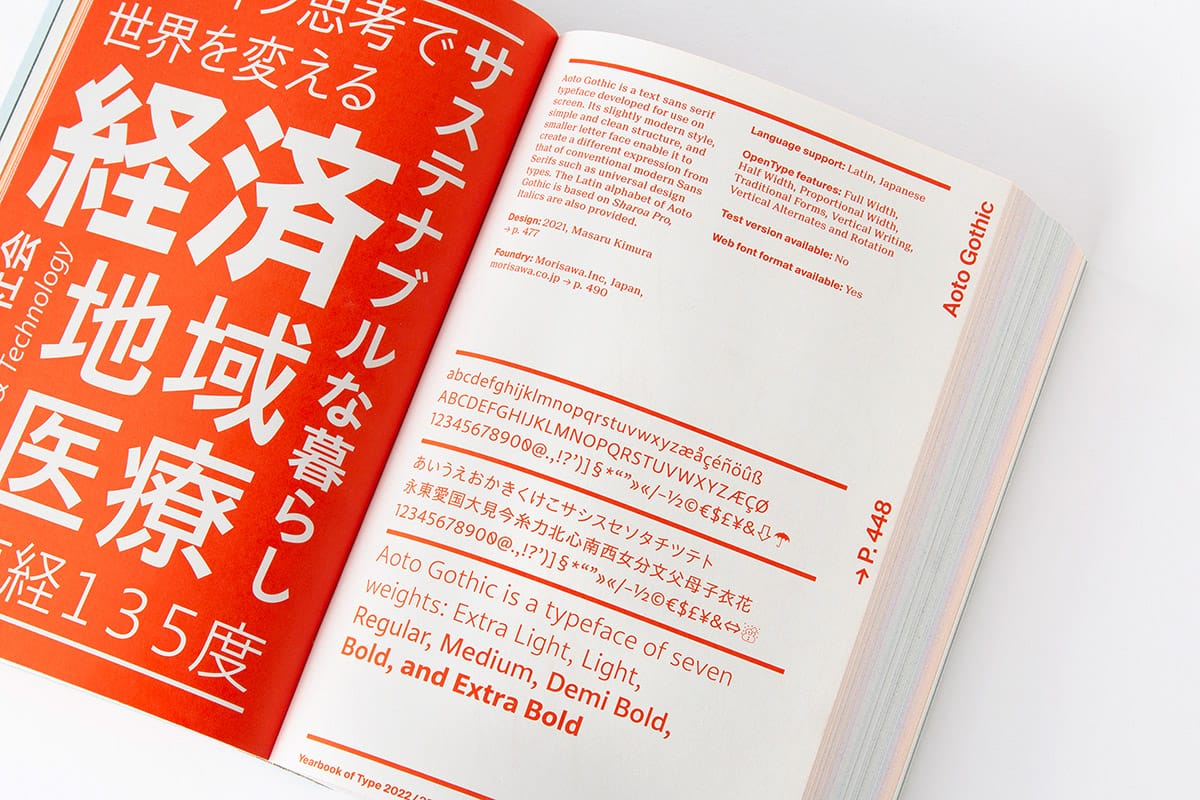
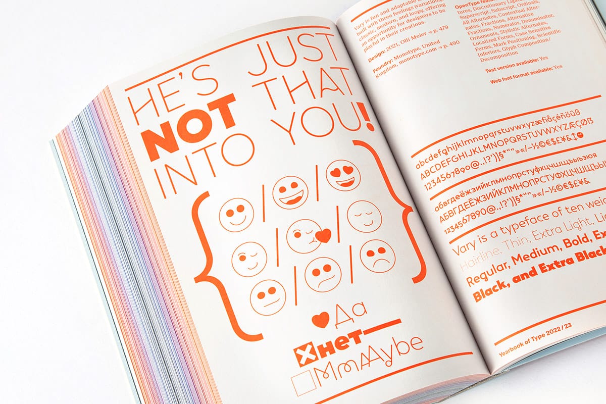
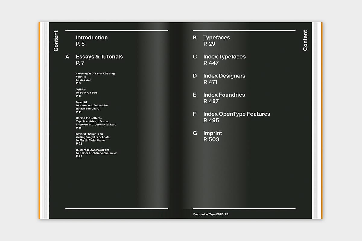
The typeface Ereganto Serif, launched by KOBU Foundry in 2021, has been featured in Slanted Publishers Yearbook of Type 22/23, dedicated to movies, with a special highlight on the book’s cover.
Ereganto Serif is a seven-weight typeface (Thin, Extralight, Light, Regular, Medium, Semibold, Bold), designed by Brígida Guerreiro, that wishes to express a tribute to the gracious and delicate forms of the human body. Being a typeface whose conception is highly drawn to the idea of beauty and grace of the human body, the lines of Ereganto transmit a wide sense of delicacy and elegance that can also be felt even in its heavier weights.
All seven weights contain character sets that include uppercase, lowercase, numerals, diacritics, punctuation, ligatures, alternates and symbols (including arrows). It supports more than 60 languages derived from Latin, namely Western, Central and South Eastern European languages, making it a perfect fit to be used either in titles or other typographic compositions.
Yearbook of Type #6 2022/2023 – Movie Edition
You know the scenario: You just want to find a fitting series or movie on your streaming platform—but you can’t find what you are looking for and keep doom-scrolling—until you turn off the computer.
The same often happens when looking for the perfect typeface for your design. You know, the one that not only conveys the mood you are longing for but also needs to fulfil all necessary requirements. In a mess of countless open browser tabs, bookmarks, lists, and folders, the right typeface and foundry—characterized by the smallest details—are hard to find.
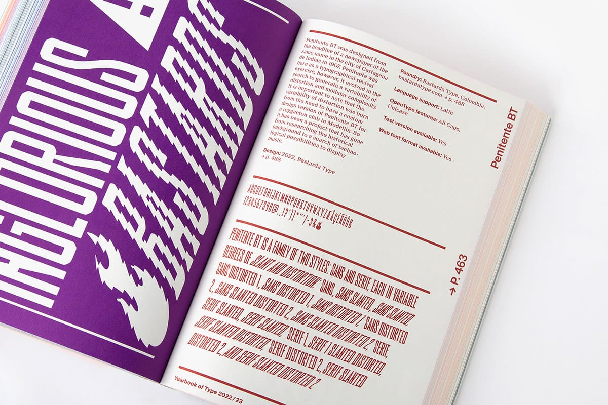
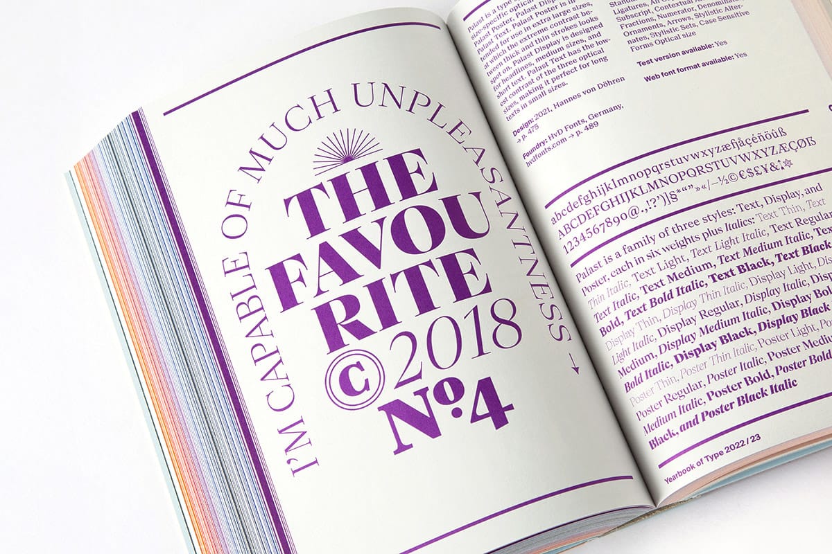
The Yearbook of Type #6 2022/23 is a collection of the latest published typefaces that helps you find the one—from a browse through the book, or quick look in the index that neatly sorts typefaces by class, designers, and foundries. Each font and font family is presented on a double page. On the left page, the font is applied; inspired by this year’s theme of film and drama. To the right, the typeface is described in detail; with all its features, as well as information about the designers and foundries. A complementary online microsite features all fonts with direct links to respective foundries and purchasing options.
The publication is rounded off by a series of essays, interviews, and tutorials on the subject of type design and contemporary typography. The Yearbook of Type provides clarity in a world of constant streaming, scrolling, and aimless browsing. Find the typefaces you’re looking for—and maybe even the right movie for the evening!
– Detailed presentation of 208 recent typefaces
– Ample background information
– Index of typeface classifications
– Index of all 200 type designers and 107 foundries from 33 countries
– Explanation of all OpenType features
– Introduction by Matthieu Salvaggio
– Essays by Karen Ann Donnachie and Andy Simionato, So-Hyun Bae, Rainer Erich Scheichelbauer, Jeremy Tankard, Martin Tiefenthaler, and Lies Wolf
– A microsite online links the typefaces directly to the foundries’ websites
Presented type foundries:
205TF, 3type, AG Typography Institute, AinsiFont, Alanna Munro Type Foundry, Apex Type Foundry, Atelier Brueckner, Atypical, Balibilly Design, Bastarda Type, Blaze Type, BLKBK Inc., BrassFonts, Bureau Sebastian Moock, Canada Type, Cape Arcona Type Foundry, Commercial Type, Connary Fagen, Inc., CRU Brand Consultancy, DSType Foundry, Fabio Haag Type, Fable Type Foundry, Face2Face, Finaltype, Formula Type, FSD, FSdesign, Gradient Type, Gregorij, Hanken Design Co., Hoftype, Horizon Type Foundry, HvD Fonts, In-House International, indestructible type*, Jeremy Tankard Typography, Julien Fincker, Kilotype, Kimmy Kirkwood, KOBU Foundry, Kontour, LA BOLDE VITA, Latinotype, Lazydogs Typefoundry, Lift Type, Los Andes Type, LuxTypo, MACHALSKI.WTF, Mark Simonson Studio, Mark van Leeuwen, Mass-Driver, MB Intl., Michal Tornyai, Monkey Type, Monotype, Morisawa.Inc, Moshik Nadav Typography, Mostardesign Type Foundry, NEW LETTERS, Nico Inosanto, Non Foundry, Nouvelle Noire Type Foundry, Nova Type Foundry, Occupant Fonts, Order, Our Polite Society Type, Pangram Pangram, Paratype, Peregrin Studio, PFA Typefaces, Posterizer KG, PSY/OPS, Quicknap.zzz, R-Typography, Road to Venice Type, Rosetta Type Foundry, Schriftlabor, Serpentype, Sharp Type, Skrr Type, Slow Fonts, Stan Hema, studio4oo2, Studio Rene Bieder, Studio Thonik, sugargliderz, Synthview Type Design, The Designers Foundry, The Foundry Types, Tour de Force Font Foundry, TYPE BY, TYPE DEPARTMENT, TYPE FIRM, Typejockeys, TypeMates, Typerepublic, Typerotation, TypeTogether, Typogama, Typotheque, Ultra Kuhl, Viktor Nübel, VivalaType, W Type Foundry, Wannatype, Wiener Schriften, Zetafonts
Yearbook of Type #6 2022/23 Movie Edition
Publisher: Slanted Publishers
Creative Direction: Lars Harmsen
Art Direction & Managing Editor: Juliane Nöst
Graphic Design Assistance: Saehyeen Shin, Clara Weinreich
Proofreading: Vicky Blake, Julia Kahl, Lies Wolf
Release: September 2022
Volume: 504 pages
Format: 16 × 24 × 4.5 cm
Language: English
Workmanship: Hardcover, thread-stitching
Printing: Stober Medien GmbH
Color: Printed with 10 HKS Spot Colors, HKS Warenzeichenverband e.V.
Cover Material: Peydur neuleinen 135 g/sm, peyer graphic gmbh
Paper Inside: Holmen TRND 2.0, 80 g/sm, Holmen Paper
Endpaper: SURBALIN seda, 115 g/sm, Pastellblau, peyer graphic gmbh
ISBN: 978-3-948440-41-1
Price: 45€
Get your copy:
https://www.slanted.de/product/yearbook-of-type-6-2022-23/
More information:
http://www.yearbookoftype.com/
Human Grade Type launched Ereganto Serif
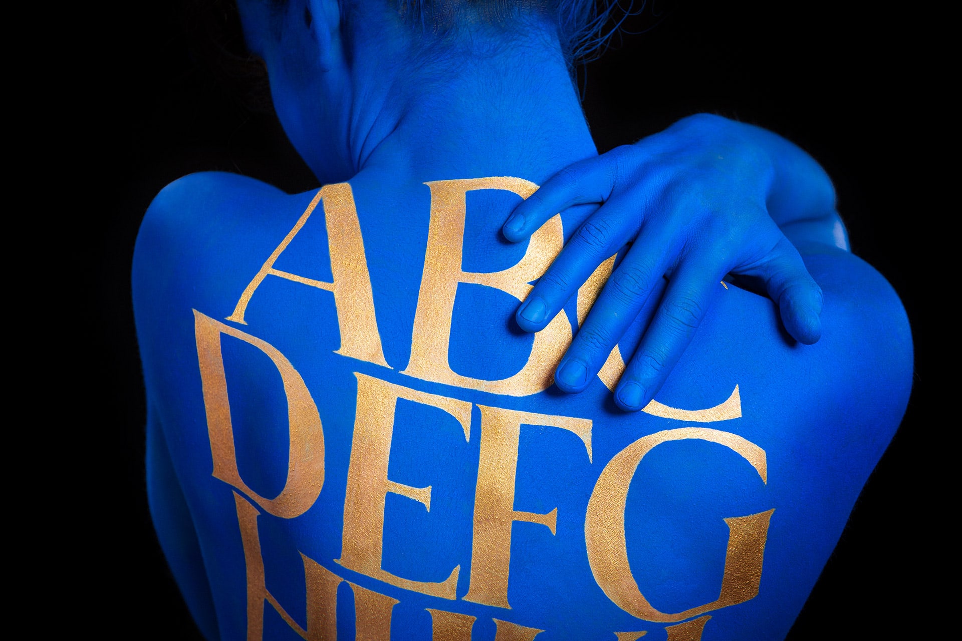
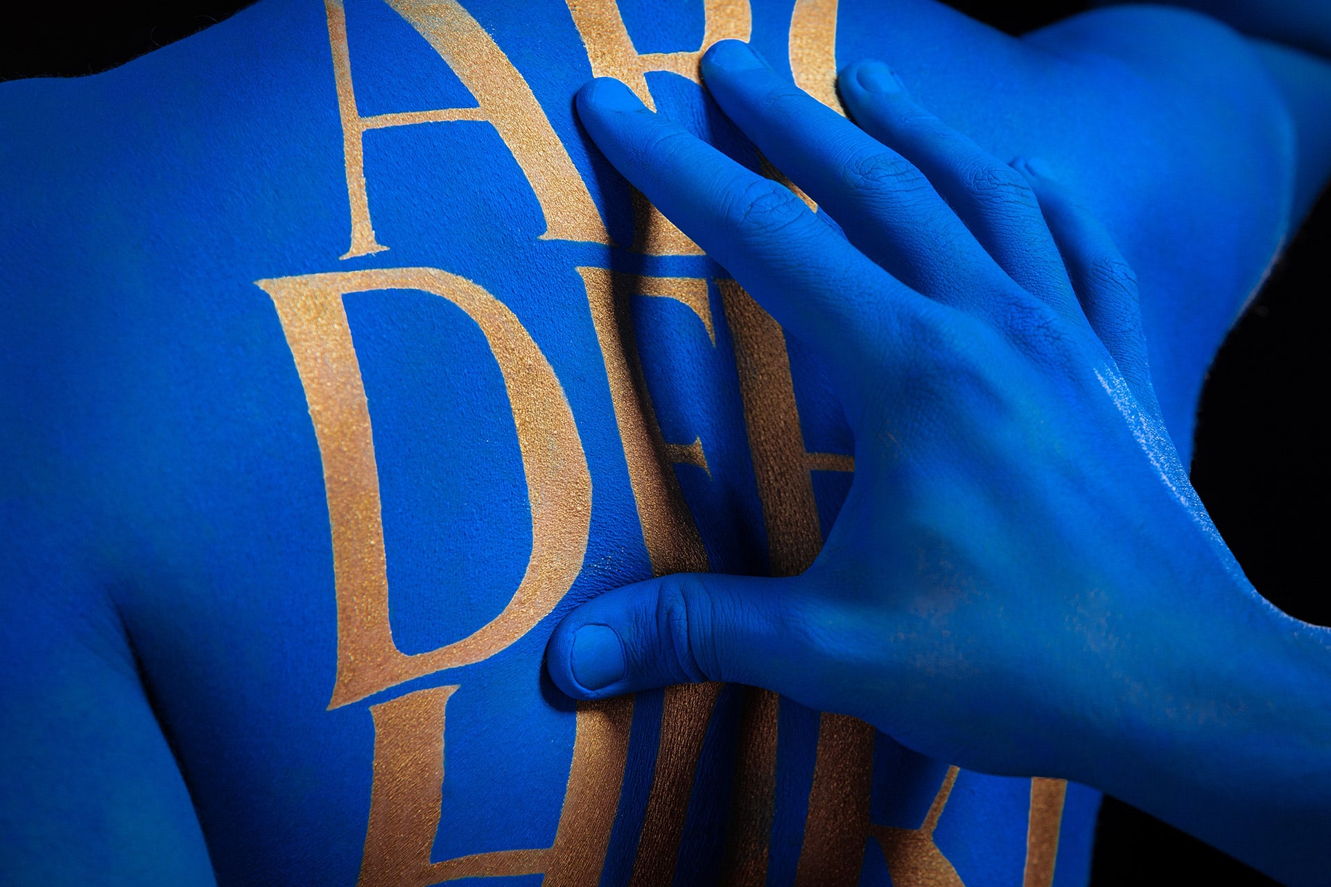
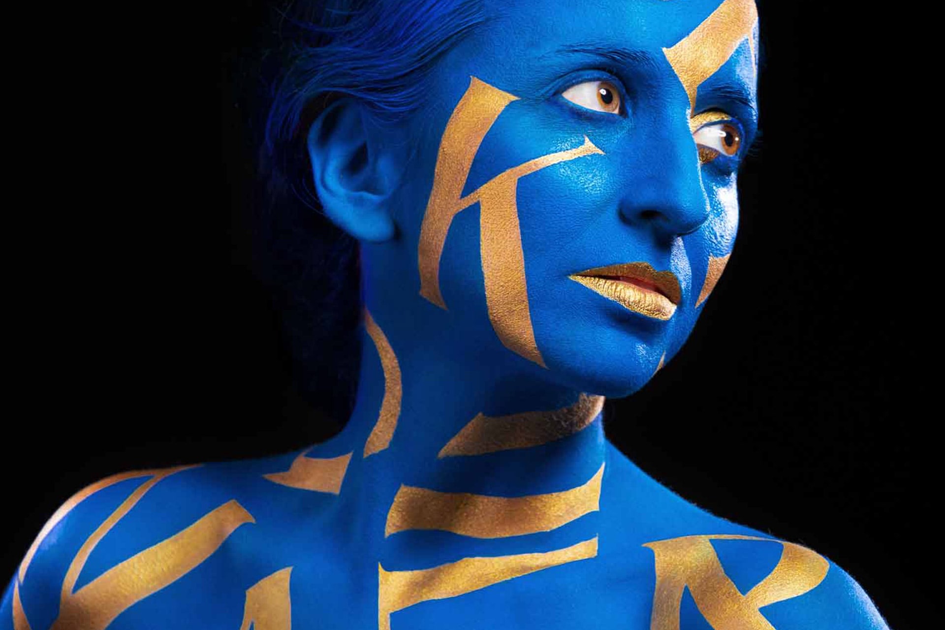
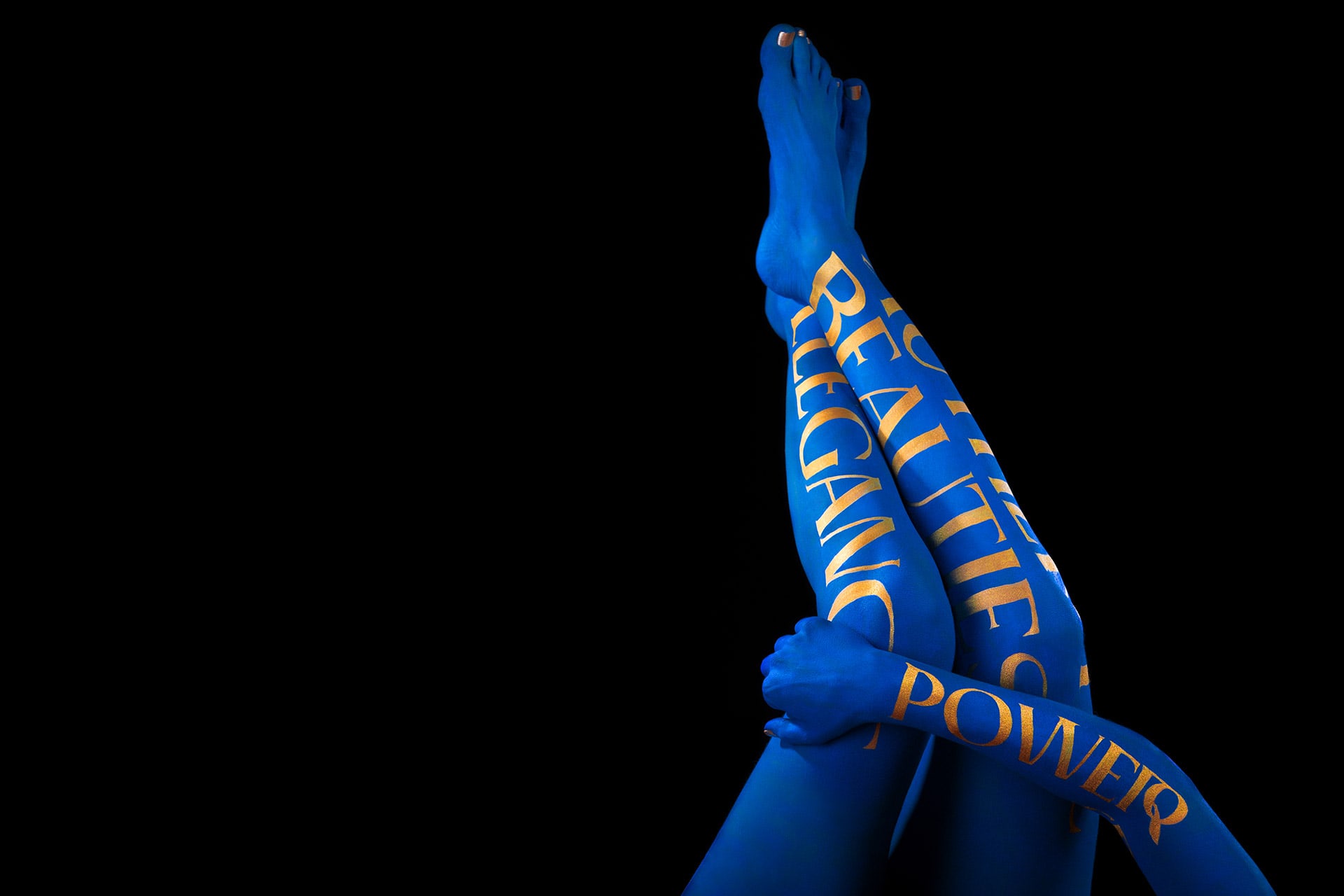
The feature of Ereganto Serif on Yearbook of Type 22/23 is a statement to the reception this typeface has received after its launch with the Human Grade Type campaign. Human Grade Type explores the link between Ereganto and the human body, in a photographic collaboration that joined both KOBU’s sub-brands (Foundry™ and Photon™) together in a project that highlights the seductive shapes and forms of this typeface, portrayed on the surface where it feels most meaningful – the human skin.
Applying projection and stencil techniques, we covered our bodies in royal blue dye and gold-painted Ereganto’s types, embracing their organic figures. A spontaneous choreography of seamless yet intentional gestures provided the alluring dynamics seen through the different elements of the campaign. The Human Grade Type campaign ran in 2021 to celebrate KOBU Foundry‘s third anniversary and to launch Ereganto Serif.
We invite you to check the Behind the Scenes of Human Grade Type, the campaign created to launch this typeface, executed by Brígida Guerreiro and Gonçalo Cevadinha:
You can learn more about Ereganto™ Serif below:
