

Typography might seem like an obscure theme to create a whole Lab Report about. And why does it matter so much when you’re designing (and specially re-designing) your brand’s identity?
The Role of Typography in Brand Identities
2
4
1
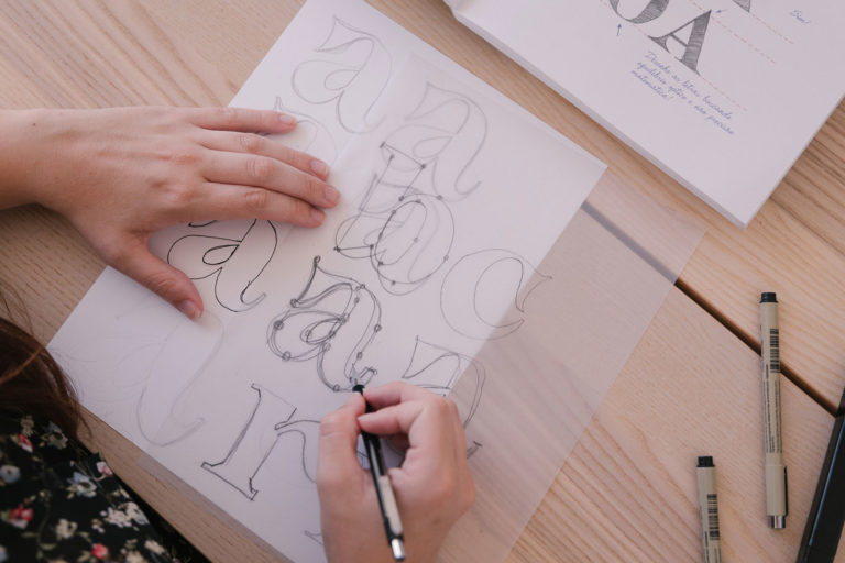
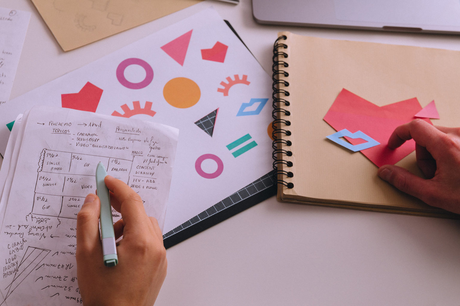
Each Font Tells a Story
If you didn’t know already, or even if you have a somewhat vague idea about it, the choice of a specific font to use in your branded material should always have a concept behind it. This concept does not need to be in-your-face; in fact, it should be felt first, then understood. The font you use says a lot about your brand: are you classic or modern? Are you conservative, or are you liberal? What if you are both? An ambivalence of values can be brought together through the creation of a font that is easily identifiable, and that makes you stand out from the crowd of old-fashioned visual identities. There are a few examples of brands doing it right.
The Case for Dropbox
Dropbox recently developed a whole new brand image that encompasses all its communication materials, from their website and their platform to their advertising materials. Part of it included designing a typographic family (i.e. a font package that has several different iterations, while all of them share details that keep the whole consistent as if they were almost the same font) for Dropbox’s new visual identity. With Sharp Grotesk, their new brand typeface, Dropbox changed its look from minimalistic and tame to versatile and creative. It’s easy to understand what we mean by checking out the GIF:

This change came along with several other brand identity guidelines; new colour schemes, a new logo and plenty other changes that can be seen just by using their platform. These changes are meant to implicate an update in how Dropbox works; instead of just being another place to store files in the cloud, Dropbox changed into a place of collaboration, a place to be creative, to work together as a team without losing track of what our goal is. This is the concept behind Sharp Grotesk: versatility, evolution, adaptivity, creativity. The new typeface mirrors a change in goals and utility for the brand.
The Case for IBM
IBM went way further by making its own specific typographic family available to anyone who might want to use it. But we’ll start from the beginning.
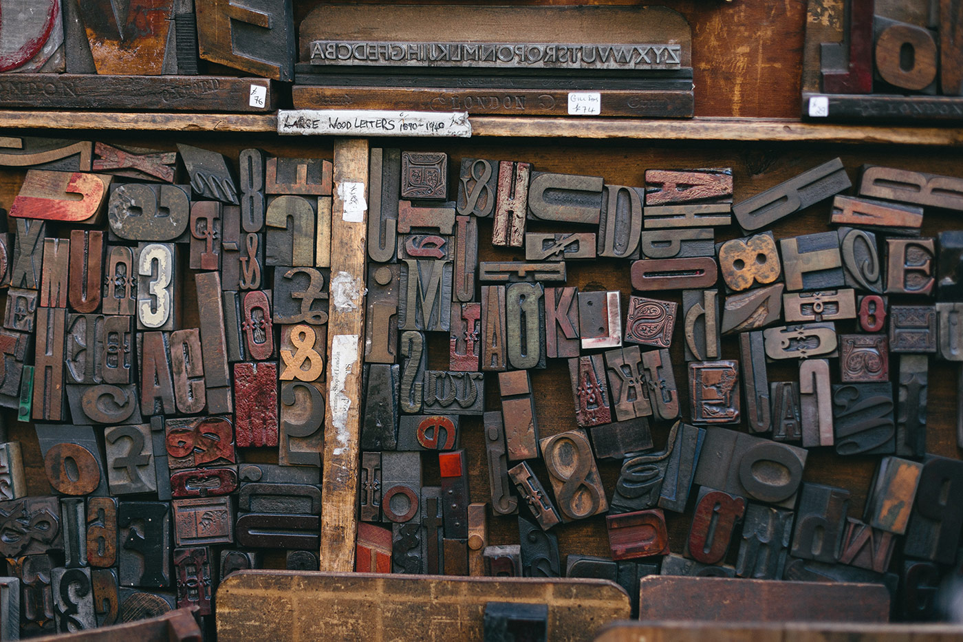
The IBM brand wanted a typeface that would show what they stand for: the connection between rationality and emotion, between human and machine. At the same time, the new typographic family had to be easily identifiable as belonging to IBM: so, a few elements from the brand’s logo were used as an inspiration to create the new IBM Plex. It balances serifs and minimalism, in the same way, it has strived to be “a medium between mankind and machine”. Serifs represent a part of IBM’s history by keeping true to its origin as a typewriter maker. IBM was the first brand to develop interchangeable typefaces to be used by everyone who owned a typewriter in 1961, with its Selectric Typewriter. Its use of oblique lines reminds us of the entropy that comes with being human; the typeface’s clean look remembers us that we’re talking about a digital company, whose history does not keep it from growing and evolving along with the times.

The Case for EDP

EDP went from an old-fashioned, pretty mainstream logo to a new logo that makes you see what it’s about at first glance: energy, movement, warmth. Along with this change, EDP’s image went through a change in their typeface and created a whole logo pack for all their brands by Sagmeister & Walsh. The agency created EDP Preon, a typeface that has become so attached to the image of the brand that you could read a pamphlet with EDP Preon and know immediately it was EDP without even taking a look at the logo.

This is a straightforward example of the power of a typeface. In Portugal, everyone recognises this typographic family as belonging to EDP, without even needing to have any knowledge of typefaces and why they are thought out this way. EDP Preon is clean but friendly; it is snappy and warm, and energetic through all its iterations. It makes you trust the brand; we could even dare to say it’s “cute”. But it helps customers through its appeal; it makes customers know they can easily identify any communication by EDP, which is an authentic proof of the great job in creating this typeface that is at the same time common and unique. Some people might not feel happy with the choice of its rounded corners and its friendliness; but even those who not like it will have to agree that its omnipresence and the fact that it’s easily recognised are a sign of a great job in creating EDP Preon.
The Power of Typefaces
If you look at IBM’s new typeface somewhere else, it will remind you of the brand that made it come to life. It is also the case with EDP. This is one of the main goals of a specific typographic family for your brand: to create a series of fonts that can undeniably be recognised as yours to those who know your product. At the same time, it must represent the values you want it to in an organic way: it must evoke the feelings you want it to evoke, without having to explain yourself. Fonts and typefaces have that power: they tell you something by design, that should match the ideas you communicate. A contemporary font that is used to express backwards or square ideas will make you feel queasy: it is as though two different messages are being expressed at the same time by a set of words. Typefaces paint a picture. It’s up to you whether you live up to their promise or not.
By the way, and since we’re talking about type: have you checked our Instagram profile recently? We are currently participating in the #36daysoftype challenge so head there for some cool stuff 🙂
___
Credits:
Main Photo by Bruno Martins
How do you feel about this article?
2
4
1

― recommended articles ―
read some more