Imagine an individual who, during his lifetime, gathers experiences and acquires capacities which impact the development of certain personality traits in his character. Along his path, there will be moments where he will be more extravagant or more eloquent, more conservative or more "rock'n roll". We can say that these are personality leaps which result from a character-building process. There will be moments where he will own his evolution, assuming the renewed identity to the world and conveying it through communication, either visual or verbal. It is precisely the same with rebranding processes within a brand lifetime - periodic leaps of identity that translate an ever-lasting character evolution. This article sheds some light into KOBU's brand identity discovery process.

The development of a rebranding project is a thorough process where several areas interrelate. The construction of the narrative around the brand’s visual and message is one of the most exciting aspects for me. It requires that we know all of the essential pillars that sustain the construction of the brand, particularly its historical path.
To properly know a brand’s past requires extensive research – how it came about, who its stakeholders are, what its fundamental values are, what its current situation is, where it plans to move in the future, and so on. Owning this knowledge gives me a better understanding of the brand’s character and allows me to better define which graphic values to assume in the rebranding. All of these parameters are part of the identity definition which will have to be reflected not only visually but also in its tone of voice personality.
An essential base to the development of any project is its methodology, and it has an even more relevant role when we are facing a rebranding. The initial methodological parameters defined for the research and analysis stages are more complex and may determine the following steps of the design.
My role in the KOBU rebranding project was not limited to the development of its visual identity and graphic language. I also had to ensure all visual elements are valuable by adapting them to the support in which they will feature. The challenge of developing a project of this nature is certainly exciting because it requires a great analysis capacity to achieve a successful initial stage. Either in branding or rebranding processes, it’s this stage that often determines what the brand will become.
Brainstorming the concept, deciding the methodology and engaging the process
Before visually materialising the identity, I felt that it was necessary to assign a core value to each KOBU sub-brand. Having the brainstorm in this initial phase allowed me to outline and clarify the way forward in the design of the identity.
KOBU derives from the root of the Japanese verb “kobusuru”, meaning to inspire, to encourage, to motivate. This meaning is linked to each human being’s personal evolution, which happens through a very intimate balance process between reflection, reason and action. This triad can be conveyed through three primary geometric forms – a square, a triangle and a circle – representing a transcendental observation of everything which is both relevant and limiting in our evolution as sentient beings. It’s an elliptical evolution where the circle evolves from the square which evolves from the triangle, which in turn evolves from the circle.
The evolutionary road undertaken by KOBU so far, considers the ramifications of its activity and the maturing of its statement. A whole identity universe, including brand and sub-brands, has been organically born from its daily existence. We can draw a comparison to the physical states of matter – solid, liquid and gaseous – and their “entropy”, this is to say, the level of randomness or chaos they represent and the corresponding degrees of freedom for creativity. Within this logic, the Agency can be perceived as the liquid element where the entropy is moderate. In contrast, KOBU Foundry, where the entropic state is lower, hence more solid, shows less space for creativity. The most entropic element of the KOBU universe is Photon, its quintessentially creative manifestation.
It was with this concept and vision of evolution and transformation in mind that we discerned the essence of KOBU’s identity. The approach was taking form and now I needed to decide how to put my hands to work!
In short, I can say that the methodology for this rebranding process was clearly reflected in the main phases of its elaboration: research, analysis, design and implementation. Both the research and analysis stages assumed greater relevance because it was during these phases that I addressed and dealt with all doubts that came up. Answering all those questions during the first two stages allowed me to be more effective in the design and implementation stages.
The KOBU rebranding process actually started approximately 2 years ago. It is the longest project I have ever developed. All good puzzles have a method to be solved – that’s how I see this process. In reality, the construction of an identity does not diverge much from solving a puzzle, where we look for a guiding thread and a narrative.
The Research and Analysis stages: question and dissect!
How did the brand come about? What graphic elements are part of the brand’s DNA? What graphical elements do they hold? Does the identity reveal the spirit of the brand? What are the underlying values of the brand? What personality do they convey and which one is more relevant? What is the brand’s role in society? Who is part of KOBU? What does KOBU mean? And at the heart of the question: what is KOBU? These were some of the questions to which I went looking for an answer. Because I am part of the KOBU team, I tried not to let my vision become skewed during the process and always tried to see beyond the horizon. The purpose was to get to know the brand as best as possible and without previous bias. It was also very important to understand how the people behind the brand perceived the past and envisioned the future. In order to do so, I developed a questionnaire where I included questions such as “What colours do you attribute to KOBU?”, “If KOBU was a cartoon, what would it be?”, “How do you envision KOBU in 5 years?” This survey was carried out simultaneously by Nuno and Sandra, and it was very curious to see their answers because they both have different views and perceptions. Despite that, when analysing both responses in detail, I concluded that they still correspond to the same ideas.
In this research phase, I also gathered all the brand’s visual identity materials like graphic elements, colours, typography, tone of voice and logotype, both symbol and lettering.
After a tireless search on the KOBU genesis and trying to understand which path to follow, it was time to consider all the brand elements, select them and hierarchically systematise each of the points addressed in the research phase. I soon realised that this rebranding could not be extreme, i.e., I could not entirely cut with the existing image and design something completely new. The current visual narrative needed to be improved, and each element needed to be placed appropriately.
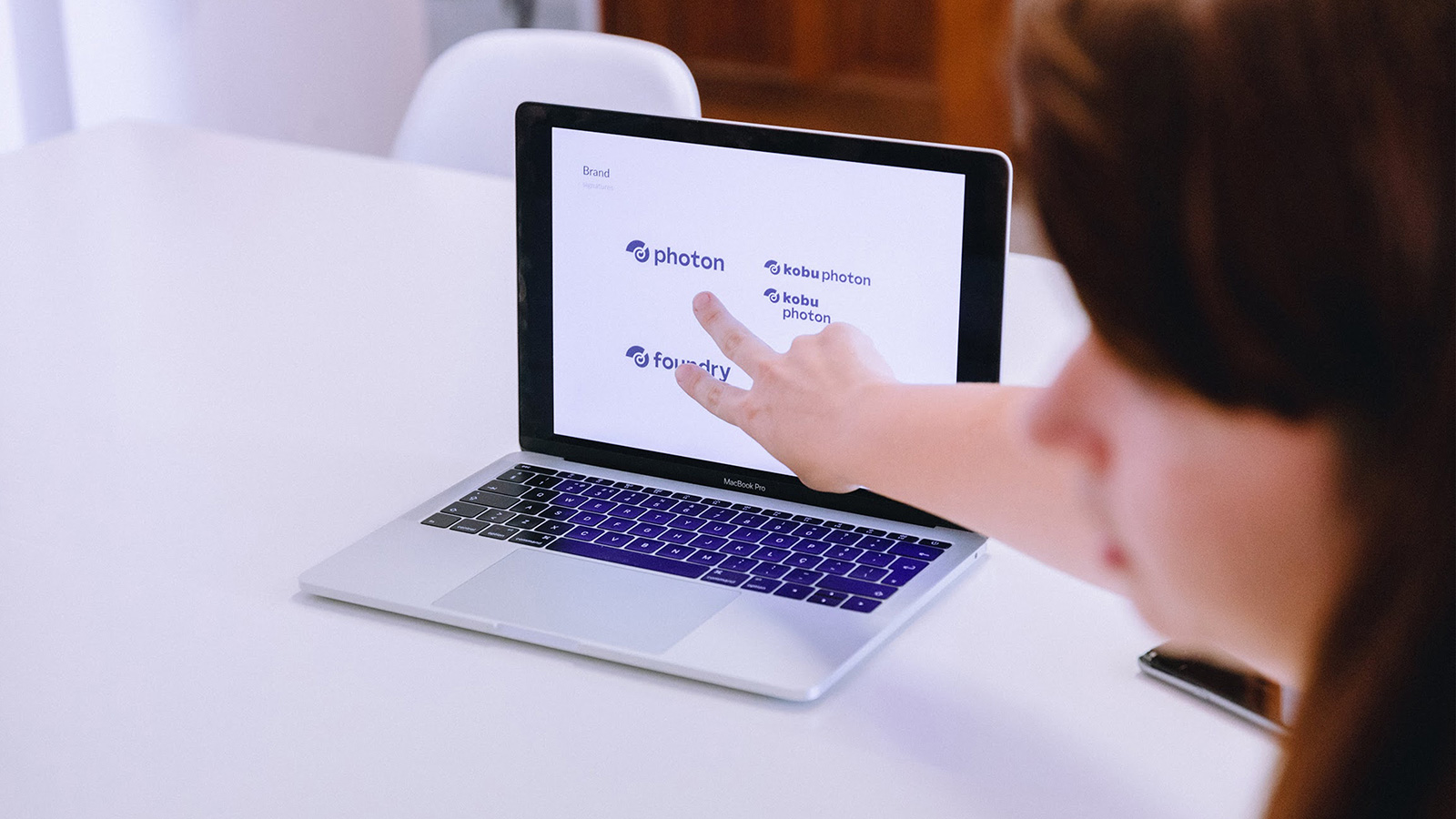
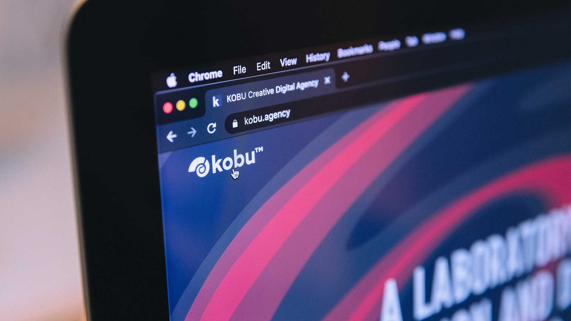
Part of the KOBU identity was presented digitally through the website, but not all existing graphic elements were applied, nor in the brand’s communication channels nor internally, which created a sense of visual inconsistency. Another aspect that had to be adjusted was the logo. Although it carried a meaning and was consistent with the message, it did not represent the personality’s organic evolution that happened over time. On the other hand, there was a need to create a sense of brand family within the KOBU universe. When two internal projects became autonomous entities – the type foundry and the content production studio – the sub-brands KOBU Foundry and KOBU Photon were born, and the whole brand family needed an update to include ??specific visual adjustments to convey that feeling of belonging to each sub-brand.
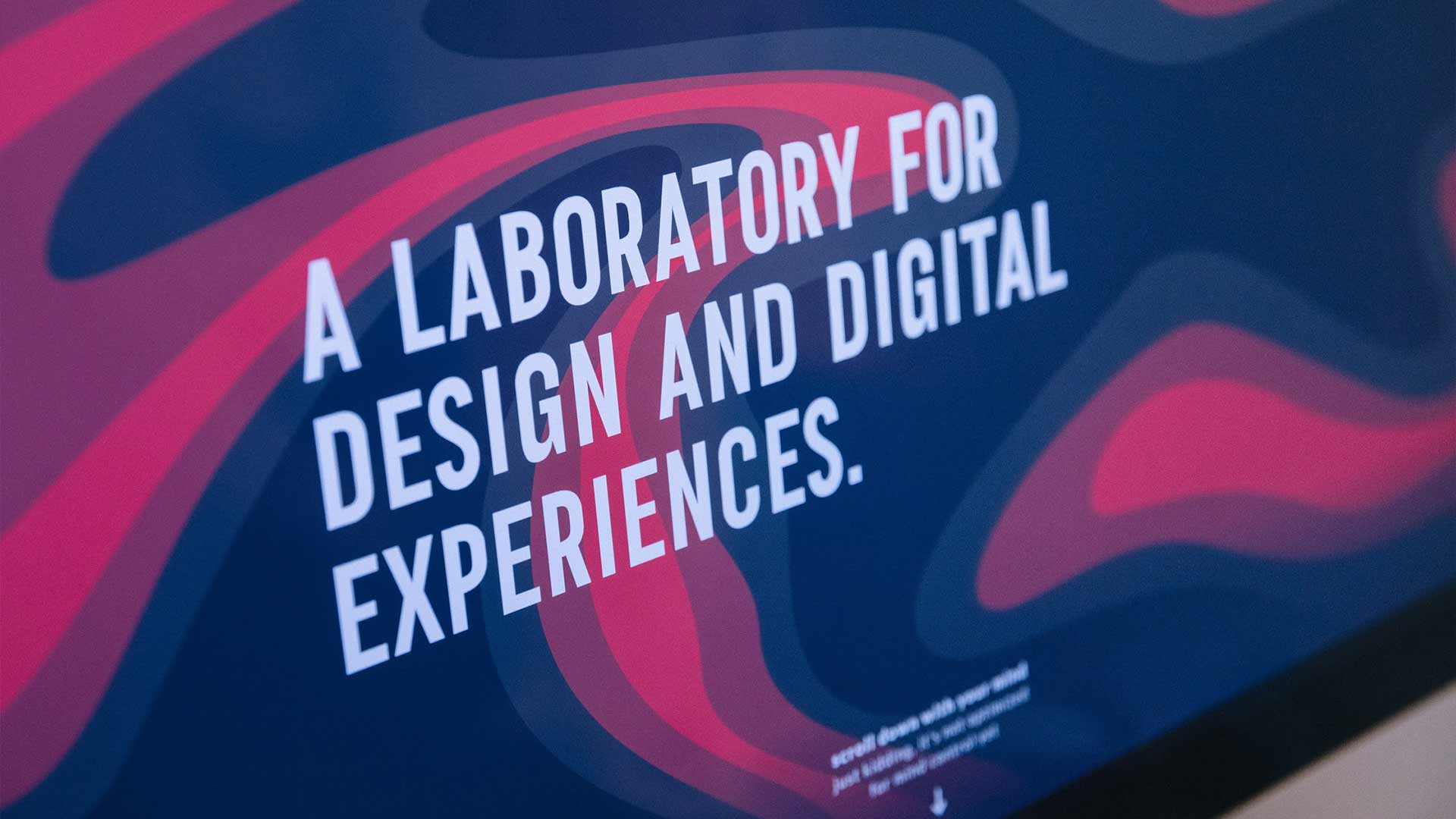
The tagline “A Laboratory for design and digital experiences” is the reflection of a considerable part of the work done at KOBU, and this message was reinforced with the division between Agency, Foundry and Photon. Now, it became easier to convey KOBU as not only a creative agency but a somewhat more complex entity. Here we have enough room (and rooms!) to freely experiment, thoroughly execute, consciously err, learn from daily experience and keep on improving through testing and re-testing. Very few creative agencies present this kind of approach.
The Design and Implementation stages: what, where, how?
The identity of each sub-brand had to be related to the main brand, and it was necessary to maintain elements that demonstrated visual coherence. I chose to use the same typography as well as the line in graphic elements. The linkage between brand and sub-brands is particularly evident in the logo. The use of storytelling techniques and the creation of narratives are specific features to the whole KOBU universe; the KBC0D3 manifesto is a particular example, and its essence is transversal to all identities within the KOBU realm.
The research and analysis stages gave me a better understanding of the brands and their purposes, and it was now time to articulate that knowledge with the graphic development phase. I had already decided that breaking with the previous design was not an option, so I would have to combine some of the already existing elements with the new elements, to allow the history of the brands to be told while demonstrating their growth.
Starting with the Agency, I kept the primary colours – red and blue. This duality represents a homogeneous movement in which these colours never mix. Instead, they complement each other. In addition to colour, another graphic element that remained was the line which allowed greater versatility in visual composition – it is from this element that the figurative piece named “Entropic Humans” was born as a vehicle to convey some of our thoughts and opinions about brands, rebrands, news and facts.
There was a need to extend the visual language to the photographic mood. The aim was to adopt a specific style, not only for image editing purposes but also for photographic typology. Even though there is consistency in the use of the defined mood, the hues differ depending on the sub-brand. While at KOBU Agency the hue is cooler, KOBU Foundry uses warmer hues.
Typography also assumes a great relevance in brand identity. Having a custom typeface allows the brand personality traits to stand out firmly on its details. The KOBU typographic family (still under construction) is composed of a specific condensed font for titles, with a single weight – this is already applied. There is also a condensed font of several weights, in normal and italic styles, applicable to text and to be mostly used in the digital world. KOBU Headline and KOBU Text are typographic fonts developed to strengthen the brand identity, reinforcing its authenticity and charisma.
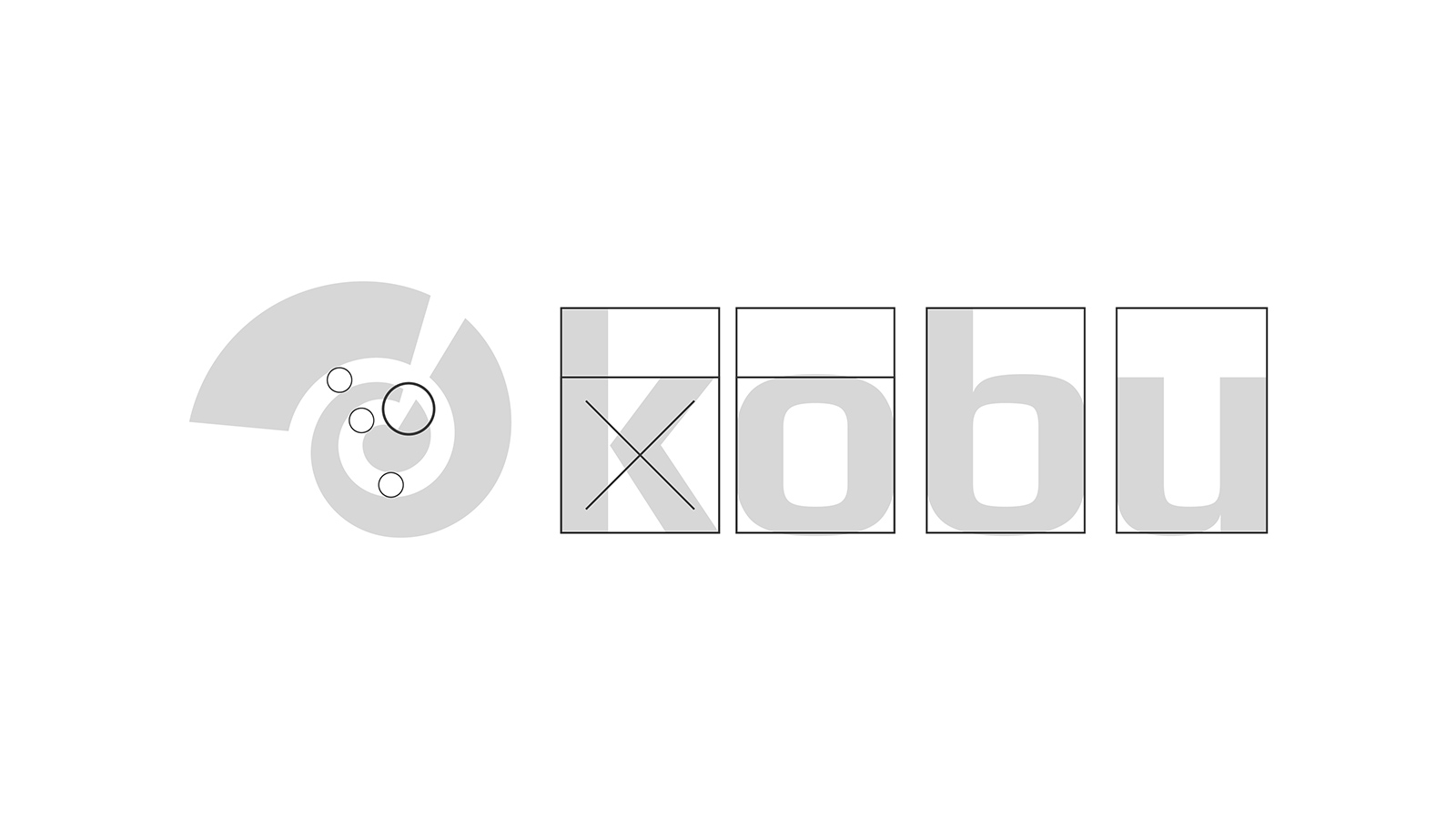
Last but not least: the logo. In many major brands, the logo is what partly defines the brand, being the central element in the identity. But it is not always like that. Depending on a brand’s tone of voice, the logo may be a secondary element. In KOBU’s case, the logo weights about the same as the other graphic elements of the company. Nevertheless, it is my opinion that the logo always carries the responsibility to provoke a sensation through colour as well as through shape. I believe that transmitting an idea through colour is much easier because of its smoother understanding and meaning rather than through lettering, which is a much more complex element to read. Specific lettering for the logo, within this particular visual universe, made it possible to organically create a hierarchy between the leading brand and sub-brands.
The symbol is an essential element in the logo representing the same relevance as the lettering. Here this element is represented by the spiral movement, recalling the mark of perfection. It translates the divergent/convergent dichotomy present in the evolution process of both brand identities as well as individual personal identities. This movement is driven by the creative generating force, here represented in negative space.
The lettering developed for the logo is a reflection of the personality that the brand acquired over time. It aims to inspire a perceptible identity, capable of reaching all mass markets without losing its charisma and manifesting what it represents. This lettering is sans serif and in lower case, which allows a perceptible reading while maintaining the balance with the remaining elements that make up the identity.
Are we there yet?
Currently, the essential elements of the rebranding are applied not just to the website. They are present in all of the brand’s working materials as well from presentations, case studies, Breakthrough reports, the KBC0D3 visual representation, all the Lab Report videos such as Insight Booth, etc. The KOBU identity continues to evolve, becoming more coherent and stable, but still flexible enough to keep on adapting to the constant change around us. That is why, even though this rebranding is two years old, I do not consider it to be complete. During a brand’s lifetime, rebranding moments should not be regarded as finished or closed actions but rather one ongoing process of organic construction, translated into ever-evolving visuals and message that speak consistently.
Transparency disclaimer
Article written by Brígida Guerreiro.
Translated by Isabel Evaristo.
Edited by Nuno Tenazinha.
Credits
- Photography by Ramiro Mendes
How do you feel about this article?
