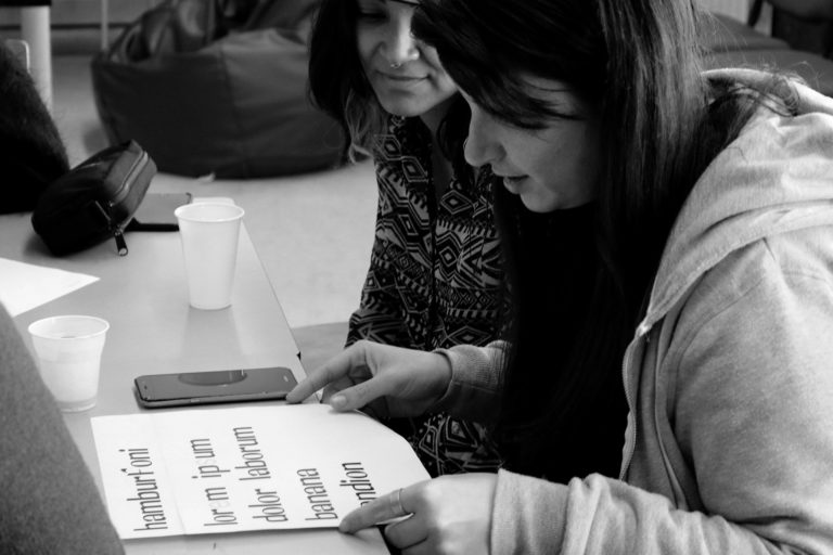


One of the main elements of graphic design is typography and what makes it particularly interesting is understanding that a font can be one of the unique identifying characteristics of a brand. Hence the paramount importance of investing in customised fonts as an advantage point in projects that aim to communicate identity.
The charisma of a custom font and its efficiency to convey identity

22
2
0
Typos* (impression) + graphia* (writing) = Typography
*Greek Language
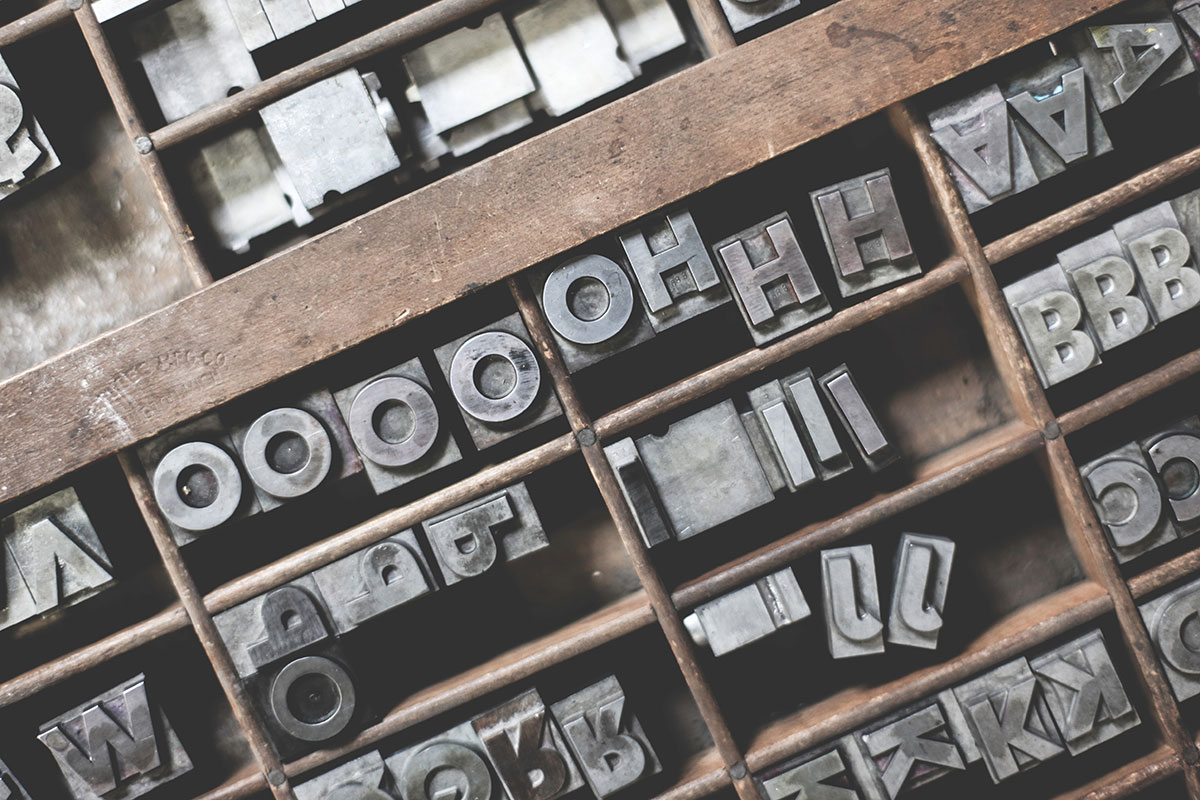
We can say typography is the process of creating a written composition, for example, a text, obeying a structural order that provides a form to the communication. We know that typography had its origin in printing with movable typefaces – they were parallelepipeds (mostly, metallic) with letters or symbols in relief and they were used in the press according to a hierarchical set to form a text. Even today, typographies still use the printing method done through movable typefaces – it’s the letterpress technique.
From all of the themes in the typographic universe, we will explore the customisation of a digital typeface, whether for digital use or for printing – and by typeface we mean all digitally created typeface designs, regardless of its purpose.
The demands of the digital world.
Companies like Google, Airbnb, Facebook, Uber, Twitter, Tumblr, among others, are some great examples of the importance typography has in defining the character and identity of a brand. These companies have recently focused on the development of customised digital typefaces as part of their rebranding processes. They have looked at custom fonts as a key element in the reconstruction and communication of their refreshed identities. The technological aspect associated to each of these brands was decisive in the creation of their new fonts and, transversely, they all assumed a specific pattern: strong appreciation in the lowercase letters and absence of serifs. This resulted in a design that appeals to the intellect of the everyday user in an accessible way, through the visual perception of simple typographic forms.
In Portugal, everyone recognises the most recent brand identity of EDP, developed by the creative agency Sagmeister & Walsh in 2011. The primary colours and simple shapes – red and white combined with a circle, half circle, square and triangle – serve as the basis for dozens of illustrations that were developed to provide, along with the lettering for the EDP wordmark, a wide range of signatures that maintain a coherent language. The technical characteristics of the new typeface for this brand reveal crucial aspects that strengthen the connection to the graphic style of its identity. All new fonts developed for these international brands followed the same recipe – they appeal to the everyday user’s intellect through simplicity.
The design of custom fonts as part of visual identities, whose purpose is to communicate through the different brand touchpoints to the mass-market, has to obey a particular set of rules. However, in different contexts, these rules may give place to some other decisive factors in order to better attain the intended purpose: to uncover the character of the brand’s identity. In the process of developing quality type design, there are two particularly relevant factors: readability and personality.

Readability is communication… always!
One of the main objectives of typography is to convey, clearly and effectively, the information that is intended to be communicated. For this purpose, legibility is a fundamental aspect, since the better the readability, the better the understanding of the information. The intelligibility of written communication depends on the readability of the font that composes it. It is the key feature that allows us to visually perceive a text, making our brains happy for not having to undertake an extra effort!
However, to achieve a readable text area, several aspects need to be met. Let’s look at this example: consider a text area that will be featured in a 500-page book, and the content of its message is exhaustive, in the sense that it contains explanatory information. Understanding it will require an intellectual effort from the reader because, in addition to being an extensive text, the contained information must be retained in the reader’s memory. For this type of text, the choice of the typeface must consider its specific purpose: to be fluent. In technical terms, legibility goes a long way in choosing the correct size and weight of the typeface – taking into account the characteristics of the public that will read the text and the type of content is also fundamental when choosing the appropriate size and weight, not forgetting kerning and leading, as well as the hierarchy in the text.
The readability of a typeface also encompasses the elegance of the form and the relationship between the different matrices (of letters). The empathic relationship between these factors allows the balance of form and counterform (positive and negative) of the typographic design. To achieve a balanced combination of all these factors, it’s fundamental to know how to draw a letter on paper first. Only then, respecting the rules previously given, should the transposition to the digital happen, through vector drawing. Mastering the vector drawing can be very important to achieve a good result because, if this transposition from paper to digital does not occur in the best way, the shape design can end up being distorted and, consequently, the readability of the font may be lost.
The personality: taking the risk.
The personality of a typeface drinks from the elegance with which the typographer reaches the balance of its forms. This elegance transpires naturally if the type design results from a thoughtful and respectful approach to its purpose, hence revealing a charisma that will bring authenticity to the project. A passionate typographer observes the personality of a font as if it was a human being; the affirmation of character in both, requires a consistent and coherent attitude on all aspects of its essence, including on what distinguishes it from the others. This is called charisma, and when a font asserts itself with a charismatic personality, it can elevate the entire branding or rebranding project to a different level, reinforcing the brand’s identity and feeding the empathy generated around itself.
During the process of type design, often the readability factor loses the battle for the personality factor. To vest personality to a font requires somewhat risky and daring decisions, such as the use of high-contrast forms. These decisions can transform the moment of visual perception (which supposedly requires simplicity and fluidity), a real treasure hunt for our brains! There is no need to fear these decisions. Embracing the differences – and many times the mistakes too – is part of this process. It is imperative to test alternative solutions for the design of the forms and keep on trying to balance the sides of the scale until reaching a result that responds, in the most genuine way possible, to what is intended.

But why is it so important to invest in a custom font for my project?
The development of a custom font follows a methodological process of its own, composed by several stages, which in itself reveals right away the exclusive and unique nature of its final result. This process starts, ideally, by focusing on the analysis of a fundamental aspect: the purpose – what is it for? Subsequently, the practical and utilitarian uses are ascertained: the formats – what channels and languages should be used? And, finally, always observing an approach as efficient and deliberate as possible, we work on the characterisation and development of some characters that will give the custom font the expression, style and elegance of its forms.
Legibility (objective factor) and personality (subjective factor) are the determining conditions for achieving a result that goes beyond satisfactory. Being able to build a custom font that serves the purpose for which it is designed must be the first aim of the typographer, but to give it its own style without compromising its intelligibility is the extra that will distinguish our font from others.
And this is the real challenge: to create a differentiating aspect and give birth to a typeface with personality. All these combined elements, tangible and intangible, bring life to the typeface and dress it with charisma. A visual identity project that integrates a strong, well-defined custom font, grows in value and authenticity. A custom typeface serves as an essential connection that brings coherence to a brand identity, also giving the project the flexibility to convey its message and purpose distinctly and consistently.
By choosing a retail, free access font, the charisma of the graphic identity can get compromised, and the whole project may acquire a certain banal look and feel… On the other hand, and in an even more pragmatic way, opting for a retail font usually translates into a worse long-term investment. The cost to licenses for the use of retail fonts will become heavier the higher the number of font users. Instead, with a custom font, you benefit from its exclusive and unlimited usage, as well as full possession of its rights.
In short, a brand that communicates through a custom font which articulates and transpires its values in a balanced way achieves an enhanced perception of identity. Incorporating a custom font in its identity enables brands to offer a differentiating element that will allow it to be more easily deployed as top-of-mind to its audience.
If you’re a type geek go check KOBU Foundry, a place where we explore our love for typography:
kobufoundry.com

Transparency disclaimer
Article written by Brígida Guerreiro.
Translation and editing by Isabel Evaristo and Nuno Tenazinha.
Article updated on July 16th 2019 to include a reference to KOBU Foundry
Credits
- Photography by Ramiro Mendes and Liliana Guerreiro
- Movable typefaces photo by Kristian Strand on Unsplash
- “Product Sans” typeface by Google
How do you feel about this article?
22
2
0

― recommended articles ―
read some more