Some projects allow us to give brands matter and body (literally). The BRUMA Taps stand, at Cersaie Bologna, was one of those projects.
After the collaboration between KOBU Agency and BRUMA Taps at Cersaie 2022 and at the ISH Fair in Frankfurt in 2023, the brand returned to Cersaie Bologna with a space that translates its essence: accessible luxury, exceptional quality, and a contemporary view of everyday life.
KOBU repositioned BRUMA in 2021, a strategy and rebranding project that defined a new language for the brand, both in terms of persona and visual universe. Since then, the exhibition spaces have become natural extensions of this identity: faithful to the brand, to its aesthetic elements, and above all, to its way of being—light, sophisticated, and approachable.
“How do you create a space that is more than an exhibition, but a brand experience?”
We wanted to be sensitive to the visitor’s journey, give prominence to storytelling, and build an immersive environment, where the product is naturally integrated, as if it had always belonged there.
“More than a stand, we wanted to create a meeting point between the essence of the brand, brand products and the audience, a place where the narrative gains form, texture, and color.”
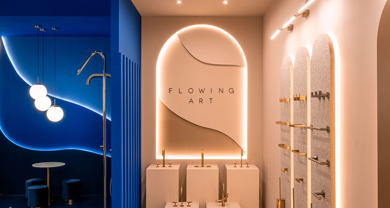
The product layout follows an intuitive logic, allowing for natural movement and a clear presentation of the different collections and finishes, from kitchen and garden taps to bathroom pieces. This year, the palette evolved toward soft sand hues, subtly illuminated by golden details.
In Bruma’s printed materials, gold traces the edges of brochures and business cards, while in the physical space it appears in the refined trims of vertical displays and furniture, creating a seamless continuity between the graphic universe and the physical environment.
Bruma, Flowing Art
BRUMA has always had an international presence, but in 2021, with the support of KOBU Agency, the brand decided to strengthen its international positioning and reposition itself as “accessible luxury”, offering the same quality and rigor, but wrapped in a more contemporary and aspirational aesthetic, with a strong storytelling component: Flowing Art.
The Flowing Art storytelling became the starting point for the stand’s entire design: accessible, fluid, and elegant. Fluidity is expressed in the vertical suspended elements (a collection of softly golden chains) that define the façade and frame the stand’s key product niches. The “sand” and soft golden tones convey elegance, while the well-organised spaces allow for easy circulation and a clear understanding of the BRUMA product. The product layout follows an intuitive logic, allowing for natural movement and a clear presentation of the different collections and finishes, from kitchen and garden taps to bathroom pieces.
Soft golden details, a signature element in BRUMA’s visual identity, (seen in brochure borders and business card edges), are now present in the trim of vertical displays and furniture edges, creating continuity between the graphic universe and the physical space.
A Spatial Experience in Bologna
Visitors enter through an archway of soft golden chains, creating a gentle transition from exterior to interior. Beyond it, their gaze is enveloped in sand and matte golden tones, a visual “nest” that invites calm and focuses attention where it should be: on the taps design, functionality, and finishes.
Pampas grass and floral elements reinforce the sense of harmony, bringing the visitor experience closer to a contemporary gallery, but with warmth and humanity.
The experience was designed to be fluid, elegante and memorable. Wide entrances and organised pathways, ensure accessibility and comfort, allowing visitors to discover the stand organically. The space is divided into thematic niches for each product type, and a central podium highlights the Flowing Art collections, inviting contemplation.
A lounge area provides space for longer conversations, catalog consultations, and discussions with brand representatives.
With its colours, arches, and soft golden façade, the stand became an Instagrammable space, a true reflection of BRUMA: making everyday life more beautiful, accessible, and harmonious.
This project was developed by KOBU in partnership with Studio Ekroo, in a deeply collaborative process. From concept to installation, everything was guided by a strong creative direction, ensuring coherence between concept and execution.
It’s always thrilling to see a brand’s storytelling take shape, when the narrative is no longer just verbal or visual, when visuals leave the screen and become spatial, tangible, and emotional. It’s at this moment that the brand manifests in all its forms and invites the audience to experience it—to literally feel what it represents.
Transparency disclaimer
Article written by Sandra Lopes.
Edited by Isabel Evaristo.
Photos by Lorenzo Piano.
References


