The SAKASU Typeface: abracadabra!

With graphic design at the core of our agency, it was a natural step to start developing our own approach to using custom made typography to boost our clients visuals. This article of the Lab Report tells the story behind our first incursion into the world of creating typefaces.
Our first born is named The Sakasu Typeface and was developed by Brígida Guerreiro.
Sakasu is a sophisticated typeface whose name derives from the japanese word for Circus. It’s a serif font featuring details reminiscent of the circus theme while conveying a sense of elegance and luxury to it.
It is also a display font meant to be used in Titles and Subtitles and was initially developed as part of the Christmas and Réveillon visuals for Pine Cliffs, A Luxury Collection Resort during 2017.
We took the time to ask Brígida for some insights into the process of bringing this typeface to life.
You are a Typography geek. What drives this passion?
“The power of typography is such that it can dictate the tone of a project. When looking at a given layout with text you don’t really need to rationalise the text to understand the message. From type you can understand if the message is soothing, aggressive, and so on. Typography generates this underlying emotional connection – and that fascinates me. It’s the designing of character, the elegance of an R or the harshness of an S.”
What was the inspiration, goal or idea behind Sakasu? What sort of applications did you have in mind?
“Regarding Sakasu in particular, everything started with a brief from a client that requested us to design a poster to promote their New Year’s Eve 17-18: the main theme for this event was the Circus. It was an interesting project, notwithstanding, an unusual theme for this time of year. In the context of the client, a luxury resort, all the visuals would have to convey a high-end feel and thus the challenge to bring both concepts together.
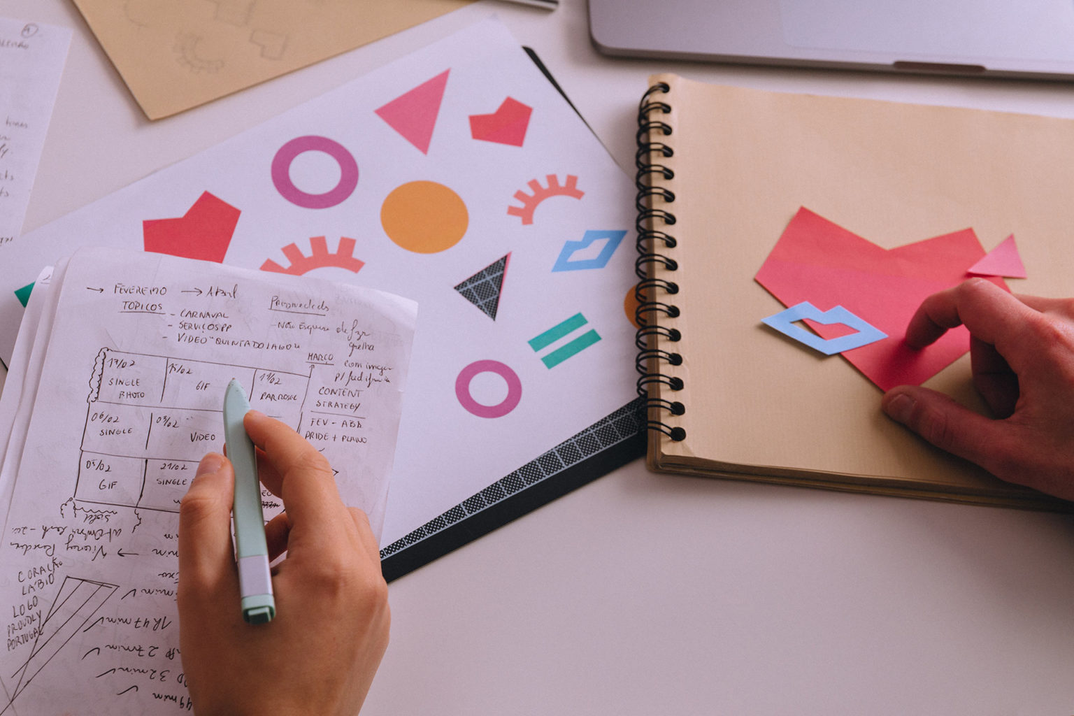
After an initial research period on the visual language to use I started sketching the main word “Circus”, looking for small details like losanges and curvilinear shapes that carried the sort of mood one usually associates with this theme.
After having the main guidelines of the visuals approved it only made sense to keep using the same style of typography throughout the visuals, in titles and subtitles. This led me to explore and develop the concept more thoroughly, planting the seed for this new typeface.”
Can you explain us part of your process to develop this font? Where do you start?
“I can not say that I have a recipe to follow. Most of the times, I begin by sketching two or three letters that challenge me the most to create the mood, e.g. “N”, “R” or “O”, sometimes “A”. But it really depends on what’s on my mind as ideas come through.
I usually start by rough sketches in loose paper sheets. When I’m confident with some options, I create a grid to bring the concept into a more defined and rigorous form, redesigning the letters and adding numerals and punctuation. Only after this creative process is finished do I move to vector software like Adobe Illustrator. There I deal with optical adjustments, correction of empty spaces and relations between letters and punctuation.
I must admit that I’m still a bit paranoid with optical adjustments and I end up redesigning the same letter over and over again, until I have a full grasp of its essence – things I’m still working on.
Nevertheless, for Sakasu the process was a bit different, because I had already previously designed the word “Circus” with a defined idea of what it would look like. When we decided to fully develop the typeface, I redesigned everything because I needed to create relations between the different letters of the alphabet, e.g. “C” should share features with “O”, that in itself shares features with “Q”.
We are now at the point where we’re implementing the typeface in Glyphs to make it available as soon as possible.
Sakasu has been a fun and interesting process, and I’m glad to be able to share it with you. Designing a typeface is like solving a puzzle where all pieces must fit together while respecting their own spaces. And we’re just getting started because other typefaces are already on the way.”
Hopefully, this is the first step in many to come so stay tuned!
Make sure to check our Behance profile to have a look at the full set.
How do you feel about this article?


