Well, let me rephrase it: though there was no blood shed, we really had to sweat our a**es off and surely some tears of joy popped out of our eyes after seeing it all coming to life! Happy anniversary, KOBU Foundry! It has been one hell of a ride!
Reeling off one year of blood, sweat and tears!
8
0
0
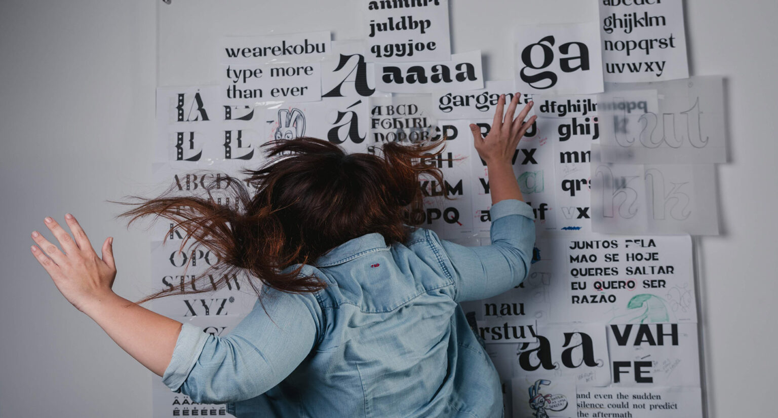
Building a type foundry within a creative agency is not very usual in Portugal. Well, I had the opportunity to embark on such an adventure by mid-December 2018 and carry on my task to emphasise the importance of this pillar in graphic design.
Going from the idea of creating a type foundry to actually having it running was a short period of about 7 months. During that time we gathered the collaboration of several people from KOBU Agency who made possible to put in place a collection of type fonts which tell the story of the journey of a rabbit, our little Meji. And though we were all up to the responsibility of such an endeavour, we were surely not ready for the crazy ride this project was! Over those 7 months, we have perfected our vision about the project, and we all grew, both professionally and personally. The experience of being involved in a team of several different people, with their own expectations about the work, made us give our best in each stage of the project. Everyone played a crucial role. Even those working at KOBU Agency and not directly linked to the project, were fundamental to ensure the conditions for KOBU Foundry to happen – you can check the website for our type foundry.
That’s how KOBU Foundry was born – a storytelling factory which comes to life through our Entertainment System and which unfolds from the moment we insert the cartridge into the game console. Welcome to the universe of digital typefaces, created to the rhythm of each chapter of this adventure.
Meji Adventures Concept
The storytelling, the illustrations, the motion graphics are all tools we use during the creative process behind the development of all typefaces, including customised fonts. For us, charisma and personality are key features to each typographic work. Hence the importance that a customised font can have to the effective communication of a brand identity. Using a font that clearly conveys a brand’s personality is a fundamental asset to assertively reach the desired target audience.
As a graphic designer, I always strive to keep in mind the conceptual benefit and the importance of staying cohesive and coherent as the project unfolds. I have this in mind all through my work process, and I often wonder how can I explore it not only when designing but also from a sales perspective.
When starting KOBU Foundry, we decided to revive Sakasu®, a custom font that we developed in 2017 for a new year’s eve communication where the theme was the circus (more about this here). By that time, Sakasu® consisted of just part of the Latin alphabet and Roman numerals in uppercase. As I retrieved this font and started developing the remaining characters, I also started to imagine a story – the story of a rabbit which escaped the circus and headed to the Moon. It sounded surreal – a rabbit wanting to reach the Moon – until I found a Japanese folklore tale whose moral was that a rabbit can reach the Moon only by the feats of its kindness. Well, it seemed that my daydream wasn’t that crazy after all, someone had already thought about it! So it was from that moment that the idea of telling stories through illustration and typefaces started to take form.
Not long after, the story of Meji was born, and it was super long! It had another three more chapters than the final version! During this construction process, we all had to face some tough decisions – probably myself more than anyone… and it wasn’t always easy! Conceptualising, organising, anticipating, preparing, putting in place… Many times (still today!) Nuno told me “This is not a sprint finish. It’s long-distance running.” and we must handle it wisely.
After outlining the story, the real deal was up: designing and intertwining the typefaces to its chapters. It wasn’t always easy, but it’s a process involving analysis and interpretation which, well, is a part of my creative process.
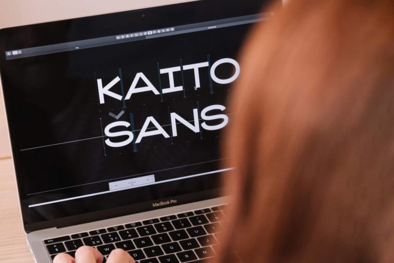
Meji arrives at the circus. In a way, this part was easy because we already had a typeface related to the circus theme, even though it was adapted. Next stop, Meji got to the Moon, and the inspiration here was the geometrical shape of it, which led me to the concept for Tsuku® Sans. After that, came Kaito® Sans (see more about this Type design process here), inspired by the elliptic trajectory of comets. Taiyo® drinks its inspiration from the flames of the Sun and, finally, the Meji Typeface mirrors our little white rabbit (ears included!).
Entertainment System
When we think about the typical type foundry, we immediately imagine a website with the traditional list of fonts which can be tested before being acquired by the graphic designer. Well, creating something in these terms was not in our plans. Our way of seeing the type design art is rather creative and engaging, and therefore we wanted to come up both with a different license model as well as a more catchy sales process. And since we are a bunch of descendants from the 90s decade who love to monkey around, we quickly realised what our foundry would look like…
Nostalgic moment alert: Vectrex, Atari 2600, ZX Spectrum, Nintendo NES and Sega Mega Drive. These consoles were the inspiration for the development of kobufoundry.com website. Our Entertainment System springs from that analogy to restore the connection with the 1990s decade and feed the nostalgic vibes of videogame consoles and that fascinating universe. We couldn’t have a video game-inspired Entertainment System without games, of course! And there they are, in the fonts presentation pages of our first collection, designed in the spirit of it. In Sakasu® Display and Decorative page, for example, we have a classic pairs card game. After all, we all know that there’s no circus without an illusionist with a magic card deck! And since it doesn’t make sense to play a game without having our eyes on the prize, every game gives you the chance to win coupons which, depending on your skill, can give you up to 30% discount when buying our fonts.
Type Experiences
Besides the classic cartridges where we keep our font collections, there are also the demos. These replicate the game-teaser demos and aim to present teaching Type Experiences. This is a captivating way to grab the user’s attention and make him stay tuned to more typographic works. The first Type Experience, for example, approaches variable fonts. It includes tools and simulators which allow the user to explore this kind of font features, helping him to understand the potential uses. The whole demo follows a visual concept, and it introduces our first free font, Kawaru™ Typeface. The usage of fonts without paying for its respective license is unfortunately common (we all know that!). Kawaru™ Typeface is a subliminal ode to this problem, not only through the graphics we used to communicate it but through its own mutable and adaptable nature.
Concerning this issue, during our foundry’s first year, we had to deal with people’s unauthorised use of our fonts (read, non-paid usage!). We consider there are no valid reasons to justify the appropriation of the work of others without due retribution. Therefore, we condemn that kind of behaviour. If requested, KOBU Foundry spares trials of each of its fonts so that you can test it – we all know how hard it can be to choose the right typeface. Many times we can only make a decision after checking several options. Count on us to cooperate transparently and justly, the world needs it!
Here’s to all of us… including you, dear friends!
And so, on July 15th, our KOBU Foundry celebrates its 1st anniversary. We will be having a whole month of celebration with new fonts, our first newsletter and fresh dynamics for social media. Looking back we’re proud to see this project slowly pave the road: our fonts are now being used in more than 40 countries; Akuto® Display, Okaasan® Serif and Kawaru™ Typeface were featured in the Typography category of Graphic Design, on Behance; our website received some distinctions within the digital universe, namely in the Awwwards and CSS Design Awards, as well as mentions in specialised blogs and Type related Instagram profiles. It has been a very positive journey, and we want to keep on growing, doing more and better. Above all, we want to keep on having fun alongside a community of people that appreciates our work and enjoys this ride as much as we do. Congratulations, y’all!
Btw, we will have news fonts released at kobufoundry.com very soon, stay tuned 😉
See ya soon!
Transparency disclaimer
Article written by Brígida Guerreiro.
Translation and editing by Isabel Evaristo and Nuno Tenazinha.
Credits
- Photography by Ramiro Mendes
- Illustration by Gonçalo Cevadinha
How do you feel about this article?
8
0
0
