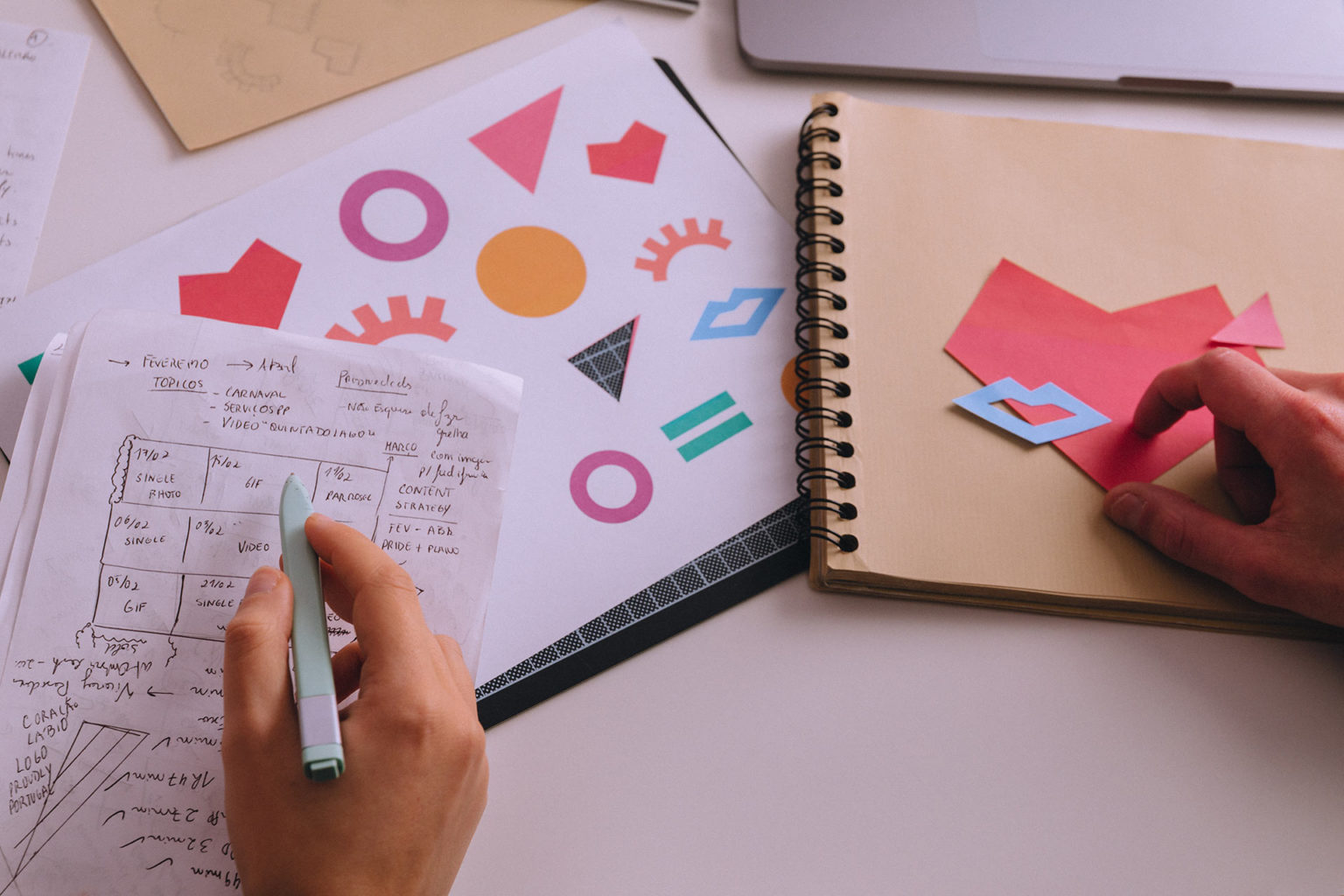
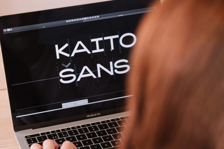
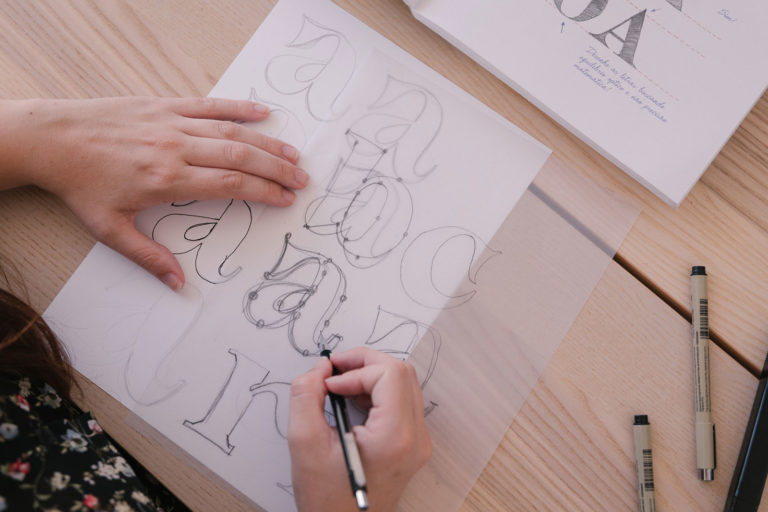
The conceptual component of this work is powerful. It definitely inspired the design of the font in its feminine characteristics and subtlety of the details. After consolidating the concept, we developed the communication visuals for the font - diving deep into the theme of Motherhood and taking ancient references to deconstruct into alternative realities. The outcome is an elegant and distinctive typographic work, conveyed through a visual communication with a lot of personality, creativity and depth.
Okaasan Serif: Maternal Essence

10
0
0
Introducing the Okaasan® Serif Typeface
Hey guys! In my last article, I wrote about the typographic process behind Kaito® Sans typeface. Now it’s Okaasan® Serif’s turn. This digital typeface is a serif typographic font inspired by the 1800’s rational mood of the Enlightenment thinking. Its serif reveals a modern high contrast between thick and thin elements, fitting a Didone style.
By the way, the Didone style was born by the hands of Firmin Didot, Giambattista Bodoni and Justus Erich Walbaum, early 19th century typographers, but this style first emerged in the late 18th century. Didot, Bodoni and Walbaum are fonts we use to this day and are named after these guys!
So, if there are dozens of fonts based on this style, what makes Okaasan® Serif so distinctive? Well, first of all, our inspiration – the Mother figure. All mothers are different and unique, but they all share some characteristics that shape their behaviour and perception of life itself. With that inspiration in mind, a digital typographic font was born, dedicated to all women who are also mothers. One curiosity: Okaasan’s name derives from the Japanese word for “Mother”.
Inspiration and Concept
Motherhood inspired us, but how could we represent the maternal essence? Mothers demonstrate an unmatched strength to protect their children while also being sensitive and gentle. Mothers represent a safe harbour as they are unbreakable and convey hope. Mothers are ubiquitous and teach us values that shape our growth while children.
How could we bring such powerful values into a typeface? The typographic process is similar to the development of a graphic design project – research, analysis, design and implementation. However, with this project, the challenge was different because we were developing a typographic font and a graphic communication based upon such a delicate and personal concept.
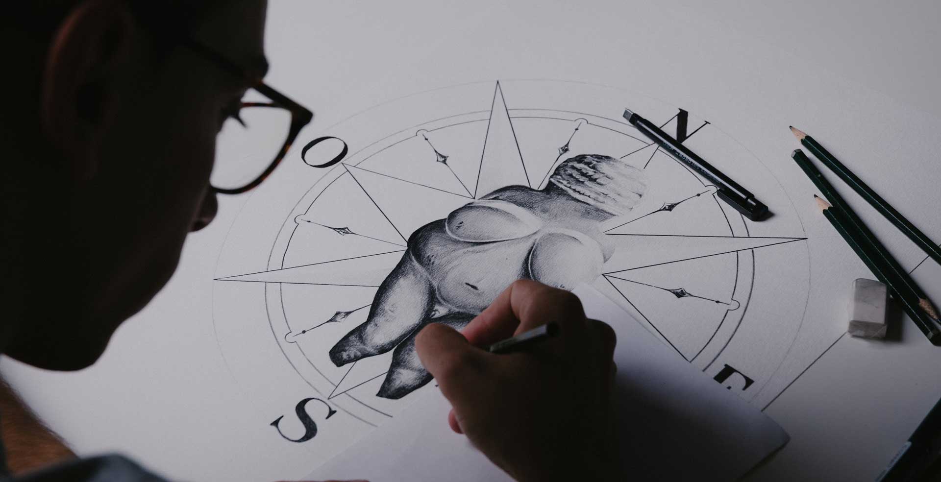
We found a representation of Motherhood that immediately helped us illustrate all of these characteristics best and show how far back in time, mothers have such an important role for humans – the Willendorf Venus statue. It is estimated to have been made in 25,000 BC, and it represents the goddess of fertility and the worship of Motherhood. An ancient piece of art with strong and deep meaning to lead us through this process. Like a true mother!
Working the visuals
We decided to create manual illustrations to depict five aspects that, for us, best represent Motherhood and the importance of the mother figure in our lives – inner beauty, altruism, transparency, heroism, omnipresence.
The challenge was to convey these values using the Willendorf Venus statue as a basis. To represent inner beauty, we imagined the statue as hollow, as if the interior contained a skeleton made of branches and flowers, thus representing a beautiful and natural essence. This link between mother nature and the purity of a clean and sincere interior portrays a mother’s inner beauty hidden inside a rock-solid exterior, flourishing outward through this illustration, visible to all.
The altruistic side of Motherhood became alive through a defragment Willendorf Venus, dismembered into various pieces, thus showing the mother’s ability to give and devote to her loved ones selflessly. The transparency of her love and devotion is shown through the representation of a crystal clear statuette – a mother’s affection is transparent, sincere and genuine.
Motherhood empowers women with unique abilities and sensibility. Like a superhero! The Willendorf Venus with a cape represents the hero inside every mother. Her love is like a supernatural power, enabling her to do everything in her reach to ensure the safety and wellbeing of her loved ones. For that, she is like an all-seeing eye, always on the lookout, thus creating an omnipresence feeling that supports us to overcome steps along the way.
Type Design Process
The concept design and illustration stage were fascinating – the story and visual outcome made us all very proud. The biggest challenge was being able to create a typeface that did justice to such an essence. I had to demonstrate all the features represented in the illustrations and use their charisma for a more significant impact. First, I tried to represent the features in a single character that would be the basis for the development of the entire alphabet – the letter “a”. I must confess that it was a bit bold of me to try and imprint in a single character all five aspects representative of the maternal charisma. Still, I think that, in a way, I did it.
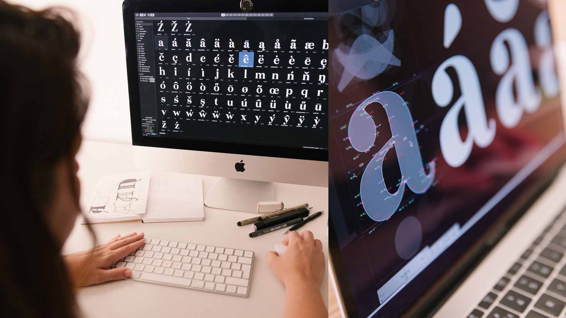
Here’s how I see it: the strongest maternal characteristic that really influences Okaasan’s typographic design is fertility. This feature is presented through the tear terminal, pairing with the whole design’s elegance, and the hook shot which accompanies the drawing of the letter. Although they seem fragile, the connections (tapering) between the elements of this character are unbreakable – the thin thicknesses are constant in all 5 weights this font has. On the contrary, the strong thicknesses of the character adapt accordingly in each weight, as if it breathes. That’s the secret behind this typographic design. All elements are involved in such a way that each character, even though having similar traits, can tell a story by itself and resonate in its particular preciousness.
After I came to the final type design of the letter “a”, I started developing “n” and “d”, followed by “o” and “v” – these are the base design characters. References from the Didone style were taken as guidelines to develop the remaining letters. For example, though Okaasan is a modern serif font, the serifs are not supported by the x-height line of some characters (this is visible in “r” and “n”, for example). “O” is based on the right axis; “W” does not have a central serif and “i” shows a round dot. You can check all the features here.
Okaasan® Serif (v.2) was designed to accommodate over 75 Latin-related languages – it includes Vietnamese diacritics for greater versatility and dynamics in a typographic composition. It also includes uppercase, lowercase, numerals, diacritics, punctuation, and some symbols. It is an elegant choice for editorial design projects, applying perfectly to both titles and small to medium text areas. Check the font’s page at KOBU Foundry clicking here.
So, now what do you think about Okaasan® Serif?
Go and check more about our type foundry here. Don’t forget to follow our Instagram @kobufoundry and send us feedback!
See you soon!
Transparency disclaimer
Article written by Brígida Guerreiro with contributions by Isabel Evaristo, Sandra Lopes and Gonçalo Cevadinha.
Edited by Isabel Evaristo and Nuno Tenazinha.
Credits
- Photography by Ramiro Mendes and Liliana Guerreiro
How do you feel about this article?
10
0
0
