Kaito Sans: Type Design Process

Hey, guys! It’s been a while since my last article, I promise not to spend so much time without giving you any news. So, last week Kobu Foundry released a new typographic font: Kaito Sans. Have you seen it already? If not, click here to get to know this newborn.
Kaito Sans is a typographic Display font, that includes only one weight yet three different styles: Normal, Stencil and Stencil + Texture. Now, I want to share with you the process behind the font’s construction (and anatomy) as well as some curiosities about this typography family integrated into the Meji Adventures.
The Storyline behind Kaito Sans
Dust, all about dust. Actually, dust is present in two chapters of Meji Adventures… You know about Meji, right? “Meji Adventures” is the first story arc that presents our first Font Collection at KOBU Foundry and Meji is its main character.
Well, Meji is a curious and very smart rabbit. And all he wants is to fulfil the dream of finding the magic Planet of Rabbits, an extraordinary place where rabbits can live free of magicians. However, Meji knew nothing but the Top Hat – which made him feel safe – that belonged to a great magician who forced all his animals to be part of his magic number. Fortunately, Meji was smarter, and he managed to escape the Great Moustachini… But if you want to know more about the story go ahead and check all the chapters of the adventure on KOBU Foundry’s website.
I can only tell you that at this precise moment our little rabbit is likely floating in space, riding a comet with his supernatural skateboard. And this is the reason why Kaito Sans was developed based on elliptical orbits: the routes drawn by comets around a star – it’s beautiful!
Oh… I forgot to tell you: Kaito’s name derives from the Japanese word for “comet”. Funny, right?
Building the Font
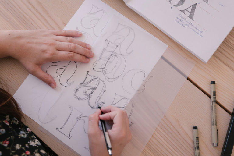
From the typefaces published on our type foundry, Kaito Sans was presented as the most relaxed construction process, which allowed me to draw faster and to create the stencil and stencil + texture variations. I’ll show you some sketches of the process of integrating a font based on the elliptical movement – and I’m very happy to have managed to keep a large part of the initial design – yes, hand-drawing letters is a recurring habit that I don’t want to let go of. For the more praised styles, the creation process was quite demanding and quite exhausting – but isn’t this the right way to do it?
But first, let’s talk about comets. As you all know, comets are balls of ice, dust and small rock fragments of many sizes and shapes. Its physical structure is divided into three parts: nucleus, coma and tail. At this point you might be wondering: “Isn’t the article supposed to be about typography?” But, you see… For me, and especially for KOBU Foundry, this is the most important part for the development of typographic fonts, their concept and purpose. Most of the times, the type design concept is undervalued but in our process everything matters, down to the smallest details. For many designers, drawing typography may be an act of madness, for others a way of expression. For me, it is undoubtedly the latter. Now, let’s head back to comets: did you know that the nucleus is the solid and central part of a comet, called dirty snowball? This type of information derived from all the research work I did before the actual design phase of Kaito Sans. It proved as an immense source of inspiration for the development of the font and, particularly, for textured style.
For this typeface (more specifically the Normal style) the “O” was the basis for the development of all characters because this is obviously the glyph most similar to the elliptical orbit previously mentioned. Letters like “C”,“D”, “G”, “Q”, “U” and “S” followed this one idea along with its oval shape, and pshhht… look at the “Y”! It reveals one cute and different personality, compared to other characters in Kaito Sans. The “U” is funny, because when we see it with diacritics it resembles a smile, gaining personality despite his common form. Sometimes people ask me about where my inspiration comes from and why a letter has a certain matrix and elegance. Well, it’s quite simple. For me, all glyphs are able to tell a story and make us believe that they are there and that is because they are part of a puzzle where all the pieces fit together. Piece by piece, creating a uniform and coherent type design.

When we planned Kaito Sans, it was decided that it would only be in uppercase and it had to be as accessible as possible – namely being accessible to several Latin languages – this was very likely the real challenge! Only after setting this constraints did the research began. I started looking for as much information as possible about Latin Languages and how to make this possible. I found loads of information on Vietnamese Typography – learned a lot about its history, alphabet, tone marks, diacritics, etc. It is indeed a fascinating culture that allowed me to learn a lot more about typographic technique in Glyphs App. These were my adventures while conceiving this typeface.
Today, I think that all the research helps me in the creative process of type design. Kaito Sans is a sans serif font and it was designed to accommodate more than 80 Latin-related languages (yes!), and it includes uppercase, numerals, diacritics, punctuation and some symbols such as arrows. One last curiosity: Kaito Sans has twenty-three “O”’ characters with different diacritics – and I believe they ended up being gorgeous! This type is suited for titles and short texts for magazines; because of the Meji storyline and the fact that our rabbit travels the universe in a magic skateboard, we found it interesting to visually connect Kaito Sans with the urban universe. As you can see in the font’s page we also illustrated its use for magazines on the skateboards and apparel markets. But it’s actually only a matter of using your imagination.
Are you passionate about typography? Check more about Kaito Sans at kobufoundry.com or at our Instagram @kobufoundry.
See you soon!
Transparency disclaimer
Article written by Brígida Guerreiro.
Editing by Nuno Tenazinha and André Oliveira.
Credits
- Photography by Ramiro Mendes
How do you feel about this article?


